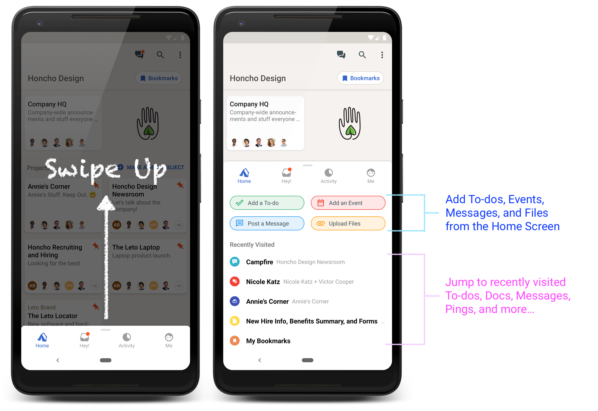
You could always Add a To-do, Upload a File, Post a Message, or Add an Event right from the Home Screen. Most people, however, just needed to browse projects or the Hey! menu without the “Big Green Add Button” in the way.
Now you can simply swipe up on the Home Screen navigation to reveal these Quick Add options. We’ve also added a list of Recently Visited sections for easy reference. Just tap on one of these to jump right back to it.
Swipe up to quickly add To-dos, Files, and more. Jump to recently visited places
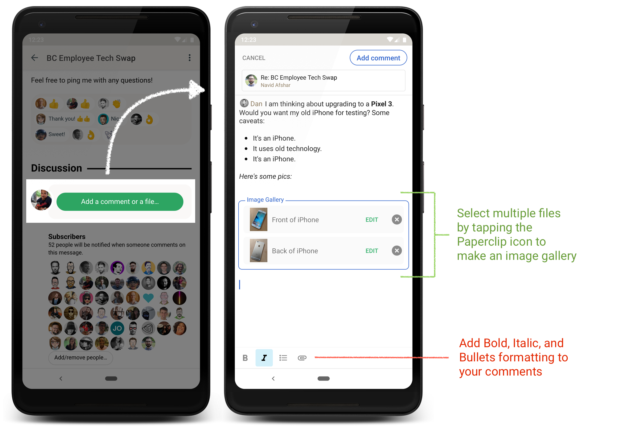
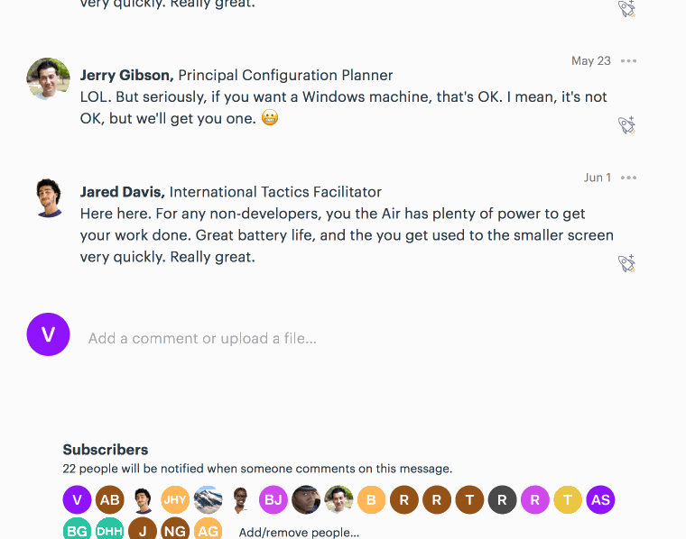
2. Comments with Image Galleries
We’ve improved the interface for commenting on Basecamp Messages. Now you can format your comments using Bold, Italic, and Bullets. You can also select multiple images to attach to form an Image Gallery in Basecamp.
Tap the Paperclip icon. Then select the images one at a time in the order you want them to appear. Tap Upload Files, and they’ll be grouped together into an Image Gallery. You can add and edit captions too.
Format your comments, make an Image Gallery
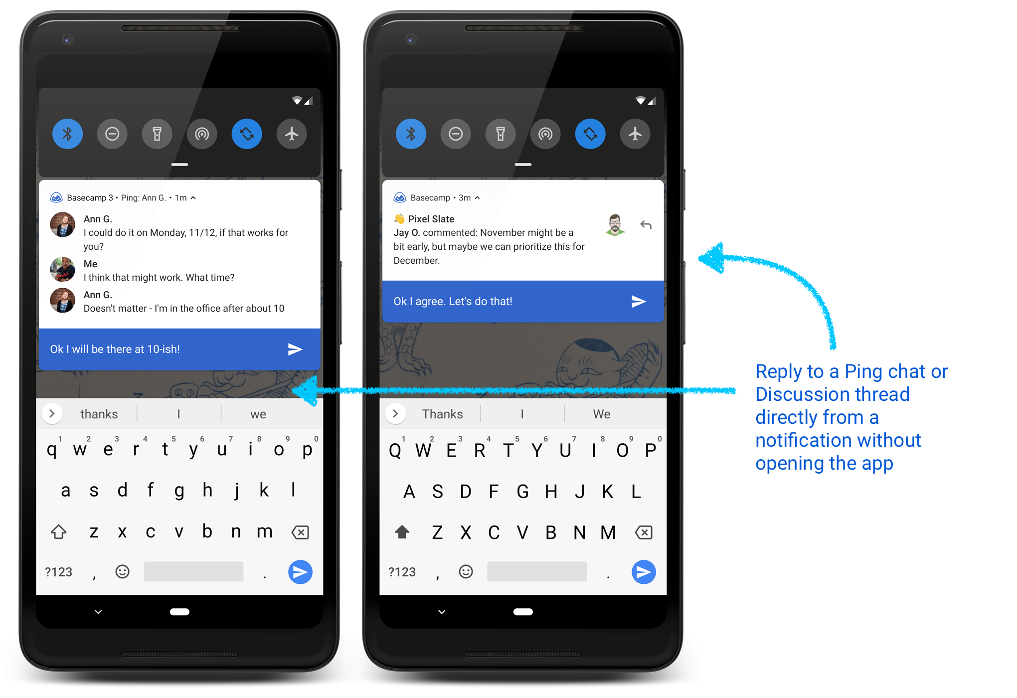
3. Reply Directly inside a Notification
If your phone supports it (Android 8.0 and above) you can now have Basecamp conversations without opening the app. Just reply to a Ping or Message notification. You’ll see a running history of what’s been said.
Reply to Basecamp discussions without opening the app
We hope these features help you get around Basecamp easier, give detailed suggestions, and reply to discussions without losing focus. We’ve got more planned! Stay tuned. Until then, get the latest on Google Play.
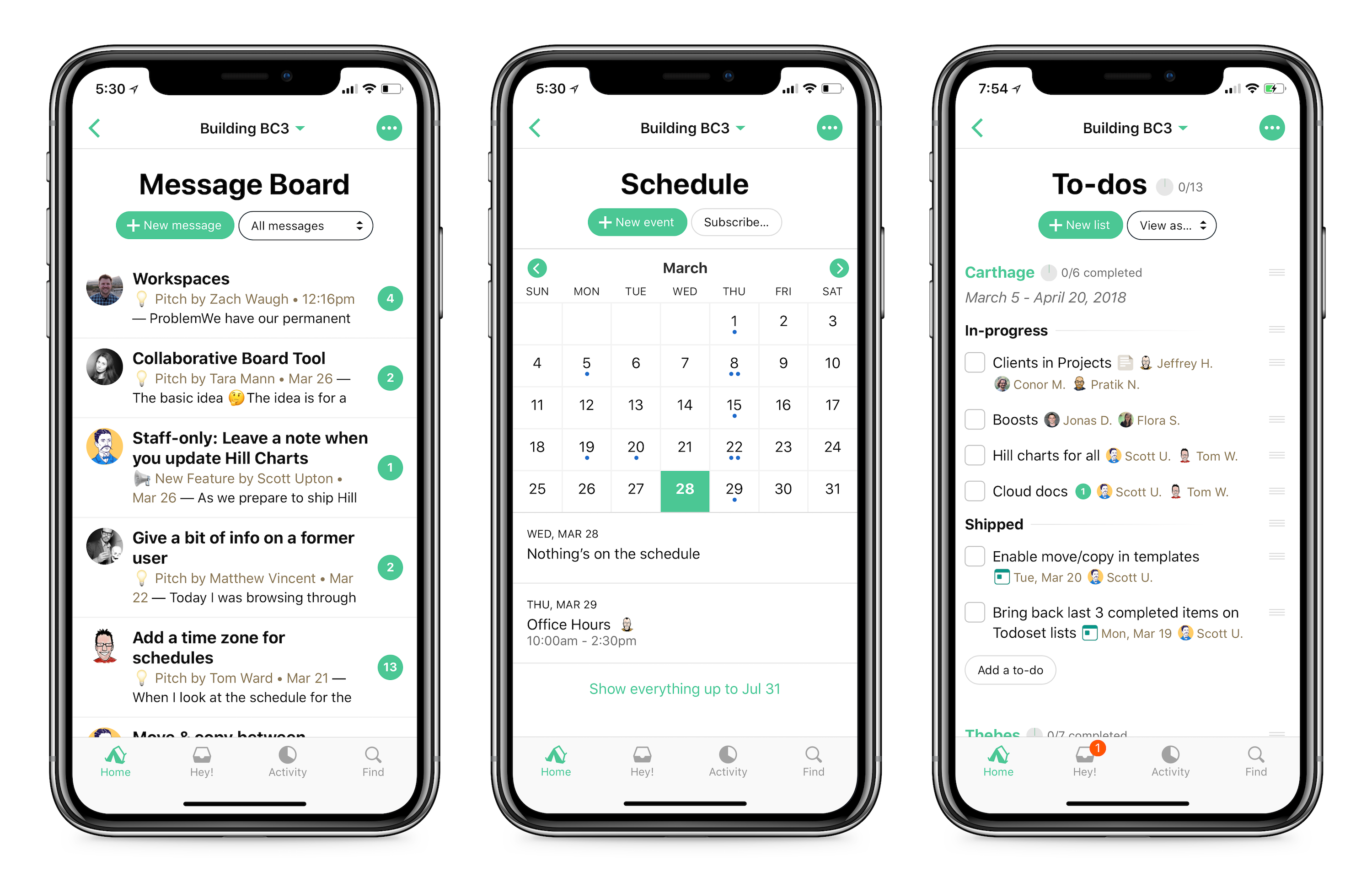
Basecamp 3’s Message Board is a central place for your team to post updates and gather feedback on the record. It’s great for announcements, internal pitches, and just bouncing ideas back and forth.
Since Basecamp 3 first launched, the Message Board has been sorted so new posts appear at the top with older ones below. That’s great most of the time, but many of you have asked for other ways to sort your posts.
New ways to sort
With this update, we’ve added a new sort order setting to Basecamp 3’s Message Boards. You can access this setting on your computer, tablet, or phone from the menu in the upper right corner of the Message Board:
Now, you can sort your posts three ways:
By original post date: Messages posted recently will always be shown first. This is still the default setting.
By latest comment: Messages with new comments be shown first. This keeps the most active discussions right up at the top.
Alphabetically A-Z: Messages will be sorted based on their title. If you use the Message Board like a table of contents for your team or company, this option will come in handy.
Applies to everyone on the project
Whatever you choose, this will affect everyone on the project. That way, everyone will know where to put things and where to find things—you’ll all see posts in the same order.
Different projects, different settings
Each project has its own setting. If you prefer organizing your Company HQ alphabetically, your client projects by latest comment, and your marketing team by original post date that’ll work great!
What’s more, Message Board posts on your project’s home screen will remember your sort order, too:
The Message Board card, sorted alphabetically
That’s it!
We hope this update gives you more flexibility and makes the Basecamp Message Board even more useful. Let us know what you think!
Curious how we build features like this while working sane, 40-hour weeks? Be sure to check out our new book: It Doesn’t Have To Be Crazy At Work.
Earlier this year I wrote about How we stopped making excuses and started improving Basecamp’s accessibility. Accessibility improvements in Basecamp 3 have come in two ways: All new features we’ve shipped over the past year and a half have been designed and tested to meet WCAG AA guidelines (The Web Content Accessibility Guidelines, or WCAG, provides a shared standard that web developers can follow to make sure their products are accessible).
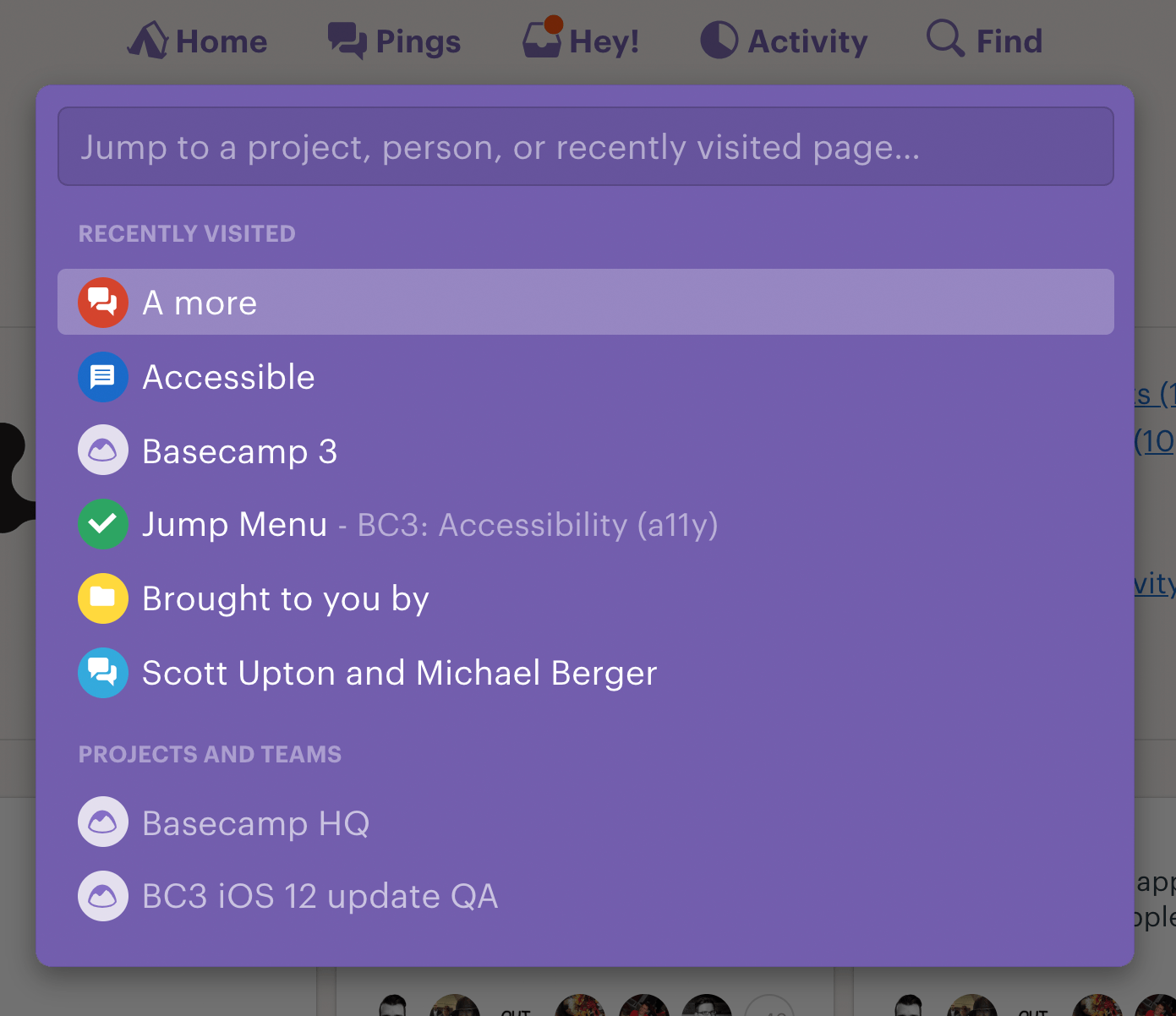
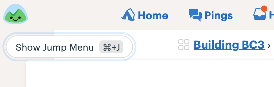
At the same time, we’ve gone back and retrofitted existing features and interactions for better accessibility. Today I’m excited to announce that we just completed some significant improvements to the Basecamp 3 Jump Menu!
The jump menu has always been the quickest way for getting to a person, project, recently visited page, and My assignments/bookmarks/schedule /drafts/latest activity. Here’s a look at it in action:
Note the small-ish “Press ⌘+J to show the menu” label
In setting out to make the jump menu more accessible we identified a few specific areas in need of help.
1. Provide an alternate way to trigger the menu
The ⌘/Ctrl + J shortcut for opening the jump menu isn’t communicated in a non-visual way, and initiating multi-key commands can be difficult for people who have motor function challenges.
To improve this, we added a button-based trigger, implemented as an invisible button that appears when someone first presses their tab key after loading up Basecamp. This technique is very similar to the common “Skip Navigation” link technique used around the web (we added one to Basecamp at the end of last year).
The Show Jump Menu button. We used the opportunity to reinforce the keyboard shortcut for those who prefer using it to open the menu.
2. Clear non-visual instructions for how to interact with it
As a visual user it’s fairly obvious how the jump menu works: We show the placeholder “Jump to project, person, or recently visited page…” with a blinking cursor, and a list of entries below it that filters down as you type.
To clarify this interaction for customers using a screen reader, we created a visually hidden <span> element with more verbose instructions, “Type to filter and use the up and down arrow keys to navigate this list of people, projects, and recently visited pages.”
3. Announcing the selected item and number of results as you filter
If you’re using a screen reader to filter through a list, how do you to know how many items are listed as your search term increases? And which item is selected as you arrow up/down or tab to navigate through the list of results?
This required the use of some specific HTML markup and JavaScript to convey this information to the Accessible Technology (such as screen reader software) that I’ll go into below.
Implementation
The first step in making a complex element like this one accessible is doing some research. We look for examples of similar elements from around the web for inspiration and guidance on the proper markup to use. The W3C WAI-ARIA examples site (get ready for a long one! “World Wide Web Consortium’s Web Accessibility Initiative (for) Accessible Rich Internet Applications”) is a great place to start. The second example on their Combobox with Listbox Popup Examples page, “List Autocomplete with Automatic Selection,” seemed most similar to the behavior of our Basecamp jump menu.
Authoritative as this site may seem, it’s worth testing the examples on real screen readers. There’s an abundance of quirks across screen reader + web browser combos that means these examples often don’t work quite as expected. When that happens, additional code is often required to get screen reader announcements to fire in the way you’d like. Expect lots of trial and error 😊
The implementation we settled on uses the aria-activedescendant property. This technique provides a way to keep DOM focus on the <input> while updating your selection as you move through the list of results. This is the key that allows the screen reader software to understand what’s happening on the screen. Here’s a look at the final product in action, followed by all of the dynamic and static attributes we used to get this working. For further reading about these attributes check out the W3C article linked above where many of the following definitions are borrowed from.
Demo
Code
On the combobox container <div>, our <bc-content-filter>element:
role="combobox": This identifies the element as a combobox.
aria-haspopup="listbox": This indicates that the combobox is associated with a pop up list of suggested values.
aria-owns="jump-menu__results": This associates the combobox with the results container.
aria-expanded="true": This indicates that the associated results listbox popup element is displayed. Since in our case the list of results is always shown when the jump menu is shown, we don’t need to toggle this attribute. If it only appeared after some text was entered, we would need to toggle the attribute between this and aria-expanded="false".
2. On the text box <input>:
aria-autocomplete="list: Indicates that the autocomplete behavior of the string that’s entered is to suggest a list of possible values in a popup.
aria-labelledby="a-jump-menu__description": A sort of backup label for instructions on how to use the jump menu.
aria-controls="jump-menu__results": Points to the popup element that lists the suggested values.
Dynamic attribute: As up/down arrow keys or tab are used to navigate the list of results JavaScript is used to update the value of aria-activedescendant="IDREF" with the ID of the focused item.
3. A non-visible status <span> to communicate the number of results (e.g. “Home, 1 of 14”). Making it an aria live region with role=”status” and aria-live=”assertive” ensures that the screen reader will immediately speak any new text content that gets pushed into it. Just make sure the <span> is present in the DOM before pushing text into it, or it won’t work!
id=”a-jump-menu__status”
role=”status”: A type of aria live region used for conveying advisory information.
aria-live=”assertive”: This makes sure that when the selection changes, announcing it takes priority over anything else the screen reader might be saying.
Dynamic attribute: When the jump menu is first rendered we inject the name of the auto-selected first item in the list followed by the directions for using the widget (“Type to filter and use the up and down arrow keys to navigate this list of people, projects, and recently visited pages”). As you arrow/tab through the list of entries, we use a helper to update the contents of the span to again communicate the current selection, followed by your current location in the list, for example “Management team project – Match 2 of 3”.
4. Another hiddendescription <span>, referenced by aria-labelledby, provides a better description for how to use the jump menu than the visual placeholder:
id=”a-jump-menu__description”
Text content: “Type to filter and use the up and down arrow keys to navigate this list of people, projects, and recently visited pages”
5. On the listbox results container <div>:
id=”jump-menu__results”: Used as a reference by the combobox element.
role=”listbox”: Defines it as a container for the list of results.
6. On each <article> element in the list of results:
A unique id for each result in the list.
role=”option”: This defines the element as a listbox option.
Dynamic attribute: Using JavaScript we set aria-selected=”true” as you move through results. This correlates with when the item is referenced by aria-activedescendant on the <input>.
We also use some additional JavaScript to generate and set the “Match X of Y” status text:
I hope this walkthrough was helpful! I would have loved to see more examples like this one as we were building the feature out. If you have any questions, please let us know!
Summer is winding down, kids are back in school and the Basecamp team has a fresh batch of updates to share. Here’s a quick look at some recent improvements that are available right now in all of your projects.
Getting over the hill
Hill Charts are a completely new way to track progress and a Basecamp 3 exclusive. People everywhere are loving this unique way to see where their projects really stand and answer the hard questions that get them un-stuck. Now it’s much faster to choose which lists to track on the Hill Chart. Take a look…
Set up Hill Charts.
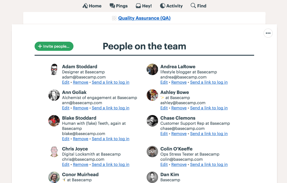
Profile cards
Clicking someone’s avatar in Basecamp is often the best way to get a little more information about people you’re collaborating with—especially when you work with clients, people you’ve never met, or on a team spread across time zones. Now profiles show you which company someone is a part of, their role in Basecamp (Administrator, Owner, or Client), and what time it is where they live. These details can help you track down an admin, figure out who the new person on the project is, or avoid bugging someone in the middle of the night.
Profile now cards display additional details.
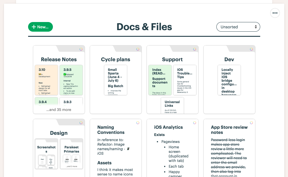
Coloring folders
Now you can color folders just like you could other items in Docs & Files. Add a little personality, make something important stand out, or come up with your own color-coding system.
Coloring and organizing folders.
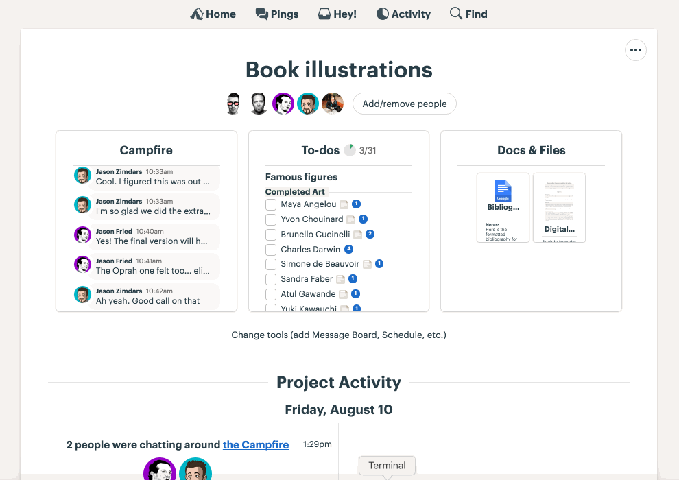
Project tools
Basecamp features seven distinct tools to handle every situtation in your projects from communicating to organizing to tracking work. With the latest update it’s easier than ever to choose which combination of tools to use on each project.
Managing project tools.
Improved invites
One of the best things about Basecamp is it keeps everyone on the same page so that nothing falls through the cracks. That only works, however, if the right people are involved in the project. So we’ve removed some steps, cut some complexity and streamlined the process so that getting people into your projects is easier than ever.
Inviting people is clearer and more direct.
Managing My Drafts
You write a lot in Basecamp, we get it. Drafts let you work on that post, announcement, article, or note in private until you’re ready to share it. But not everything gets published and before this update it could be a lot of work to figure out what was what or simply get rid of the ones you no longer needed. With this update, you can see all of your draft Messages and Documents, when they were last edited, and in which project they live. Not only that, but you can trash them right from the list without having to click into each one first. More info, faster edits, less pain = win!
Managing My Drafts
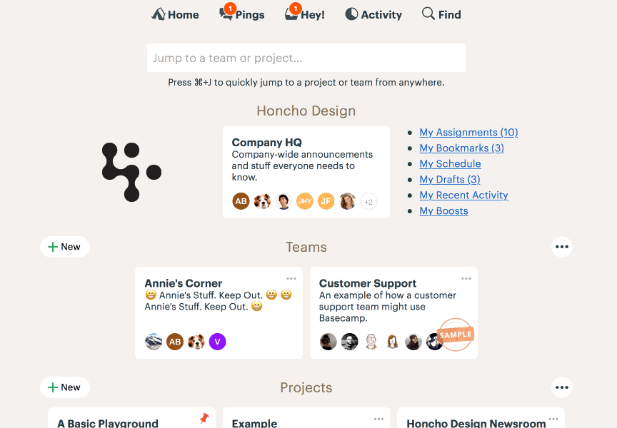
Jump to projects
For Basecamp pros, the Jump Menu is a speedy way to get around in Basecamp. Just hit ⌘+ J to return to something you saw recently or type a few characters to quickly filter Projects, Teams, and People. With our latest update we made it easier to jump to another project by making them pop up to the top of the list. This makes the Jump Menu hands-down the fastest way to get to a project in Basecamp.
Filtering in the Jump menu now makes jumping to another project even faster.
Thank you ❤️
We’re so grateful for all our customers and we hope these improvements make your time working more calm, effective, and enjoyable. If you’re not yet a Basecamp customer and feeling overwhelmed because your business is growing, you’re buried in email, stuff is slipping through the cracks, and communication is a struggle maybe it’s time to give us a try. You can try Basecamp completely free and unlimited for 30 days. No credit card needed to sign-up!
Now you can add [daily, weekly, monthly, yearly] repeating events to the Basecamp schedule. Here’s how it works:
When you add an event in Basecamp 3…
…you’ll see a new option to repeat the event…
…the options include every day, every week day, once a week, once a month, and once a year…
…you can choose to repeat the event forever, or until a certain date…
…the repeat frequency is shown on the event page as well…
This feature has been a long time coming. Thanks to everyone who sent in a request, to Merissa on the support team for championing the push to make this happen, and to Jeff, Conor, Pratik, and everyone else who pitched in to help make it all work. The new feature is live for all Basecamp 3 customers on all platforms (Web, Mac Desktop, Windows Desktop, iOS iPhone + iPad, and Android). We hope you find it useful.
The newest release introduces a brand new tab along with improvements to searching, navigation, and for people who have multiple accounts. Get it for iPhone and iPad in the App Store today. Read-on for details about what’s new…
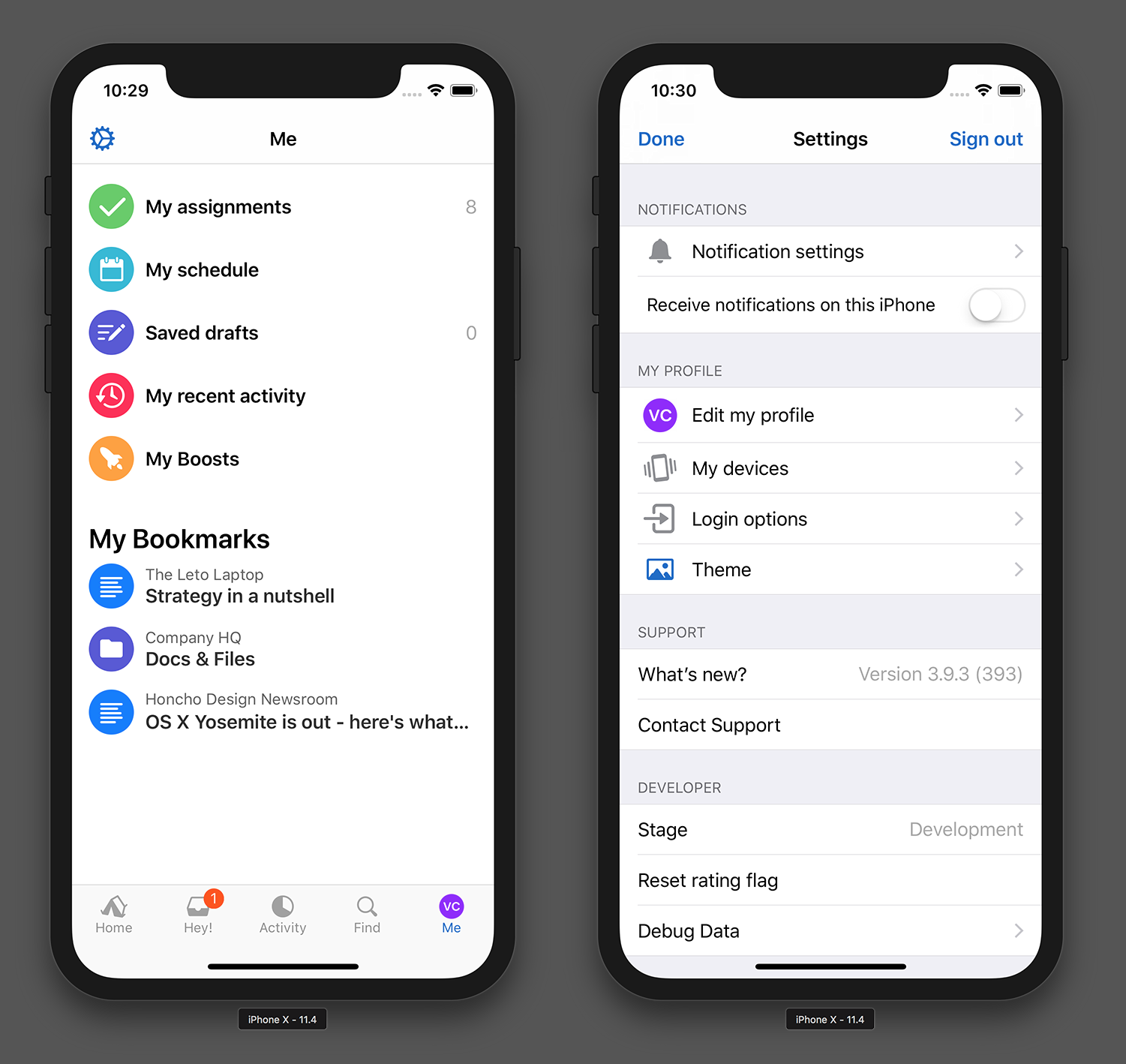
New Me tab!
We know that My Assignments is one of the most popular screens in Basecamp on all platforms but it can be hard to find. Now My Assignments and the rest of My Stuff are easier to reach on the new Me tab. It also includes your Bookmarks and app Settings.
Introducing the brand new Me tab, a place to find all your stuff and settings.
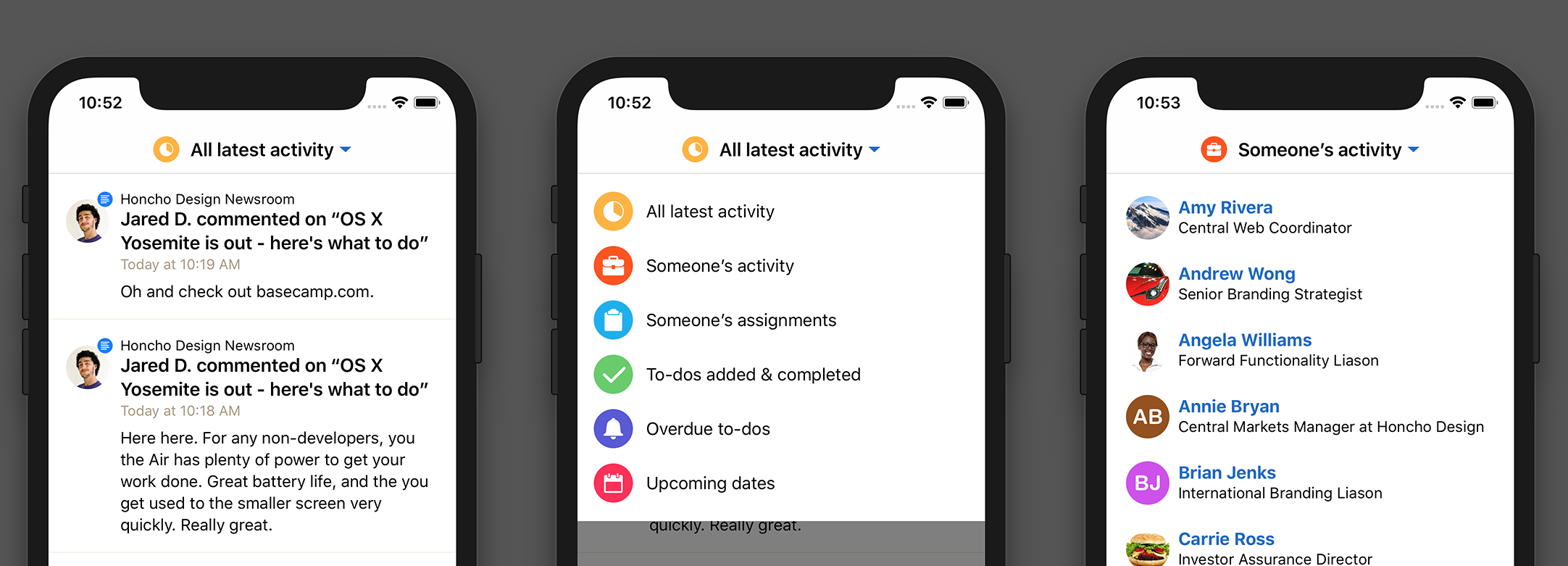
New Activity view switcher
Gone is the old Activity | Reports toggle. Basecamp now has a nice switcher to change between activity views more akin to web and mobile web. It’s easier to see what you’re currently looking at and you now stay on the same screen rather than navigating forward.
Tap the switcher at the top to choose a different activity view.
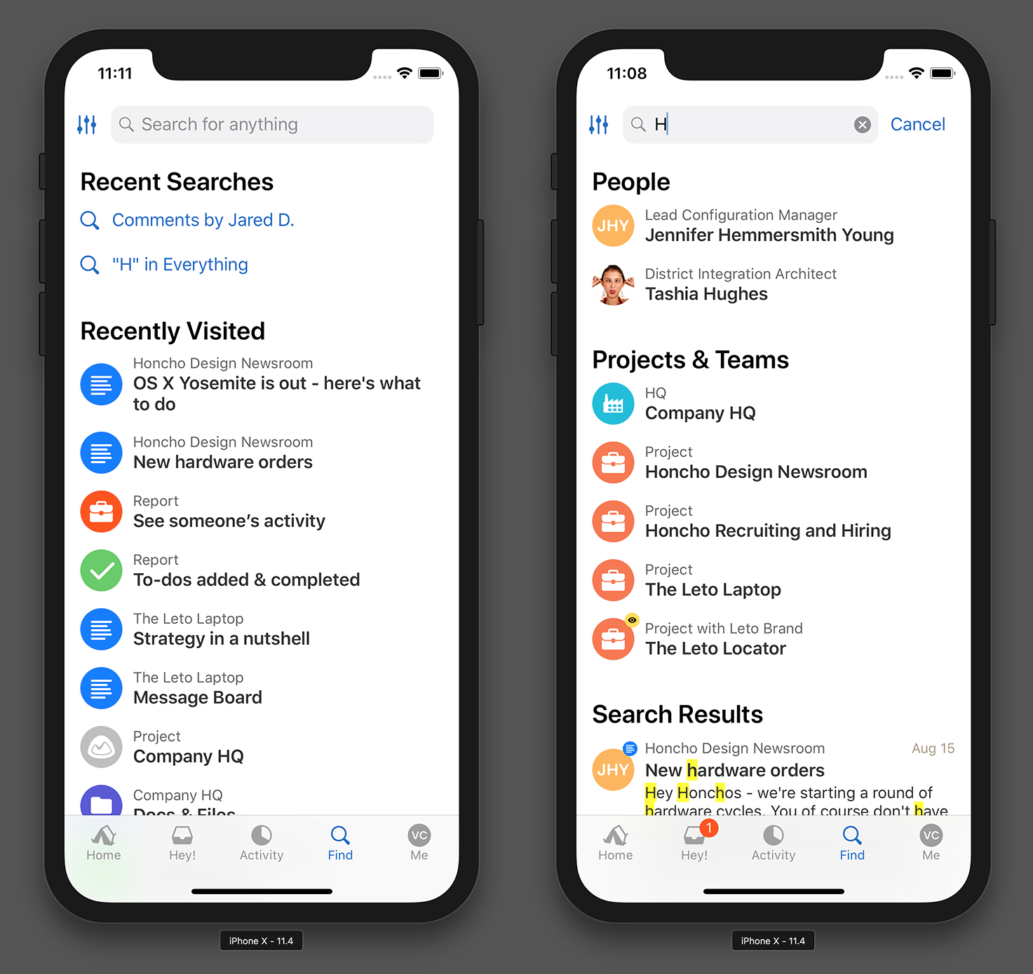
Before you search…
Looking for something in Basecamp? Pop on over to Find to see your Recently Visited places and Recent Searches, too. We hope that with this change, Basecamp helps surface what you might be looking for before you search.
Pick something recent (left) or search everywhere (right).
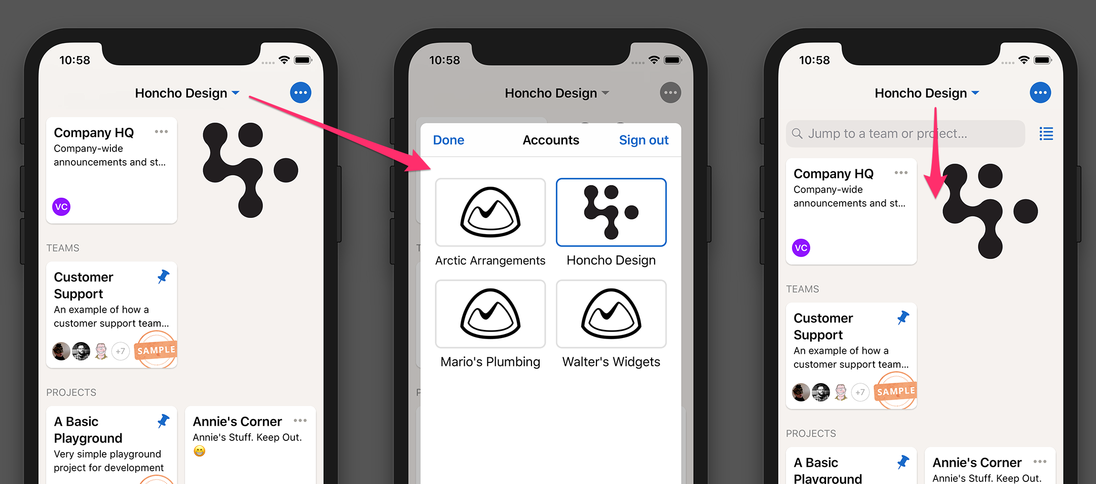
Better support for multiple accounts
If you have multiple Basecamp accounts, this one is for you. Now the name of the current account is prominently displayed at the top of Home and Hey. Tap it to switch to a different account.
Tap the account name to switch to another account (left). Pull-down slightly to reveal the project filter and view toggle.
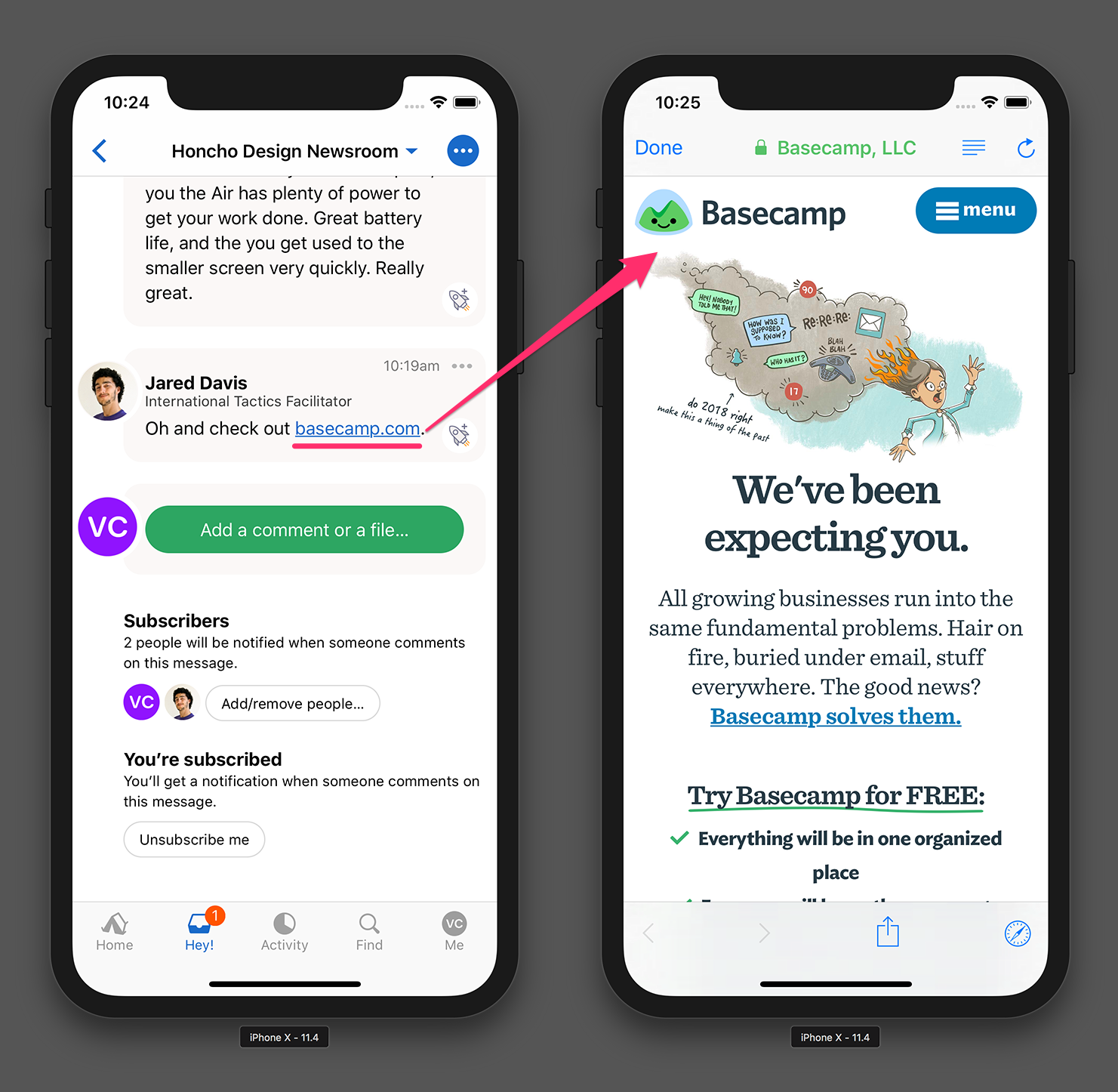
Opening links
This is a small change but now when you tap an external link in Basecamp it’ll open with a Safari view right inside Basecamp rather than opening the Safari app. You may have seen this in Twitter and other popular apps already. Now it’s so much easier to get back to where you were in Basecamp when you’re done reading.
External links now open inside Basecamp with a SafariViewController.
Thanks for using Basecamp!
As always, please keep suggestions, feedback, and bug reports coming our way. If you’re interesting in seeing new features before everyone else, we have a few openings left in our private beta. Send us an email and we’ll get you invited.
Using SMS as a second security factor for signing into web applications is no longer recommended by security experts. Therefore we will be ending our homegrown SMS verification program on July 2nd, 2018, and switching to Google’s state-of-the-art Two-Factor Authentication (2FA) system.
Moving forward, if you want to secure your Basecamp account with 2FA, you’ll need to log into Basecamp using a Google Sign-In. You can use Google Sign-In with 2FA through their own authentication app, 1Password (we love those guys!), or the gold standard of a physical Yubikey.
How to switch to Google Sign-in with 2FA for Basecamp:
It’s never been more important to take serious precautions to guard your security online. Hacks are common, and failing to protect your online accounts with a second factor makes it so much easier to become a victim. We highly recommend switching to a Google Sign-In so you can take advantage of the protections 2FA provides.
Besides Basecamp, please take the time to get acquainted with two-factor authentication in general, and ensure that you have it turned on for as many services as you can. These days, almost everyone offers some way of adding a second factor. Read about doing it for iCloud, Dropbox, GitHub, Facebook, and Twitter.
Good security is like good backups. It’s a bit of a hassle to setup, but the regret you’ll feel if you don’t have it when you need it dwarfs that inconvenience. Don’t procrastinate.
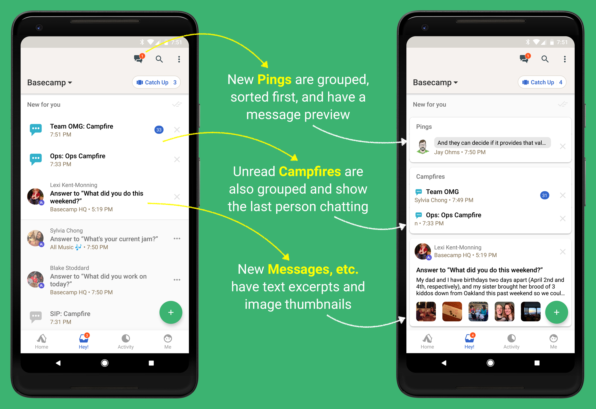
Ping and Message excerpts, image previews, and grouped Campfires make catching up with Basecamp a breeze.
There’s a new Hey! screen design in Basecamp 3 for Android. Hey! is already pretty good on Desktop and Web. Currently you get a chronological list of unread Campfires you’re following and discussions you’re part of.
On Mobile, however, you’re probably peeking in for a quick summary of What’s New. Hey! should help you prioritize what’s important at that moment. A better design can save time.
Here’s how the current Android Hey! and this new design compare:
The new design (right) makes Hey! easier to parse and prioritize.
✨ What We Improved
Show me my Pings. Excerpts from unread Ping conversations are now shown at the top of the Hey! screen. If you have more than one unread Ping conversation they’ll be grouped together. You’ll see all your new Pings in one place. Note: All Pings are still accessible everywhere in the app via the top navigation. Just tap the “conversation bubbles” icon next to Search.
Group unread Campfires together. New chats from Campfires you follow are now easily scanned since they’re grouped together. The Campfire notification will also display who spoke last (which matches Basecamp 3 on the Desktop and Web).
Give context to Messages, Comments, and more. It’s a mystery what’s behind that unread notification. It might be 1 sentence, or 1 emoji, or a long paragraph. Now there’s an excerpt of text and image thumbnails so you can see what was posted without having to tap through.
💅 The Result: Better Insight into What’s New
Messages and Comments are no longer a mystery. Excerpts and image previews hint whether you should dive deeper or move along. Unread Campfires aren’t scattered across other notifications. You can prioritize chats you want to read.
The new design gives Hey! notifications more context. It helps you stay looped into Basecamp without having to tap each notification. Stay updated at your own pace.
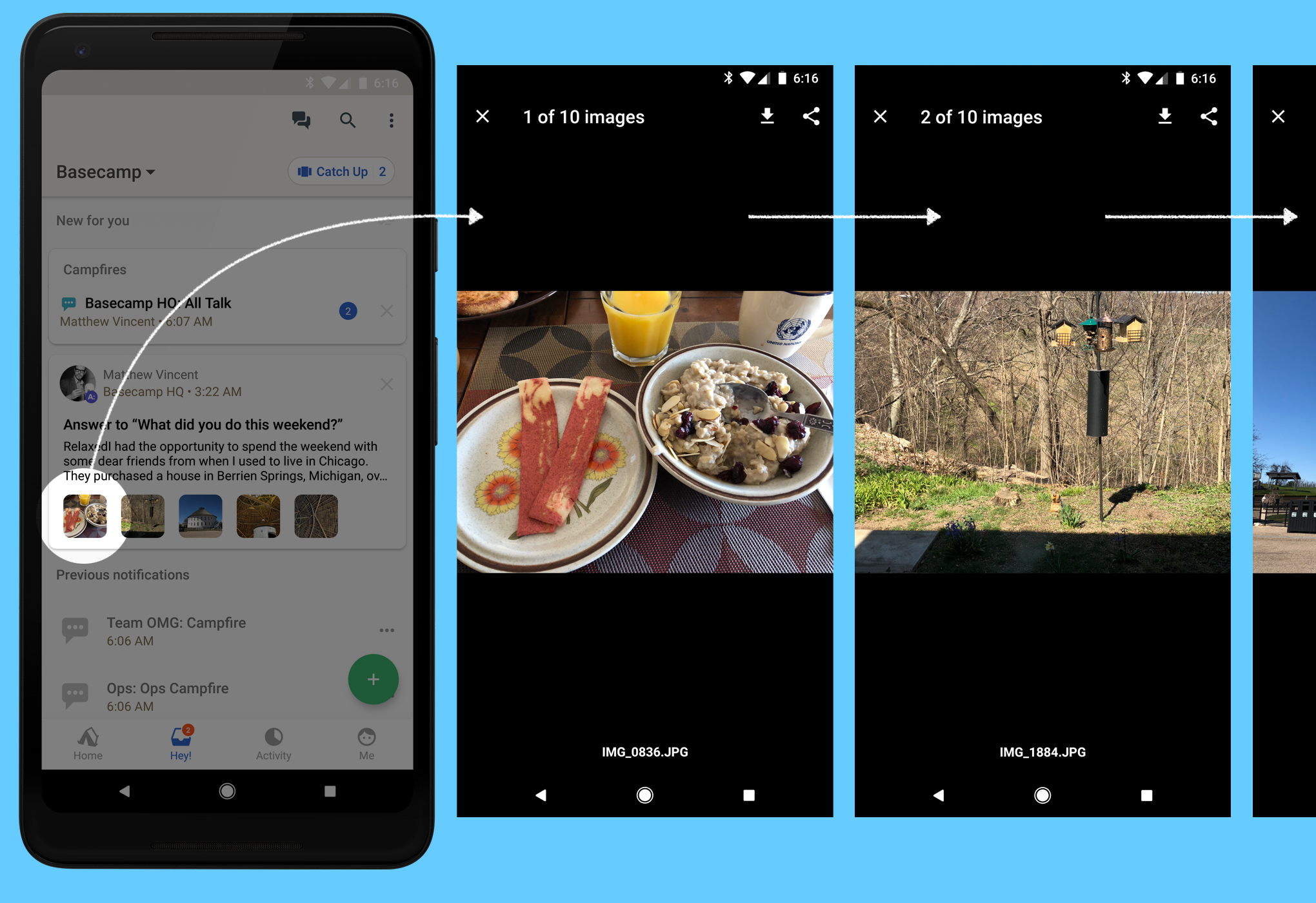
🖼 Bonus: Swipe Through Multiple Images
We also updated our image viewer to know if a Message or Comment has multiple images. Now you can swipe back and forth between images! If there’s a caption we show that too.
We hope you like these improvements to the Basecamp 3 Android app (Version 3.9.1, updated May 1, 2018). We have a lot more planned and thanks for being a Basecamp customer—especially if you have an Android device!
Thanks for reading. If you have any questions about Basecamp 3 for Android please let us know.
— Brought to you by the Android Team at Basecamp: Jamie, Dan, and Jay
This release is all about usability improvements. Download it for iPhone and iPad from the App Store now.
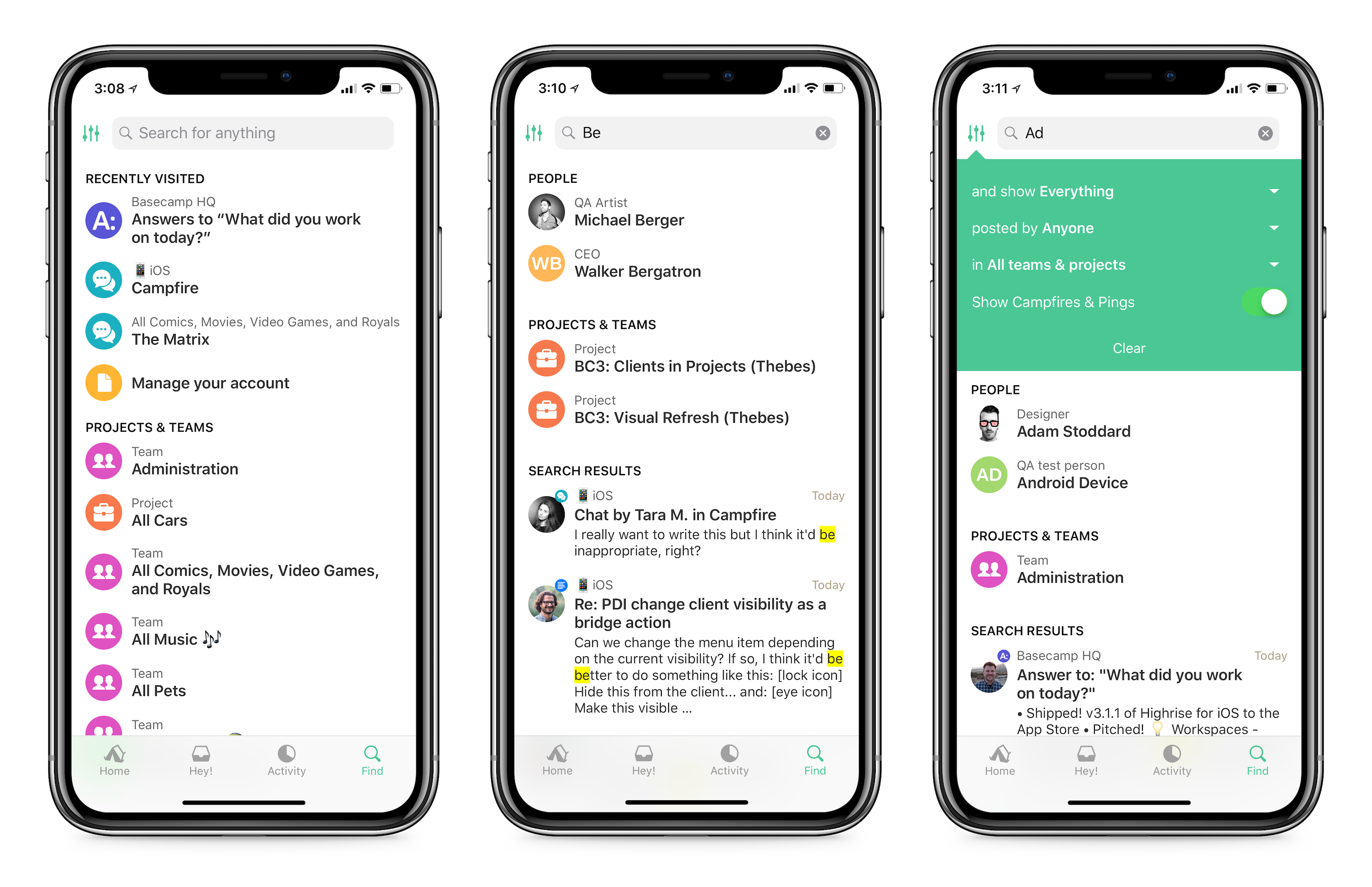
Find tab improvements 🔍
The Find tab now lets you quickly jump to anything you recently viewed without having to type a word! When you open Find, you’ll see your most recently visited pages, making it super easy to quickly get back to something you were viewing. Or start typing to instantly search in place for anything in your Basecamp account. You can also use advanced filters to define even more specific search terms. Go forth and find!
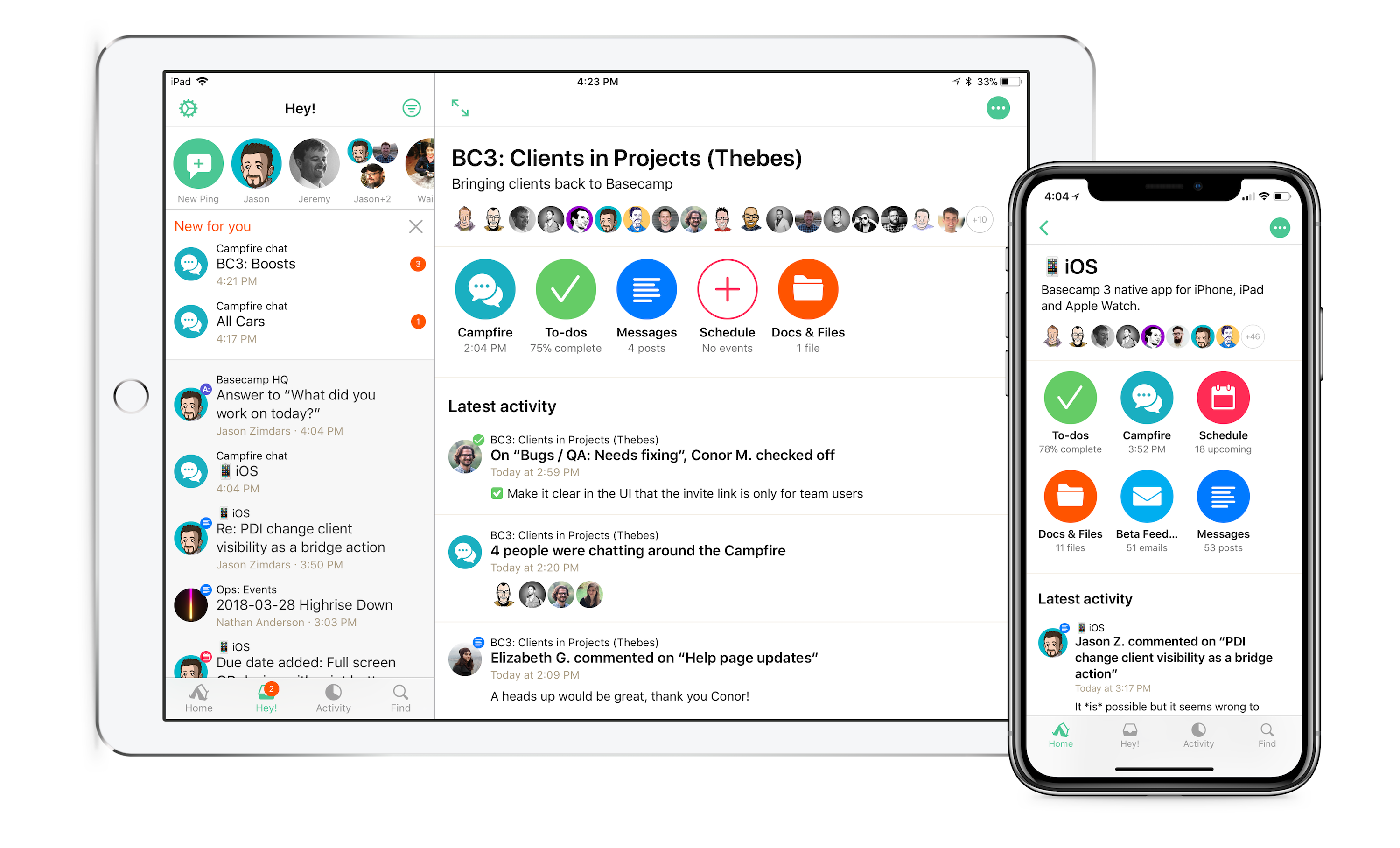
New project and team pages ⚡️
The old project and team pages were… slow. We decided to speed them up, as well as feature your team’s latest activity more prominently with this new design. Instead of nearly identical cards for each tool, you’ll see a unique icon in a bright color, making them easier to recognize. Each icon also has a bit of data underneath, hinting at what’s in each tool so far. We’ve been testing these internally for quite a while and the increased speed has been such a relief. We hope you love it too.
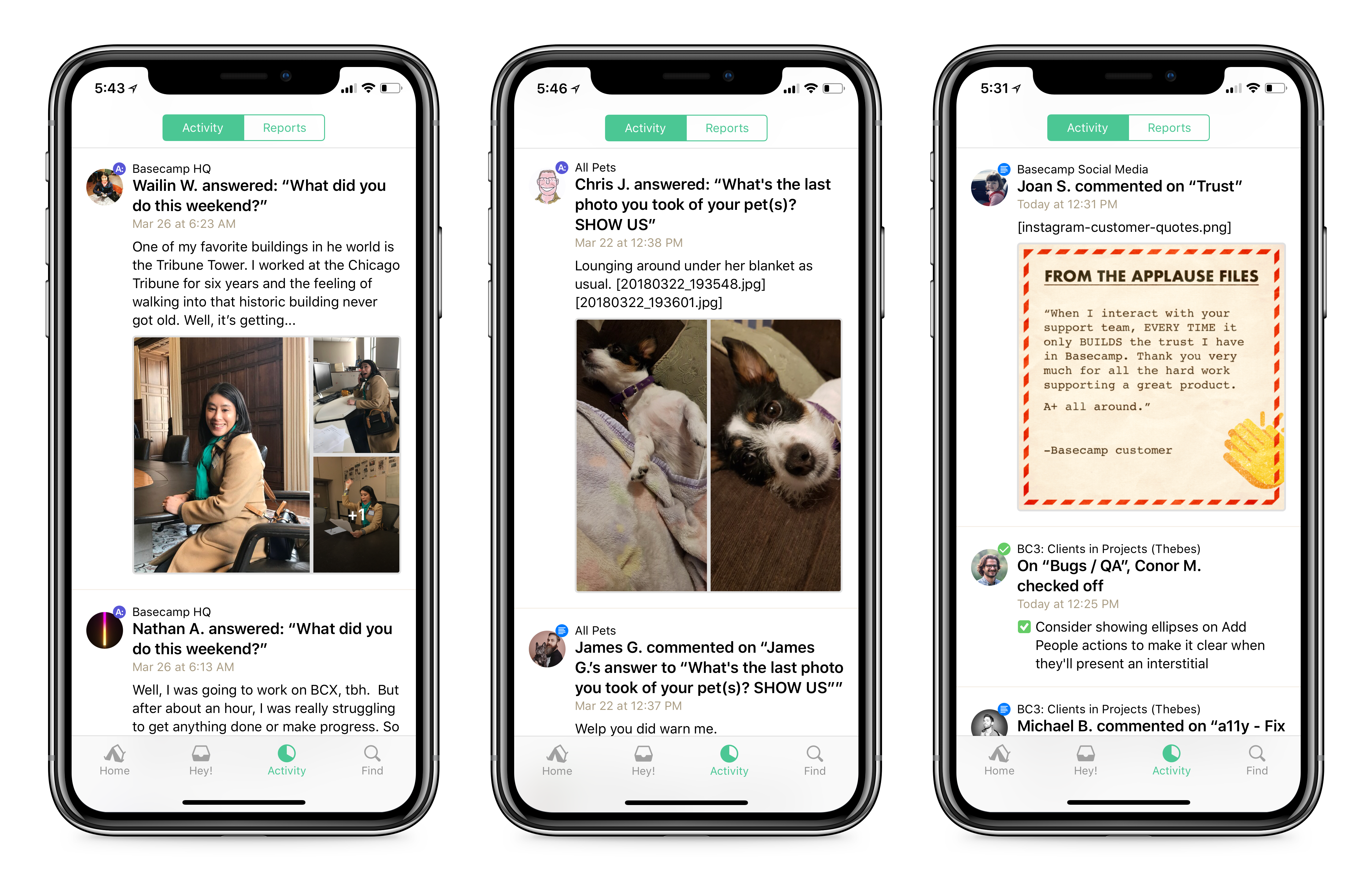
Improved image viewing in Activity 📷
Image previews in the activity feed are now much larger and easier to interact with. If there are multiple images in an attachment, we’ll group them together in a nice grid, too! You can tap on any photo to view it in the media viewer right from the activity feed, or tap into the thread if you want more details and context.
Simplified navigation and tool indexes 🗺
The nav bar now just displays the project or team name, as well as a button to launch the menu to jump to another tool. The screen’s title is displayed larger, and there’s a big “add something” button on every screen so you can’t miss it! We experimented with a lot of complicated designs for this and ended up going with the simplest option. Sometimes you need to overthink to realize you’re overthinking, I think. Now I’m overthinking this.
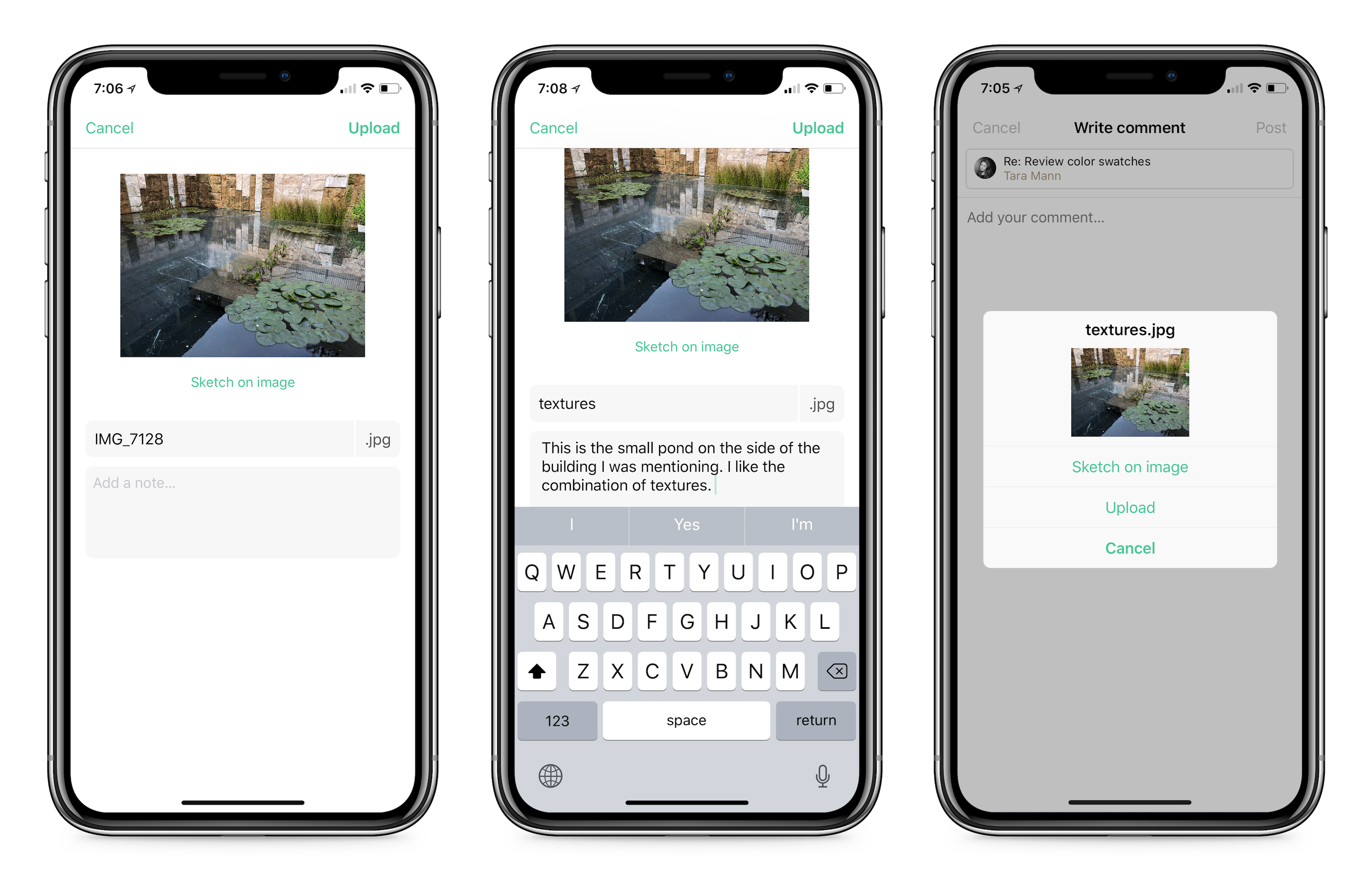
New UI for uploading attachments 📎
You’ll now have more room to access additional options when uploading individual attachments to Docs & Files, like sketching, adding notes to your upload, or changing the file name. Cool!
Support for clients in projects 💼
All new clients in projects features will work on iOS right out of the gate! Read more about this entirely new way to work with clients in Basecamp over here.
And you know, “bug fixes and performance improvements….” 🐛
Scrolling within a field while you’re writing is much smoother now. “Less janky,” you might say.
Updated theme choices, so you can pick from a lighter or darker version of each theme color.
Fixed some drag and drop issues!
Fixed missing file-type icons for non-media attachments in Activity.
And various other bug fixes that are boring to explain.
Thanks for reading and feel free to reach out with any comments, suggestions, concerns, feedback, bugs, doughnut recommendations, etc.
When we launched Basecamp 3, we introduced a new way for client services firms to work with their clients. We called it the Clientside. It was an entirely separate part of a Basecamp project where all client-facing communications lived. Essentially, it was a mini project within a project — a distinct space with separate tools and a different interface.
Conceptually it made sense, but practically it was inflexible and not collaborative enough. It worked well for some people, but it missed the mark for far more. We fell short of what we hoped we’d be able to create.
So we put our heads together and spent a couple months working on a complete revamp. Today we’re introducing something better.
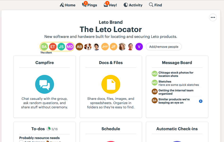
Introducing Clients in Basecamp!
Starting today, not only can you send messages to clients, but now you can work with clients using all the same tools you already use with your team. That means you can assign clients to-dos, share files and folders, schedule events and meetings, chat around the Campfire, and even ask clients automatic check-in questions! If you can do it with your team, you can do it with your clients. And now it all happens in the same place as the rest of the project — no more separate Clientside. It’s everything you’ve been asking for.
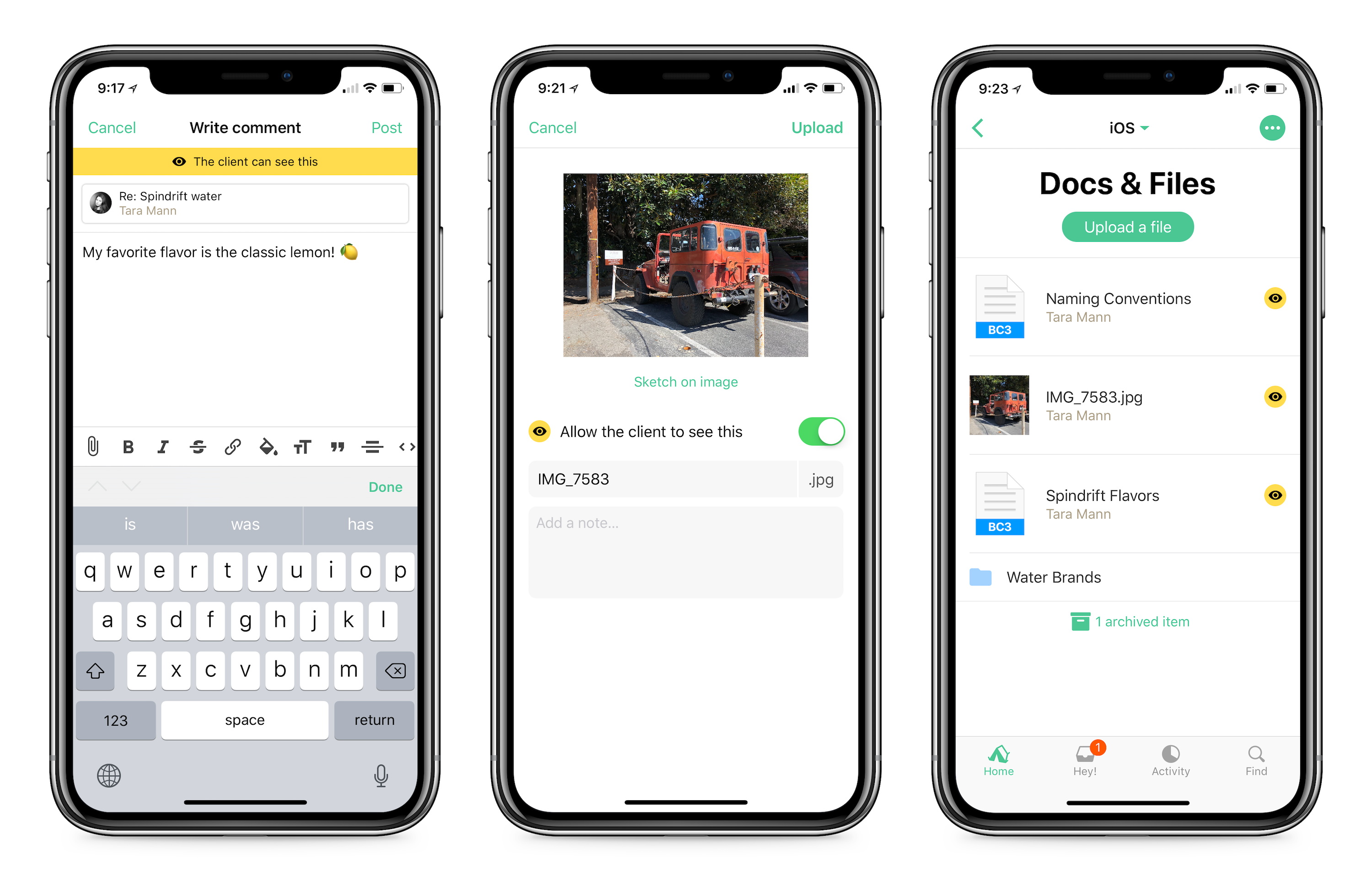
You’re in 100% control of what clients see. Clarity and privacy is at the core of this new feature. That’s why everything in a project is now labeled as “private to our team” or “the client can see this”. Plus, to reduce anxiety and prevent “oh shit, they weren’t supposed to see that” moments, everything in a project starts off as private just to your team. When you’re ready to share something — a message, a to-do, a file — just flip the switch:
Whenever you post something new, you’ll have the option to specify if the client should be able to see it or if it’s private just to your team:
Blue+lock means private to your team, yellow+eye means visible to the client.
For example, here’s a to-do on a to-do list the client can see. It’s also assigned to Victor, your client:
And here’s a message thread about a revised headshot. The client can see it, and they’ve responded below:
And here’s an email you’ve forwarded in that you don’t want the client to see. It’s been marked private for your team only:
And finally, here’s a combination of files and folders. The client can see some folders, but not others. For clarity, only the ones they can see are labeled with the “The client sees this” tag:
They can’t see the “logo redesign folder” in top left, but they can see everything else.
Log-in or email-only — It Just Works!
We all know how hard it can be to ask a client to get used to using a new system. Even an easy system like Basecamp 3. So, Basecamp works even if your clients don’t want to learn anything new. Clients can respond to Basecamp messages right from their inbox, and new email they send you can be forwarded to Basecamp where your whole team can see them. Regardless if whether a client logs in and posts something directly to Basecamp, or they respond to a message via email, you’ll always have everything in one organized place inside the Basecamp project.
Fantastic! How do we turn it on?
Go into a project, click the “Add/remove people” button. This is the same way you’d invite anyone to a project:
2. Then click the green “Add people” button and select “Invite a client to the project” from the bottom of the menu.
Now you’re off and running. Any existing content will be private, and anything new you add to the project will give you the option to mark something as private or visible to the client.
Back to the future?
If you’ve used Basecamp Classic or Basecamp 2, this new setup may ring a bell. You’d be right — it’s based on a similar approach. What’s changed is both the interface and the default privacy setting. In Classic and 2, everything in a project was visible to a client until you marked it private. Problem with that was that you could easily make a mistake and reveal something you didn’t intend to. But then it was too late. That’s why in Basecamp 3 we’ve flipped it. Everything is private by default. You have to expressly give a client permission to see something. It’s much safer this way. Less anxiety ahead.
What if we liked the Clientside?
If you’re an existing customer that used the Clientside in the past, you can continue to use it on any project in your account. It’s no longer an option for new customers, or for existing customers who’ve never used the Clientside before, but if you have, and you still prefer it, it’s all yours. You can even use the Clientside on existing projects and the new way on new projects. Further, if you relied heavily on the Approvals feature, you’ll want to continue to use the Clientside as there’s currently no equivalent feature outside the Clientside.
This is a big change, a big deal. We think you’re really going to like it. You’ll have the power and flexibility to collaborate with clients in true Basecamp style without any of the limitations imposed by the previous Clientside approach. And most importantly, you’ll always have 100% control over what messages, to-do lists, folders, files, Campfire chat, and automatic check-ins your clients can see and participate in. This way you can keep the private work private, and the shared work visible — all in the same project so everything is organized together.
Questions? Comments? Post ’em below. Thanks again for using Basecamp 3!