Web developers: here’s an alternative way to build UI features that rely on scroll position without actually observing scroll events. Using the Intersection Observer API we can know when an element enters or leaves the viewport and respond in a way that’s much more performant.
It’s a very, very, bad idea to attach handlers to the window scroll event.
You probably don’t have to be reminded of this but there are few other options when you want an element to behave like the back-to-top button we recently added to Basecamp. Here’s how it looks:
The back-to-top button appears and disappears as-needed
The design dictated that the button wouldn’t always be visible but rather just when you most need it. That meant only on pages that require scrolling at all and only after you’ve scrolled a good amount — at least a couple of screens.
Enter Intersection Observer
The Intersection Observer API provides a way to asynchronously observe changes in the intersection of a target element with an ancestor element or with a top-level document’s viewport.
Perfect! Since we only want to know when the user has scrolled a couple of screens we just need an element in the DOM that’s the right height to observe. When that element leaves the viewport we’ll reveal the button.
Here’s how it works
The mark-up has two elements: the button and its container.
<div class=”back-to-top-container”>
  <button class=”back-to-top--button”>Back to top</button>
</div>
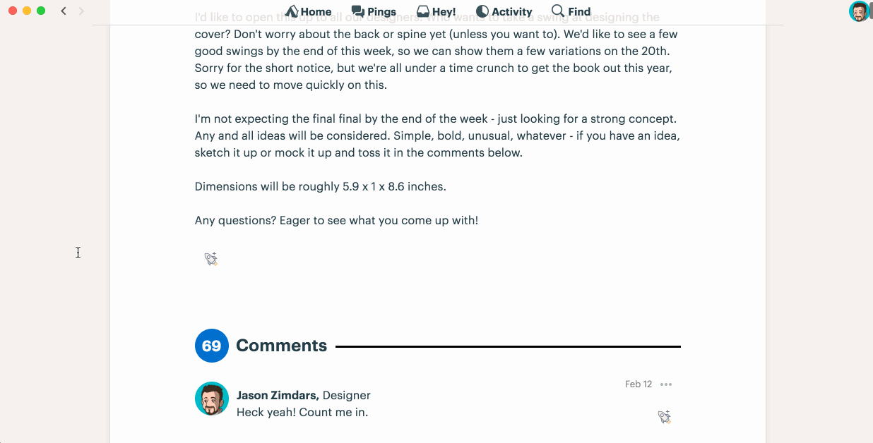
Every essay in Jason and David’s previous titles, REWORK and REMOTE is accompanied by an illustration that captures the key message of the essay. Contract llustrator Mike Rohde’s iconic original art perfectly compliments the irreverent and contrarian tone of the books. We love the format and it has worked well for us but when it came time to design the new book, Jason was eager to try something new. He reached out to the Basecamp team for fresh ideas.
Jason’s post in Basecamp from February 2018
At the time the working title of the book was The Calm Company, which was less provocative but perfectly captured the kind of company we want to have here at Basecamp—the kind of company prescribed in the book. Jason had already asked our team to pitch ideas for the jacket design and with two best-selling books behind us there was a sense that we could take even more of the production in-house. Having already contributed some spot illustrations to Basecamp’s marketing in recent years, I eagerly started work on concepts for It Doesn’t Have to Be Crazy at Work.
The concept
From the onset, I felt pretty strongly that the illustrations could be valuable content in themselves rather than simply complimenting the text. So I explored ideas that featured a running narrative that could tell a parallel story of a company that’s anything but calm. I considered graphic novel style spreads, comic strips and even something like Sergio Aragones’ “marginals” in Mad Magazine. I also explored ideas in the style of cartoons in the New Yorker that wouldn’t directly relate to the essays but would be satirical vignettes of situations where it’s crazy at work.
Here are the original sketches I shared with Jason and Basecamp marketing designer, Adam Stoddard, a few weeks later in a video call.
Original sketches pitched to the team in April
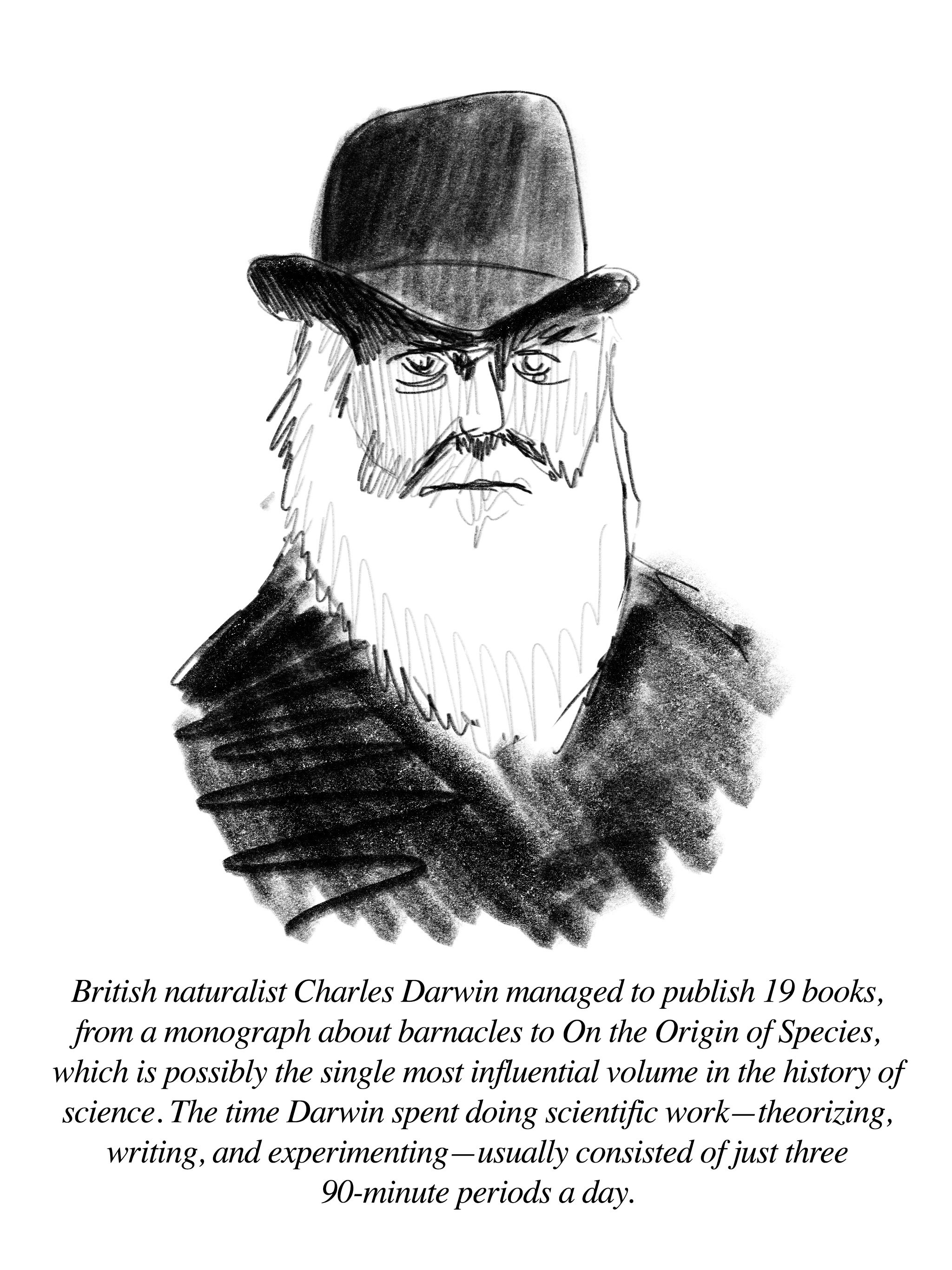
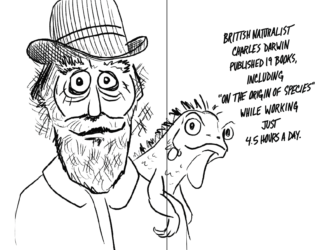
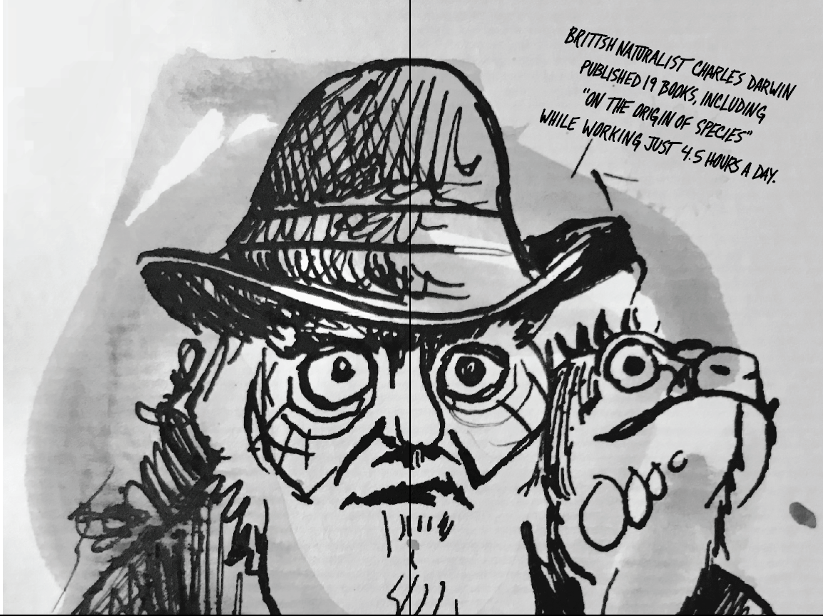
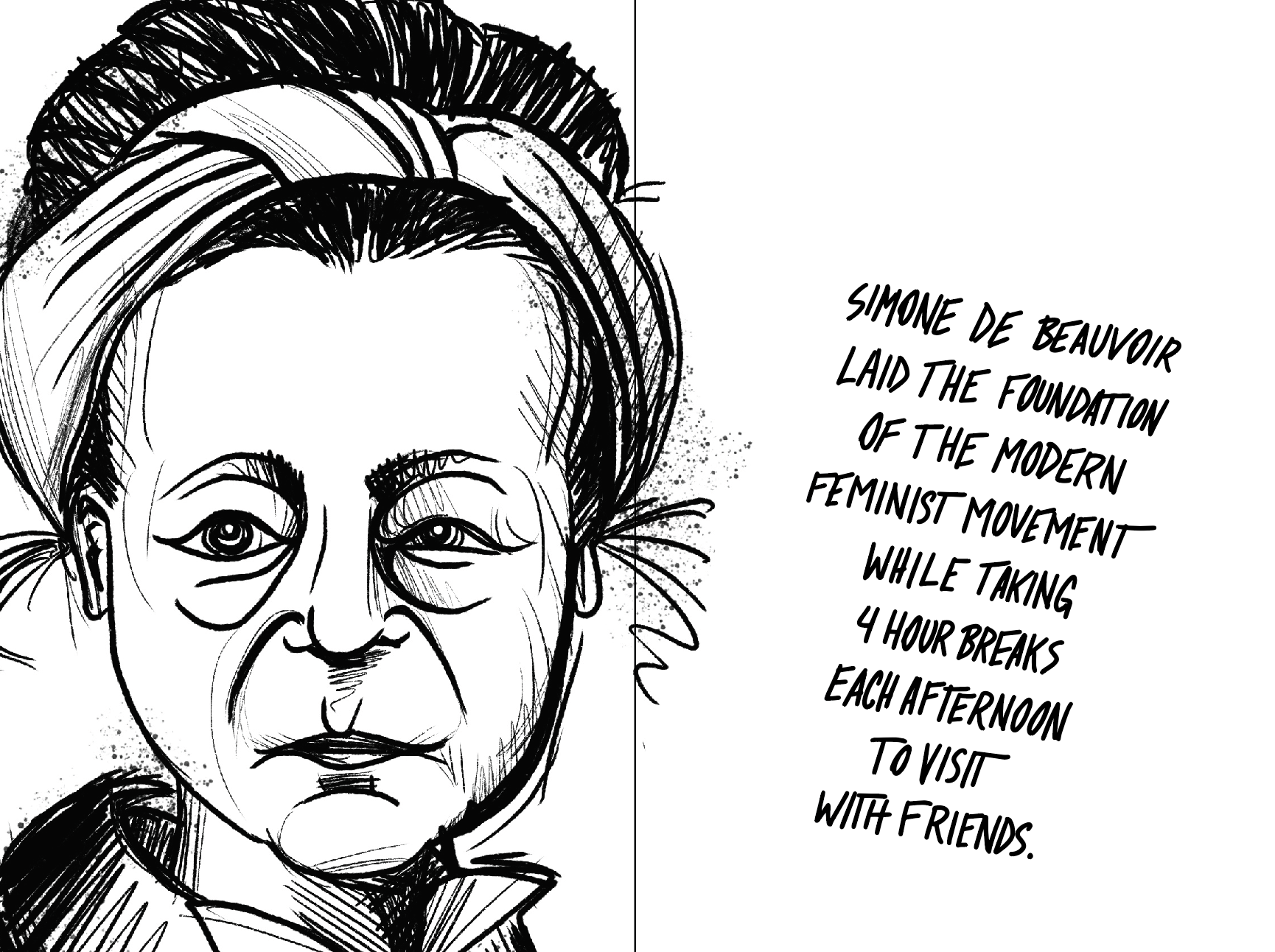
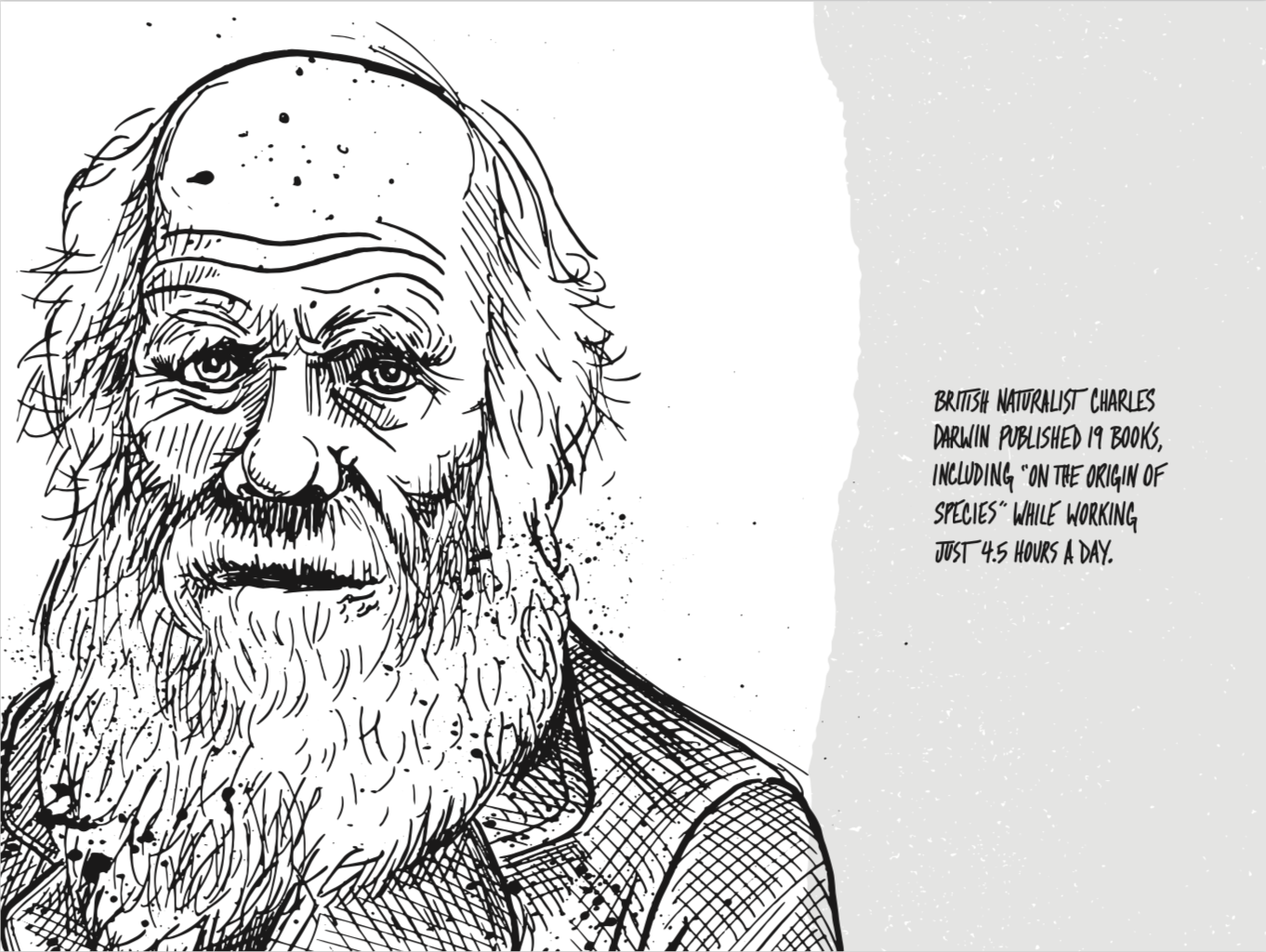
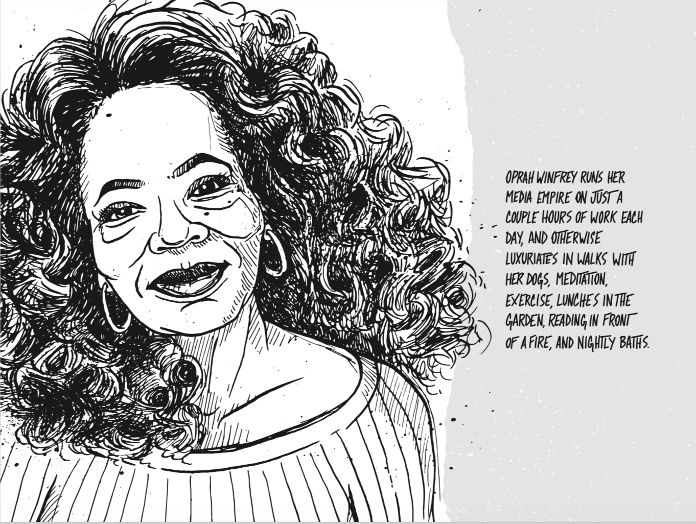
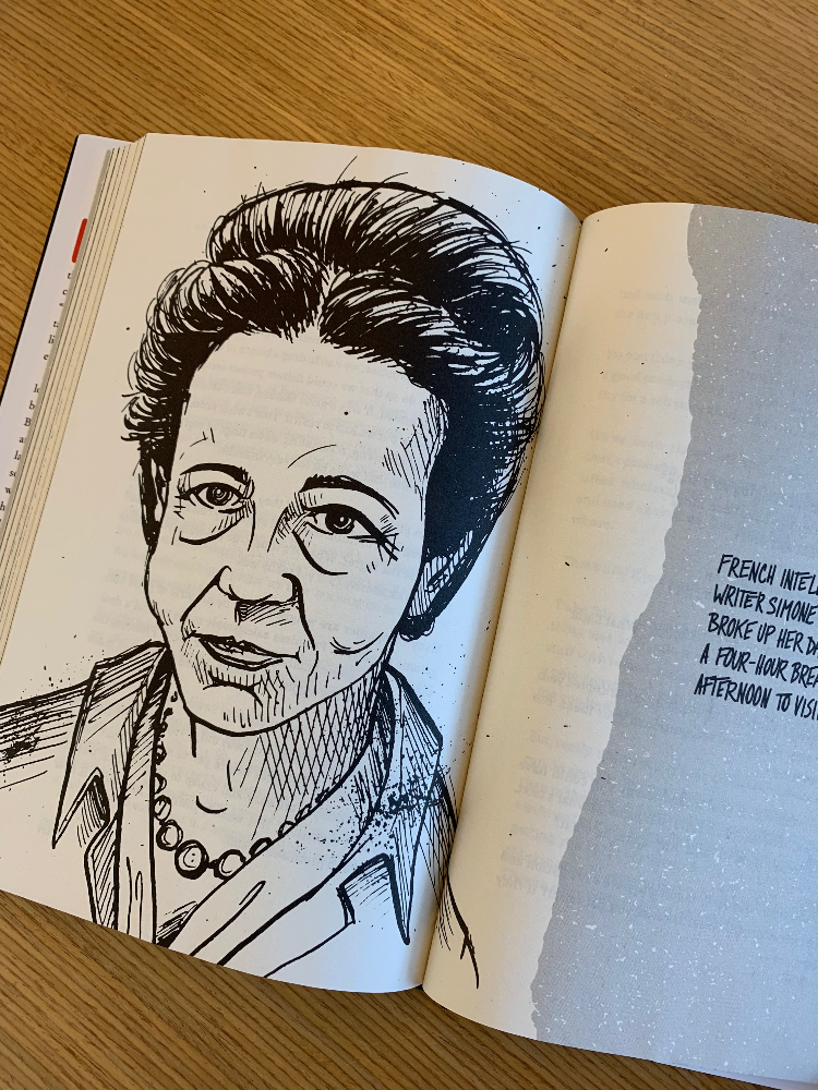
I pitched each of these ideas but it was the sketch featuring a blurb about Charles Darwin that we found ourselves most excited about. I had remembered reading an article about Darwin’s daily routine several months before and that had sparked the idea to feature famous people—both current and historical—who had done great things without embracing the extreme work habits that are so often praised today. The illustrations would introduce these figures to readers, reinforcing that it truly doesn’t have to be this way. After all, if Darwin could write one of the most important works in modern science working only 3 hours a day whatever you’re spending 80+ hours a week doing probably isn’t quite as important. So I ran with the concept enlisting our own Wailin Wong to identify, research, and write the blurb for each figure.
We had a tight deadline—only about 60 days from concept to delivery of the final art—so I got right to work exploring visual styles. Modern illustration, especially in the tech world, seems uniformly clean and over-simple so I knew I wanted to try something more unrefined and irreverent. I also had the sense that these should be draw by hand with real materials. Partly for practical reasons like printing at high resolution but also so that the original art would actually exist for posterity. Maybe we’d frame and display them in our office or give them away. So I explored several approaches that shared a loose, rough feel and Adam popped them into the interior layouts he’d been working on.
Style explorations using Charles Darwin as our prototype
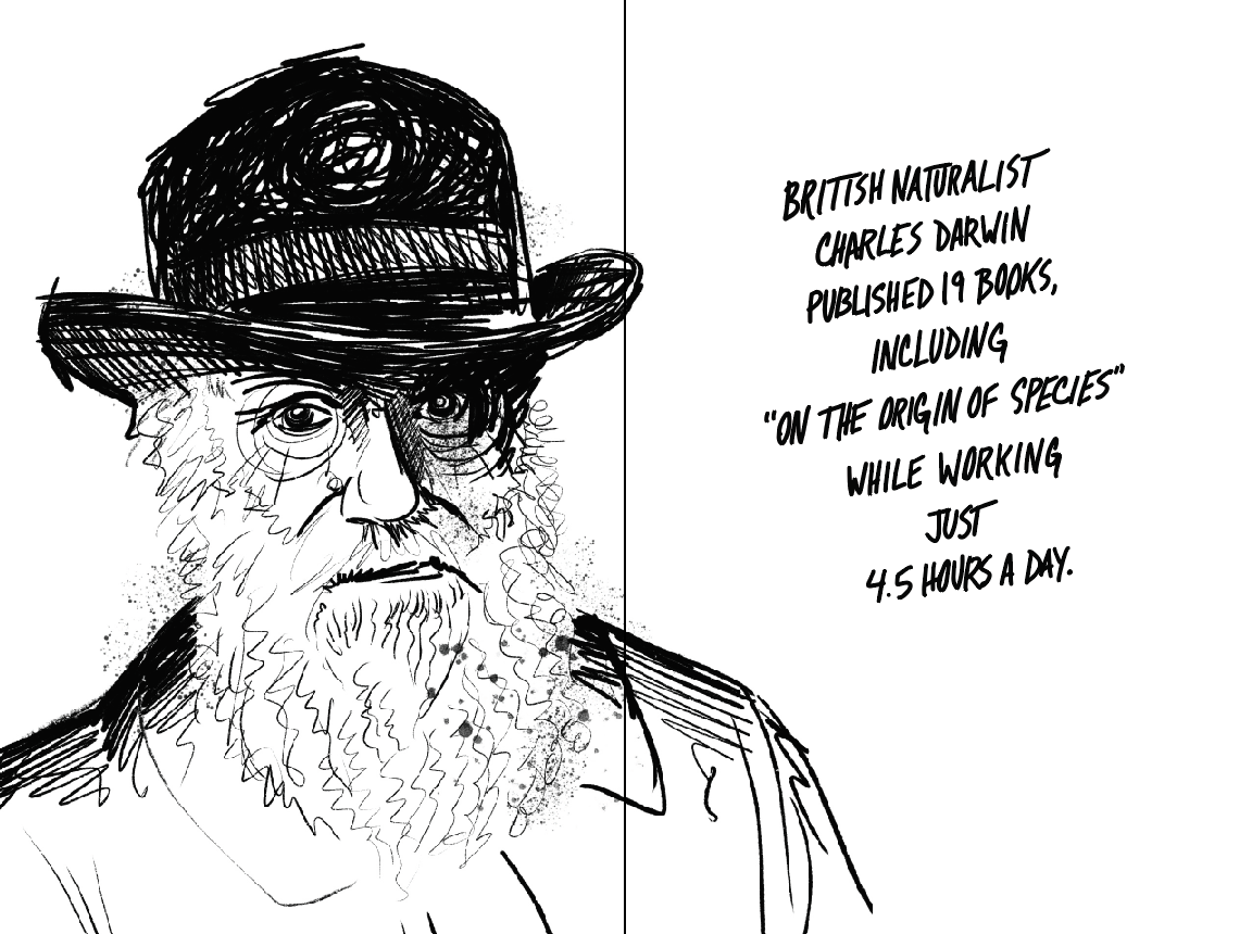
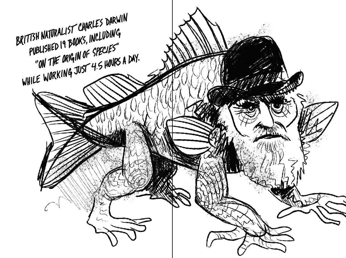
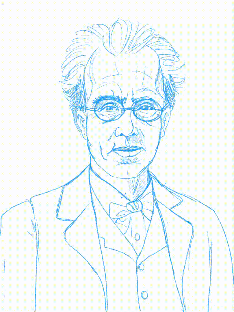
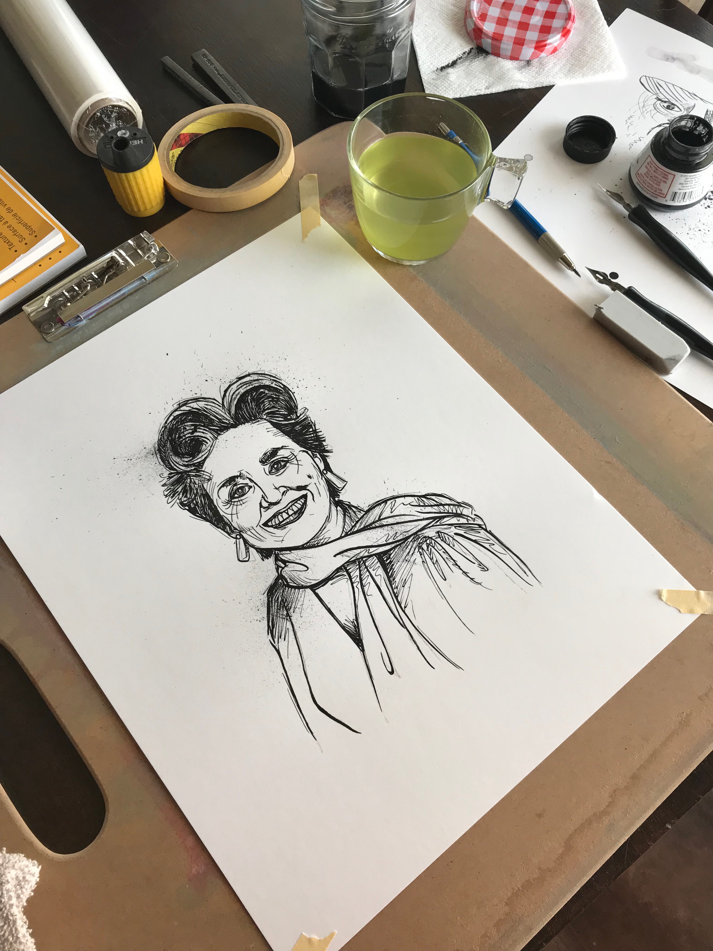
They ranged from just bad to outright weird but the idea seemed to be taking shape. I especially liked the ones that were in a more editorial cartoon style and include a prop or other visual gag (such as Darwin’s iguana) but these illustrations needed to feel like a consistent set and I was concerned about finding equally interesting themes for 20+ figures. We decided the more realistic, but slightly unhinged portrait (second row, left) was the way forward. As a final proof of concept I drew two additional subjects from our list in the same style and we submitted the idea to the publisher.
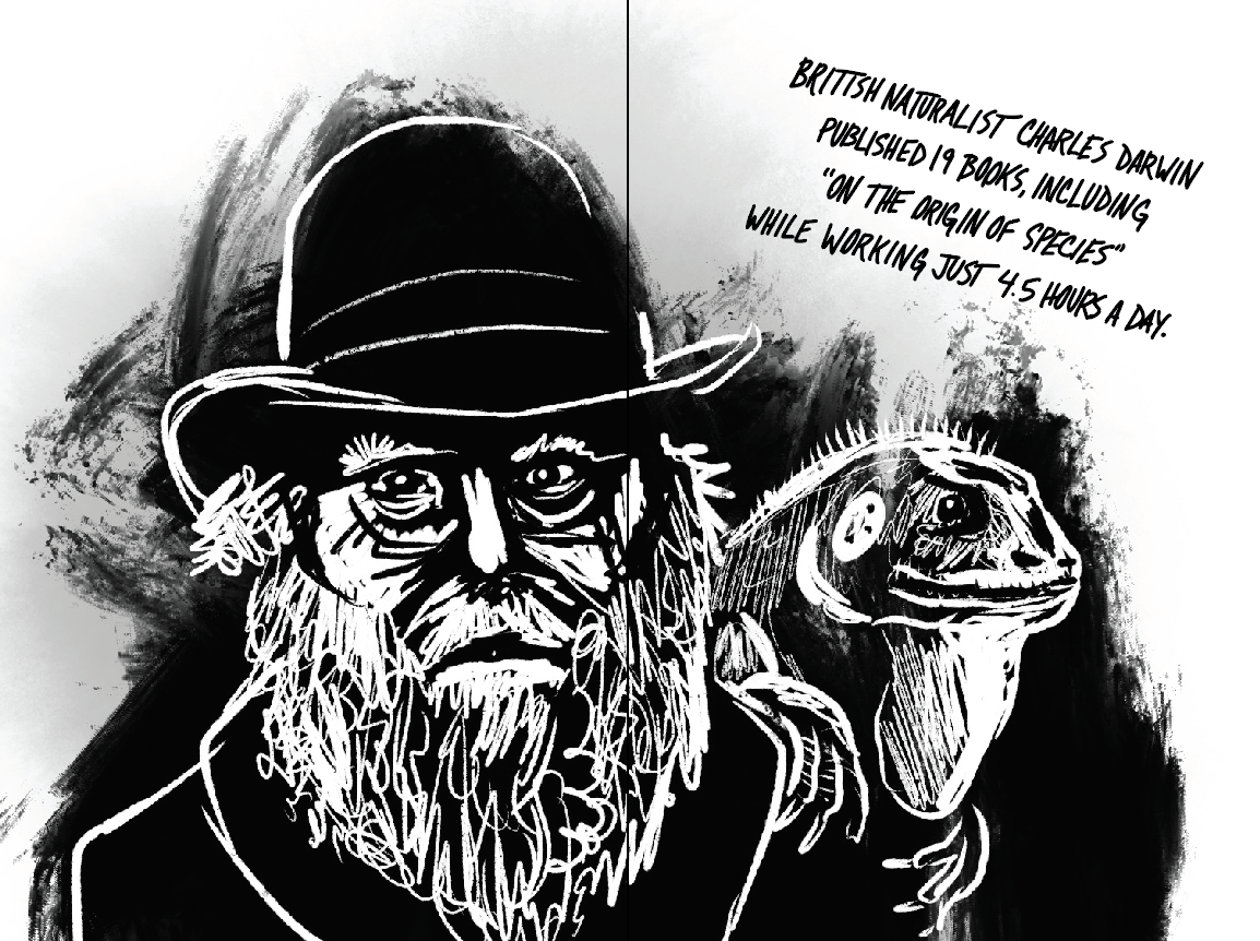
Three illustration spreads presented to our publisher. Interesting note: all three of these subjects made it into the book but I redrew each of them because the style evolved as I worked.
Production
With approval in-hand I got down to work. How many illustrations would ultimately appear in the book depended, in part, on the final page imposition. We hoped for at least 12 but I drew about twice that many so we were ready if there was room for more and so that there was some opportunity for editorial changes. That meant I had to average about one finished illustration per day to meet the deadline—oh and still leave enough time for my normal work.
At first I started splitting my days in half. In the mornings I’d do my normal design work at Basecamp and then I’d switch gears and work on illustrations for the book in the afternoons. This didn’t work out well at all. For one thing, it was easy to let the morning’s work spill over into the early (or late ) afternoon. It was also really difficult to switch between such different tasks. To boost my output and provide less frequent context switching I tried splitting my week into two parts: two days on product design and two on illustration. It was better but I still wasn’t working at full speed. Things only kicked into high gear once I decided to go all-in on drawing and fully immerse myself in the project, ignoring everything else. How much difference did it make? In the first 10 days of the project I did 7 pieces. In the last 6 full-time days I completed 17! Even though it meant putting my regular work on hold for a few days, ultimately by focusing intently I finished the work far ahead of schedule and spent less time than I anticipated overall.
The Process
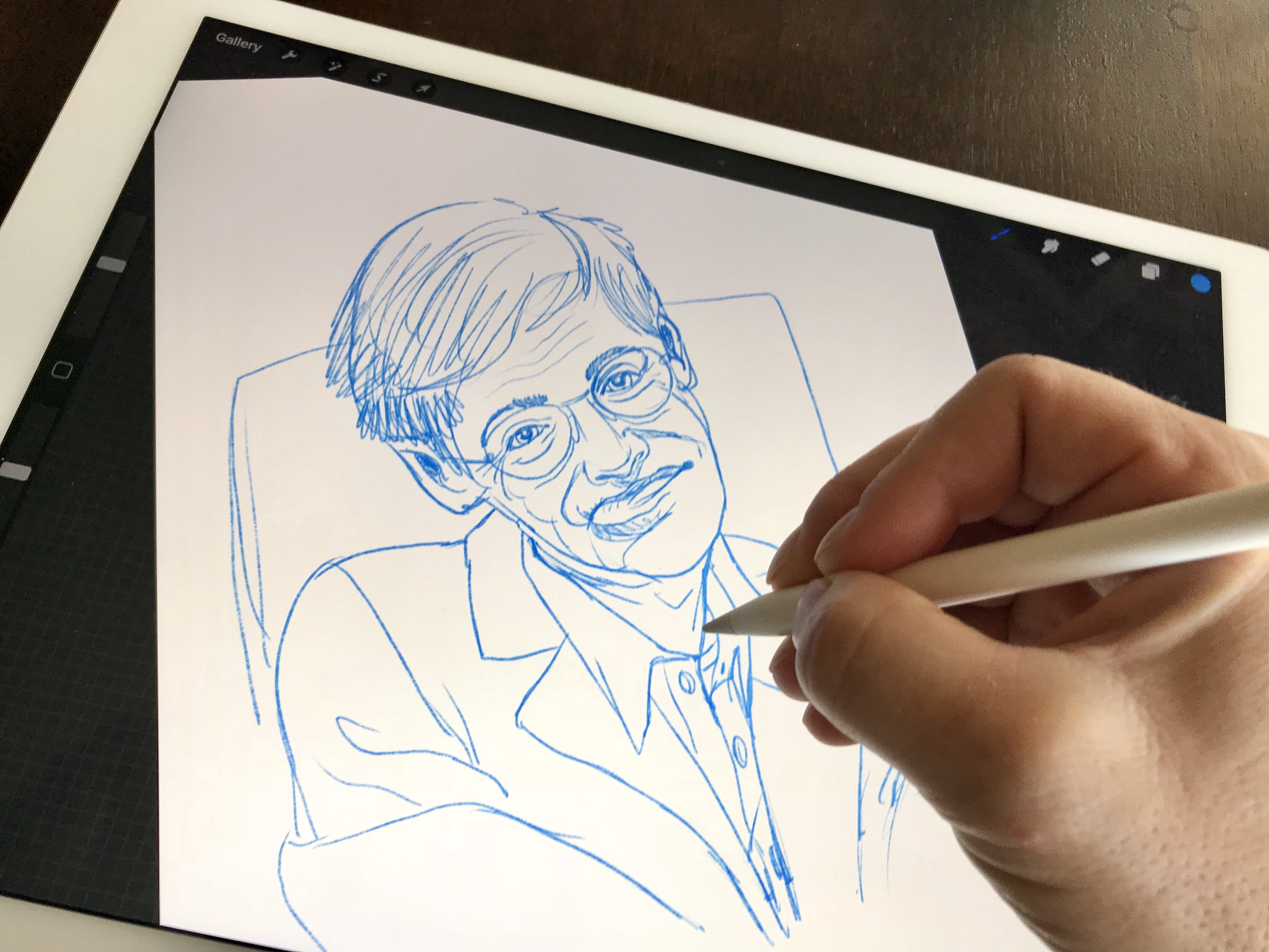
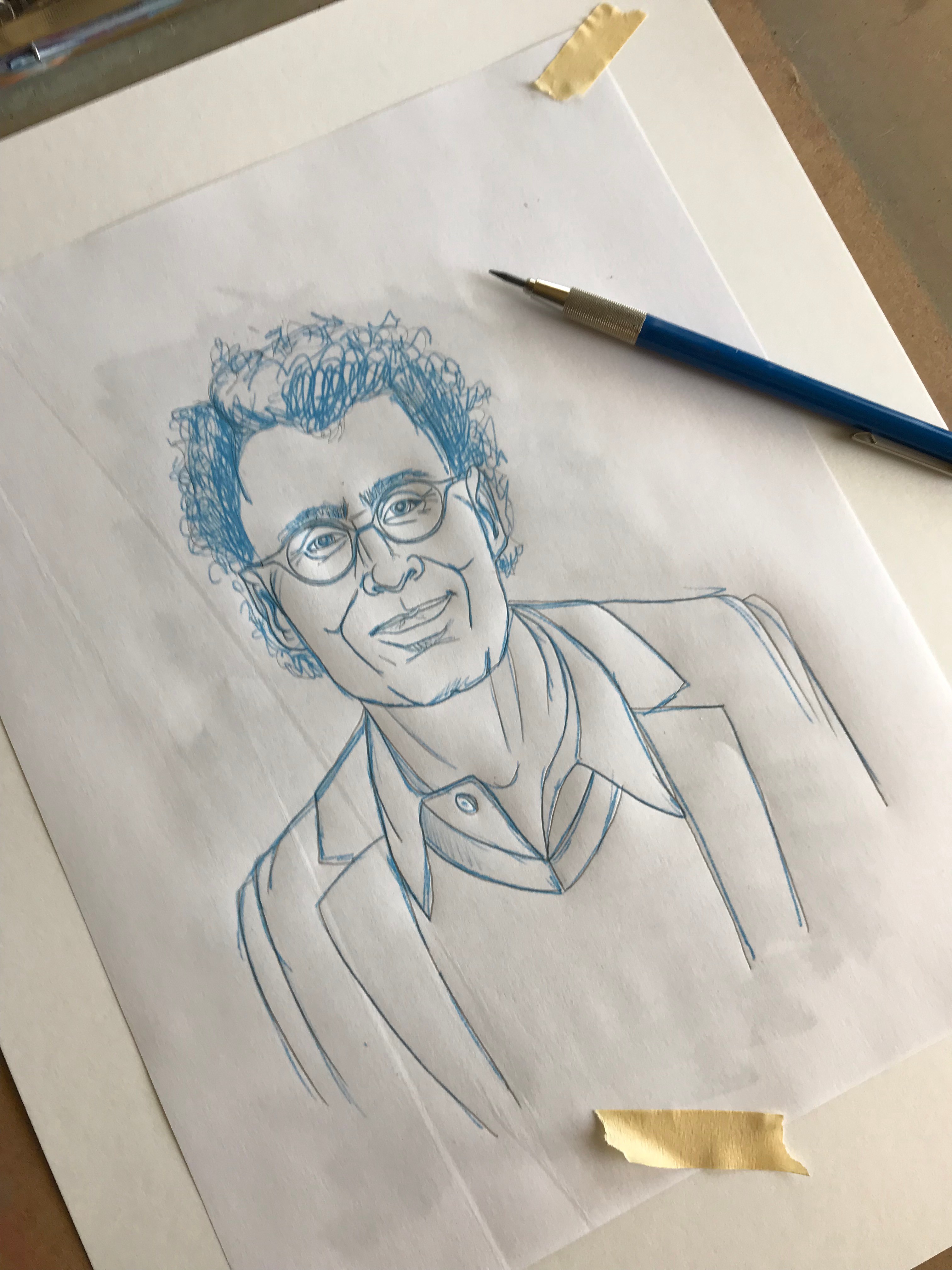
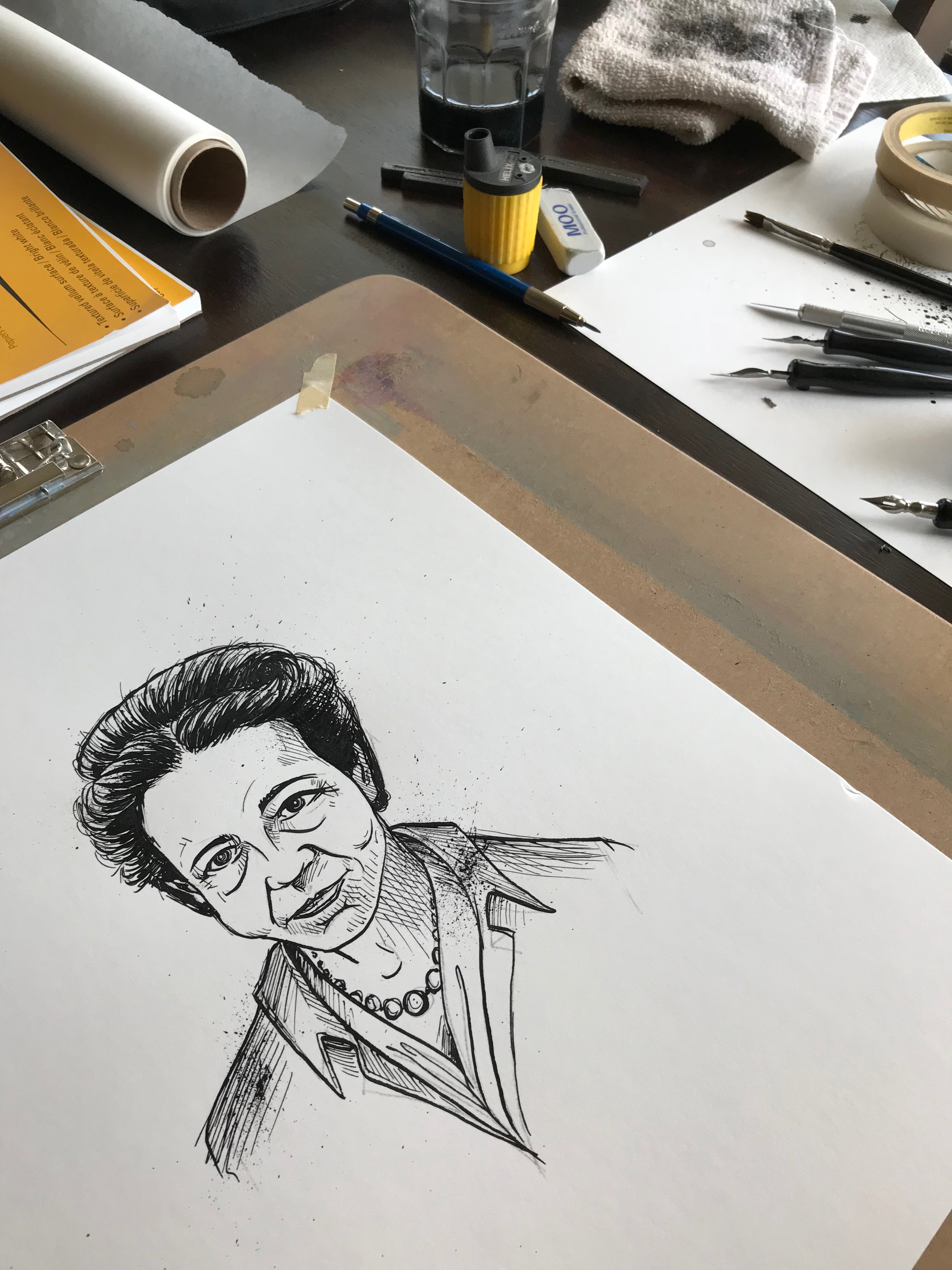
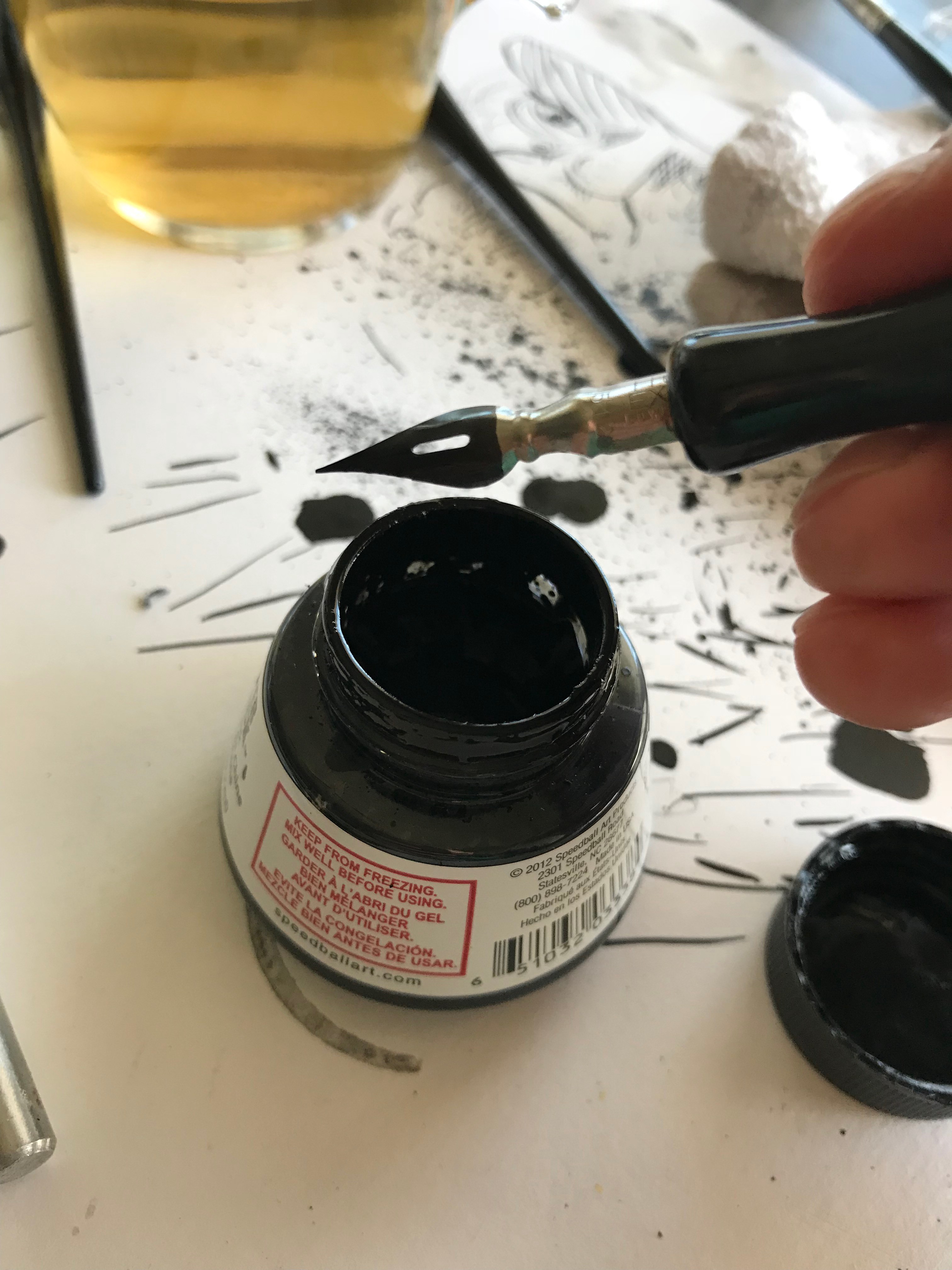
Since the art would be printed in black and white in the book, I settled on ink and paper for the original art. Even though it would be hand-drawn on paper, I actually did my rough sketching digitally with Procreate on iPad Pro. Why? Speed. Working digitally meant I could easily erase, redraw, resize, move, stretch, copy and skew my drawing as I refined each sketch. Nose, too big; eyes too small? It’s just a matter of seleting and resizing instead of erasing and drawing again. What I could do in seconds with the tools in Procreate would have required dozens on redraws on paper.
Rough sketch of Stephen Hawking with Procreate on iPad Pro (left). This time-lapse recording of Gustav Mahler shows the quick editing digital sketching affords (right)
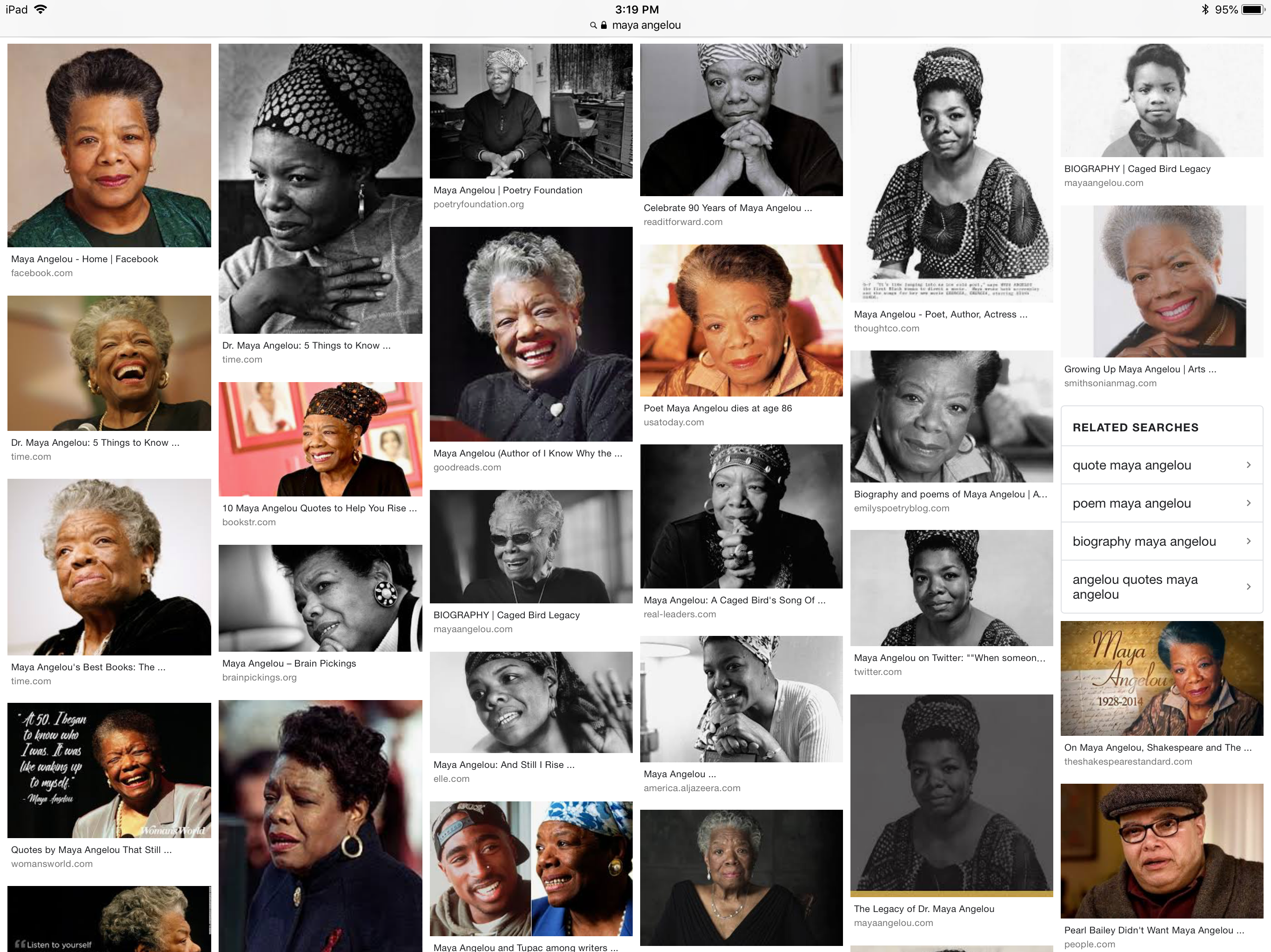
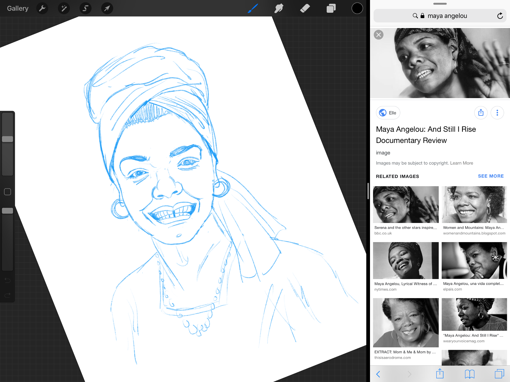
Drawing portraits of people you don’t know and can’t observe in-person is a tricky thing to do so I had to gather publicly available image references for each figure. Google Images was instrumental in this, in particular because it allowed me to see many images of a person all together. Studying a subject from many angles, in different situations, and even at different times in their lives allowed me to create exactly the portrait I imagined for each person.
Sketching on iPad Pro, allowed me to keep reference images from Google Image search (left) visible while I drew using the split-screen feature (right)
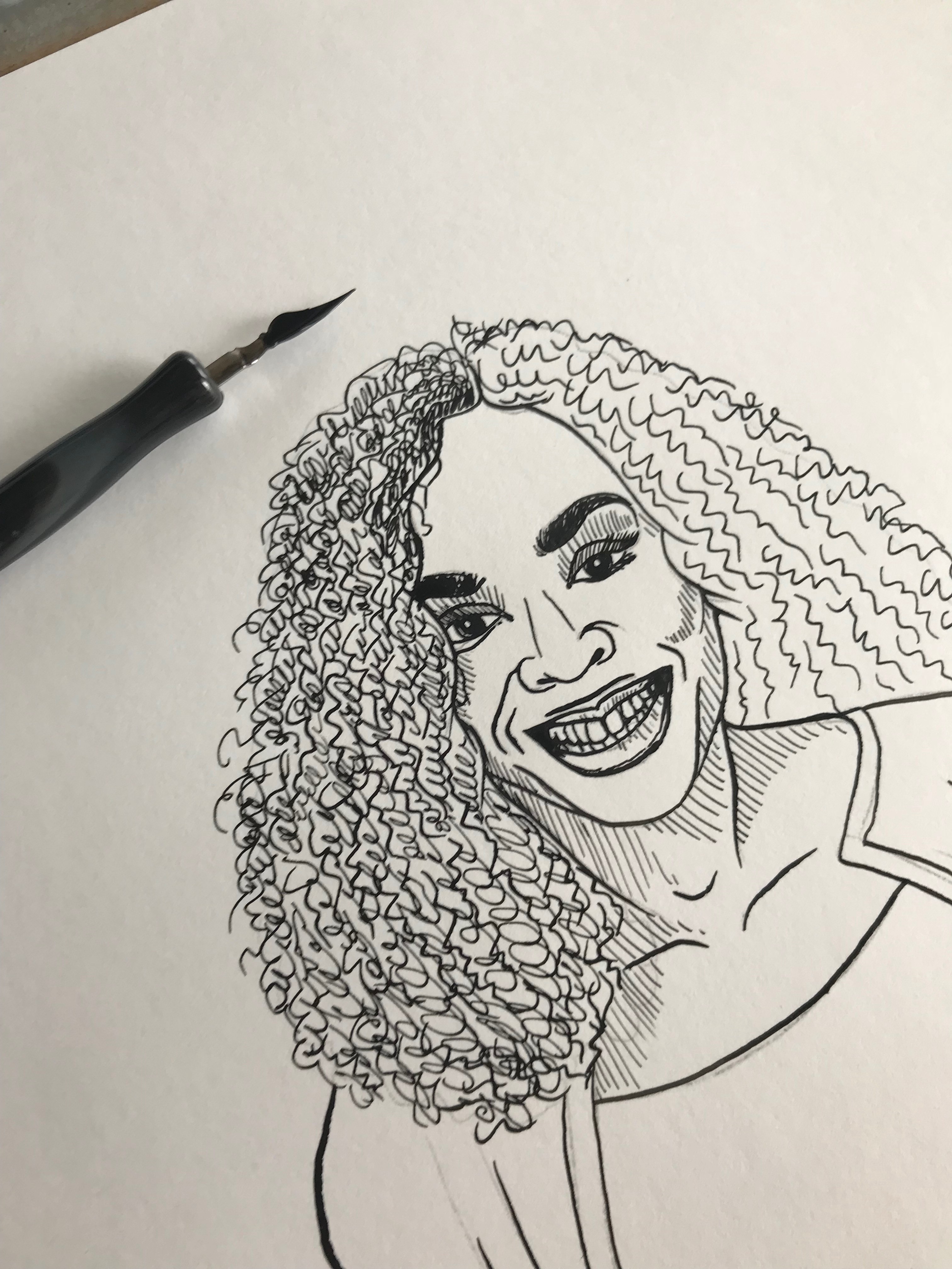
The portraits of Maya Angelou and Stephen Hawking are examples of this that I’m particularly proud of. I had a pretty clear idea going in about how I wanted to represent them and a wide range of reference photos of these well-known figures gave me all the image data I needed. In both cases the final piece is a somewhat ageless portrait that represents their character without recalling a particular, recognizable moment in their lives. I found that the younger reference images didn’t have enough character, but the images in their later years exaggerated their features in a way that helped me understand them better. The final art is more like a set of caricatures than serious portraits.
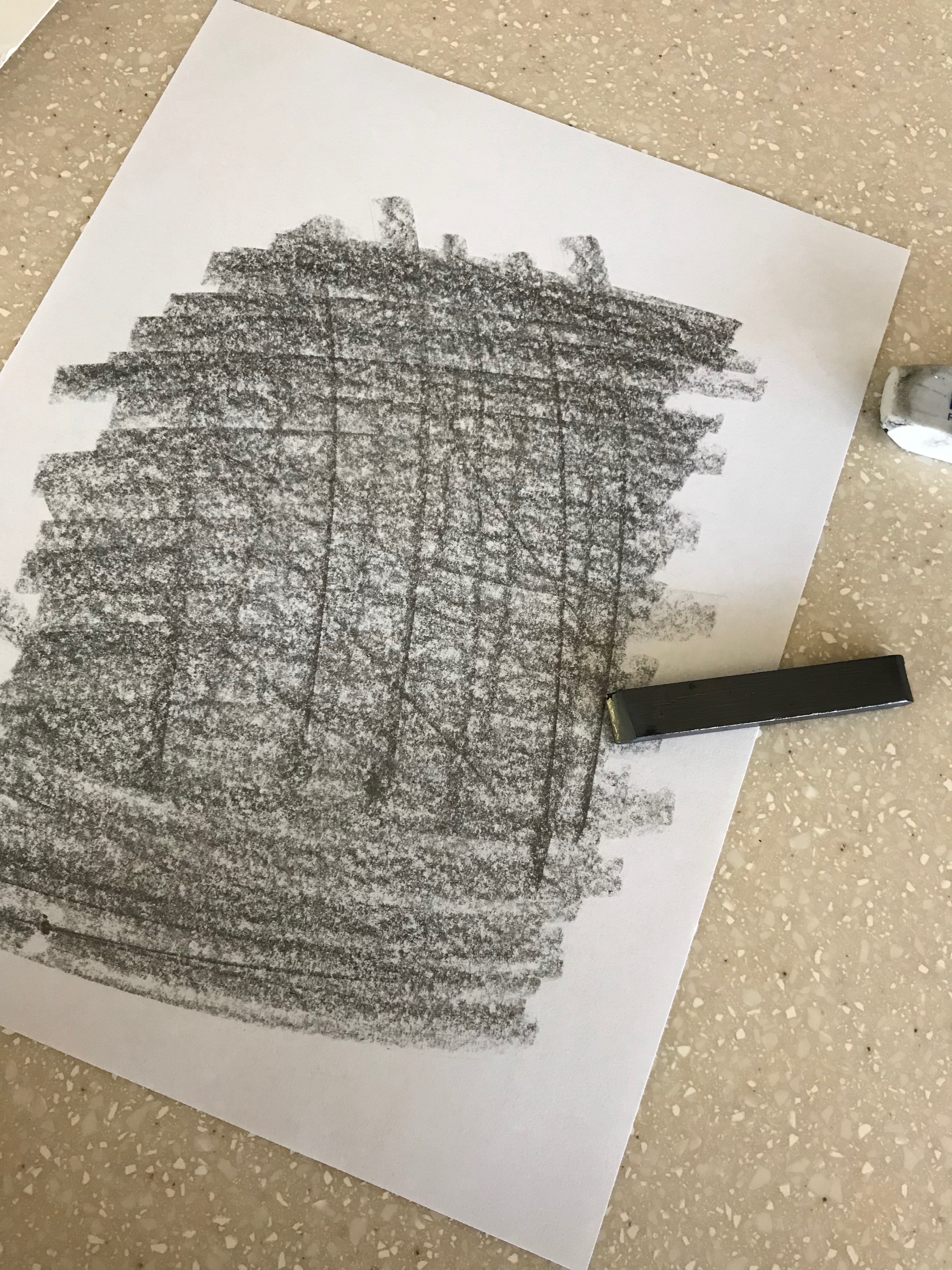
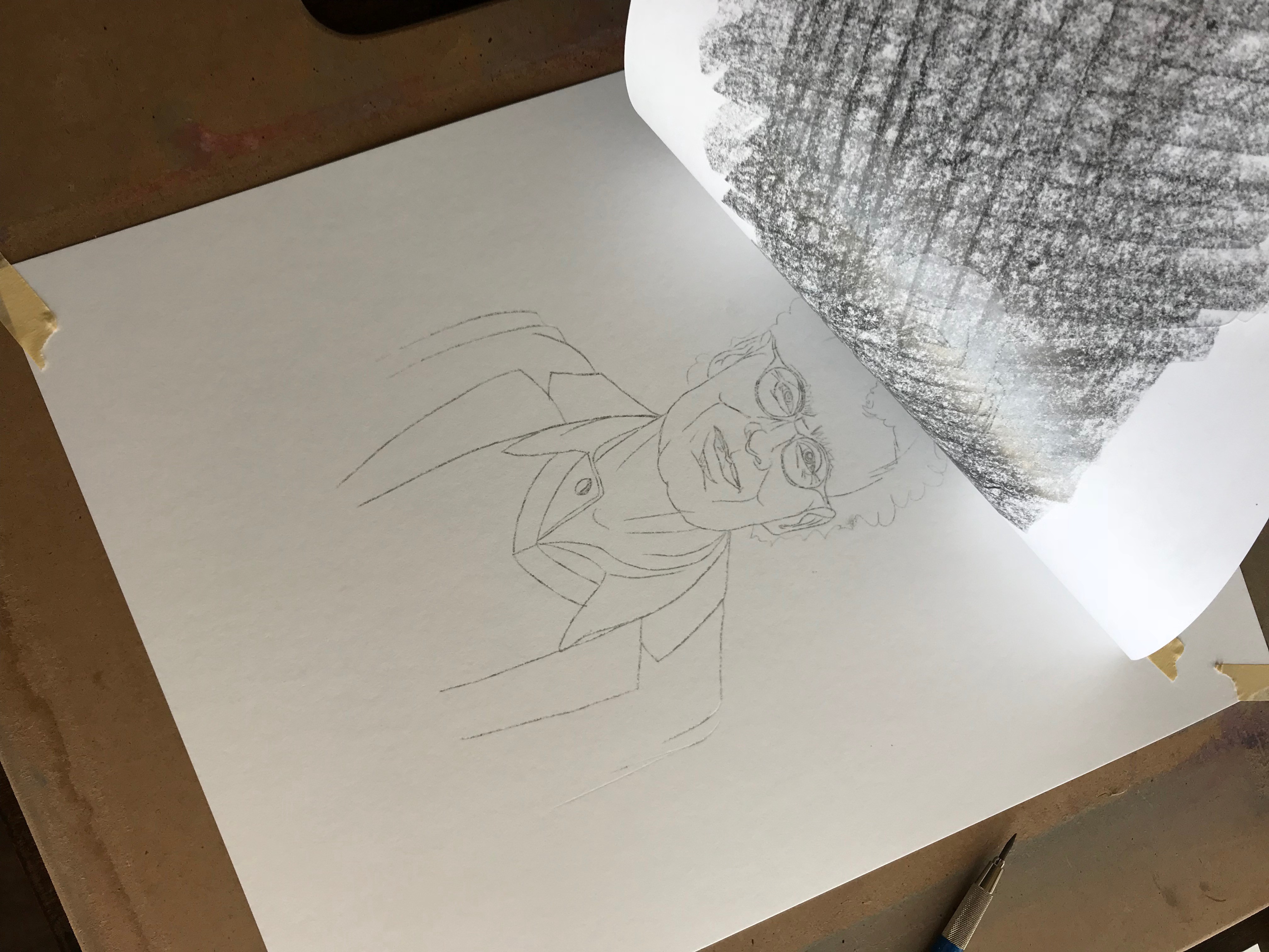
After completing the rough sketch, I would resize it for consistency and print it out. Then using a classic technique, I’d transfer the image to paper for inking. This made the task of drawing a set of 20+ images at a consistent size and laid-out nicely on the final page mistake-free. If you’ve ever drawn something starting in the middle only to run off the edge of the paper, you know what I mean!
Transferring an image: first I covered the back of the print-out with graphite (left), then laid it down on the final paper and traced over the lines causing the graphite to transfer onto the paper (middle), that left a light pencil outline perfectly placed on the final medium (right)
This project was unlike anything else I’ve attempted. All said, I completed 25 drawings, 18 of which appear in the first print and e-book editions of It Doesn’t Have to Be Crazy at Work. I’m incredibly proud of the project and even more grateful for the opportunity Jason and David gave me to contribute to this wonderful book that speaks so clearly about how we work. In fact, the entire project was done almost entirely in-house at Basecamp. It was written by Jason Fried (CEO) and David Heinemeier Hansson (CTO), jacket design and interior design by Adam Stoddard (marketing designer), illustrations by me, Jason Zimdars (product designer), and research by Wailin Wong (producer of The REWORK podcast).
Final spreads (designed by Adam Stoddard) including a new rendering of our friend Charles Darwin (left), THE OPRAH, and a photo of the first print edition (right)
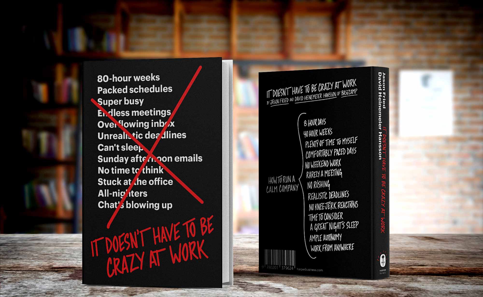
It Doesn’t Have to Be Crazy at Work
I did this work at Basecamp where 40 hour work weeks are the norm, no one checks email on the weekend, and our benefits are focused on getting people out of the office, not enticing them to stay longer. We’ve stepped out of the hustle game in Silicon Valley and designed our company differently. This book will show how you can have a calm company too.
Summer is winding down, kids are back in school and the Basecamp team has a fresh batch of updates to share. Here’s a quick look at some recent improvements that are available right now in all of your projects.
Getting over the hill
Hill Charts are a completely new way to track progress and a Basecamp 3 exclusive. People everywhere are loving this unique way to see where their projects really stand and answer the hard questions that get them un-stuck. Now it’s much faster to choose which lists to track on the Hill Chart. Take a look…
Set up Hill Charts.
Profile cards
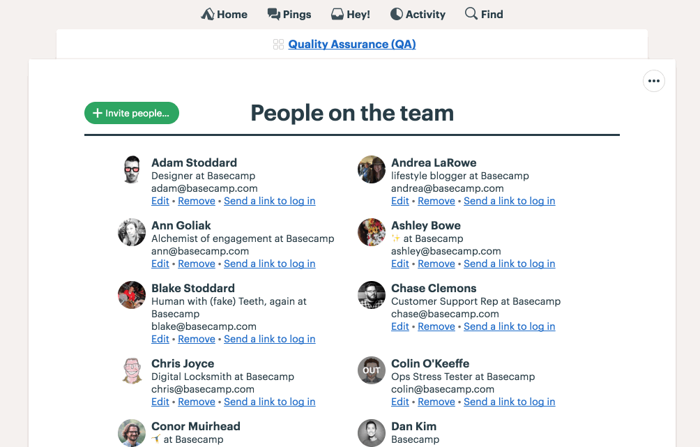
Clicking someone’s avatar in Basecamp is often the best way to get a little more information about people you’re collaborating with—especially when you work with clients, people you’ve never met, or on a team spread across time zones. Now profiles show you which company someone is a part of, their role in Basecamp (Administrator, Owner, or Client), and what time it is where they live. These details can help you track down an admin, figure out who the new person on the project is, or avoid bugging someone in the middle of the night.
Profile now cards display additional details.
Coloring folders
Now you can color folders just like you could other items in Docs & Files. Add a little personality, make something important stand out, or come up with your own color-coding system.
Coloring and organizing folders.
Project tools
Basecamp features seven distinct tools to handle every situtation in your projects from communicating to organizing to tracking work. With the latest update it’s easier than ever to choose which combination of tools to use on each project.
Managing project tools.
Improved invites
One of the best things about Basecamp is it keeps everyone on the same page so that nothing falls through the cracks. That only works, however, if the right people are involved in the project. So we’ve removed some steps, cut some complexity and streamlined the process so that getting people into your projects is easier than ever.
Inviting people is clearer and more direct.
Managing My Drafts
You write a lot in Basecamp, we get it. Drafts let you work on that post, announcement, article, or note in private until you’re ready to share it. But not everything gets published and before this update it could be a lot of work to figure out what was what or simply get rid of the ones you no longer needed. With this update, you can see all of your draft Messages and Documents, when they were last edited, and in which project they live. Not only that, but you can trash them right from the list without having to click into each one first. More info, faster edits, less pain = win!
Managing My Drafts
Jump to projects
For Basecamp pros, the Jump Menu is a speedy way to get around in Basecamp. Just hit ⌘+ J to return to something you saw recently or type a few characters to quickly filter Projects, Teams, and People. With our latest update we made it easier to jump to another project by making them pop up to the top of the list. This makes the Jump Menu hands-down the fastest way to get to a project in Basecamp.
Filtering in the Jump menu now makes jumping to another project even faster.
Thank you ❤️
We’re so grateful for all our customers and we hope these improvements make your time working more calm, effective, and enjoyable. If you’re not yet a Basecamp customer and feeling overwhelmed because your business is growing, you’re buried in email, stuff is slipping through the cracks, and communication is a struggle maybe it’s time to give us a try. You can try Basecamp completely free and unlimited for 30 days. No credit card needed to sign-up!
The newest release introduces a brand new tab along with improvements to searching, navigation, and for people who have multiple accounts. Get it for iPhone and iPad in the App Store today. Read-on for details about what’s new…
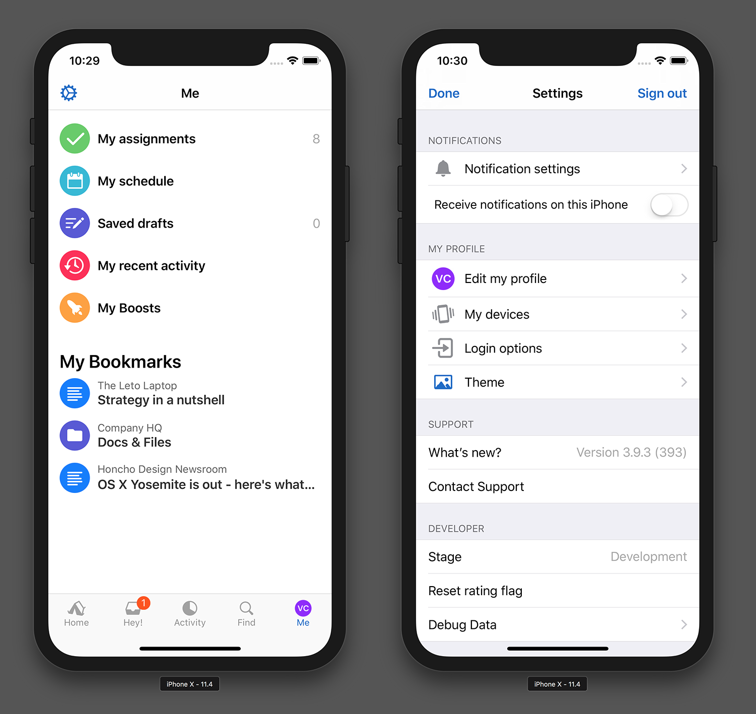
New Me tab!
We know that My Assignments is one of the most popular screens in Basecamp on all platforms but it can be hard to find. Now My Assignments and the rest of My Stuff are easier to reach on the new Me tab. It also includes your Bookmarks and app Settings.
Introducing the brand new Me tab, a place to find all your stuff and settings.
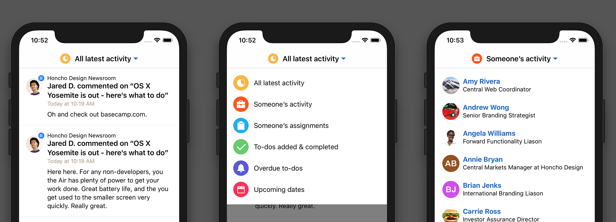
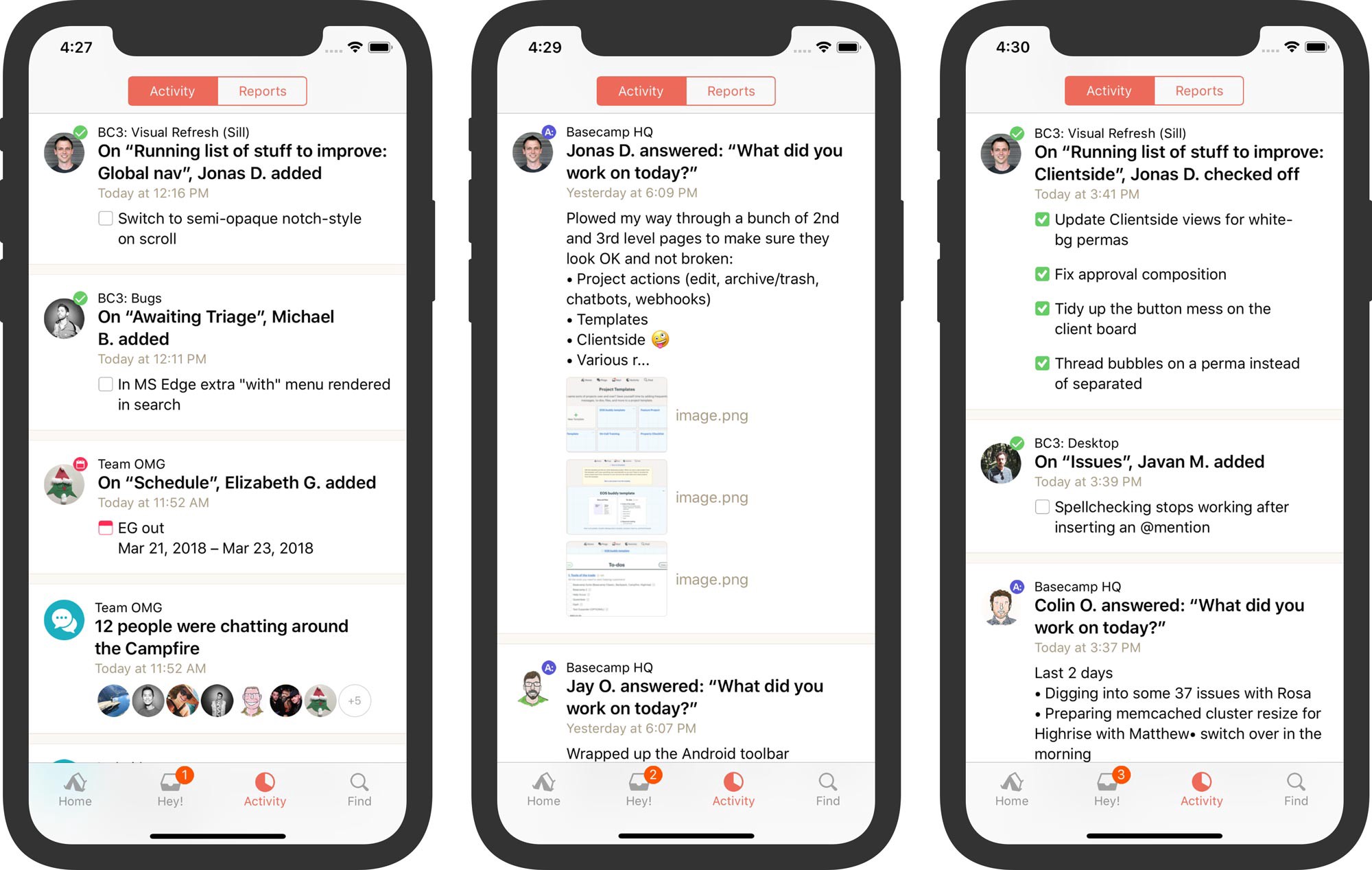
New Activity view switcher
Gone is the old Activity | Reports toggle. Basecamp now has a nice switcher to change between activity views more akin to web and mobile web. It’s easier to see what you’re currently looking at and you now stay on the same screen rather than navigating forward.
Tap the switcher at the top to choose a different activity view.
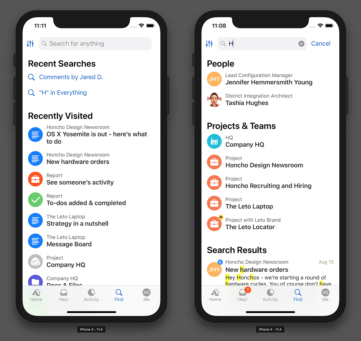
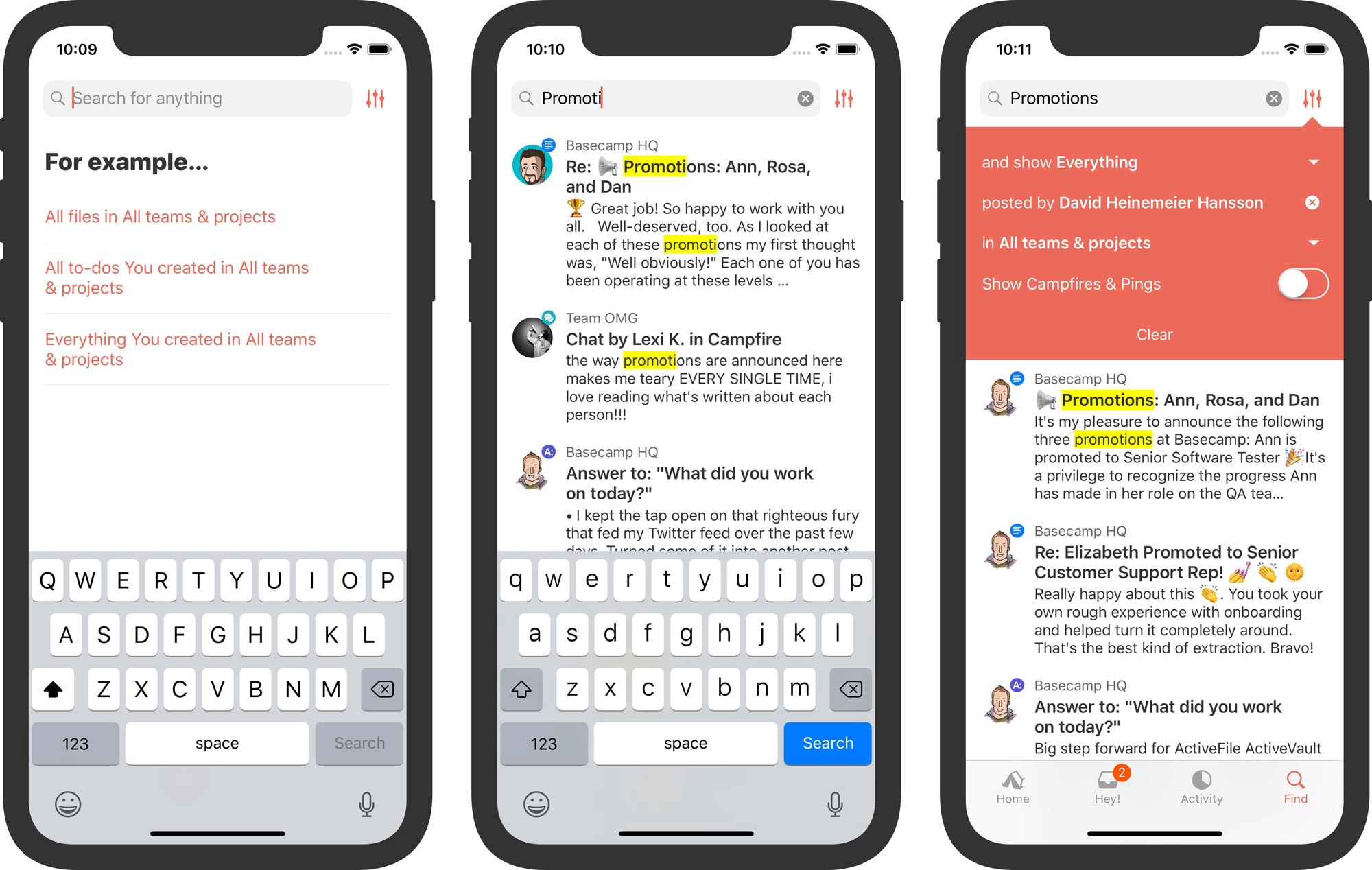
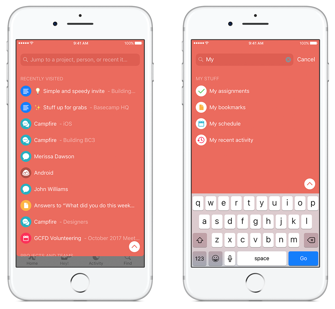
Before you search…
Looking for something in Basecamp? Pop on over to Find to see your Recently Visited places and Recent Searches, too. We hope that with this change, Basecamp helps surface what you might be looking for before you search.
Pick something recent (left) or search everywhere (right).
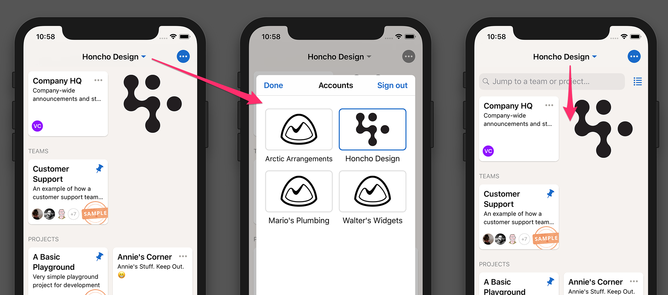
Better support for multiple accounts
If you have multiple Basecamp accounts, this one is for you. Now the name of the current account is prominently displayed at the top of Home and Hey. Tap it to switch to a different account.
Tap the account name to switch to another account (left). Pull-down slightly to reveal the project filter and view toggle.
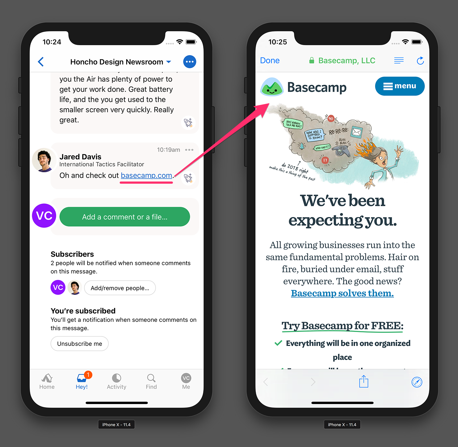
Opening links
This is a small change but now when you tap an external link in Basecamp it’ll open with a Safari view right inside Basecamp rather than opening the Safari app. You may have seen this in Twitter and other popular apps already. Now it’s so much easier to get back to where you were in Basecamp when you’re done reading.
External links now open inside Basecamp with a SafariViewController.
Thanks for using Basecamp!
As always, please keep suggestions, feedback, and bug reports coming our way. If you’re interesting in seeing new features before everyone else, we have a few openings left in our private beta. Send us an email and we’ll get you invited.
One last release of Basecamp for 2017 is here. Get it for iPhone and iPad in the App Store today. Here’s a look at some of the most recent improvements.
Brand new design for Activity
Feeds are everywhere on mobile, so we took the best modern design patterns and applied them to Basecamp’s own feed. This is the first step in a string of improvements we’ve got planned for this screen—especially algorithmic feed ordering based on your Applause (We kid, we kid!). Here’s how it looks:
Activity shows everything happening in all your projects and teams at a glance.
All-new Find tab
Search got a lot better in Basecamp for web this fall, so we’re excited to bring those improvements to the app—with an iOS flavor. Searches are now live as-you-type and can be quickly filtered to narrow down to exactly what you’re looking for. One of my favorites is to exclude Campfire chats from search results—it can be a life saver with some keywords.
The new Find tab in Basecamp 3.8 makes it super easy to find what you need in your projects and teams.
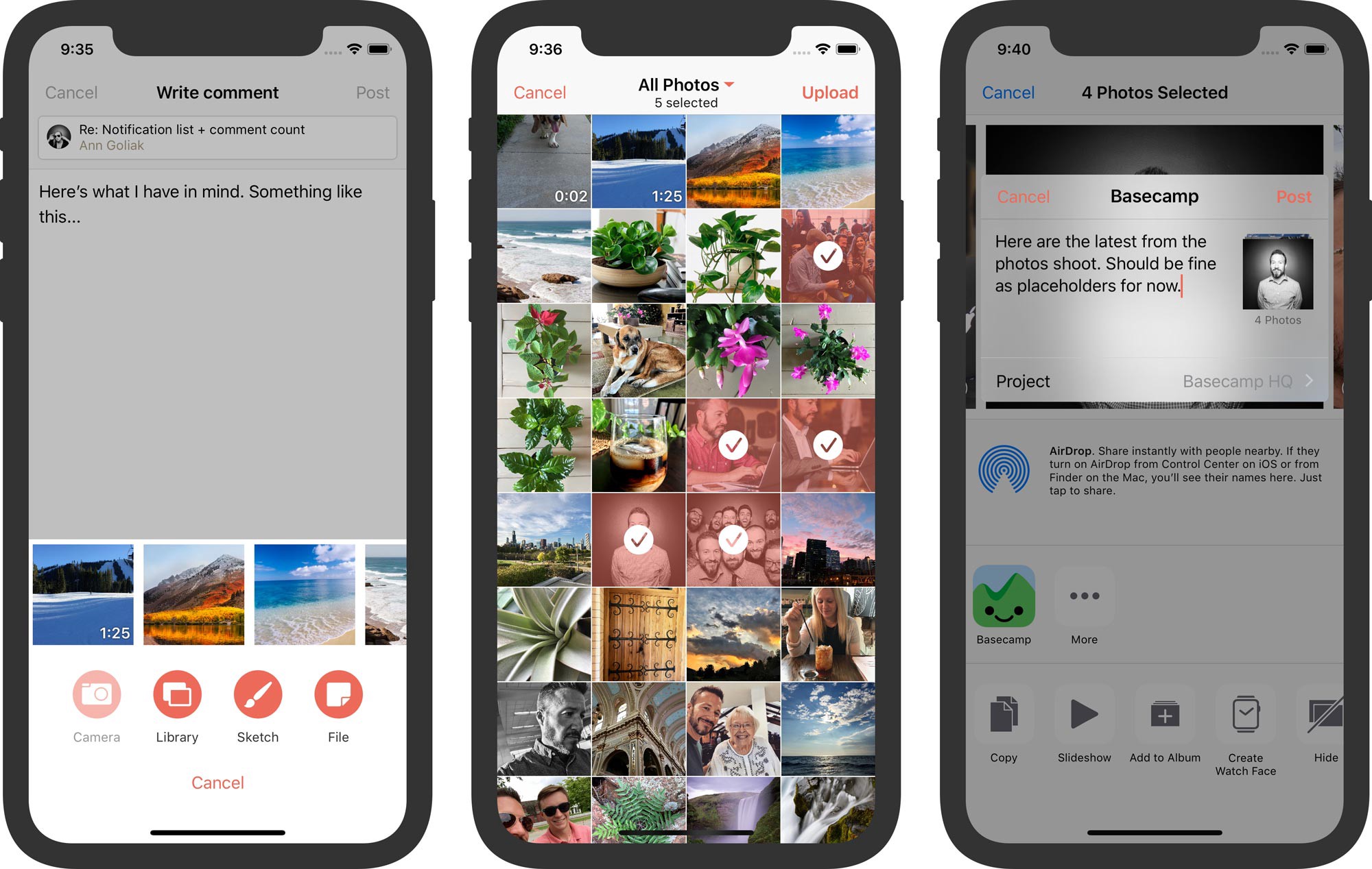
Add multiple files to Basecamp at once
This has been a popular request from customers and it was trickier to build than you might think, so we’re excited to finally deliver. We’ve designed a brand new screen for choosing photos and videos from your device that allows for multiple attachments all at once. It works with Basecamp’s Share extension when saving files from other apps, too!
Quick-pick recent photos and videos (left) · Choose multiple images from your library (center) · Share multiple files to Basecamp from other apps (right)
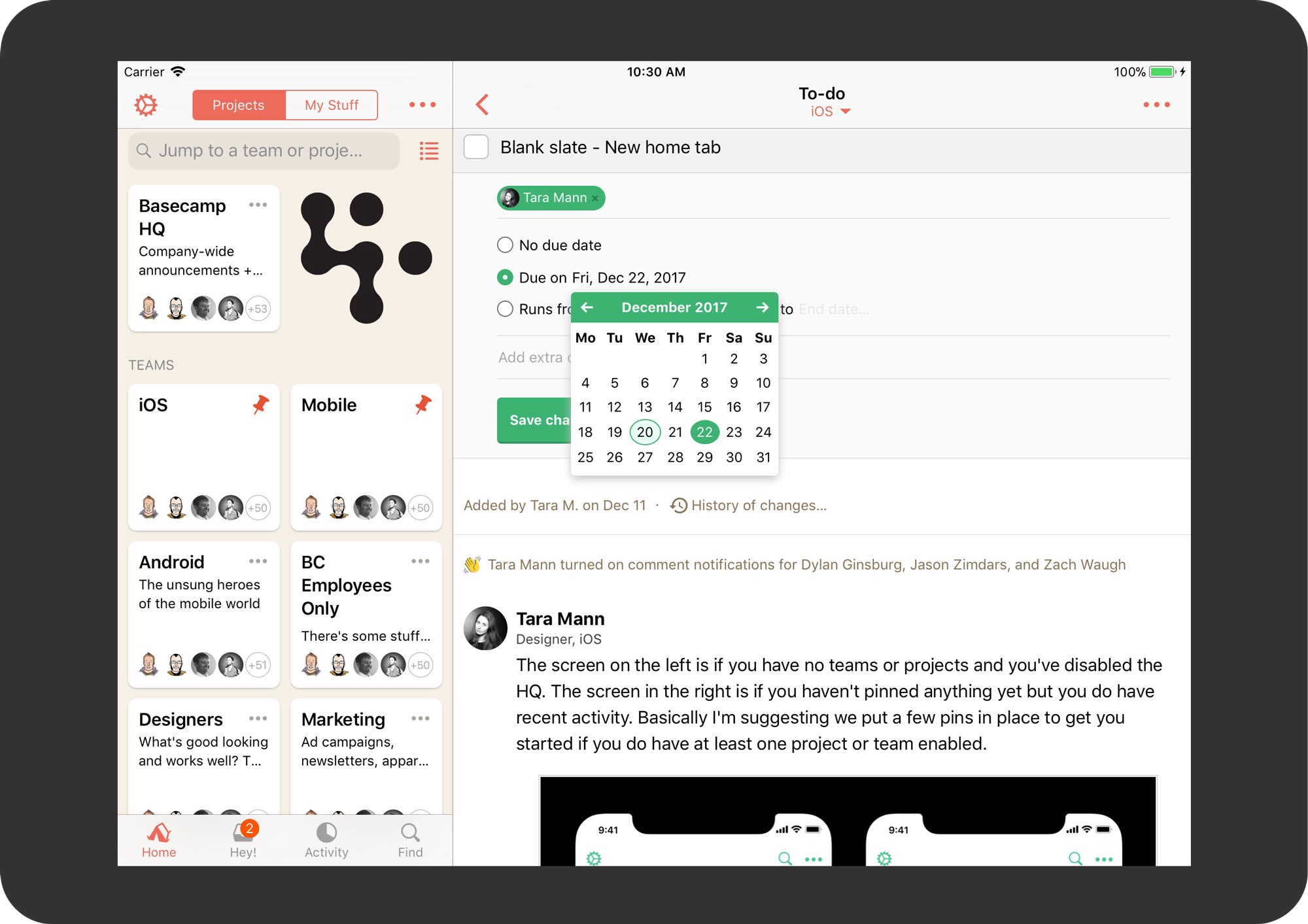
New Calendar picker for choosing due dates
Previously Basecamp used iOS’s native “spinners” for choosing due dates, but we heard from many customers this just wasn’t good enough. In particular, the spinners didn’t display the day of the week, which could make planning harder than it needed to be. We’re happy to offer a new calendar picker that shows the whole month at-a-glance including weekends!
Pick due dates in context
It’s been a great year—see you in 2018!
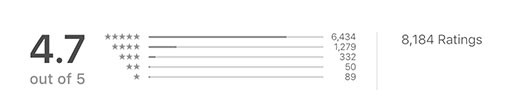
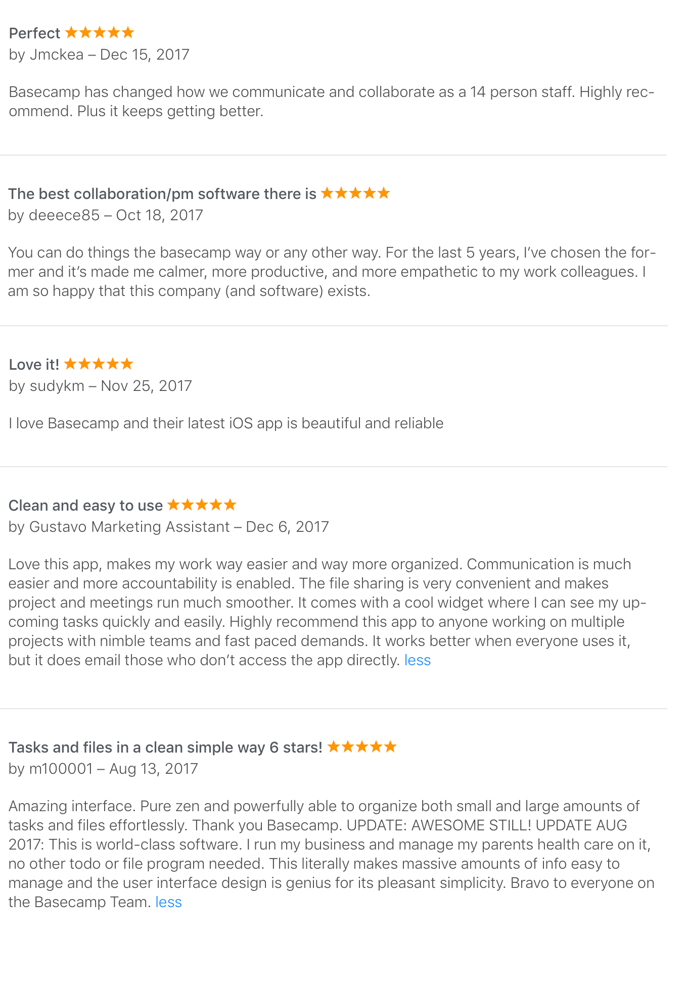
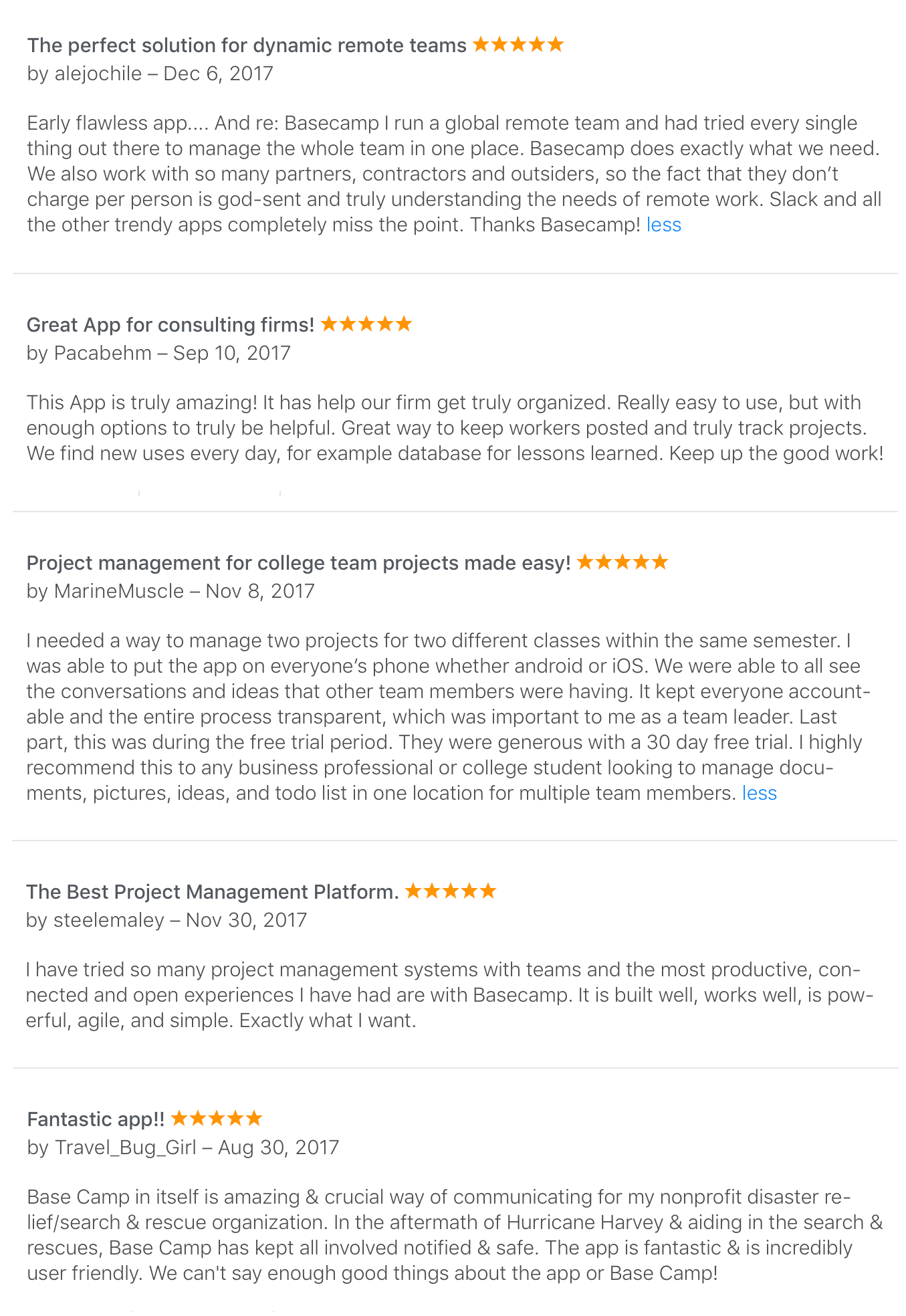
We’re especially grateful to all the wonderful customers who’ve taken the time to leave reviews for Basecamp in the App Store. Here are just some of our favorites:
Of course, we couldn’t make everyone happy…
We hope 2018 treats you better, Cruzwhore.
As always, please keep suggestions, feedback, and bug reports coming our way. 2018 will be here before you know it and we’ve got some great stuff in the works. If you’re interesting in seeing it before everyone else, we have a few openings left in our private beta. Send us an email and we’ll get you invited.
This feature-packed release of Basecamp for iPhone and iPad is available in the App Store today. Here’s a look at what’s new.
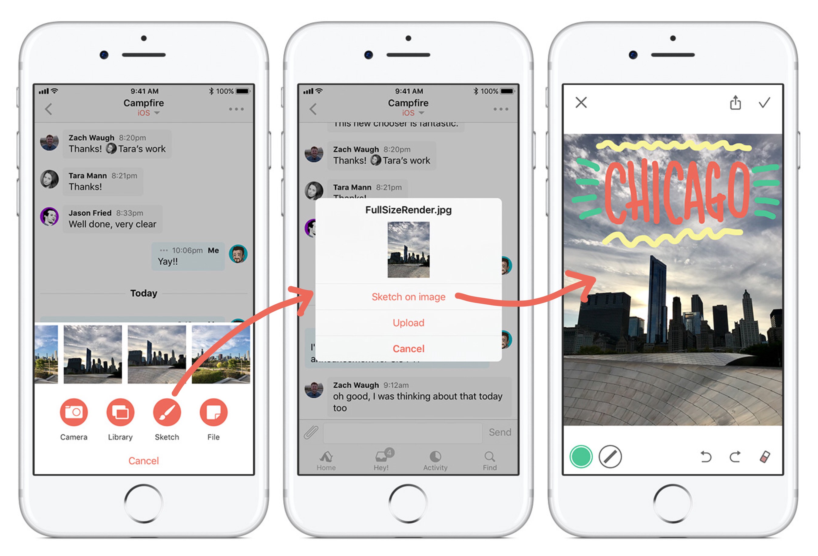
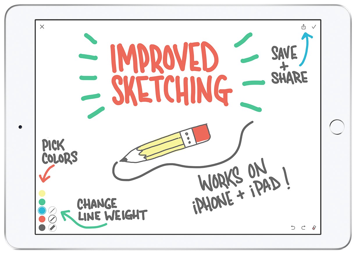
Improved attachments and sketching
It all starts with a redesigned file picker. Tap the paperclip button anywhere in Basecamp to see clear buttons for each kind of thing you can attach. They’re all first-class — especially Sketch which got a big boost in this release. Now, before you upload an image to Basecamp you’ll have the option to draw on it first. It’s great for highlighting and making notes — or just having fun.
Pick an image (left), tap ‘Sketch on image’, then add your drawings before uploading to Basecamp.
In addition to sketching on images, we’ve also beefed-up the drawing tools. You can now choose the from 3 line weights and 5 colors to add variety and interest to your sketches. Also new: save your Basecamp sketches or share them to other apps.
Works great with Apple Pencil on iPad Pro, too.
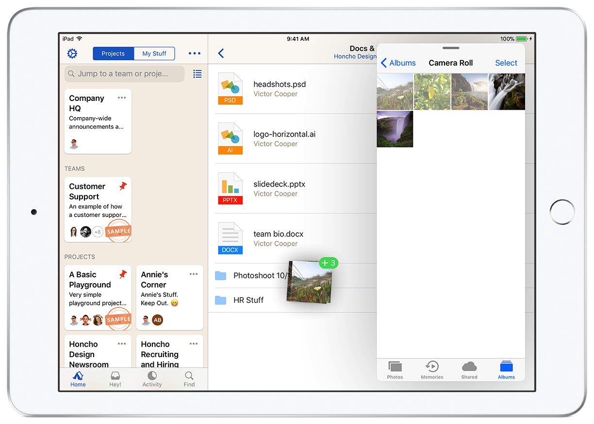
Drag and Drop Files on iPad
One of the coolest new features on iOS 11 is drag and drop and it’s now supported in Basecamp. You can now select one (or more) images from the Photos app, for example, and simply drop them into Basecamp! Here’s how it looks:
Drag one or multiple files into Basecamp.
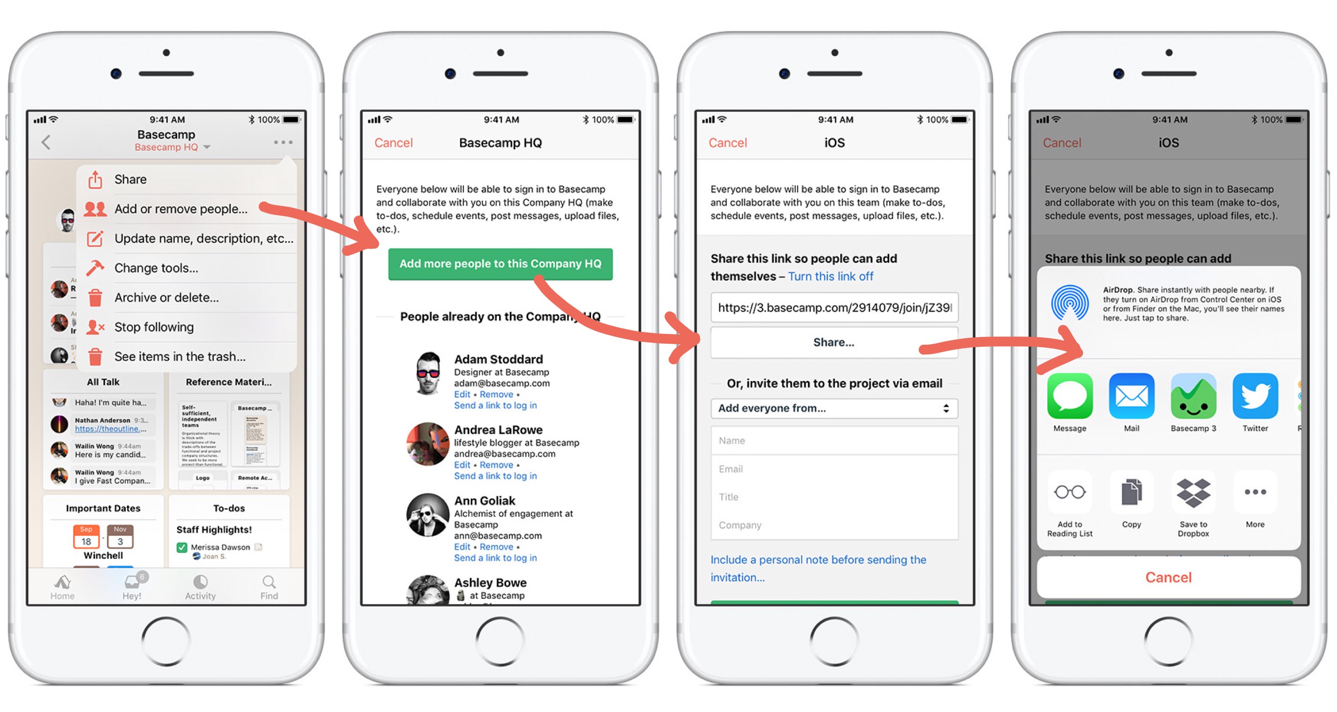
Easier invites
Awhile back, inviting people to your projects got easier with the introduction of special links you could send to people that would automatically invite them to the project — no need to enter their name and email. On iOS we took that a step further. With one tap you can now share the URL with others via Messages, Email, Airdrop — or any other apps you use on iOS. It’s the easiest way to get people into your projects yet!
iOS 11 updates
Finally this release includes several fixes and improvements for iOS 11. The most notable one is for people who were unable to upload images to Basecamp because they were using iOS 11’s new space-saving HEIC format. Now when you upload an HEIC image, Basecamp will automatically convert it to a compatible format (jpg). It all happens automatically and behind-the-scenes so you won’t have to do a thing—it just works!
That’s all for now. We’re cooking up more for the next release. Stay tuned!
As always, please keep your suggestions, feedback, and bug reports coming our way. We’ve got some neat stuff coming in the next version so if you’re interesting in seeing it before everyone else, we have a few openings in our private beta. Send us an email and we’ll invite you.
🍂 Fall is here, there’s a new version of iOS, and with it comes a new release to Basecamp for iPhone and iPad. It’s available in the App Store today. Here’s a brief look at what’s new:
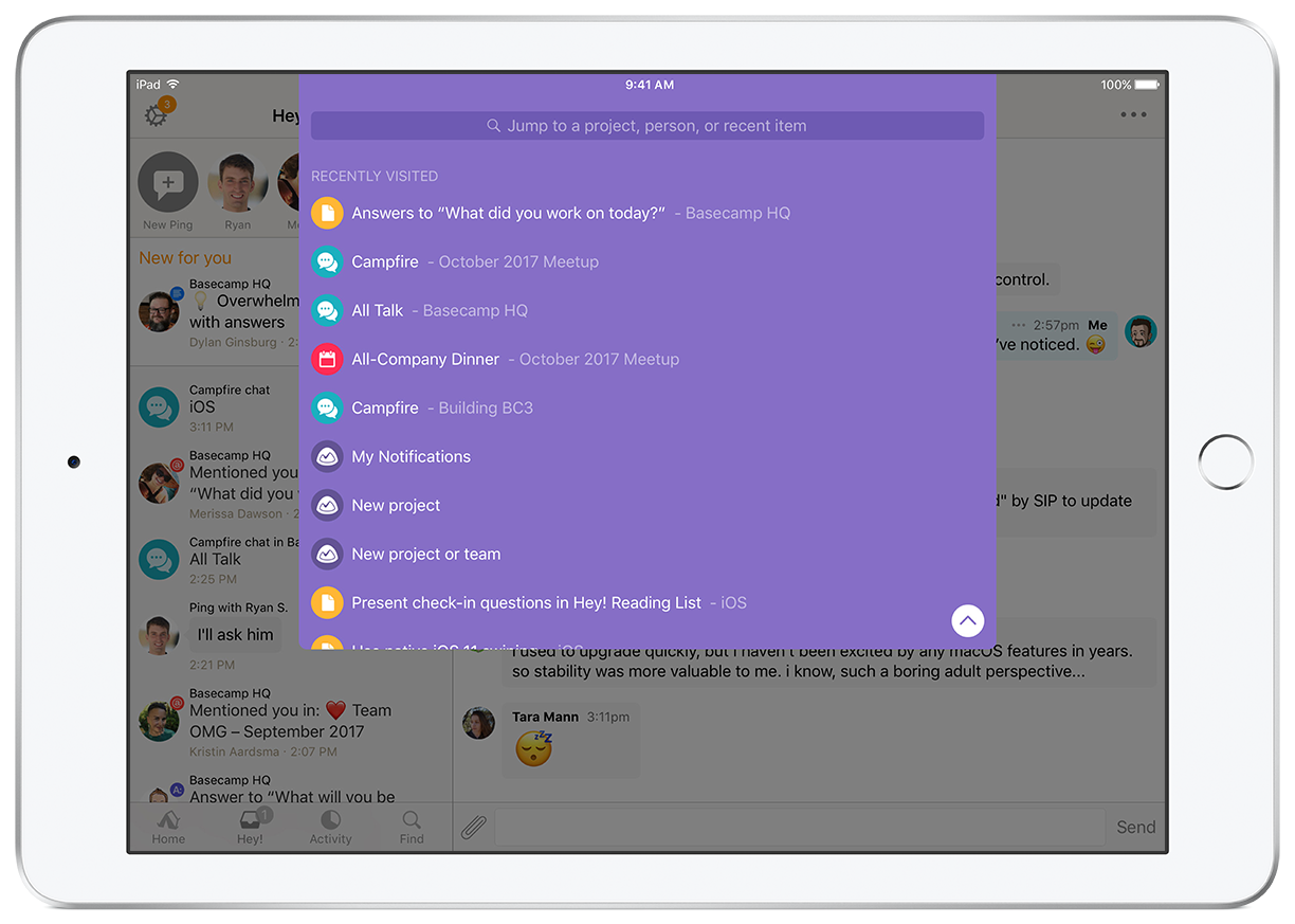
Quick jump
Quick jump is one of our favorite new things in Basecamp this year and we’re excited to bring it to iOS. It works exactly like the desktop version, especially on iPads with a keyboard attached (either 3rd party keyboards or iPad Pro with the Smart Keyboard). Command + J to start. Arrow up/down. Enter to select. Type to filter. It’s just the same.
Quick jump to projects, people, or recently visited items.
It’s also available on as an experimental feature on iPhone.That’s an atypical approach for us so let me explain. As of today you can quick jump by swiping from the top edge of your iOS device with two fingers. It works pretty well but the gesture makes this feature hard to find on your own, it can be difficult to execute reliably, it gets overridden by a system gesture used by iOS’s Voice Over, and until we hold one in our hands, we’re unsure how well this gesture will hold up on the iPhone X.
Quick-jump on iPhone. Swipe-down with two fingers to access recent items. Type to filter.
That said we’ve been using it internally for weeks so we know it’s useful. Rather than hold it back until we have a better idea, until we get it perfect, we made the decision to ship it and see how it fares in the wild. To be successful this feature needs to be quickly and easily available anywhere you are in the app and today the best means to accomplish that is with a gesture which can be triggered anytime. We hope with daily use and your feedback, new solutions will present themselves. We’ll continue to evaluate and evolve in upcoming releases.
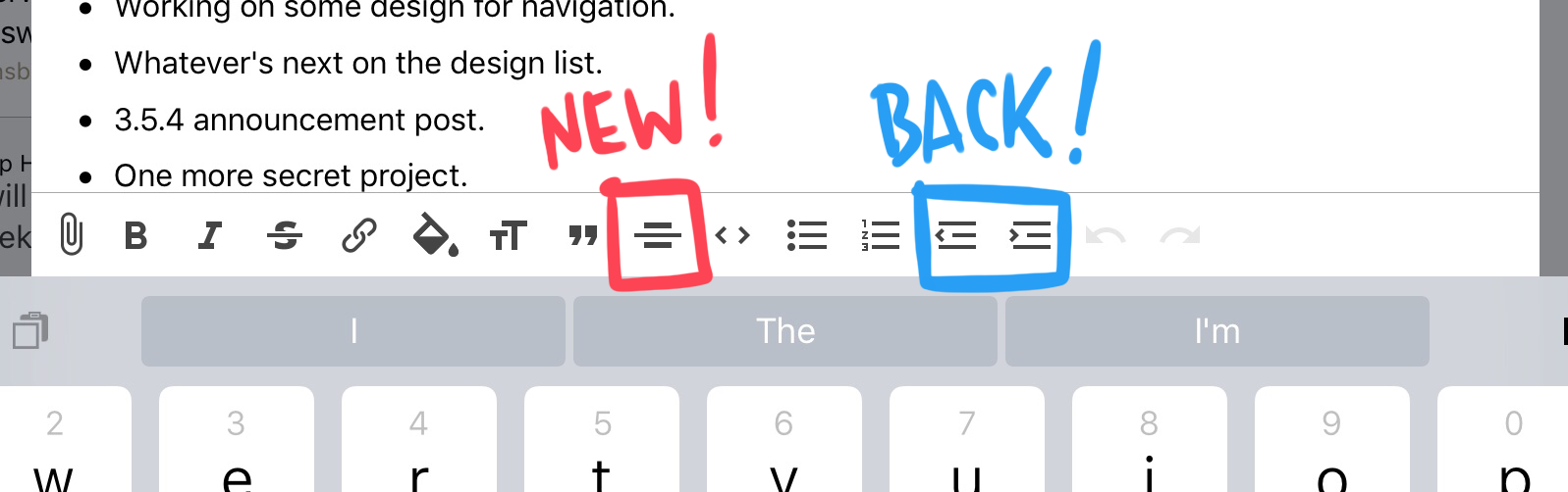
Rich text editing
In our previous release we added support for the new rich Color tool. This time we’ve kept pace by adding support for the new Horizontal Rule tool. We also reversed our decision to match the Basecamp desktop and remove the indent/outdent tools. While normally it makes sense to offer the same tools on all platforms, it’s the tab key that made indent/outdent expendable on desktop. Without a tab key on iOS (unless you have an external keyboard) we left users with no way to indent. This update brings them back.
Horizontal Rule, Outdent/Indent.
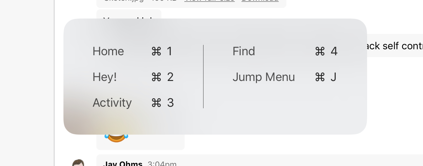
Keyboard Shortcuts
In addition to command + J to quick jump we’ve added shortcuts for quickly opening the Home, Hey!, Activity and Find tabs on iPad.
Hold the command key to see available shortcuts on iPad.
Finally we included a few fixes for issues with iOS 11.
As always, please keep your suggestions, feedback, and found bugs coming our way. We’ve got some neat stuff coming in the next version so if you’re interesting in seeing them before everyone else, we have a few openings in our private beta. Send us an email for details.
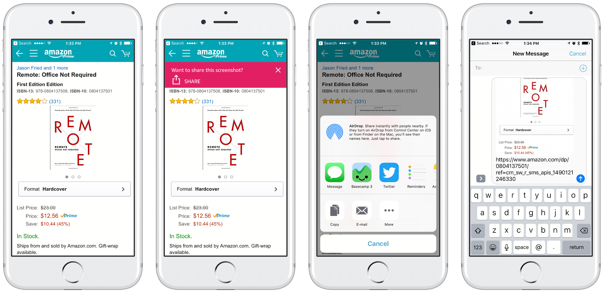
A proper sharing feature has been part of iOS for years. It has a consistent, system-level UI that’s available from most any app with anything worth sharing and yet no one seems to use it. Well, no one but us geeks, right? Everyone else just takes screenshots—which require mastering an unintuitive multi-button press and a fair amount of dexterity.
I moaned when people started posting screenshots of highlighted selections from articles to beat the 140 character limit on Twitter because they just shared a picture of text that I can’t copy, reformat, enlarge, etc. I’ve been that guy when friends send a screenshot of a product rather than a link. Sharing properly is a very type-A process that I dutifully complete out of ease for my friends and respect for the content!
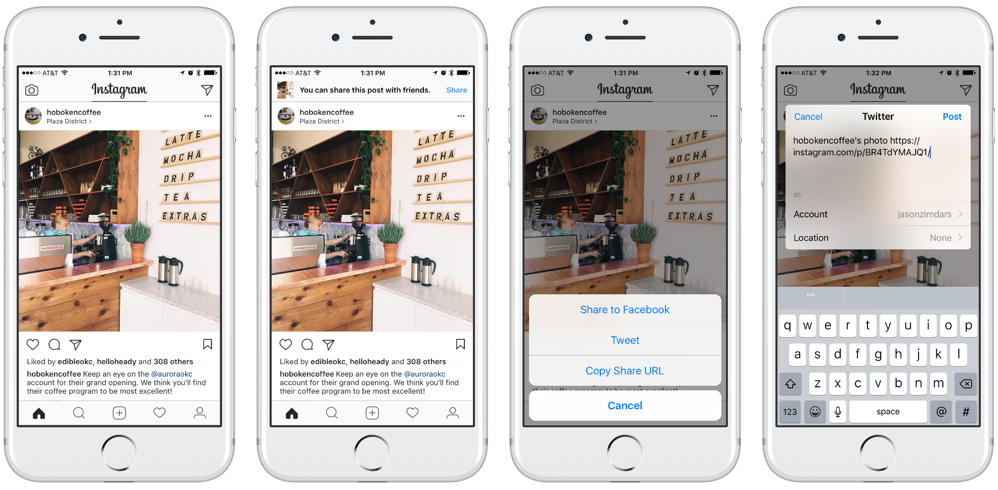
That’s why my inner pedant was delighted when Instagram noticed I had taken a screenshot and gently nudged me to use the proper share features.
Use the hardware buttons to make a screenshot and Instagram is all, “Oh silly luddite, please send people a functional link.” Tapping the Share banner in the second screenshot corrects your bad form and helps you share a URL.
It’s a really nice solution that gently guides the user to the correct way to share. I’ll admit this is probably the solution I’d have designed, too. The built-in Share feature should be easier and yet friends and relatives who can barely download an app find screenshotting to be second nature.
That’s why I was delighted to see Amazon’s take on the same problem. Where Instagram’s design is a gentle scolding, Ahem! I see you have no idea what you’re doing, Amazon’s much scrappier version says, Oh you made a screenshot? Cool, lemme help you with that.
“I got you, bro.”
Amazon shows a similar, though more obvious, banner after you make a screenshot but it does things a little differently after that. For one, it uses the system’s Share Sheet which is familiar and provides a lot more options than Instagram’s custom one.
More important than that, however, is the payload. Amazon shares my screenshot and then adds a URL to it. It’s a subtle difference but Amazon’s version makes me feel better. Where Instagram gets my intent and tries to help me do the right thing, it replaced my content. Amazon’s design let’s me do what I intended but helps me do it better. In the screenshots above a major difference is posting to Twitter. Instagram’s post wouldn’t include an image, Amazon’s would.
As a designer I love being surprised by solutions I wouldn’t have come up with. I can absolutely see how Instagram arrived at their solution. Part of UI design is guiding users back when they go off track. Designers want to change the world by making things easier, more understandable, more enjoyable—more ideal. That completely resonates but I can’t help but admire the audacity of Amazon’s designers who have accepted the world as it is and humbly offered a helping hand. Kudos!
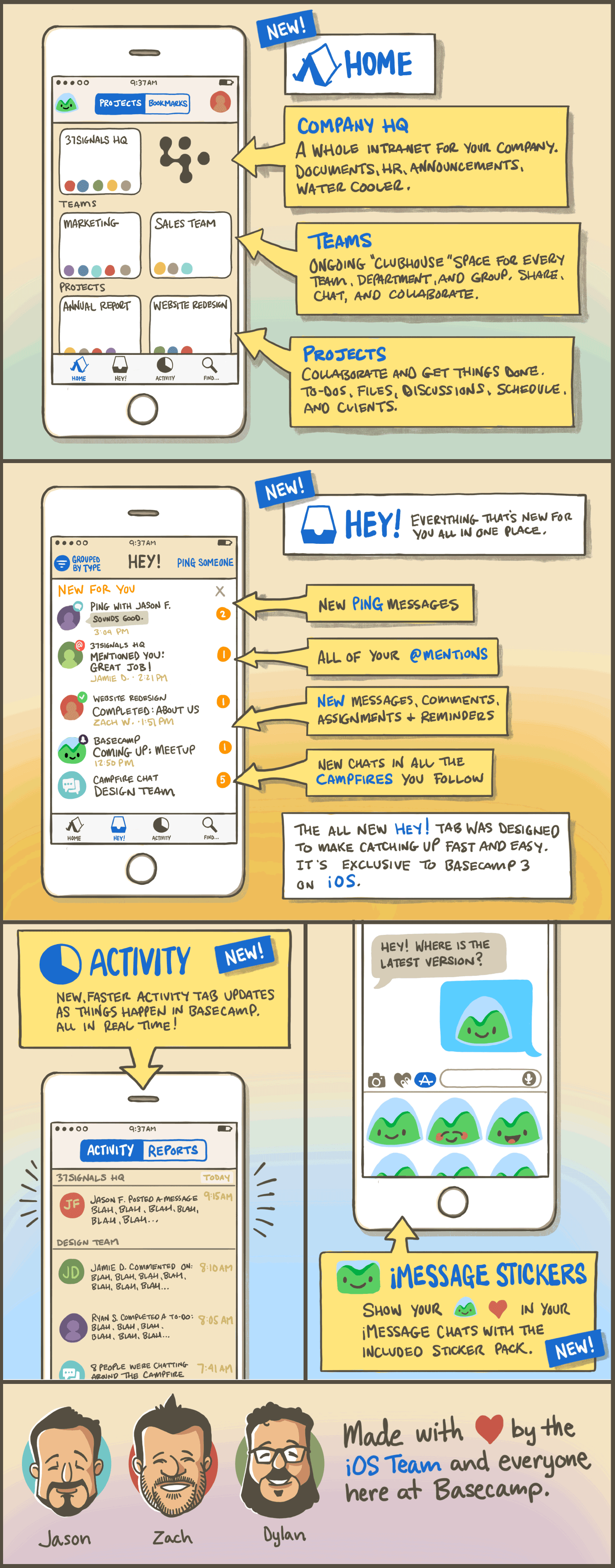
In the year since we launched Basecamp 3 for iOS we’ve shipped 16 releases full of features, improvements and fixes. After all that you might be surprised that the app has gotten simpler, not the other way around.
The most recent release is the biggest yet but it doesn’t include a bunch of new features. Instead, it’s a huge step forward in clarity and simplicity. While it’s nearly a complete redesign, it wasn’t planned that way. We never decided to do a “Major Redesign”, we simply started with a hunch that Basecamp could be much simpler. And then we ended up somewhere great.
Here’s how we set off with a hunch and arrived somewhere entirely unexpected.
It’s full of buttons
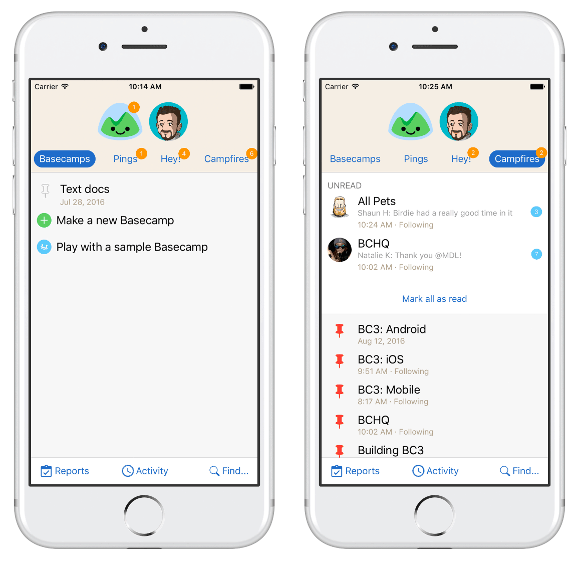
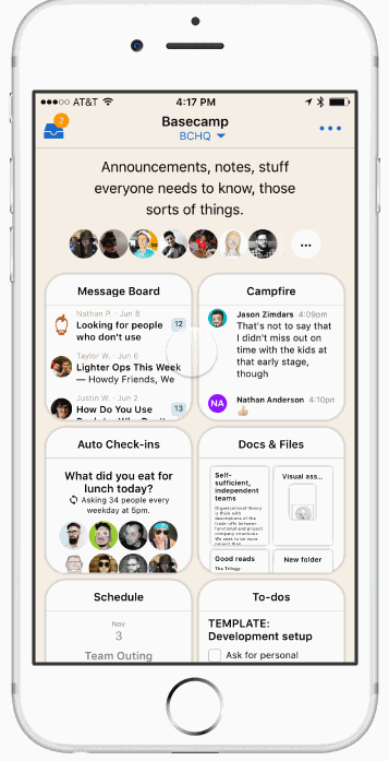
The old Home screen on Basecamp for iOS was the core of the app, the jumping-off point for everything in your projects. It had tabs for Basecamps, Campfires, Pings, and “Hey!”. But that’s not all. It had buttons for Activity, “Find…”, Reports, Me, and HQ. In fact there were 9 buttons in all and that’s if you don’t count the contents of each tab. Four of those buttons could be badged when something new arrived! All that UI chrome could overwhelm the contents of your account, especially if you only had one or two projects. We were especially concerned about this situation because that’s the experience for nearly everyone when they first start using Basecamp.
There are 4 badges, 12 buttons, but only one project (left). The Campfires tab (right) lists all chats and calls out ones with new activity, too.
We thought, “This screen is trying to do too much.” Nowhere was this more evident than on the Campfires tab which listed every chat on your Basecamp account and also called out the ones with new activity. Just this one part of the Home screen was trying to do the jobs of both a directory and an inbox. That was a big red flag.
We also a more radical thought, “Does Basecamp need separate tabs for “Hey!”, Pings and Campfires? Early on we’d decided that having dedicated inboxes for each kind of notification was a helpful way to triage when you have a lot going on. For example, when you’ve got your head down managing a to-do list or writing a Text Doc what kind of notification just arrived matters. A Ping might require immediate attention, but a Check-in Answer could wait. Knowing what type could help you decide if you should break your focus and respond or keep working. The question was did this pattern fit on mobile?
With these two thoughts in mind we set out to explore some new ideas. But first we need to address a bigger insight that would become a driving force throughout the process.
The “us” and “them” problem
Basecamp is the software we use to run our company and literally to build Basecamp, itself. It’s long been a core principle at the company that we’re building software for us and that remains true to this day. After all, we’ll never know our customers better than we know ourselves.
This guiding philosophy serves us well but recently we’ve noticed that we don’t look as much like our customers as we used to. We still use Basecamp much like them but we use it a lot more than they do. Compared to our average customer we have more employees, more projects, and larger teams; we chat more, comment more and have longer to-do lists.
We had a sense that Basecamp’s design overly favored our own usage levels. It elegantly handled dozens and dozens of projects, hundreds of lines of daily chat, constant activity and frequent notifications. But if your account wasn’t like ours, when you only had a couple of projects, or when you were just starting out, Basecamp could be confusing and feel empty.
That our design was optimized for our own use levels was understandable but it made the experience worse for the majority of our customers who didn’t have the same problems we did and that felt awful. Throughout the project as we evaluated designs or responded to feedback from our internal testers we returned to this question, Is this an “us” problem? and that was key to unlocking this design.
The Unified Inbox
Next, we set off to explore a design that we came to call the Unified Inbox. We reasoned that if you weren’t getting dozens of notifications at a time then separating them into different buckets wasn’t all that useful. You don’t need a file cabinet if you’ve only got 3 folders. And it didn’t seem like managing focus was as important on your phone as it is on your laptop.
Having all these places to see what’s new for you seemed like overkill and it actually resulted in more work (jumping back-and-forth), more UI, and more cognitive load. Having all your notifications in one place just makes sense. It’s easier to pick-up when you’re new and easier to explain in a help document or customer support email.
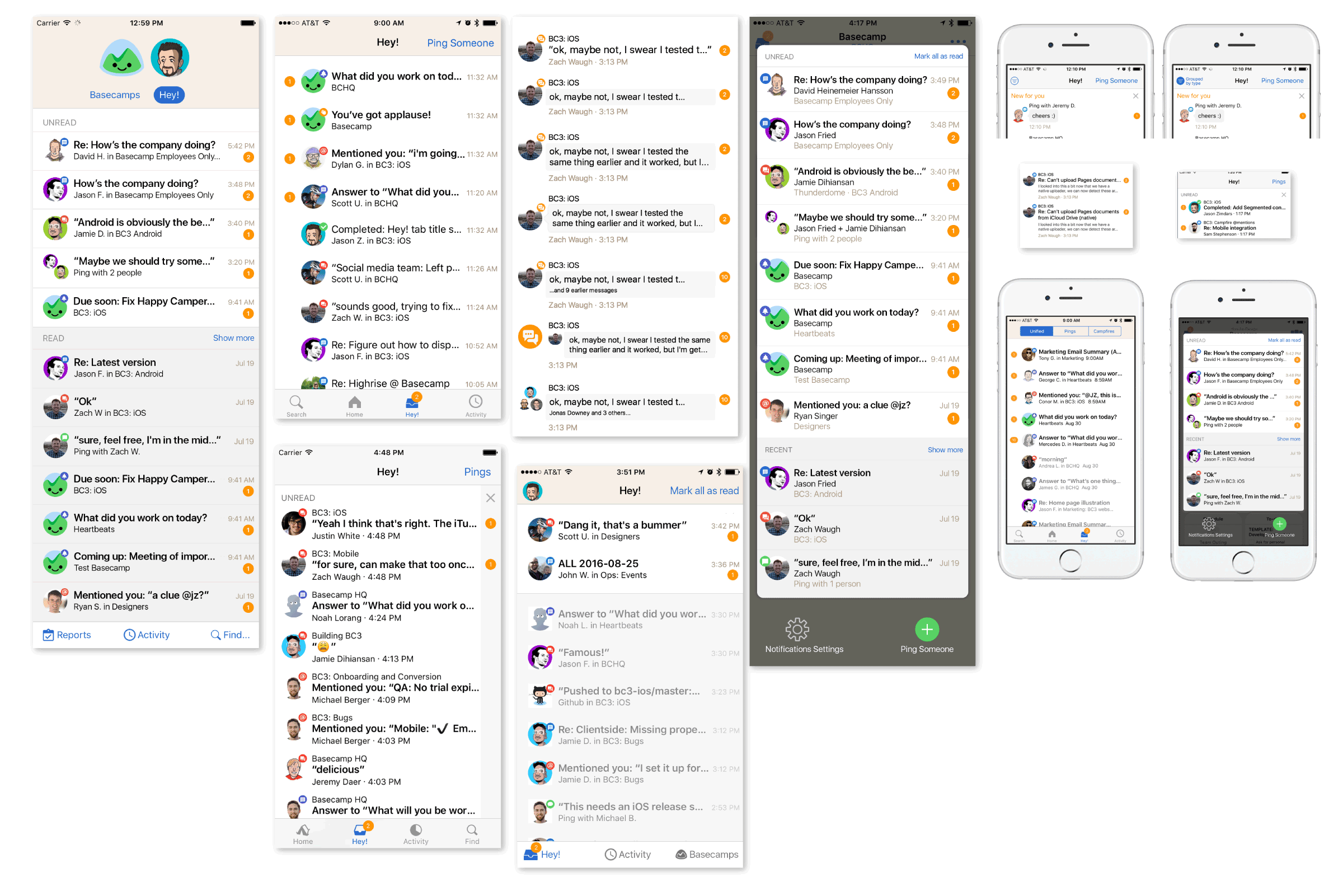
Various early mock-ups of the Unified Inbox
Combining these separate tabs into one screen called “Hey!” was a huge simplification but that was just the start.
Getting around in Basecamp
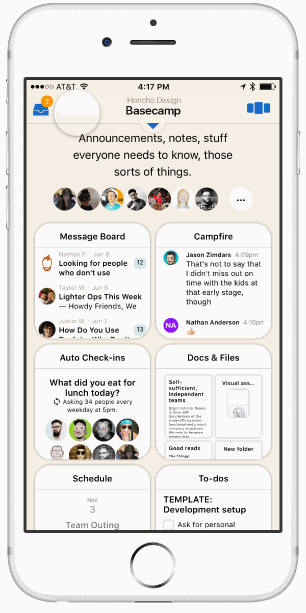
The old Basecamp Home screen was comprehensive but in providing a way to get to everything in Basecamp from one screen, it failed to help users understand what Basecamp was about and offered no hints about what matters most. This led to another radical idea, “What if there was no Home screen?” If your account wasn’t busy, starting each session on a screen that’s all about what’s new isn’t very useful. If Basecamp was all about your projects, why not have the project screen be the root of the app?
We imagined you’d open Basecamp to the last project you visited, it might even be your only project—even better. You’d still need a place to read your notifications when they arrived so a badged inbox button in the Navigation Bar would slide the inbox screen in from the left. If you did have multiple projects another button on the right side would slide a project switcher in from the right. As a bonus these overlaid the screen you were on so you’d never lose your place.
Early protoypes of the inbox and project switcher overlays (left) and a cards-based UI for switching between projects
We jumped into Framer and started building prototypes to try out these ideas. Everything was feeling great and the project switcher was particularly promising. It wasn’t long, however, before we got stuck in the details. If we move x, how will people get to y? Doesn’t z require more taps than the old flow? Progress ground to a halt because a protoype isn’t real and it couldn’t answer certain questions. The way forward was to try our designs in the wild with real data.
Getting Real
We’d been using the project switcher in our prototypes for weeks but it only took a few hours of real world use to see the problems.
When you popped open the switcher you’d see a card for the project you were already viewing. Swiping right-to-left would reveal additional cards from off-screen, one for each of your most recently active projects. But you couldn’t see which card was next until you swiped which meant it was always a surprise which one you’d see. That was hardly intuitive. If the goal was to make it fast and easy to jump in and out of a few projects, this missed the mark. After a day or two we killed the idea completely.
But all was not lost! In a separate build we were also making the Unified Inbox idea real.
Writing real code is an expensive and time-consuming way to explore ideas that aren’t yet fully-formed. That’s the whole reason we started with prototypes in the first place! So we knew we needed to get real in order to move forward but we wanted to write as little code as possible. One way to do that was to plug the Unified Inbox into the existing Home screen. We didn’t need to figure out how to display it in an overlay in order to prove the concept.
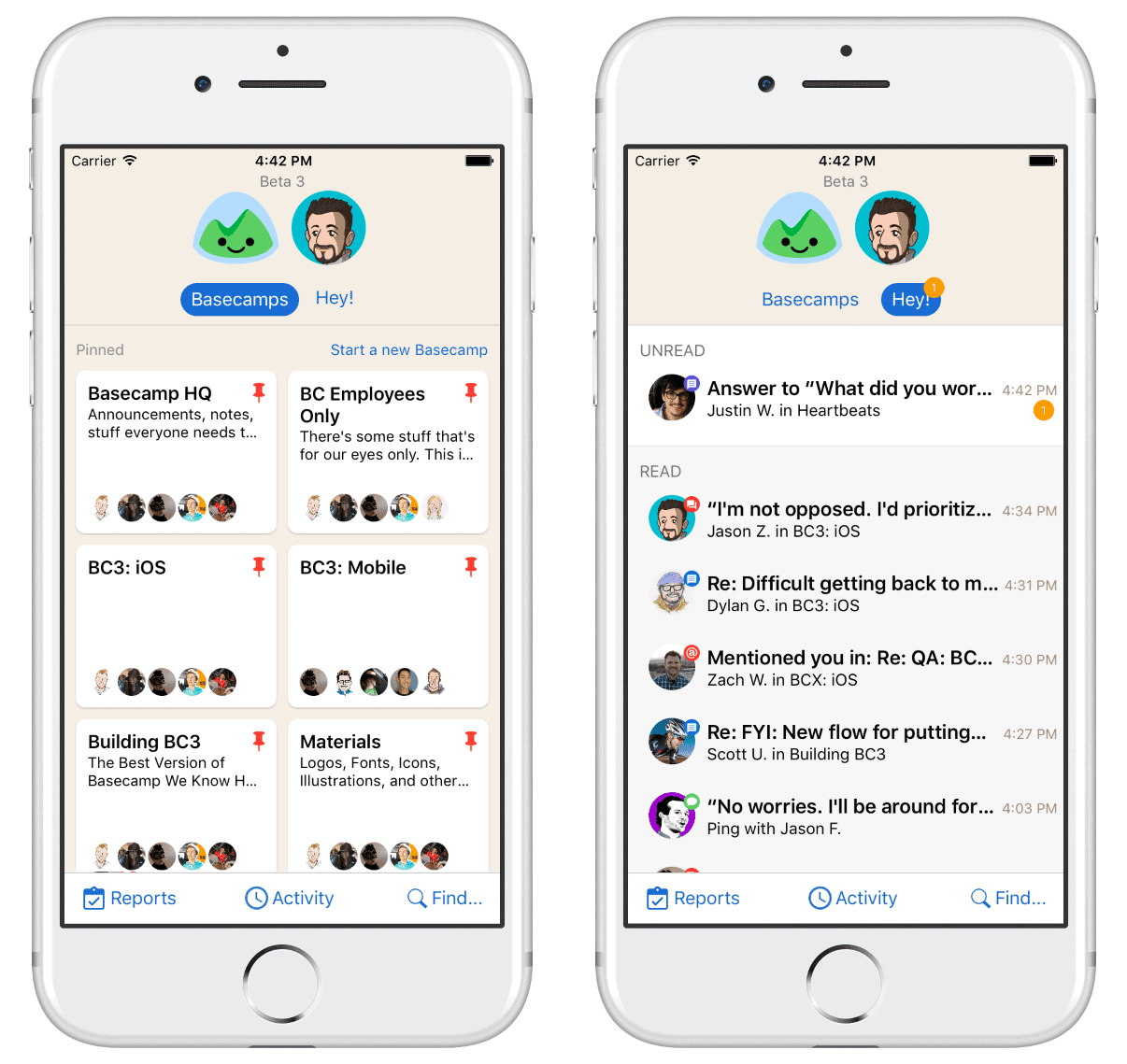
Basecamps (left) and Hey! were a great 1–2 punch. The new cards-based project list was a huge improvement for most users.
We would never have tried this in a prototype but it worked great. Even better, one of our web product teams was working on a new design for the Projects (formerly Basecamps) screen that fit nicely. The one-two punch of Projects and Hey! was a great simplification. The constraints of writing real code took us down a path we didn’t expect and we never went back to the overlay design.
Putting it all together
We knew we were getting close and that’s when an old idea resurfaced. Earlier, Zach Waugh and Dylan Ginsburg had each proposed we try a standard iOS Tab Bar. The reasoning was sound: it’s a stock UI component on iOS that’s very flexible, widely used, and well understood by users.
I was concerned it would make Basecamp look generic and convinced it was a poor fit for Basecamp’s deep, hierarchical navigation which could leave users in a confusing state where multiple tabs were several screens away from the root view.
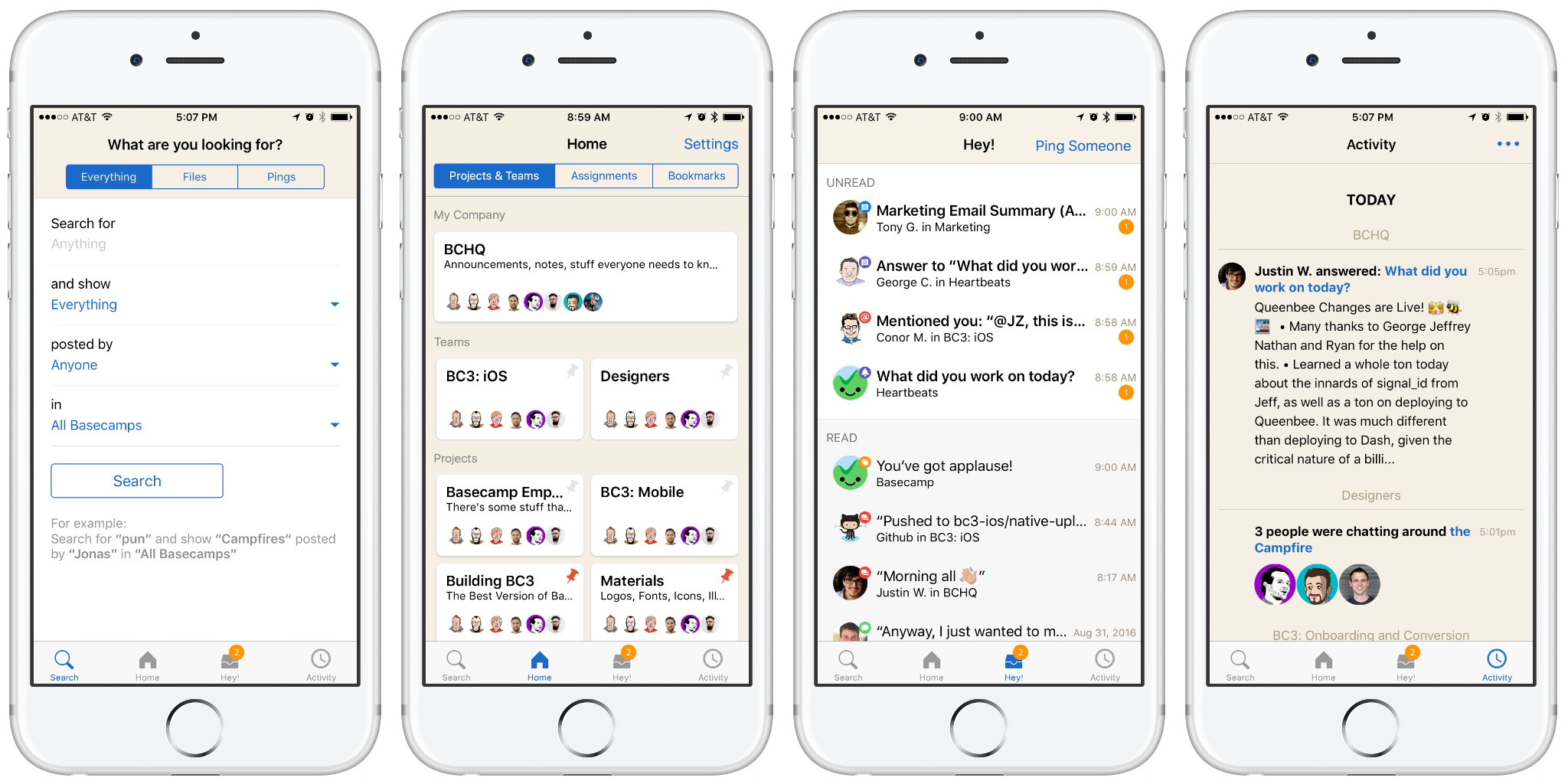
Dylan persistently pushed an internal build to prove the point. He was right, it was great. Conceptually, Basecamp was now four memorable and understandable places: Home (your projects), Hey! (your notifications), Activity (what’s going on), and Find…(search for something).
An early design for each tab. Note the odd order of the tabs. We’d reasoned that the most-used tabs should be close to the center which is easier to tap than the far left and far right of the Tab Bar.
Finishing touches
We pushed the new tabbed design out to our internal testers with great excitement. Feedback was very positive and everyone seemed to agree this was a big step forward but one issue kept coming up: the Unified Inbox could feel overwhelming at times. With a lot of notifications—all using the same template—it could be hard to pick out the important stuff. At first, my instinct was to pushback on this as an “us” problem but I began to see that in some ways it was a step back.
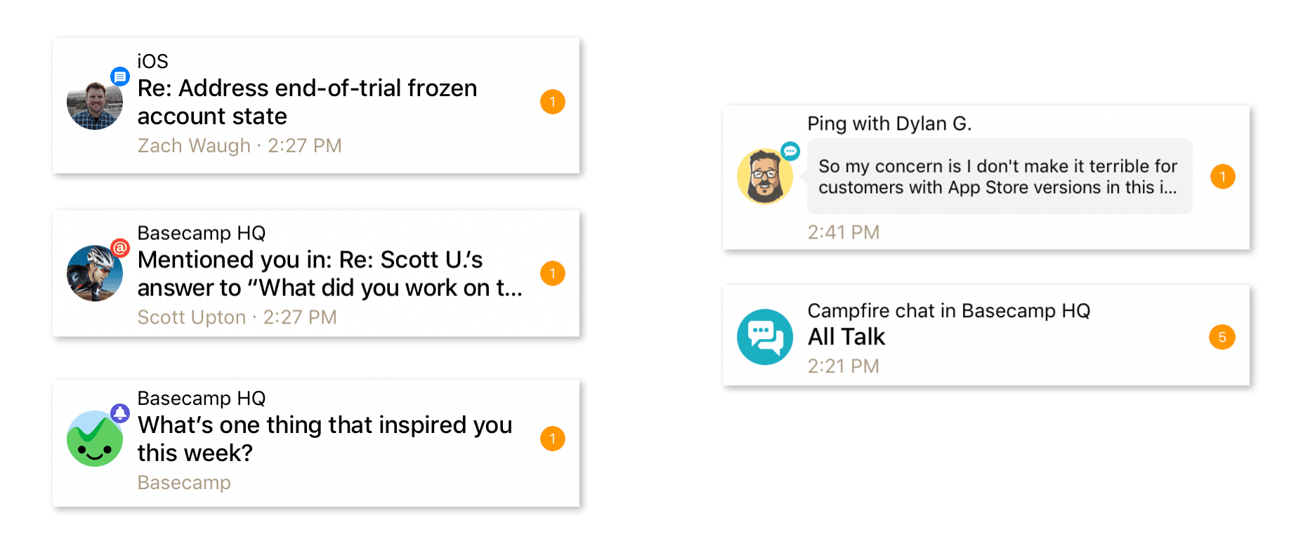
Being able to visually spot a new Ping or @mention was important but we couldn’t agree that one type was more important than another in every situation or for every person. It was a highly personal thing. We considered grouping them by type, pushing kinds to the top of the list, even going back to separate tabs inside Hey!, but in the end all it took was a little graphic design to right the ship.
Messages, @mentions, and reminders (left) share the same visual design while Pings and Campfires have a unique look that makes them easy to pick out of the crowd.
We made thousands of decisions, reacting to and building on the iteration before, all based on using it as we worked. New ideas came from people across the company, not just designers. It was only through that process that the ideas developed, through building and using it day-to-day that they matured, and only then could we see how they converged into something completely new.
We’re excited that Basecamp hasn’t just gotten better and more feature rich over the past year (it truly has) but I’m most proud that it also got simpler. We hope you agree and Basecamp is making you feel more in control of your company and your work.
Basecamp 3 is available on iOS, Android, Mac, and Windows — and anywhere you’ve got a web browser and an internet connection. Still haven’t tried Basecamp? Here’s what a 1,000 of our customers said when we asked, “What’s changed for the better since you started using Basecamp?”
Basecamp 3 is one year old and we’re celebrating with the most significant update since launch last fall. It’s available now in the App Store! Here’s a quick look at what’s new…
Basecamp 3 is also available on Android, Mac, and Windows — anywhere you’ve got a web browser and an internet connection. Still haven’t tried Basecamp? Here’s what a 1,000 of our customers said when we asked, “What’s changed for the better since you started using Basecamp?”