How a Basecamp feature was born

Follow along as I share screenshots, scraps, and conversations that birthed a tiny little Basecamp feature.

👋 Hiya, I’m Conor, one of the designers at Basecamp. Before joining Basecamp I remember reading some neat posts by Jason Zimdars where he shared how a feature got from A → Z. In the spirit of JZ’s old Design Explorations I wanted to share a behind-the-scenes look at how things unfolded for a recent feature I worked on.


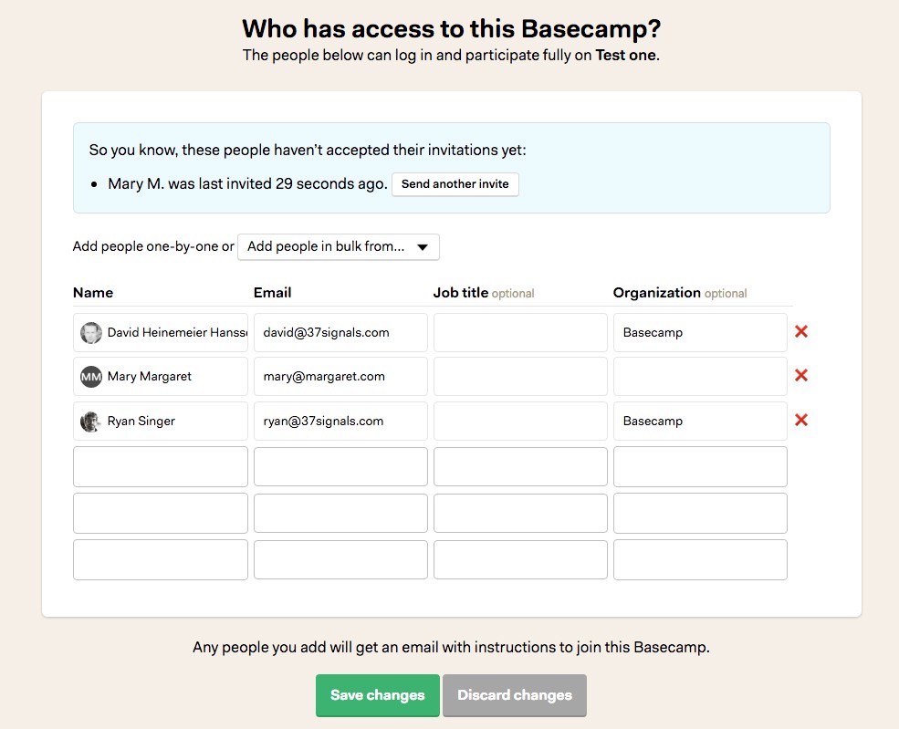
People couldn’t re-invite a teammate to Basecamp

Every day people write into Basecamp support asking if/how they can re-invite a teammate to their Basecamp 3 account. Sometimes the person simply missed their invite email among the hundreds of other emails they get every day. For others, it looked like spam, so they trashed it. Whatever the cause, it was clear that people should be able to re-invite a teammate who can’t figure out how to get into Basecamp. But they couldn’t without writing into our support team 🙁

When this project was slated for our current cycle, I was eager to tackle it. In fact I was apparently so eager that I’d already spiked an idea for solving this very problem nine months earlier!

Screenshot from an old and dusty branch I’d started 9 months earlier!

When I started digging into this feature, I was focused on a couple situations:

Situation #1

Someone specific has told me they can’t access Basecamp and that they never got an invitation, so I want to check if they were invited and resend an invite if needed.

Situation #2

I’m not seeing people participate in Basecamp as I hoped. I want to check if they ever got in, and re-invite them if they didn’t.

So I dusted off that old pull request, and thought: yeah, that was a decent solution. But I quickly ran into a problem, the screen had been redesigned since then. Dusting off my old branch wasn’t gonna work.

The new design meant I couldn’t just use my old branch…a good thing it turns out!

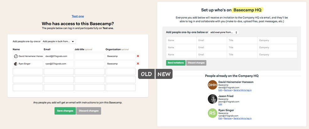
No worries, I quickly threw together something similar for the new design:

Calling out the folks that haven’t accepted their invite in a special block up top.

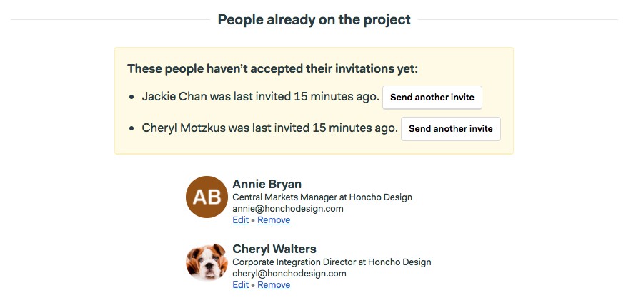
But…what would this look like when I first invited everyone? I’d have the list of people on the project below, and then a list of all the same people (minus myself) listed in the yellow block above. That seemed pretty lame. Was there a better way that avoided all the duplication?

Ugh, duplicates for every person, and soooo much unneeded repetition.

How about just putting the “resend an invite” links alongside the edit and remove links?

Why do some people get a link, but not others?

That’s definitely less repetitive, but it quickly raises more questions than it answers. Why can’t I re-invite some people? Is something broken? How can I help Cheryl or Jared to get in, the link doesn’t show up by their names?

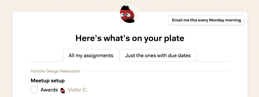
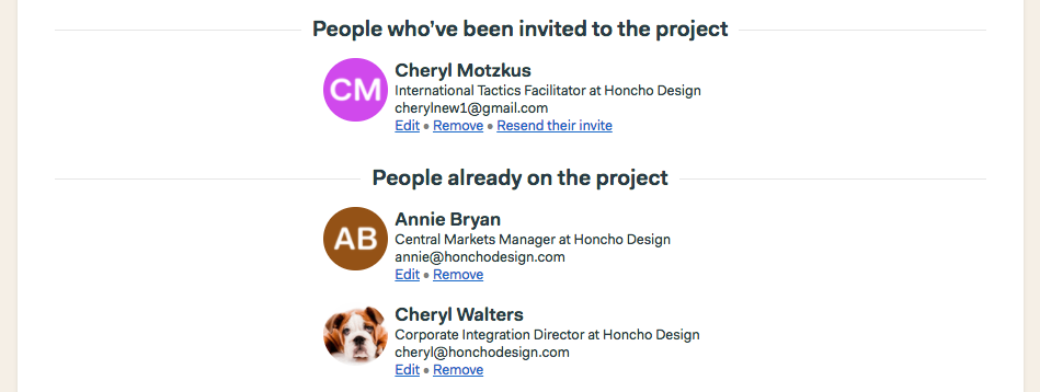
Aha! I could kinda go back to two lists of people — but this time without any repetition. That would give me room to explain why some people get links, and others don’t. And if you were wondering if someone had accepted their invite, you could quickly get the answer:

Really drawing attention to the invited folks, but without duplicating them.

Getting some feedback

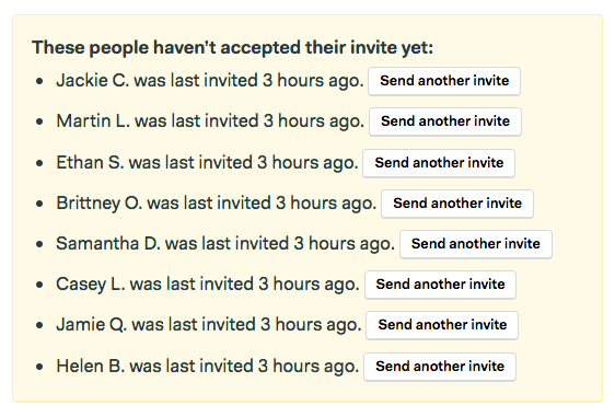
I shared that with a couple teammates to get their thoughts, Ryan helpfully poked at what looked like a speculative situation I was basing my design on. Here’s a screenshot from the discussion:

What Ryan had to say about my pitch for the design I shared above.

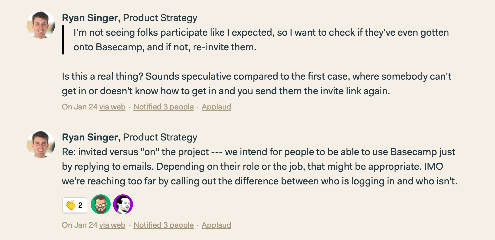
Now, I knew that this situation wasn’t totally speculative, because I’d actually been there myself. But what Ryan made clear was that it probably wasn’t the common case. He also reminded me that we’re happy to support folks that choose to use Basecamp via email only, calling those people out didn’t seem fair.

When a piece of UI isn’t a slam dunk, it usually isn’t worth the effort to build and maintain. So I decided not to worry about the situation where someone’s trying to figure out who’s gotten into Basecamp.

Jason also dropped some fresh perspective that helped flip the job of the feature on its head:

What Jason had to say about ditching the word “invite”

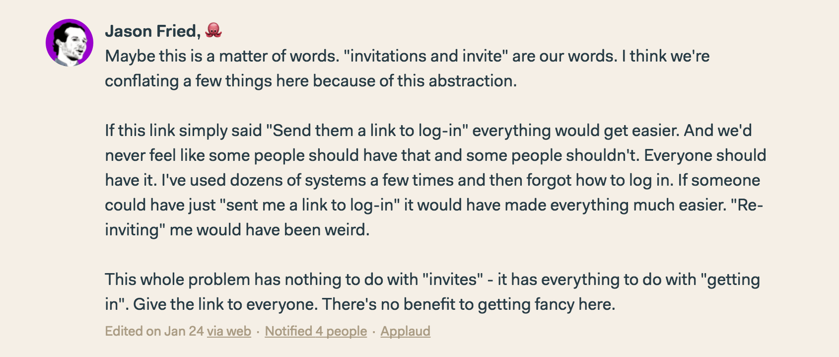
It turns out that the word “invite” brought all sorts of baggage with it. People weren’t trying to “re-invite” their teammates, they were just trying to help their teammates get into Basecamp—by whatever means necessary!

A clearer problem

By cutting out the stuff that wasn’t a slam dunk, and ditching the baggage of the word “invite”, I was left with a clearer problem to solve.

I need to help a teammate get into Basecamp.

A clear problem makes for a fisher-price-easy solution. Now if a teammate is having trouble getting into Basecamp, I can just send them a link to log in.

You get a link, you get a link, you get a link, everyone gets a link!

Putting the link by each person’s name makes it easy for me to help any of my teammates out.

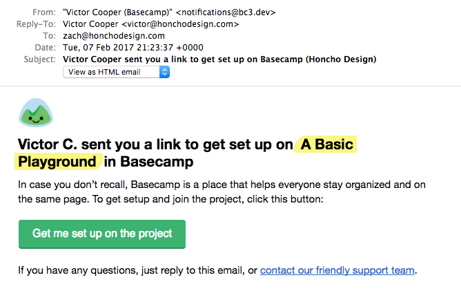
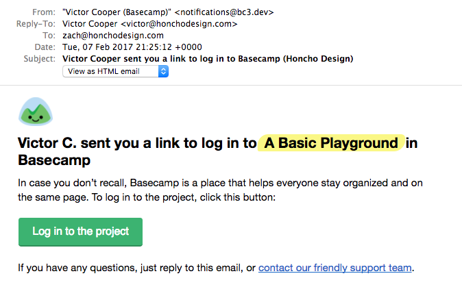
Finishing things off with an email

Now I just needed to make sure that when I clicked that link, the email they received gave them a clear path forward. I hooked up an email that is 98% the same with a couple small copy tweaks depending on whether the person has logged in to Basecamp before or not:


Left: never logged in before, so they need to get set up • Right: just needs the link to log in

There you have it, a simple feature from A → Z! I hope you enjoyed this little peek into how a small batch feature came into being at Basecamp. If you’d like to see more of this kind of thing, please tap the 💜 to let me know.

Transforming a screen with a few questions

Some scraps and learnings from the workroom floor

Recently I’ve been working on an update to Basecamp 3 that’ll give people a couple more options for how they sign up and log in to Basecamp. People will be able to choose from using a password, their Google account, their Facebook account—or all three.

Huh, why write about that, there’s nothing special there? I know, right!? I’m not sharing this because there’s anything groundbreaking in the feature, but because I found myself re-learning the importance of looking at my work critically, and honing things in by asking and answering a few simple questions along the way.

So, as we start offering multiple methods to log in to Basecamp, we need to also provide a place for people turn each method on or off. Let’s dive in and take a look at my first iteration on this screen.

Getting the mechanics in place

I started by carving out a screen to hold all the login options that are available to a person. I was thinking about this screen as an unfortunate (but necessary) evil for letting people toggle these login options.


Take one look at this first iteration and it’s clear that my attitude was showing through 😳. Sure, you can turn Google off. Yes, you can start using Facebook. Yeah, you can figure out which options are on or off…you just have to read every single word on the page!

The mechanics were there, but there was no soul, and no clarity.

What is this really about?

I’m still not clear what I’m looking at here or what the options actually are… Ok, I finally figured out I’m using Google…

…right now there’s a lot of parsing to do. You could have Facebook on, but you’d have to scroll through two other options first that are calling you to do something. It’s unclear if this screen is informational, or transactional, or both.

After getting the above feedback, I realized I hadn’t really stopped to think on what this screen was really about. Sadly, this is a mistake I’ve made many a time! It can be all to easy for me to start with the mechanics and then just leave it there.

So I asked myself, what is this really about? After a bit of thought, it was clear that I was hoping to do two things:

  1. Give current state of the world
  2. Offer any additional options

Explaining the current state of the world was something I was already trying to do in each individual login method’s copy, but totally failing to express holistically. If these two things were really the purpose of this entire screen, why not structure everything around them?


A big step forward. Now the screen tells me what’s set up right now, and what my other options are. But…it still lacks clarity and precision! I have to read the entire thing to actually understand it.

The first time around I missed the forest for the trees—state was expressed in the individual blocks, but not holistically. This time around I missed the trees for the forest—the screen has the right structure, but the blocks are confused and seemingly unaware of their context.

I mean, who wants to read three paragraphs just to get a sense of what there current options are?

How can I make this clearer?

Now that the screen’s structure reflected its purpose, it was time to tighten things up and double down on making it as clear and precise as I could.

Could I say this more efficiently?
The first step towards clarity was to remove a lot of words.

“Right now you can log in with…” becomes “Today, you log in with…”

“You can add the option to log in with…” becomes “Add more ways…” because folks already know what we’re talking about.

The paragraphs describing how “you’re set up to login…” for each active login method are just repeating what the heading tells us. Drop those.

Sometimes words are too wordy, and an image can speak more efficiently. Adding icons for each login method made it easier to see what’s on/off without even having to read beyond the headings.

Oh, and speaking of headings, we don’t need that “Login options” title up top anymore — gonzo!

(oops, just noticed that “login” should be “log in” here!)

The final (for now) product is a lot better. The whole and the parts are working together. It’s clear what the state of the world is, and I can easily see my other options. The words are precise and clear.

The questions I asked along the way

Like I said, no groundbreaking designs here, but I was surprised at what asking a few questions did to transform this screen.

Here are the questions I used along the way:

  1. What’s this screen really about?
  2. Is the overall screen oriented around that purpose?
  3. How about the individual building blocks?
  4. Could I say this more efficiently?
  5. Is there anything I could remove (or add) to make this clearer?


If you haven’t already, head over to Basecamp and start a free account. You can get going with either a password or your Google account—we haven’t gotten to Facebook yet.

Two new email reports in Basecamp

Until today there’s only been one way to stay caught up with all the activity on your Basecamp account, and one way to see what’s on your plate—both required you to log in to Basecamp and check yourself. Now you can have each automatically delivered to your email inbox.

Stay caught up with the daily activity email

Get a daily summary of all the activity across your account—even if you weren’t directly involved in it. Now you’ll get a daily email summarizing everything that happened since yesterday morning. If you’re working with clients, activity on the Clientside will be front and center with a special callout. After that you’ll get a rundown of all the new stuff that was added, and finally any discussions that took place.


Stay ahead with the weekly assignments email

If you’re like me and use assignments to keep you on track, you’ll enjoy starting each week with a full email report of what’s on your plate. Any assignments due this week or overdue — hey, it happens! — will be called out at the top for you.


Starting and stopping your email reports

Decided you don’t need these anymore? Just tap the link to “turn this email off” at the bottom of your email report or visit the Latest activity screen and the My assignments screen and click the orange button that says “Emailing me…”. Want it back on? Just click the “Email me…” button again.

Send me a daily email of what happened

Send me a weekly email of my assignments

We hope these new email reports make it easier to stay caught up, and stay ahead—all without even logging in. Happy Basecamping!