Options, Not Roadmaps

Since Shape Up came out, many people asked some version of this question:

I understand you make bets six weeks at a time. But how do you plan in the longer term? Don’t you have some kind of a roadmap?

The short answer is: no. We don’t have roadmaps. We think about what to do at the timescale larger than single bets, but we do it in a different way.

Why not a roadmap?

No matter how you try to hedge it, a roadmap communicates a plan—a series of commitments—to other people.

We of course have lots of ideas about what we’re going to do next. But we don’t want to make any commitments, internally or externally. This is very important.

What’s wrong with committing to future work?

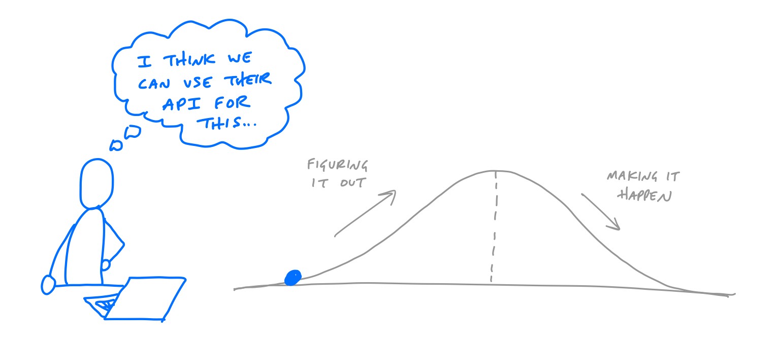
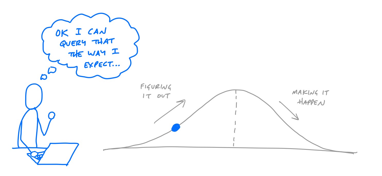
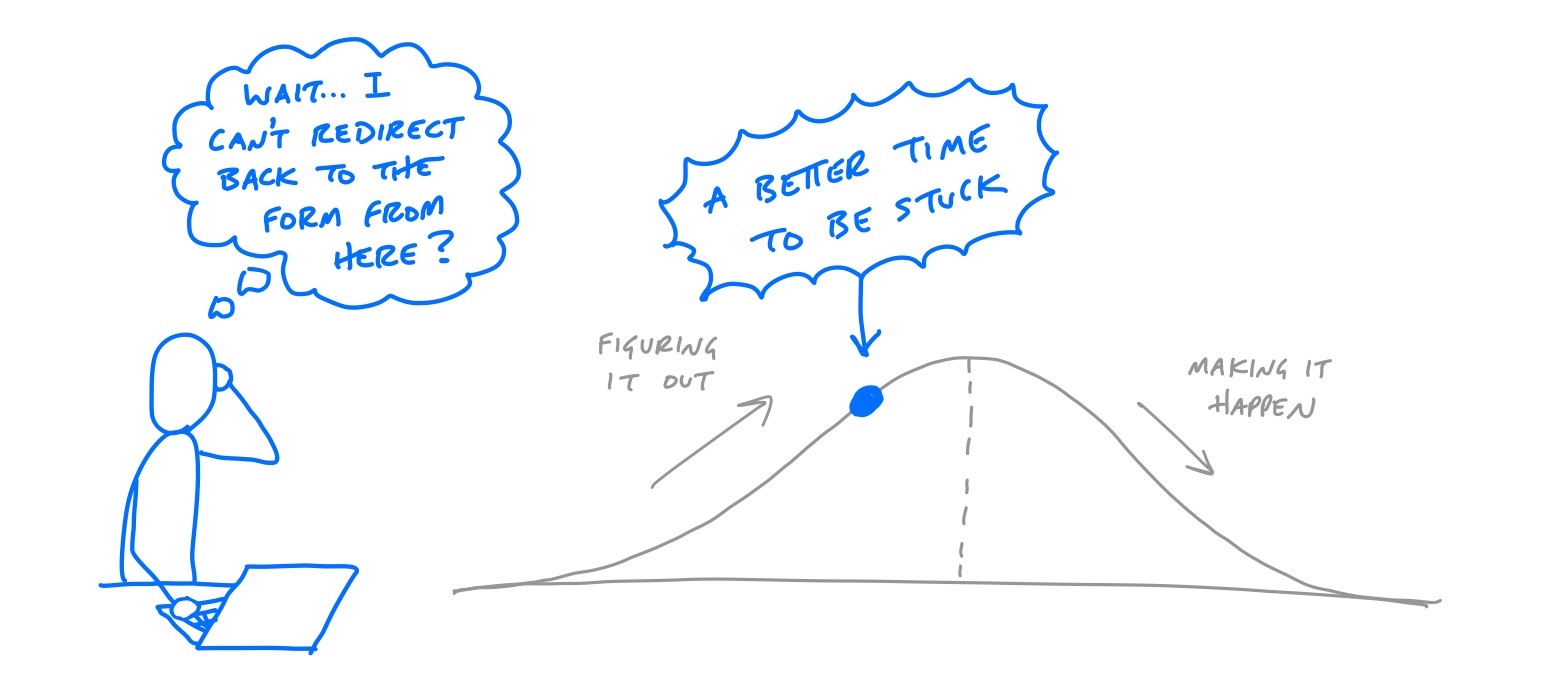
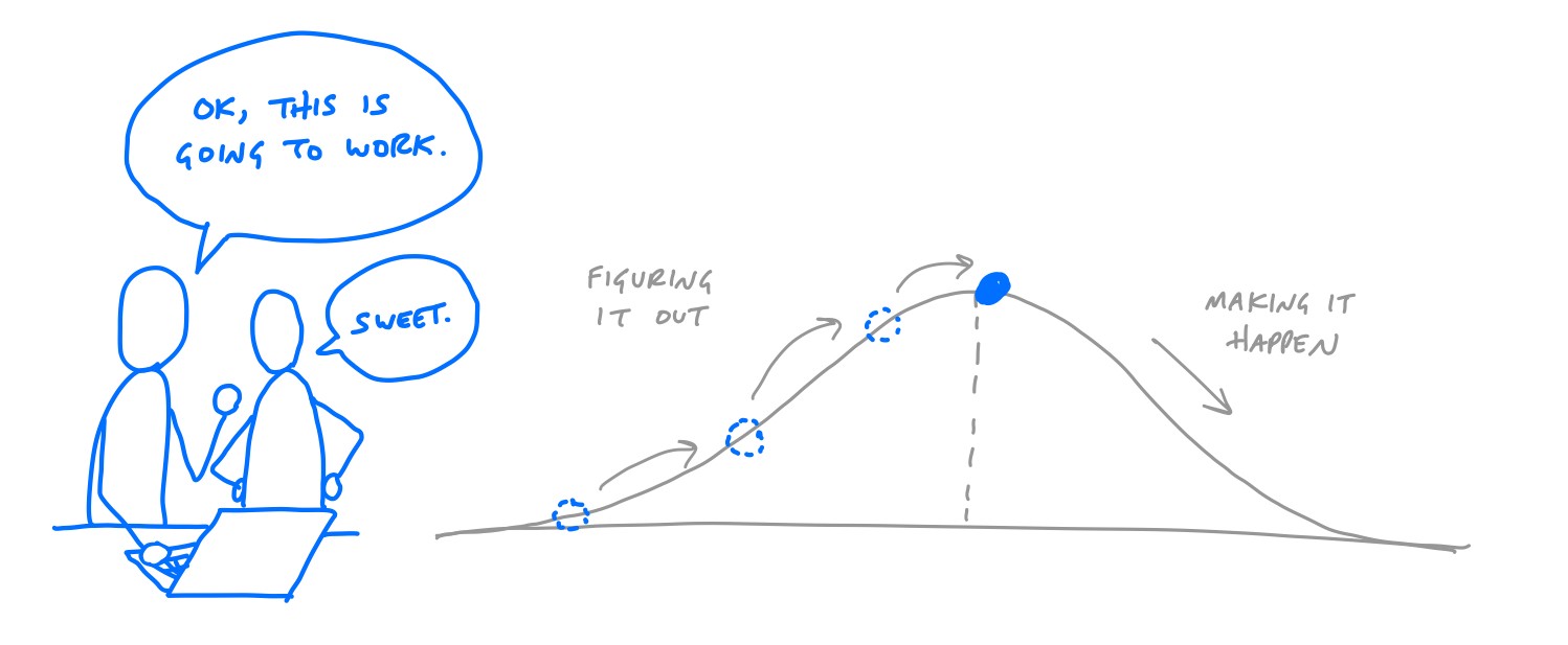
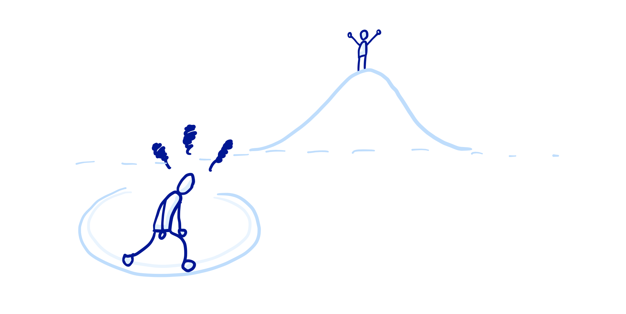
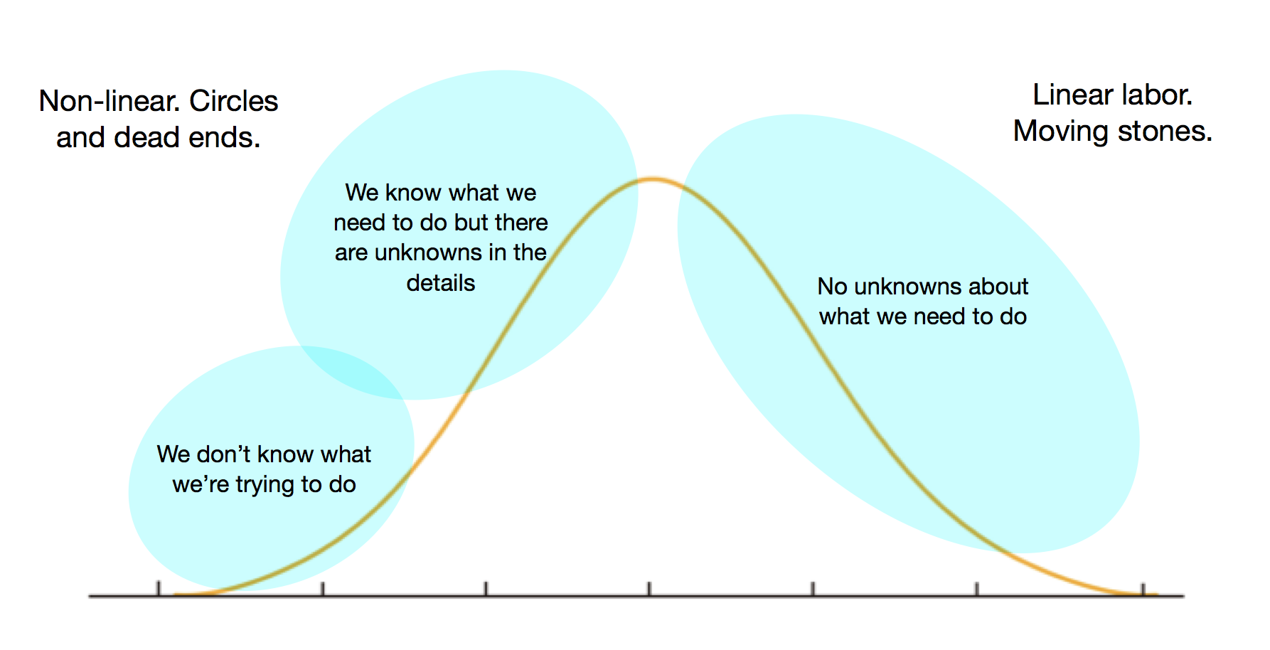
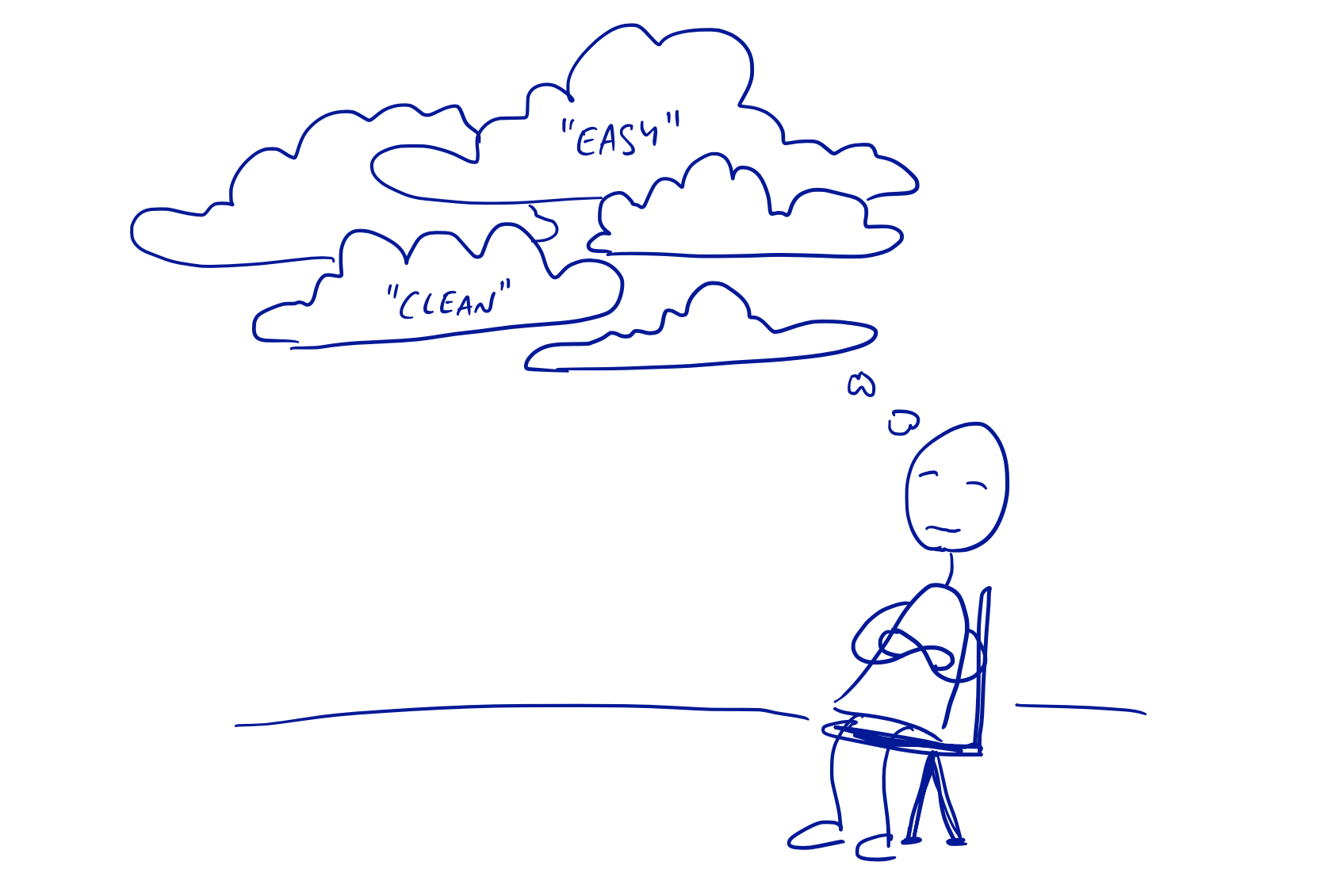
First, there’s the uncertainty. We don’t have a crystal ball. Say we have features A, B, and C we want to build. We don’t know if A is going to work out as planned, and what that would mean for B. We don’t know if we’ll have a eureka in the bathtub one day, and new idea X will suddenly feel much more important than B or C. Or we might start building out B, only to realize that it’s not what we want or it’s harder than we thought and want to bail on it.

In short, we don’t know enough to make good on any promises.

Second, there are expectations. Leadership might be ok with changing course, but what about everyone who saw the roadmap and was eagerly awaiting feature C? What about the conversations with customers where someone in the company assured them to just hold tight because C is coming? Despite our best intentions, if we say we’re going to do something, it’s going to be really hard to back out of that, both internally and externally.

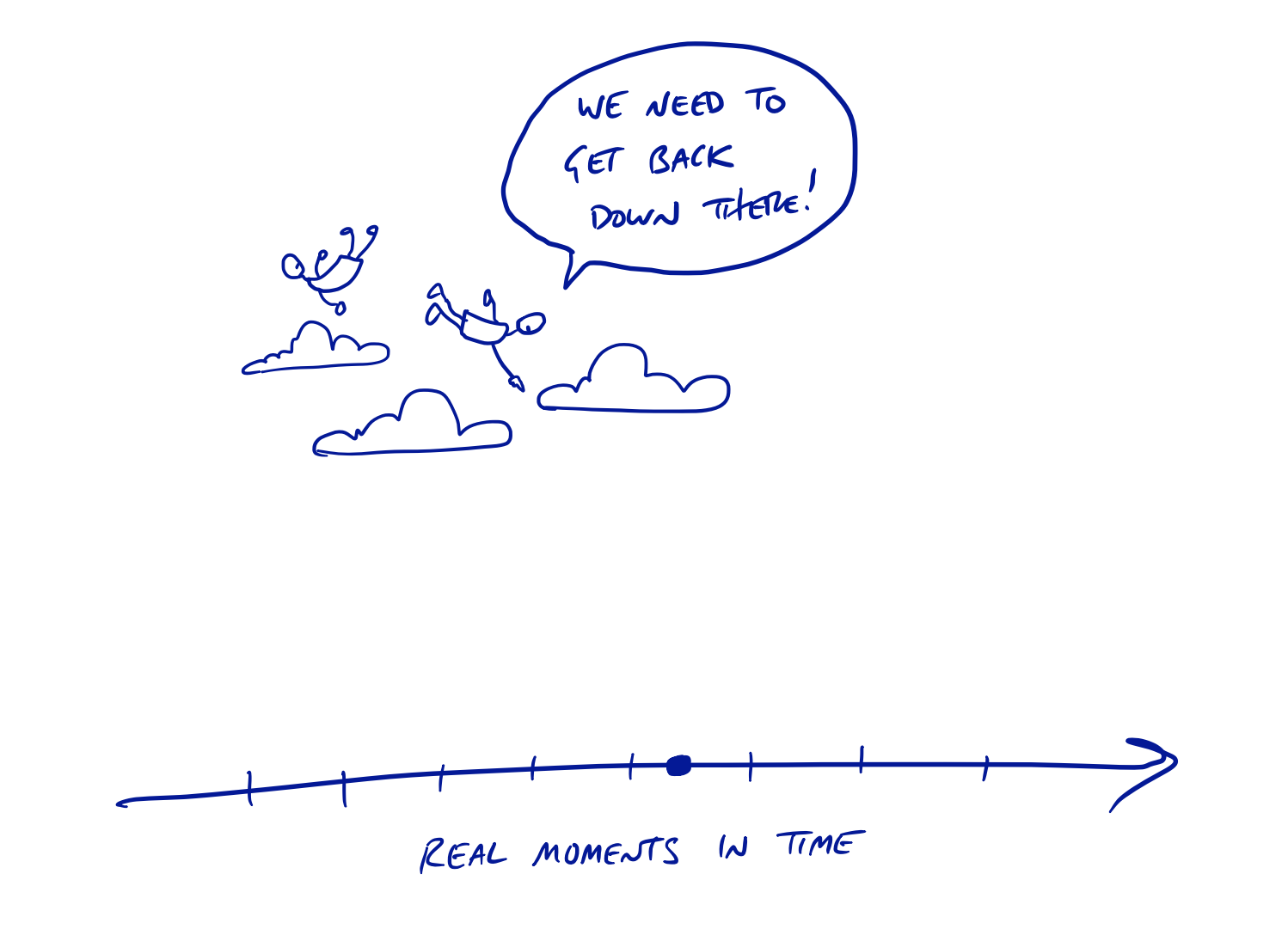
Third, there’s the guilt. Yeah, guilt. Have you ever looked at a long list of things you said were you going to do but haven’t gotten around to yet? How does that list make you feel? The realities of life and uncertainty show us that 100% of the things on the roadmap are not going to happen on time the way we imagine. And meanwhile, the world is not going to stop and wait for us to finish the old list. New ideas are constantly coming up. New requests and new problems constantly arise. If we hold ourselves completely to the roadmap, we’ll have to say no to new important things we actually want to do. And if we interrupt the roadmap to do those new important things, we’ll have to push back other things we promised. And that won’t feel good.

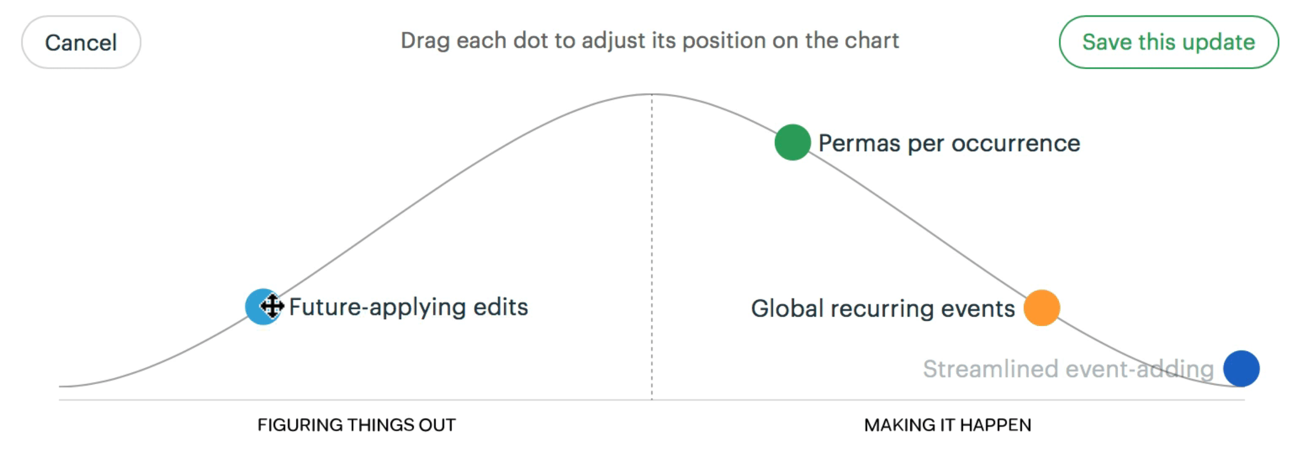
Our solution was to stop making commitments and start collecting options.

A portfolio of options

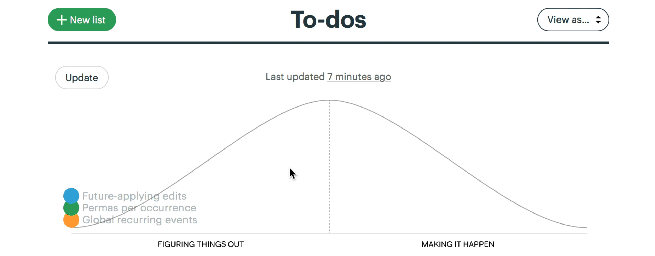
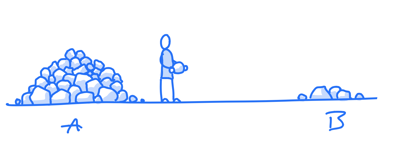
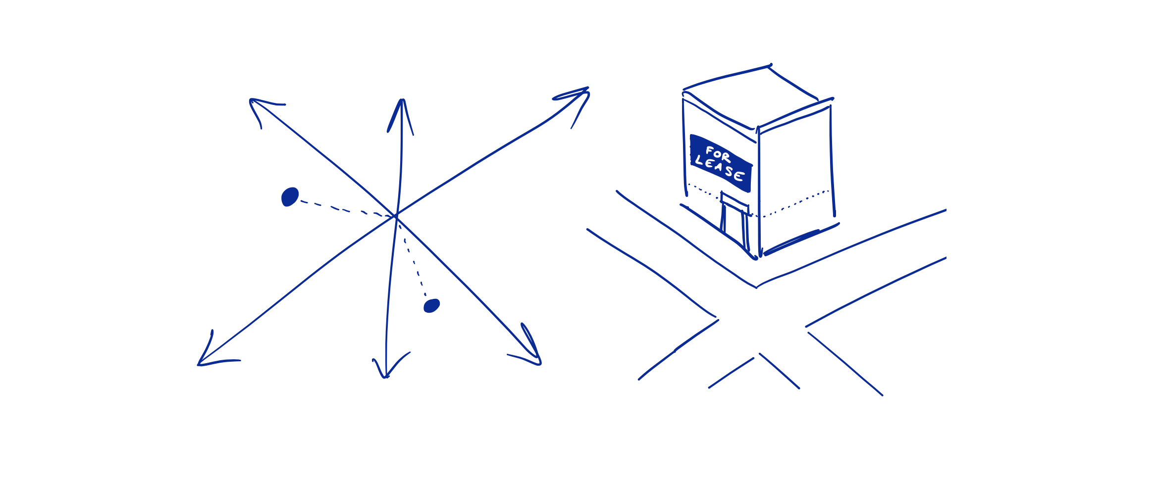
An option is something you can do but don’t have to do. All our product ideas are exactly that: options we may exercise in some future cycle—or never.

Without a roadmap, without a stated plan, we can completely change course without paying a penalty. We don’t set any expectations internally or externally that these things are actually going to happen.

That means no explicit promises and no implicit promises either. A list on the wall or in some official strategy document is an implicit promise: “this is what we’re doing next.“ There is no official list of what we’re doing next anywhere in the company.

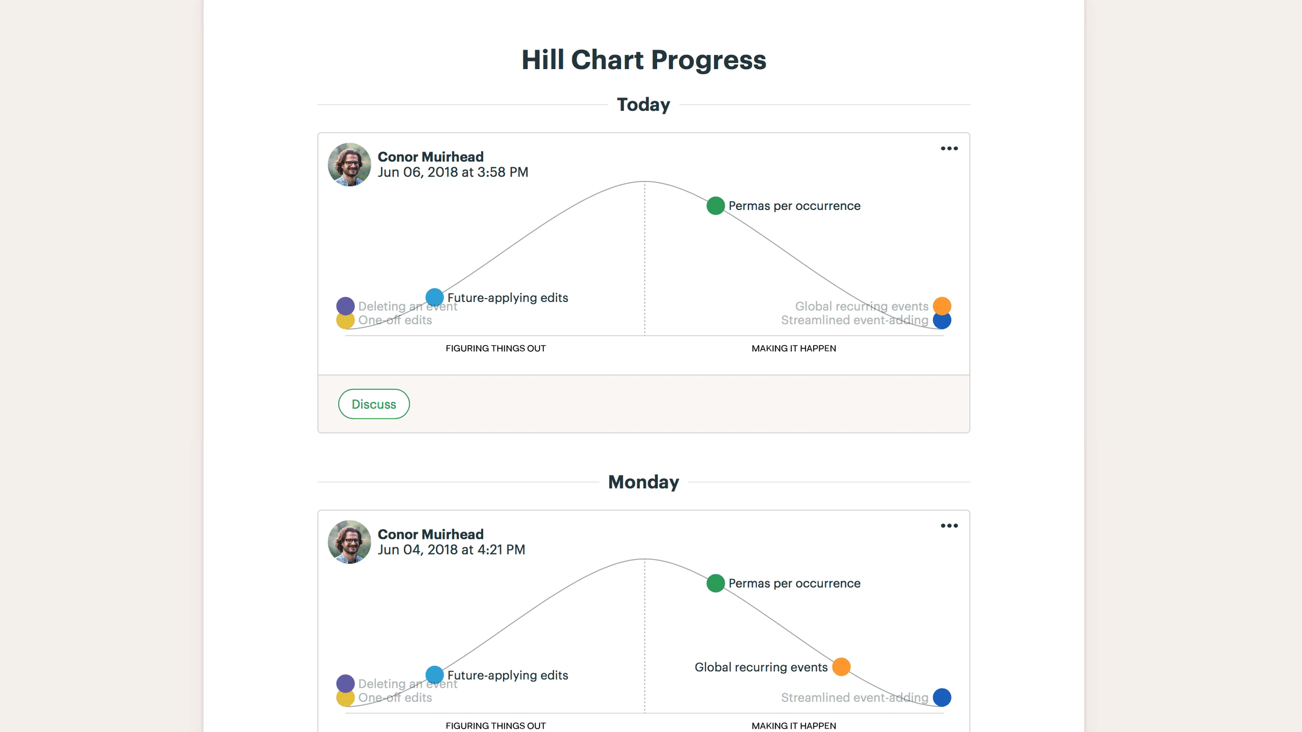
When Jason (CEO) and David (CTO) decided the company would spend X cycles building out HEY, they didn’t have a roadmap. They had what they thought was a good set of options. There were enough good ideas for how to flesh out the app that they felt confident saying “we’ll dedicate X cycles to this.” They decided on which actual ideas to build one cycle at a time.

The overwhelming majority of our good ideas have never been built and never will be. There are things we have badly wanted to build for years that still don’t exist. Why? Something always came up. And that’s ok!

Because we aren’t committing to a roadmap, we aren’t setting expectations. And because we don’t set expectations, we don’t feel guilty when that great idea never gets any build time because we decided something else was more important.

Keep digging

I’m reviewing transcripts from interviews we did with customers last year and came across a nice example of interview technique.

The hardest thing about customer interviews is knowing where to dig. An effective interview is more like a friendly interrogation. We don’t want to learn what customers think about the product, or what they like or dislike — we want to know what happened and how they chose. What was the chain of cause and effect that made them decide to use Basecamp? To get those answers we can’t just ask surface questions, we have to keep digging back behind the answers to find out what really happened.

Here’s a small example.

Doris (name changed) works in the office at a construction company. She had “looked for a way to have everything [about their projects] compiled in one area” for a long time. All the construction-specific software she tried was too “in depth.” She gave up her search. Some months later, she and her co-worker tried some software outside the construction domain: Monday and Click-Up.

I asked: How did you get to these options?

She said she and her co-worker did Google searches.

I asked: Why start searching again? You tried looking for software a few months before. What happened to make you look again?

She said they had quite a few new employees. And “needed a place for everything to be.”

That sounds reasonable enough. We could have moved on and started talking about how she got to Basecamp. But instead of accepting that answer, I kept digging.

Ok so you hired more employees. Why not just keep doing things the same way?

“It was an outdated system. It’s all paper based. And this isn’t a paper world.”

We have our answer, right? “Paper based” is the problem. No, not yet. That answer doesn’t tell us enough about what to do.

As designers that’s what we need to know. We need to understand the problem enough to actually decide what specifically to build. “Paper based” sounds like a problem, but what does it tell us? If we had to design a software fix for her right now, where would we start? What would we leave out? How would we know when we made the situation better enough to stop and move on to something else?

So I asked one of my favorite questions:

What was happening that showed you the way you were doing things wasn’t working anymore?

This question is extremely targeted and causal. It’s a very simple question that invites her to describe the problem in a way that is hard, factual, time-bound, contextual, and specific — without any analysis, interpretation, speculation or rationalization. Just: What happened. What did you see. What was wrong.

“The guys would just come ask for the same information over and over again. And it was taking up time for me. . . . They shouldn’t have to ask me some of these questions. You get asked 20, 30 stupid questions and try to go back to something you have to pay attention to . . . you’re working numbers and money you need to be paying attention to what you’re doing.”

Aha. Now we’re getting somewhere. She holds all the information. The guys in the field need the information. She needs to give them access to the information so they can look it up themselves. Then she’ll stop getting interrupted and she can focus on her own work.

This dramatically narrows down the supply side and begins to paint the outlines of actionable design requirements.

I check to see if I understand the causality here.

Was the number of interruptions worse after you hired more people?

“Oh yeah, absolutely.”

Because we kept digging for causality, we got to an understanding of the situation — what caused it, what went wrong, what progress meant to her, and why she was saying “yes” and “no” to different options as she evaluated them.

For more on this interview approach I recommend checking out Competing Against Luck by Clay Christensen.

How we shaped Basecamp 3

Here’s a common question that’s coming up about Shape Up, our new book on product development:

People in my book club love all the principles, but they had one question: How did they build Basecamp 3 doing this? It seems like all the practices are for adding features to an existing product.

There’s a new appendix in the book now to answer this question: How to Begin to Shape Up: New versus existing products.

We’re working on a new product right now, and we’re following the same approach we used to build Basecamp 3 and Basecamp 2 before it.

There are two phases of work when you start a new product. We call them “R&D mode” and “production mode.”

New products start in R&D mode. Instead of shaping and betting on a specific feature idea, we bet a block of time (a six-week cycle) on exploratory work with an extremely rough list of potential features. An experienced designer/programmer team will pair together skunkworks style to work out the basics of the overall architecture and some key interface elements. Instead of building features to completion, they build just enough to verify that the product hangs together and the architecture accommodates the functionality we’ll need. (The Pragmatic Programmers call this “firing tracer bullets.”)

R&D mode is messy and unpredictable. It’s common to pursue one approach for a couple weeks, realize it’s not working, scrap everything, and then try something else. That would be very unhealthy in production work. But for a new product, you need to get through this experimental phase to arrive at the basic design.

The R&D team integrates shaping and building in a blurry mix within the time box we’ve allocated. They’ll shape an approach, spike it out, learn something, and try something else. That’s why the team needs to be small and senior. There are lots of deep judgement calls to make and no existing code or interface constraints to guide their efforts.

Eventually the R&D team gets to a point where they’re willing to “pour concrete” on the fundamentals. With the key pieces of the architecture in place, constraints now exist for future work. It’s easier to see where new features will go and what they will be built upon. It can take the skunkworks team a few cycles of work before they get to this point. Once they do, we can shift to production mode.

There are still lots of unknowns and unbuilt features in production mode. What’s different is now the architecture is settled and the ground is firm, so we can make surer bets. All the detailed Shape Up methods apply at this point. We don’t know if we’ll like a new feature or if we’ll include it in the final cut of the product, but we can define our appetite for it, shape it, bet time on it, and give it to a team. Instead of building things half-way like in R&D mode, the team is expected to build a fully working version and deploy it by the end of the cycle.

In the case of Basecamp 3, David (co-founder and CTO) started by doing R&D work to define the access model and how data of many different kinds would belong to one project versus another. Extremely bare bones versions of the message board, comments, and to-do features validated the architecture. Those features weren’t anywhere near complete enough to ship, but the stubbed versions gave him confidence that the architecture would accommodate all the functionality we hoped to build later.

We still only made commitments one cycle at a time. We knew it would take multiple cycles to build BC3 — maybe a year’s worth or more. But we didn’t commit to any specific work further than six weeks ahead.

This split between R&D and production mode is also useful for existing products. Sometimes you need to do build a feature totally unlike anything you’ve done before or with unfamiliar technology. In that case, draw a boundary between the part of the app that has a settled architecture and the new area that’s unsettled. Bet time on exploratory work in the new area to firm up the ground. Then if that works out, shape a project with clearer expectations and a hard bet.

That’s how we handled Hill Charts in Basecamp 3. We had never built the kind of high fidelity interactions required to drag dots on the hill, and there were lots of open questions about the data model. For the first cycle, the team wasn’t expected to ship. They had a roughly shaped concept but lots of room for R&D work to figure out how to render the chart and store its history. Then, after we validated the approach, we were able to shape a subsequent project with clearer expectations and build the feature to completion in another cycle.

Haven’t heard of “shaping” or “betting”? All the details about how we work are in the book. You can read it online or download a free PDF here: Shape Up: Stop Running in Circles and Ship Work that Matters.

How I Wrote Shape Up

Here’s a little behind-the-scenes look at the development of our newest book, Shape Up: Stop Running in Circles and Ship Work that Matters.

In August 2018, Jason Fried (Basecamp’s founder and CEO) asked me to write a book about how we work. “Sure thing!” I said — having no clue how to go about it or what it would entail.

I didn’t know how to write a book. But I did know how to give a workshop. So I put a call out on Twitter.

The workshop was a prototyping device. It was going to do three things:

Keep reading “How I Wrote Shape Up”

The Place of UX

Debates continue to rage about the role of UX designers, user research, and how far knowledge about the user should permeate the organization. On one extreme, UX is seen as a specialized pocket of knowledge that informs the definition of projects and sets requirements. On the other, UX is something for which the entire organization should somehow feel responsible.

A few concepts can facilitate a deeper discussion by drawing meaningful distinctions.

  1. UX at the boundary between supply and demand

UX happens at the boundary between what is technically possible and what is fitting for the problem at hand. The canonical picture for this boundary is the client/firm relationship. The firm knows how to do a lot of things. The client wants something in particular. The firm tries to understand the client as well as possible to do what they want (create “value” in business jargon.)

This boundary happens at different points within a company too. Each boundary can be viewed from the supply side or the demand side. Somebody knows how to make something (supply) and somebody needs something (demand). These two perspectives meet at each link in the value chain.


For example, programmers program something according to some kind of requirement. The requirement is set according to some understanding of the problem. The person who’s responsible for understanding the problem is looking at it from the demand side, while the person who’s responsible for finding a solution to that problem is looking at it from the supply side. Or the same person may be doing both by alternating their perspective from demand side to supply side.

Often when we’re talking about UX we assume a view from the last link in the chain: the end user. Knowing explicitly which link we’re talking about can inform the discussion. For example, the user and the buyer might not be the same person. They both need “UX.” To clarify what that means and who’s involved we can make the boundary explicit. The parts of the supply side at the buyer boundary (marketing, sales, product features in macro) will be different from the parts at the user boundary (onboarding, interaction flows, back-end performance).

The concept of supply/demand boundary lets us think about how far down to go too. Consider a freelancer who builds on WordPress. The design of WordPress is affecting the UX from the most macro perspective. But from the perspective of the freelancer, WordPress is a constraint on their supply side capability and it’s her job to adapt its potential to the demand of the client.

2. Modular vs integrated boundaries and UX

The boundary between two links in the chain can be of different types: either a distant third-party style relationship or a more intimate “let’s solve it together” relationship. The freelancer using WordPress is an example of the former. A designer and programmer teaming up on an interface concept is an example of the latter. Following Clay Christensen’s lead, we can call the former ‘modular’ because there’s a standardized interface and the latter ‘integrated’ (he calls it ‘interdependent’).

This distinction describes the organization of the people who provide the supply to fit the demand. Some teams are small and intensely collaborative. They talk directly to the customer and then sit around the table together to architect the solution. In that case the boundary between requirement setting and programming is integrated.

Often when a company grows beyond a certain point the boundary modularizes. This means there’s a formal interface (aka handoff) at the boundary with some procedure for how information from the demand side is communicated to the supply side. An extreme example of this would be the relationship when one team creates specs for the project and another team fulfills those specs. Each has a different boundary. From the spec creator’s perspective, the demand side would be the use case they are looking at to design the spec, while the capabilities of their technical team are the supply side. From the spec fulfiller’s perspective, the demand side is the spec itself and the supply side is their knowledge, toolset, and stack. Both do “UX” in the sense that they want to provide the best experience to the demand side of their boundary. But they don’t all sit at that last boundary with the end user.

This doesn’t make a good/bad judgment about how to organize. Different organizations suite different constraints. Generally speaking, if the problem has been solved a hundred times already, the organization can modularize. On the other hand if the solution has never been done before, more integration is required between links in the chain. That’s why at Basecamp our designers and programmers work tightly together to design a brand new feature. Or Apple had to create its own Pencil that integrates with the glass under the iPad to outperform capacitive styluses.

3. Domain specific vs. domain independent UX

A third distinction we can make is between the knowledge and skills that improve UX in general versus for a specific domain.

Domain specific UX means understanding how the supply should fit the demand considering a specific situation and use case. For example, imagine a user of a task management tool is walking from their office to the parking lot and they suddenly think of a task for their team. They try to add the task on their phone before the forget it, but it takes so many steps to file correctly that they struggle to remember the task in the middle of the process. This is specific knowledge about a specific problem that would inform the UX of the mobile product design.

On the other hand, many aspects of UX don’t require knowledge about a particular situation. They‘re based on the common constraints of human sense faculties, memory and cognition or the net of ergonomic factors around the device and the setting where it’s used. These domain independent elements of the UX are important too. They make up much of what the early usability movement wrote about. A specific example would be using labels on icons instead of icons alone so users understand their meaning.

These types of UX problems are the subject of books like Norman’s The Design of Everyday Things or Tufte’s The Visual Display of Quantitative Information. Those examples are at the interface design boundary. For the back-end, Evan’s Domain Driven Design or Fowlers’ Refactoring show how to provide better UX to consumers and editors of the API.

Domain independent UX should absolutely pervade the organization. It belongs to the general skill and knowledge of each supplier at their link in the chain. It’s part of learning to be a good designer, programmer, marketer, salesperson etc. Looking at the firm as a whole, domain independent UX belongs to the supply side.

Domain specific UX is different because there’s a new cost to acquire it for each customer, product, or use case. If an interaction designer wants to increase their domain specific knowledge, they have to stop designing interfaces and go research for a while. Then they have to analyze what they learned and synthesize it into conclusions that are general enough to create requirements and design against. Looking at the firm as a whole, domain specific UX belongs to the demand side. It’s about understanding what to produce and sell.

Whether or not everyone in the firm needs domain specific knowledge depends on your architecture. A company with modular boundaries between teams will need to modularize the acquisition of that knowledge. In other words, specific people in the organization take the time to do research. Their requirements constitute the domain specific UX.

On the other hand a company with integrated boundaries could alternate how they spend time. Sometimes researching the customer’s situation, other times designing a fitting solution.

Which approach is appropriate will depend on the size of the company, the complexity of the use case, the complexity of the technology, and other factors.

Hopefully these concepts can help move discussion about UX to a deeper level, enable designers and researchers to think more rigorously about their place in the organization, and give companies tools to better apportion responsibility for different types of knowledge and decision making.

Update: See the discussion in the comments below for a more concrete example of how these concepts apply in practice.

Real Work vs. Imaginary Work

Since we launched Hill Charts in Basecamp we’ve been fielding many interesting questions. One common question is: how do we catch more problems in the uphill phase so they don’t surprise us later?


What happens is, people think a piece of work is downhill, and then all of a sudden a problem comes out of nowhere. Especially when it comes to programming issues. “Why didn’t we catch this earlier?”

The reason often traces back to the uphill phase. An engineer looked at some work and imagined the solution in their head. “Yeah I don’t think that’ll be too hard.” They saw in their head how to do it, so they positioned the work at the top of the hill.


What happened next? After they got their hands dirty and started building, the reality turned out to be more complicated.


The problem is the uphill work was imaginary. Thinking about how you’re going to do something is not the same as rolling up your sleeves and trying.

The solution is to start at the bottom. If all of you’ve done is thought about the solution, then mark your status at the bottom left of the hill to show you haven’t built anything yet.

Start at the bottom when the solution is still imaginary

Now to move uphill, write some code to prove out the idea. Pick out the most essential steps or moving parts and write enough to validate the approach. Some teams call this “spiking” or “stubbing out” the work.

Doing real work to move uphill

You’ll still run into the unknown. But the difference is now you and the rest of the team expect that to happen because you’re still in the uphill phase. In fact all of your development work on this side of the hill is about spiking the unknowns and finding these trouble spots.

Catching the problem on the uphill side

You can’t bet on work that isn’t over the hill. So nobody will be surprised if a problem comes up on the left side. This is a healthy time to get stuck.

There could be a variety of solutions. Maybe you need to put heads together with your peers. Or get advice from someone senior. Or consider a different package or library to do what you want. Whatever the solution, everyone can see the problem as a step toward figuring out what’s going to work — what’s going to make it over the hill.

Doing work to get over the hill gives you more certainty

Having spiked out the most important parts of the problem, you can be confident that what’s left really is just a matter of execution. Sure there will be little surprises, but you’re less likely to run into something that blows the budget or breaks important assumptions.

The key point here is: imaginary work doesn’t count. Get to running code early. Or a rough interface. Or an outline of the copy. Whatever it is, the way to get uphill is to roll up your sleeves. Seek out the things that might go wrong and show evidence that the approach will cover them all. Then when you get to the top of the hill, your team can trust that the work is really going to ship as planned.

New in Basecamp: See where projects really stand with the Hill Chart

For years we’ve used Basecamp To-Dos to track all of our design and programming work here at Basecamp. They help us make sure that nothing slips through the cracks.

However, for some projects, tracking to-dos isn’t enough. When you have dozens or hundreds of tasks, you need a way to see the bigger picture. Is the project going to be done on time? Are we making progress on the right tasks? Which things need to be solved now and what can be deferred until later?

To solve this problem, we built an entirely new idea into Basecamp To-Dos. It’s a 10,000-foot view of our projects that answers the hard questions about where things really stand.

Introducing the Hill Chart.

Progress is not a number

“42% of the tasks are complete.” What does that tell you? Very little.

For creative work and software projects, you can’t describe progress with a number. Why not? Because tasks on a project aren’t all the same. If the team gets stuck or starts to run out of time, it matters which tasks are in that 42%. The strategy for getting unstuck depends on where you’re stuck.

More than that, we don’t actually know every task in advance. As we roll up our sleeves on a project, we discover more detailed tasks to track than we had in the beginning. A raw percentage count would show our progress going backward instead of forwards when that happens!

What we really want to know is where the work stands. Has the team figured out how to do it? Are there unknowns that will block us ahead? What’s solved and what’s still full of uncertainty?

Work is like a hill

We found a metaphor for talking about this at Basecamp. Every piece of work has two phases. First there’s an uphill phase where you figure out your approach. You have a basic idea about the task, but you haven’t figured out what the solution is going to look like or how to solve all the unknowns.

Then after you’ve explored what works and what doesn’t, you reach a point where there aren’t any unsolved problems anymore. That’s like standing at the top of the hill. You can see clearly all the way down the other side. Then the downhill phase is just about execution.

Work on the two sides of the hill is very different.

Uphill work is hard to estimate. You might go in circles searching for the right approach. And as long as unknowns remain, there’s risk. The programmer thinks it’ll be a quick change but the API is different than expected. Or the interaction design seemed like a quick fix but there’s no room for the button on the mobile version.

On the downhill side, the world is certain. You’ve solved the problems, figured out your approach, eliminated the unknowns. All that remains are steps of execution to finish the project.

A human data point

No calculation will tell you how many unknowns are on a to-do list. Or how hard the remaining problems are. That’s why we built a way for teams to communicate, in a human way, exactly how they feel about where the work stands from unknown to known using the metaphor of the hill.

Here’s a demo to show you how it works.

A Hill Chart from a real project

Each of our development projects in Basecamp is made of a set of To-Do Lists. We create a To-Do List for each piece of work that we can make progress on independently.

Now to track progress, we turn on Hill Chart tracking for each list. This will reveal a Hill Chart on the top of the To-Dos screen with a dot for the list we’re tracking.

We did this for three lists. Next we click Update on the Hill Chart and drag the dots for those lists into position.

Now anybody who checks on the project can see the status of these three lists. Two of them are over the hill — full of certainty, with just execution left. One is still on the uphill slope, which means there are unsolved problems or open questions.

Note how that the status is human generated, not computer generated. This reflects a real person’s feeling of the work at this moment. And because the status is attached to lists, not individual to-do items, we gain a higher-order perspective on all the work at once.

Hills make history

Every time someone updates the positions on the hill, a new snapshot is saved to the project’s history. This enables managers to immediately acquire a ton of context about what is moving on the project and what isn’t without peppering the team with questions. People on the team can optionally annotate each of their updates with commentary. You can even comment on or Boost someone else’s Hill Chart update. This enables a new level of fast, asynchronous communication about high-level progress on projects.

More well-defined work

Sometimes trying to position a list on the Hill Chart helps you to better structure the work. On a recent project we were building a feature to notify people when an Event in Basecamp was rescheduled.

This dot didn’t move for a few days.

That dot sat there for a few days without moving. Something was wrong. Why weren’t we making progress? After a short talk with the team, we realized that it was unclear where to place the dot because part of the work was fully figured out and part wasn’t. The back-end code to deliver the notification was fully solved. But there was some more design work relating to the emails and Hey! menu that we hadn’t figured out. So where should the dot go?

In a case like this, the hill is telling us to break up the list. We renamed the original list to “Notification: Delivery” and moved it over the hill to show where it really stood. Then we created two separate lists to track the front-end work that was still uphill.

Breaking up the work shows where it really stands

Redefining the To-Do Lists like this made it easier to see what was actually going on in the project and what needed to be done next.

Flexible, per-list setting

For each project, you can choose which To-Do Lists appear as dots on the Hill Chart. It’s a per-list setting, so you can still have regular To-Do Lists mixed in with your tracked lists. We usually keep a list called “Chowder” at the end a project for loose ends that don’t fit anywhere else, and we don’t plot that one on the hill.

From unknown to known, and known to done

Instead of counting tasks, the Hill Chart shows where the work really stands. From unknown on the far left, to known at the top, to done on the far right.

Since we adopted the Hill Chart internally at Basecamp, our teams have been communicating about progress at a level never before possible. Our intuitions are the same, but now we have a visual way to immediately show each other where the work stands. And because of the Hill Chart history, we don’t need to call meetings to catch up on a project’s status. It’s no longer a challenge to see what’s in motion and what’s stuck. We can have quick, substantial conversations asynchronously about where to focus next or how to break up a problem.

That’s the kind of thing Basecamp is supposed to do: make you more organized, give you more time, and put everybody on the same page.

We hope you can experience the same benefits we have by trying the Hill Chart on your next Basecamp 3 project. You can use the Hill Chart on any project today by navigating to a particular To-Do List and choosing “Track this on the Hill Chart” from the Options menu (•••) in the top-right corner.


New to Basecamp? Learn what it’s all about and start a 30-day free trial over at Basecamp.com.

Running in Circles

Why Agile Isn’t Working and What We Do Differently

UPDATE: We’ve written an entire book on this topic! Read it online: Shape Up: Stop Running in Circles and Ship Work That Matters.


Agile started off as a set of values. Values are subtle and abstract, so as agile spread, what spread wasn’t the values but the practice of working in cycles. Cycles are easy to explain and easy to copy.

People in our industry think they stopped doing waterfall and switched to agile. In reality they just switched to high-frequency waterfall.

Agile became synonymous with speed. Everybody wants more, faster. And one thing most teams aren’t doing fast enough is shipping. So cycles became “sprints” and the metric of success, “velocity.”

But speed isn’t the problem. And cycles alone don’t help you ship. The problems are doing the wrong things, building to specs, and getting distracted.

Claiming there’s a True Agile™ somewhere in the past or future doesn’t help either. When your team struggles with shipping, you need practical steps you can apply here and now. Not just an ideal.

Cycles are good. We work in cycles at Basecamp. But in addition to cycles you need three other practices to ship on time and in good health.

Deliberate resource allocation

Designers and developers can’t make progress if people constantly pull at their attention. It doesn’t matter if support finds a bug or sales needs a new feature. Allocating resources means dedicating resources. Whoever allocates the time and money to build a feature must also protect the team so they can do what was asked. It takes a mandate from above to secure the team’s time and attention. The team is doing this and only this during the cycle.

At Basecamp we start each cycle of work with a team of three: one designer and two programmers. They have nothing to do but this project. If you feel you must fix bugs the moment they arise, then dedicate resources for that. If you have tension between sales and product, make a choice for this cycle. If you don’t have enough people, rotate cycle time among departments.

Only management can protect attention. Telling the team to focus only works if the business is backing them up.

Mutable requirements

If a team works to a spec, there’s no point in iterating. The purpose of working iteratively is to change direction as you go. Defining the project in advance forces the team into a waterfall process. If every detail of the plan must be built, teams have no choice when they discover something is harder than expected, less important than expected, or when reality contradicts the plan.

At Basecamp we kick off each project with a core concept. We do our homework on the strategy side to validate that some version of the idea is meaningfully doable in the time we’re allocating. We’re also sure that less than 100% of the concept will ship. Not everything will make it but the important things will. If we aren’t sure, we’ll slot something else into the cycle and come back when we’ve honed the concept enough.

To start teams off with a concept like this, you have to separate the core from the periphery. Separate the things that are absolutely important from the things that were just “ the idea we had for how to do it.”

A single UI decision can cause a week of unnecessary work. A programmer could struggle to refactor a bunch of Javascript only to discover that the detail wasn’t core to the concept. The designer just happened to pick that interaction without knowing the cost.

In practice, this means giving the teams power to redefine scope. Some things are essential and other things aren’t. The team must be able to know the difference and make calls accordingly. To reinforce this, we give teams low fidelity hand-drawn sketches when a cycle starts and spend more time on motivation than the specifics of design and implementation.

One of Jason’s sketches for the team that built To-Do Groups. They ended up choosing not to build the “add” buttons below each group.

Uphill strategies

Teams that track “velocity” and “story points” treat development as if it’s linear labor. Software development is not like moving a pile of stones.

If work was like that, you could count the stones, count the time to move one, do the math and be done.

Work that requires problem solving is more like a hill. There’s an uphill phase where you figure out what you’re doing. Then when you get to the top you can see down the other side and what it’ll take to finish.

The uphill phase is full of false steps and circles and dead ends. It’s where you encounter the unexpected. The programmer says “yeah that’ll take two days” but then they start touching the code and the reality is more complex. Or the designer says “this interaction will be perfect” and they test it on the device and it’s not what they hoped.

The most important question for a team isn’t “what is left?” but “what is unknown?” Can you see the edges? Have you gone in there and seen everything that needs to change? The only way to gain certainty is to roll up your sleeves and engage with the reality of problem.

At Basecamp our teams seek out the areas with the scariest unknowns and work on them first. This uphill work requires strategies. We wrote about these in Getting Real. Open the code, spike something that works, load it with real data and try it. When the whole feature is too big to prototype, factor out the most important pieces and spike them.

Different phases of the uphill and downhill work

The uphill work is where you learn what’s hard and what’s possible and make value judgements. Here’s where you make decisions about those mutable requirements because you’re seeing the real costs and opportunities in the implementation. Learning uphill requires the focus and time given to the teams by deliberately allocated resources.

We’ve done this informally for years, focusing on unknowns and chipping at them first. We recently started formalizing this with the Hill Chart. A question we often ask these days is “where is that on the hill?”

Here’s a snapshot from the Search in Place project that shipped in October.

First reworking search results, then moving them into the nav

And here are some moments in time from the To-Do Groups project.

The three most important pieces went over the hill first
Wrapping up

It takes a whole business to ship

Whether teams work in cycles or not is just one part of the story. An “agile” team isn’t going to get very far if management doesn’t protect their time. And if they don’t have flexibility to change requirements as they learn, late nights and late delivery are guaranteed.

Designers and developers can learn the uphill strategies from Getting Real to gain certainty instead of crossing their fingers. Whoever sets requirements can give teams the room to push back in the uphill phase. And resource allocators can take more responsibility to guard the focus of their teams.

We’ve been doing it for 15 years. Hopefully sharing some of these techniques will help you do it too.


UPDATE:

We’ve written an entire book on this topic! You can read it online here: Shape Up: Stop Running in Circles and Ship Work That Matters.

Foggy thinking in design (and how to cut through it)


As designers we’ve all used foggy sentences like these:

“I felt it was getting a little too heavy for the casual nature of the feature.”

“The screen was a little confusing so we moved the layout around.”

“We really need this flow to be easy and clear.”

They sound meaningful but they don’t point to specific trade-offs or product attributes. They’re dressed up ways of saying “I like this better.” What actually makes it easier, or what specifically is confusing about it? Here are some examples of the questions you can use to cut through the fog.

What do ‘easy’ and ‘clear’ really mean?

  • It’s possible to implement in a short time window? (I’m under deadline and if I can’t send this email blast today I’ll have to come in on Sunday.)
  • It requires less domain knowledge? (I don’t know anything about taxes but I just answered some questions and it e-filed my return.)
  • It sets expectations about the future? (I spent all day setting it up but I felt confident that the transfer would go through.)
  • It leverages skills they already have? (I can never remember what app to plug in to the scanner, but taking a picture with my phone is easy.)

What does ‘confusing’ mean?

  • It uses unfamiliar language? (I’m trying to set up an appointment window but it asks me to “create an activity” first.)
  • It offers choices that are too similar to each other? (How’s the Message Board different from sending messages in the chat?)
  • It doesn’t explain what’s happening behind the scenes? (I sent the invitation but I can’t tell if they got it or what happens next.)
  • It goes against muscle memory? (That Discard button is right where the Post button normally is on the other tools. I keep clicking it accidentally.)

What does ‘heavy’ mean?

  • It takes too long to load? (I tried pulling up the website to get the address but it was loading so slow I just searched Maps instead.)
  • It takes too much time to do given the user’s situation? (I need to enter this follow-up before I get off the phone or I’m going to lose track of it.)
  • It takes too much effort given the user’s goal? (My clients are willing to sign the doc, but they don’t want to set up an account. They end up asking me to email it to them instead.)
  • It sends the wrong social signal? (This invitation makes the party look extremely formal and I’m worried those people won’t want to come.)
  • It triggers the wrong emotion for the time? (We rented this movie to unwind and now it’s killing the mood.)

How to defog your design

First, amp up your BS detector. Ask “what does that really mean?”

Second, if you don’t know the answer, it’s probably time to bone up on your domain expertise. Talk to customers, go on site, do some interviews, whatever it takes to get in touch with the reality.

Lastly, include time in your thinking. A great way to put a foggy statement into context is to stop asking “why” and ask “when” instead. Discussions about “why” devolve into personal opinions without a specific moment in time to anchor and contextualize them.


Tell a story about the problem. Stories require you to define the situation where somebody had a specific window of time, a specific circumstance, and a specific level of warm-blooded interest in the outcome.

This is a cultural thing in our field. Unclear thinking doesn’t have to be ok. We can fight it back and make a bigger impact in our teams by insisting on more real-world context, more clear thinking, and more concrete answers.

Position, Position, Position!


The mantra in real estate is “location, location, location.” You can upgrade kitchens and bathrooms all day, but if you’re in the wrong neighborhood it won’t sell.

The same is true for products. Focusing on individual features and experiences is good, but you should never forget about the position you’re trying to hold.

A product’s position is a “location” in a more abstract space — the space of trade-offs. The decisions you make about which features to build and how to integrate them places you “closer” or “further” from other products.

Your position also affects whether you’re in or out of the competitive set when a “hiring” moment arises. That is, when a person reaches for a product to solve their problem, are you the right fit? Which problems are good fits for you and which ones are bad fits?

When you know your position, you can say “no.” When you don’t know, you say “yes” out of fear. You build a feature because you’re afraid of what will happen if you don’t. That’s not a strong place to be competitively and it’s not a coherent place to be in terms of your product design.

Snickers and Milky Way

Let’s make this less abstract. The thing that made this click for me is a story about Snickers and Milky Way. Once upon a time, they were marketed identically. “Smooth chocolately flavor” etc. The teams took on a challenge to outsell each other, under the assumption they were competitors in the same space — the “chocolate candy bar” position.

Both teams did some unconventional research, and big distances appeared between them. Snickers is chewy like food. A little salty, a little crunchy. People ate it when they missed meals and needed a snack. They ate it in public.

Milky Way melts in your mouth. It’s an indulgence. People ate it after an emotional event when they needed a boost. They ate it in private.

The marketing story is famous. Snickers became “You’re not you when you’re hungry.” Young guys bite into them between plays on a football field. That’s a lot different from “Get lost in a Milky Way”, as the happy customer closers their eyes and time stretches out.

What’s important from a product design perspective is this: Snickers can’t take a feature request to be “more melty” and then win over some new customers. Milky Way can’t “add a little crunch” to hit two birds with one stone. These are trade-offs. The trade-offs are both what make them different, what define their competitive sets, and what make them suitable for different hiring moments.

Basecamp’s trade-offs

Each product has its own version of “melty vs chewy.”

At Basecamp, we have an informal understanding about what the product should be and what it shouldn’t be in order to hold its position.

A metaphor from math can create a picture. There are a few trade-offs that you can think of like dimensions that position us in an n-dimensional space.

An abstract space


We could spend months or years building a multiperson live editor ala Google Docs. It’s a “collaboration” feature right? But Basecamp errs on the side of asynchronous communication instead of live editing. Basecamp should make your business a calmer, more orderly place. We want to help you respond to things when you have time, suggest edits when you have time to think, etc.


We could build high-end project management charts that map every dependency between every task. But we want Basecamp to help you make sure key things don’t slip through the cracks. We’d rather make sure you don’t forget something than help you plan to the millimeter.


You can store anything you want in Basecamp. But it’s going to work best if you use it to share and discuss read-only, flat rendered files. Screenshots, PDFs, proofs of copy, video edit #23, etc. Other tools are better for the constant churn of uploading/download or opening/saving that happens with an original PSD file.


We could build custom features that let you tune Basecamp to your exact workflow. But then you’d have to learn how to configure it, navigate all the options and setup flows, and train your team on the inevitably complicated UI. Instead we try to be more like Post-It notes. Something anybody can understand because they don’t have time to learn and set up a more complicated system.

Colors in the ocean

The book Blue Ocean Strategy captures this notion well. The trade-offs you make and the features you integrate position you differently relative to other offerings and hiring situations. With the space of trade-offs in mind, you can visualize how some areas are more attractive than others depending on who else is there. The authors talk about “red oceans” where competitors make similar trade-offs and “blue oceans” where there’s space for something new.

Red and blue “oceans” — positions you want to target or avoid

Communicating with your team

In this year’s strategy retrospective we used an informal table to remind ourselves of how we want to make trade-offs going into 2017.


The “less about / more about” format is a quick way to stake out a position. No math class required.

Position, position, position

Without a clear point of view on what makes you different, it’s easy to wander. Especially in the software industry. New feature requests come in every day, and if you can’t say “no”, who knows where on the map you’ll land.

Like in real estate, it’s easy to repeat the mantra but hard to make the right bet. If you find it hard to clearly define where you belong in the market, you’re not alone. We struggled with it ourselves when Basecamp’s customer base grew into all kinds of industries and use cases. In our case, techniques like the “job to be done” interview technique that Bob Moesta and Chris Spiek teach at their “Switch” workshops were very helpful.

As Clay Christensen says, “questions create the space where answers can appear” — so at the very least, thinking about your product’s position can set you on the right path for gaining more clarity down the road.