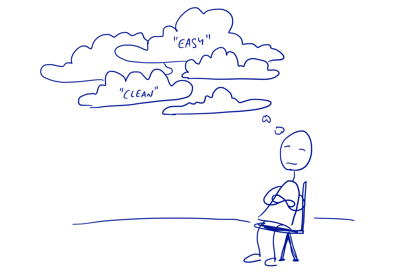
As designers we’ve all used foggy sentences like these:
“I felt it was getting a little too heavy for the casual nature of the feature.”
“The screen was a little confusing so we moved the layout around.”
“We really need this flow to be easy and clear.”
They sound meaningful but they don’t point to specific trade-offs or product attributes. They’re dressed up ways of saying “I like this better.” What actually makes it easier, or what specifically is confusing about it? Here are some examples of the questions you can use to cut through the fog.
What do ‘easy’ and ‘clear’ really mean?
- It’s possible to implement in a short time window? (I’m under deadline and if I can’t send this email blast today I’ll have to come in on Sunday.)
- It requires less domain knowledge? (I don’t know anything about taxes but I just answered some questions and it e-filed my return.)
- It sets expectations about the future? (I spent all day setting it up but I felt confident that the transfer would go through.)
- It leverages skills they already have? (I can never remember what app to plug in to the scanner, but taking a picture with my phone is easy.)
What does ‘confusing’ mean?
- It uses unfamiliar language? (I’m trying to set up an appointment window but it asks me to “create an activity” first.)
- It offers choices that are too similar to each other? (How’s the Message Board different from sending messages in the chat?)
- It doesn’t explain what’s happening behind the scenes? (I sent the invitation but I can’t tell if they got it or what happens next.)
- It goes against muscle memory? (That Discard button is right where the Post button normally is on the other tools. I keep clicking it accidentally.)
What does ‘heavy’ mean?
- It takes too long to load? (I tried pulling up the website to get the address but it was loading so slow I just searched Maps instead.)
- It takes too much time to do given the user’s situation? (I need to enter this follow-up before I get off the phone or I’m going to lose track of it.)
- It takes too much effort given the user’s goal? (My clients are willing to sign the doc, but they don’t want to set up an account. They end up asking me to email it to them instead.)
- It sends the wrong social signal? (This invitation makes the party look extremely formal and I’m worried those people won’t want to come.)
- It triggers the wrong emotion for the time? (We rented this movie to unwind and now it’s killing the mood.)
How to defog your design
First, amp up your BS detector. Ask “what does that really mean?”
Second, if you don’t know the answer, it’s probably time to bone up on your domain expertise. Talk to customers, go on site, do some interviews, whatever it takes to get in touch with the reality.
Lastly, include time in your thinking. A great way to put a foggy statement into context is to stop asking “why” and ask “when” instead. Discussions about “why” devolve into personal opinions without a specific moment in time to anchor and contextualize them.
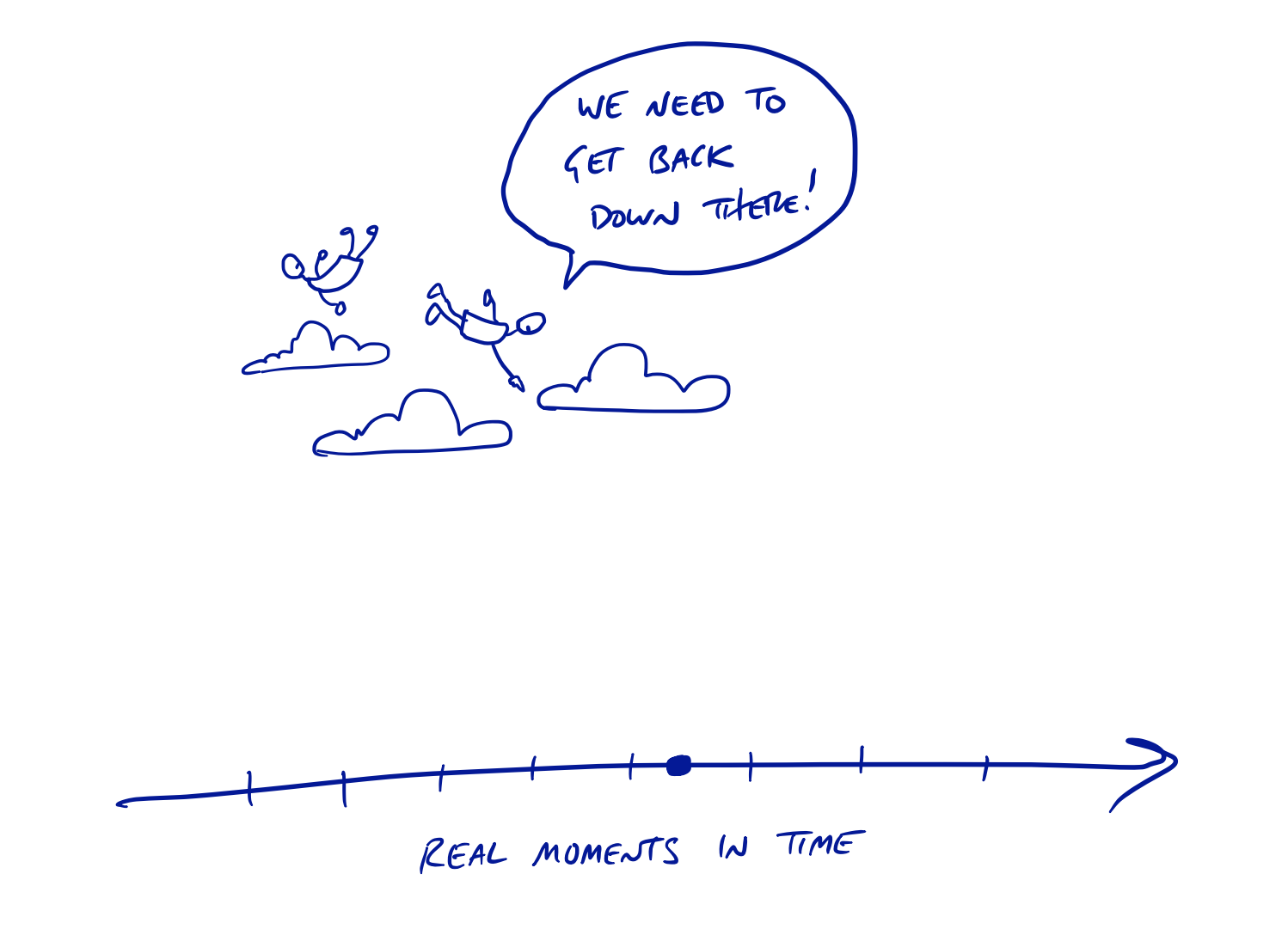
Tell a story about the problem. Stories require you to define the situation where somebody had a specific window of time, a specific circumstance, and a specific level of warm-blooded interest in the outcome.
This is a cultural thing in our field. Unclear thinking doesn’t have to be ok. We can fight it back and make a bigger impact in our teams by insisting on more real-world context, more clear thinking, and more concrete answers.