A proper sharing feature has been part of iOS for years. It has a consistent, system-level UI that’s available from most any app with anything worth sharing and yet no one seems to use it. Well, no one but us geeks, right? Everyone else just takes screenshots—which require mastering an unintuitive multi-button press and a fair amount of dexterity.
I moaned when people started posting screenshots of highlighted selections from articles to beat the 140 character limit on Twitter because they just shared a picture of text that I can’t copy, reformat, enlarge, etc. I’ve been that guy when friends send a screenshot of a product rather than a link. Sharing properly is a very type-A process that I dutifully complete out of ease for my friends and respect for the content!
That’s why my inner pedant was delighted when Instagram noticed I had taken a screenshot and gently nudged me to use the proper share features.
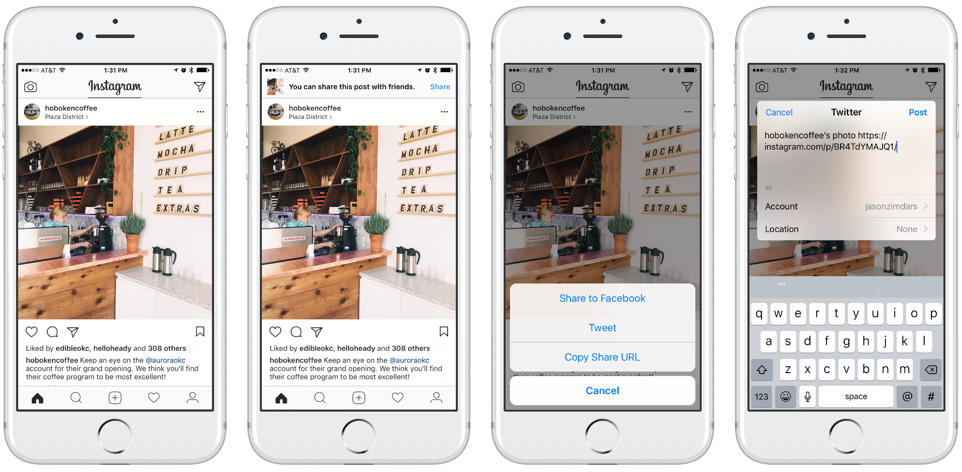
It’s a really nice solution that gently guides the user to the correct way to share. I’ll admit this is probably the solution I’d have designed, too. The built-in Share feature should be easier and yet friends and relatives who can barely download an app find screenshotting to be second nature.
That’s why I was delighted to see Amazon’s take on the same problem. Where Instagram’s design is a gentle scolding, Ahem! I see you have no idea what you’re doing, Amazon’s much scrappier version says, Oh you made a screenshot? Cool, lemme help you with that.
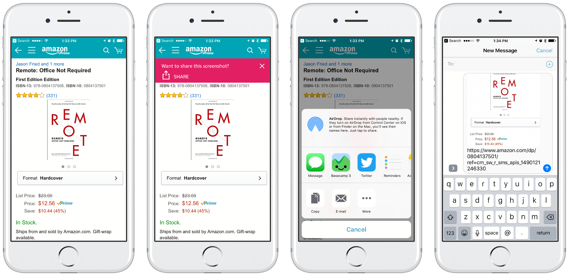
Amazon shows a similar, though more obvious, banner after you make a screenshot but it does things a little differently after that. For one, it uses the system’s Share Sheet which is familiar and provides a lot more options than Instagram’s custom one.
More important than that, however, is the payload. Amazon shares my screenshot and then adds a URL to it. It’s a subtle difference but Amazon’s version makes me feel better. Where Instagram gets my intent and tries to help me do the right thing, it replaced my content. Amazon’s design let’s me do what I intended but helps me do it better. In the screenshots above a major difference is posting to Twitter. Instagram’s post wouldn’t include an image, Amazon’s would.
As a designer I love being surprised by solutions I wouldn’t have come up with. I can absolutely see how Instagram arrived at their solution. Part of UI design is guiding users back when they go off track. Designers want to change the world by making things easier, more understandable, more enjoyable—more ideal. That completely resonates but I can’t help but admire the audacity of Amazon’s designers who have accepted the world as it is and humbly offered a helping hand. Kudos!