Take a look behind the scenes at the illustration process for Jason Fried and DHH’s new book, “It Doesn’t Have to Be Crazy at Work”.
Back story
Every essay in Jason and David’s previous titles, REWORK and REMOTE is accompanied by an illustration that captures the key message of the essay. Contract llustrator Mike Rohde’s iconic original art perfectly compliments the irreverent and contrarian tone of the books. We love the format and it has worked well for us but when it came time to design the new book, Jason was eager to try something new. He reached out to the Basecamp team for fresh ideas.
At the time the working title of the book was The Calm Company, which was less provocative but perfectly captured the kind of company we want to have here at Basecamp—the kind of company prescribed in the book. Jason had already asked our team to pitch ideas for the jacket design and with two best-selling books behind us there was a sense that we could take even more of the production in-house. Having already contributed some spot illustrations to Basecamp’s marketing in recent years, I eagerly started work on concepts for It Doesn’t Have to Be Crazy at Work.
The concept
From the onset, I felt pretty strongly that the illustrations could be valuable content in themselves rather than simply complimenting the text. So I explored ideas that featured a running narrative that could tell a parallel story of a company that’s anything but calm. I considered graphic novel style spreads, comic strips and even something like Sergio Aragones’ “marginals” in Mad Magazine. I also explored ideas in the style of cartoons in the New Yorker that wouldn’t directly relate to the essays but would be satirical vignettes of situations where it’s crazy at work.
Here are the original sketches I shared with Jason and Basecamp marketing designer, Adam Stoddard, a few weeks later in a video call.
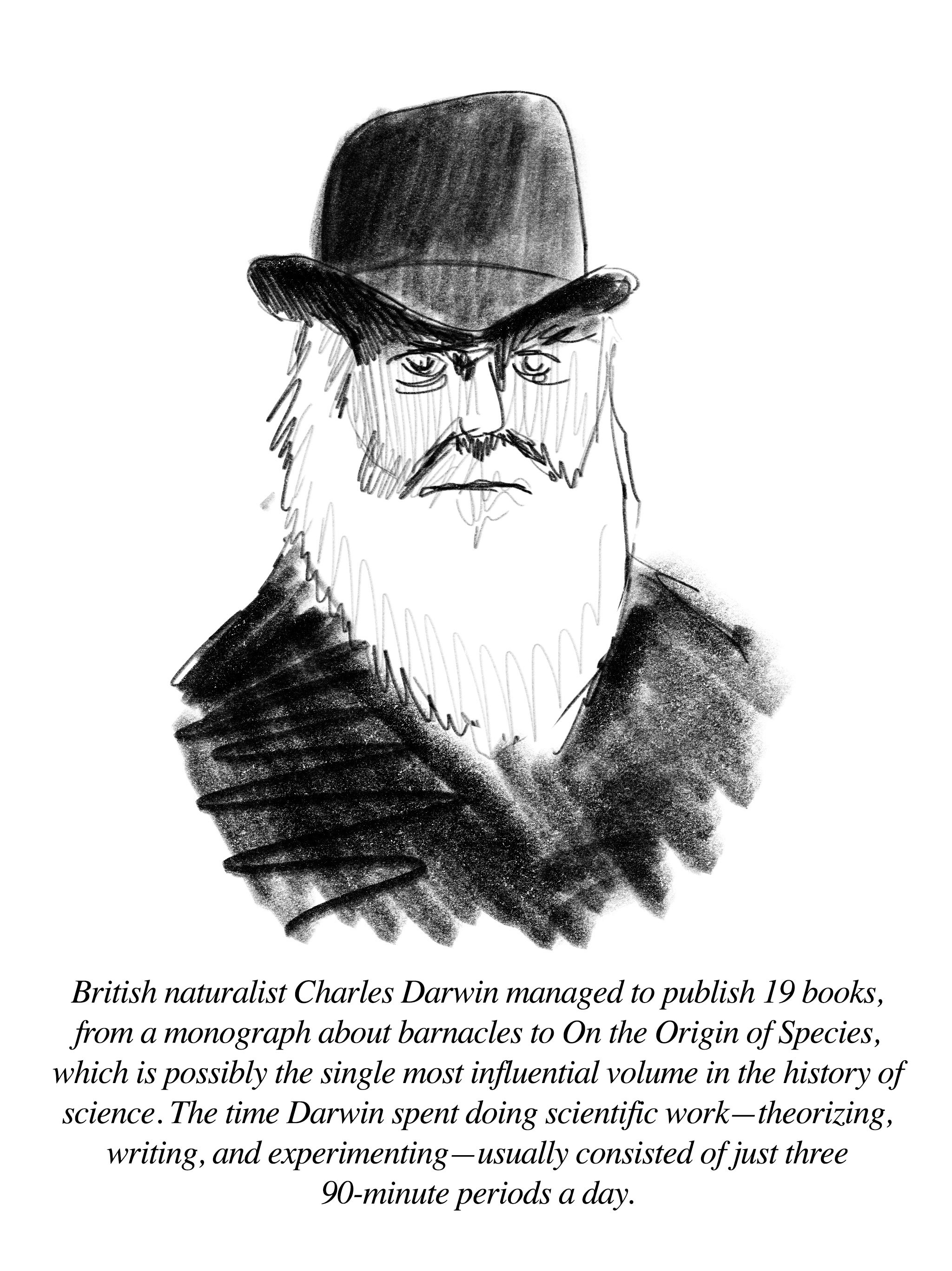
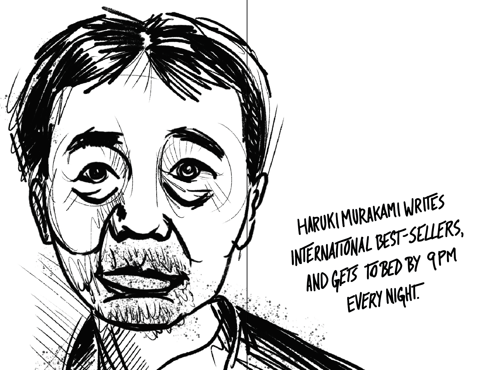
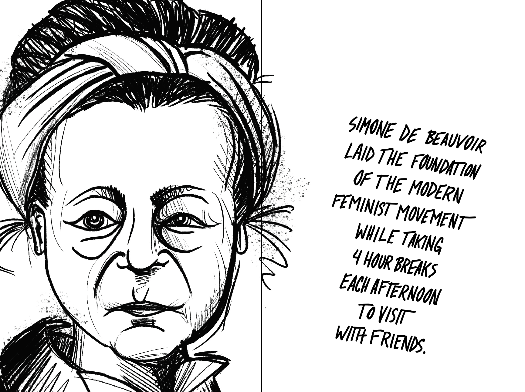
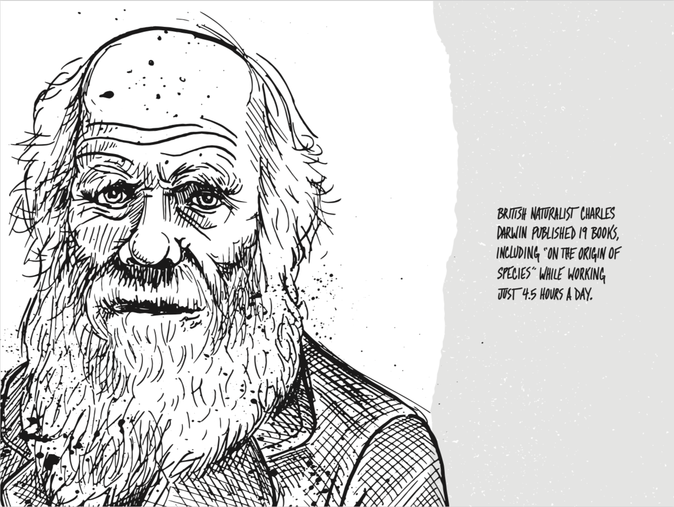
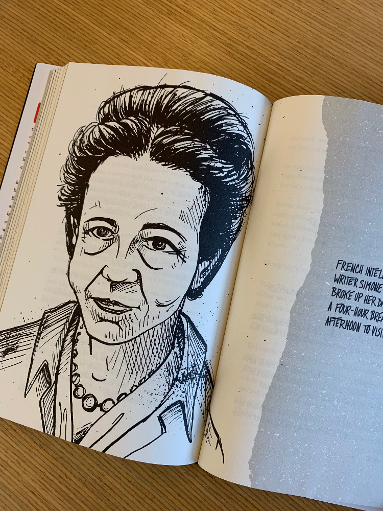
I pitched each of these ideas but it was the sketch featuring a blurb about Charles Darwin that we found ourselves most excited about. I had remembered reading an article about Darwin’s daily routine several months before and that had sparked the idea to feature famous people—both current and historical—who had done great things without embracing the extreme work habits that are so often praised today. The illustrations would introduce these figures to readers, reinforcing that it truly doesn’t have to be this way. After all, if Darwin could write one of the most important works in modern science working only 3 hours a day whatever you’re spending 80+ hours a week doing probably isn’t quite as important. So I ran with the concept enlisting our own Wailin Wong to identify, research, and write the blurb for each figure.
We had a tight deadline—only about 60 days from concept to delivery of the final art—so I got right to work exploring visual styles. Modern illustration, especially in the tech world, seems uniformly clean and over-simple so I knew I wanted to try something more unrefined and irreverent. I also had the sense that these should be draw by hand with real materials. Partly for practical reasons like printing at high resolution but also so that the original art would actually exist for posterity. Maybe we’d frame and display them in our office or give them away. So I explored several approaches that shared a loose, rough feel and Adam popped them into the interior layouts he’d been working on.
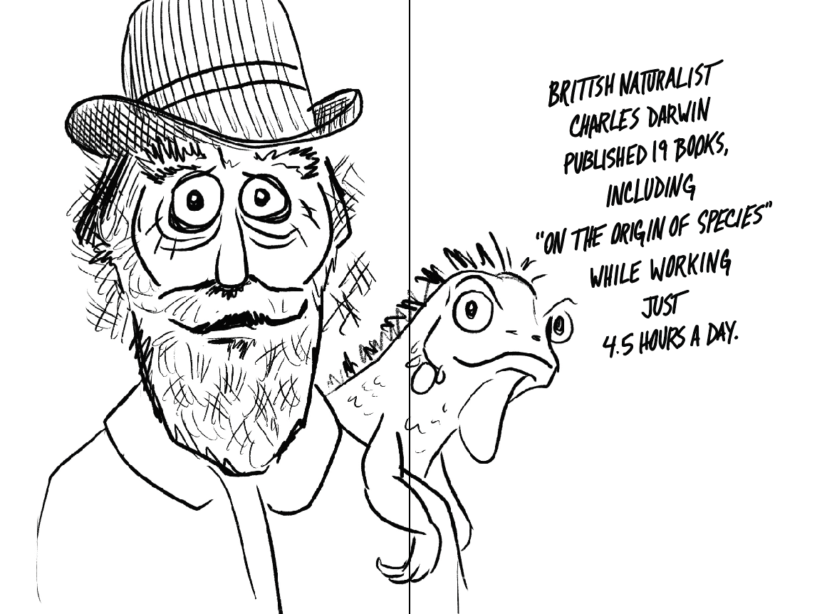
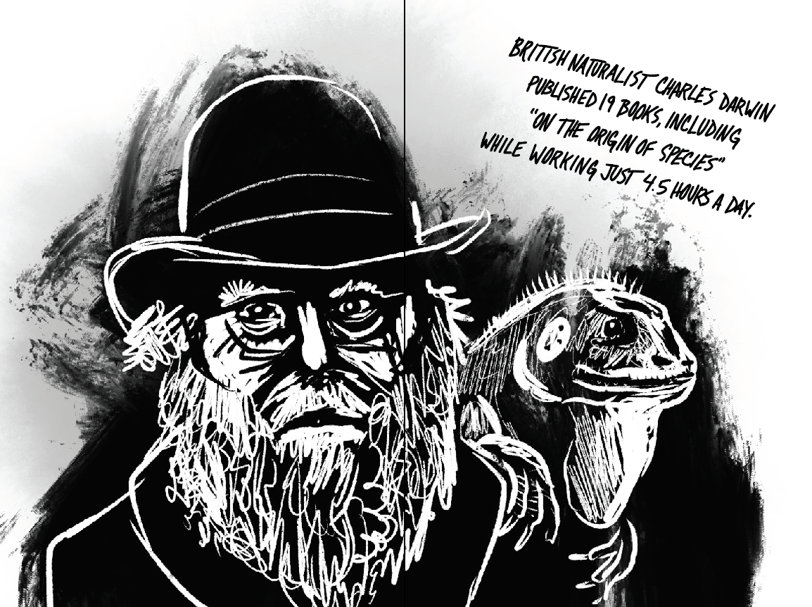
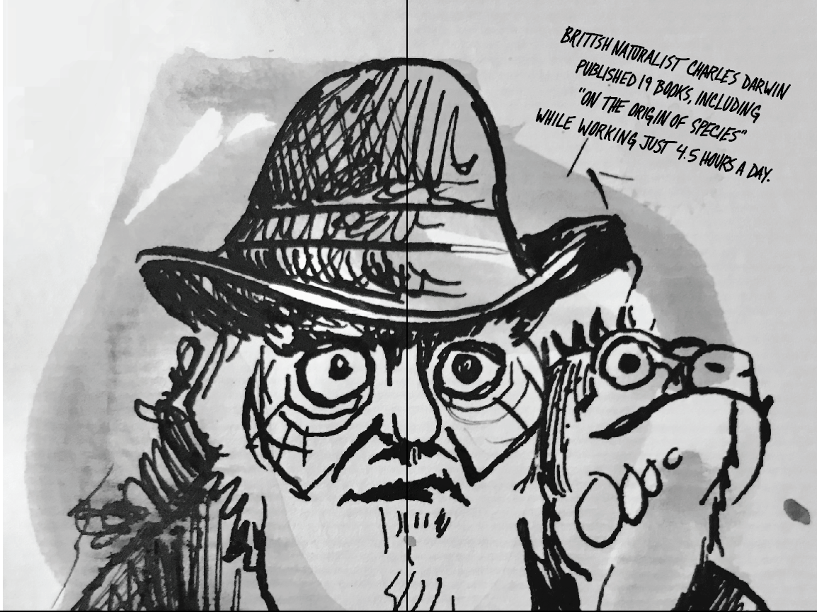
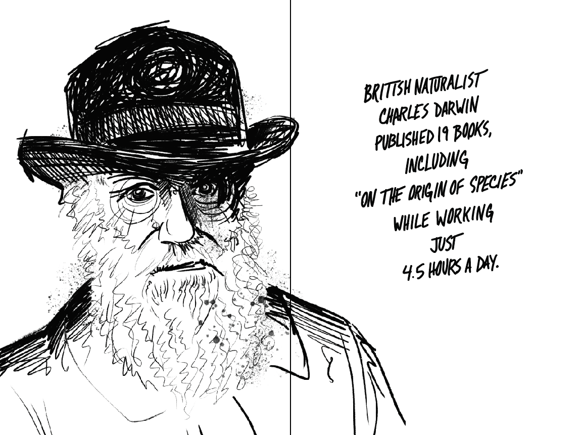
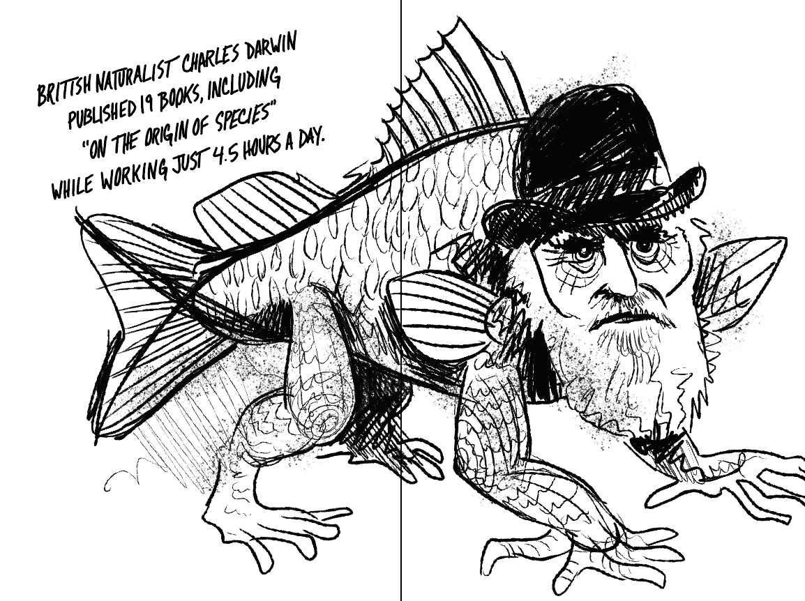
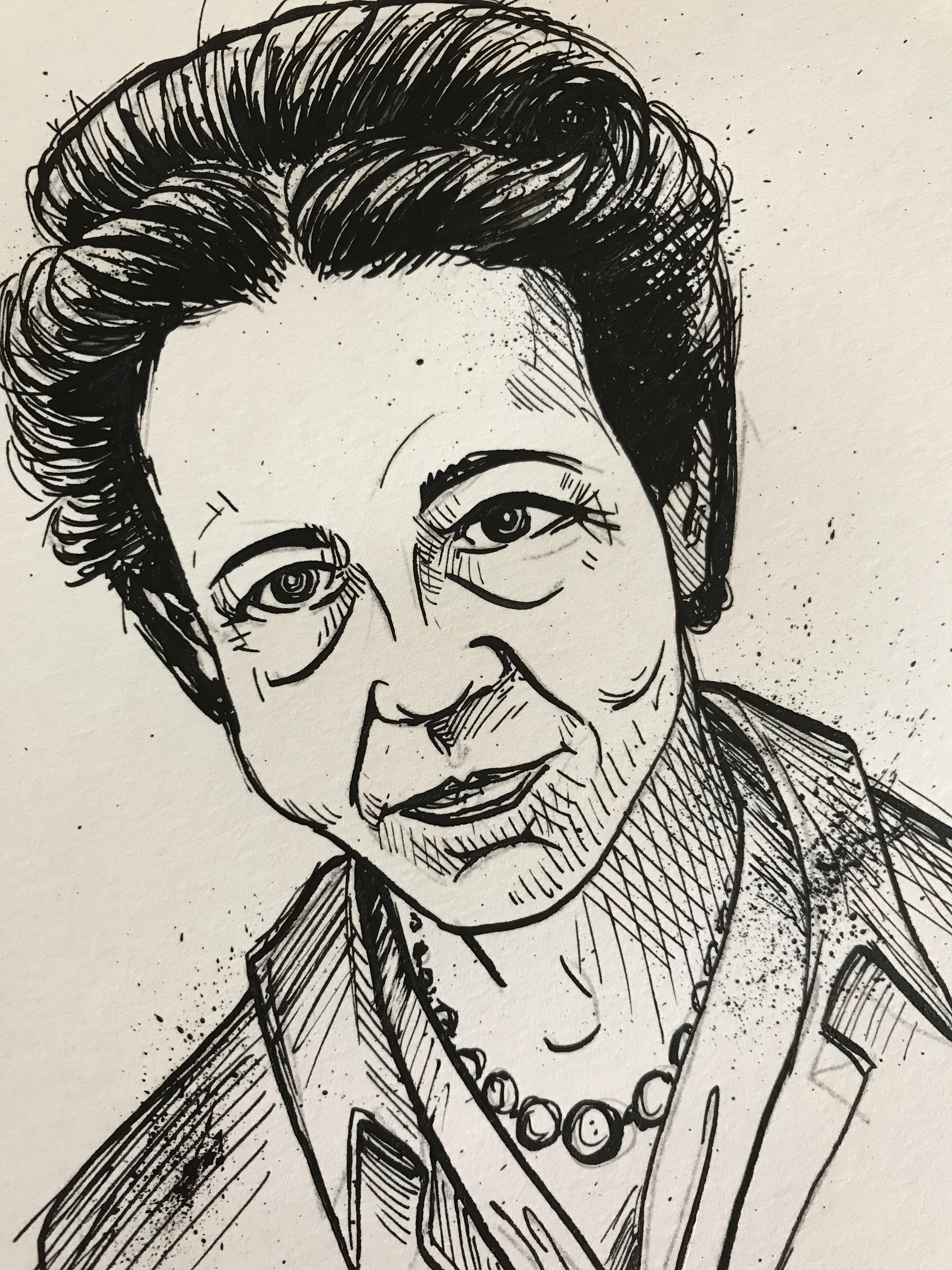
They ranged from just bad to outright weird but the idea seemed to be taking shape. I especially liked the ones that were in a more editorial cartoon style and include a prop or other visual gag (such as Darwin’s iguana) but these illustrations needed to feel like a consistent set and I was concerned about finding equally interesting themes for 20+ figures. We decided the more realistic, but slightly unhinged portrait (second row, left) was the way forward. As a final proof of concept I drew two additional subjects from our list in the same style and we submitted the idea to the publisher.

Production
With approval in-hand I got down to work. How many illustrations would ultimately appear in the book depended, in part, on the final page imposition. We hoped for at least 12 but I drew about twice that many so we were ready if there was room for more and so that there was some opportunity for editorial changes. That meant I had to average about one finished illustration per day to meet the deadline—oh and still leave enough time for my normal work.
At first I started splitting my days in half. In the mornings I’d do my normal design work at Basecamp and then I’d switch gears and work on illustrations for the book in the afternoons. This didn’t work out well at all. For one thing, it was easy to let the morning’s work spill over into the early (or late ) afternoon. It was also really difficult to switch between such different tasks. To boost my output and provide less frequent context switching I tried splitting my week into two parts: two days on product design and two on illustration. It was better but I still wasn’t working at full speed. Things only kicked into high gear once I decided to go all-in on drawing and fully immerse myself in the project, ignoring everything else. How much difference did it make? In the first 10 days of the project I did 7 pieces. In the last 6 full-time days I completed 17! Even though it meant putting my regular work on hold for a few days, ultimately by focusing intently I finished the work far ahead of schedule and spent less time than I anticipated overall.
The Process
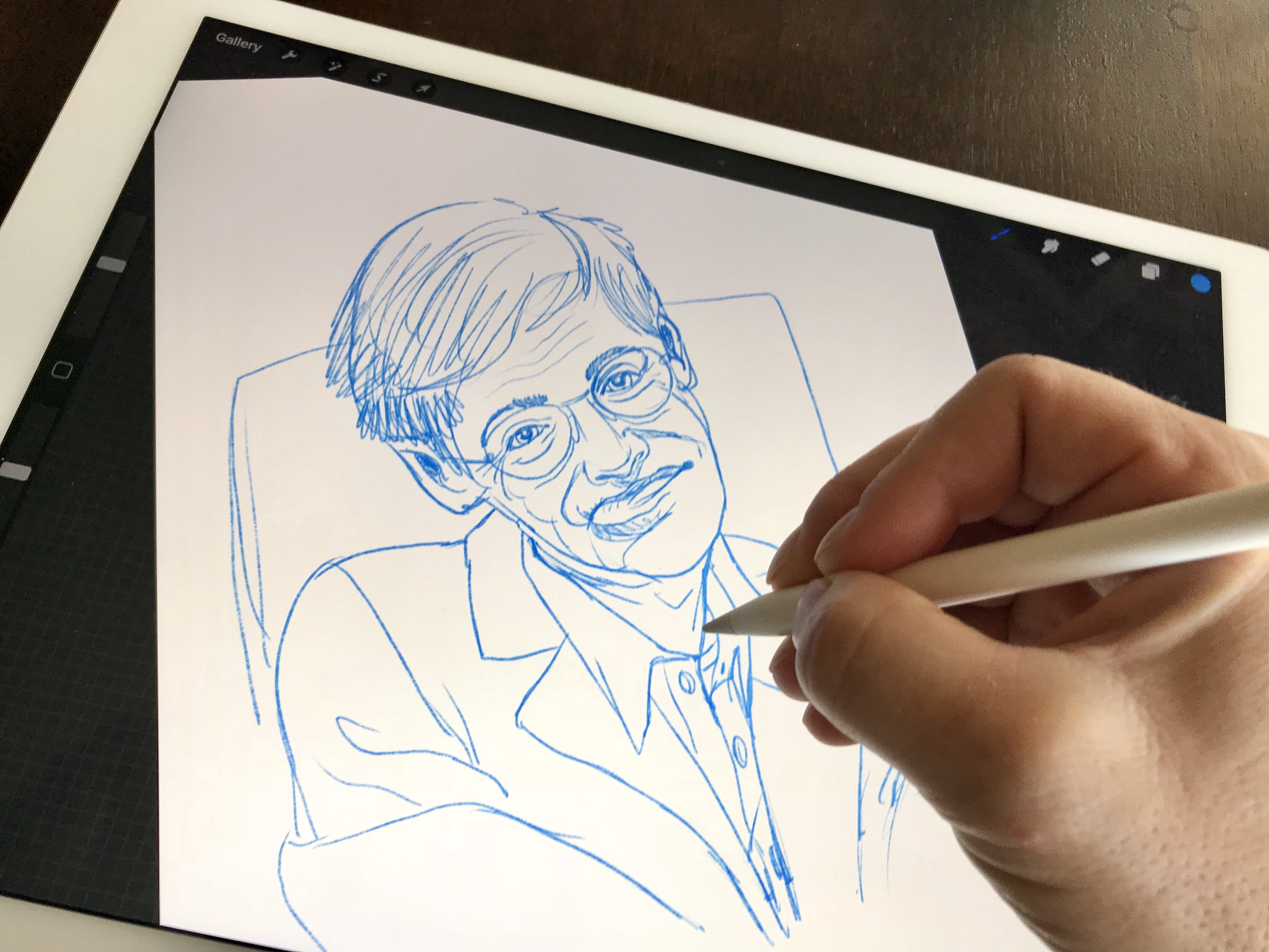
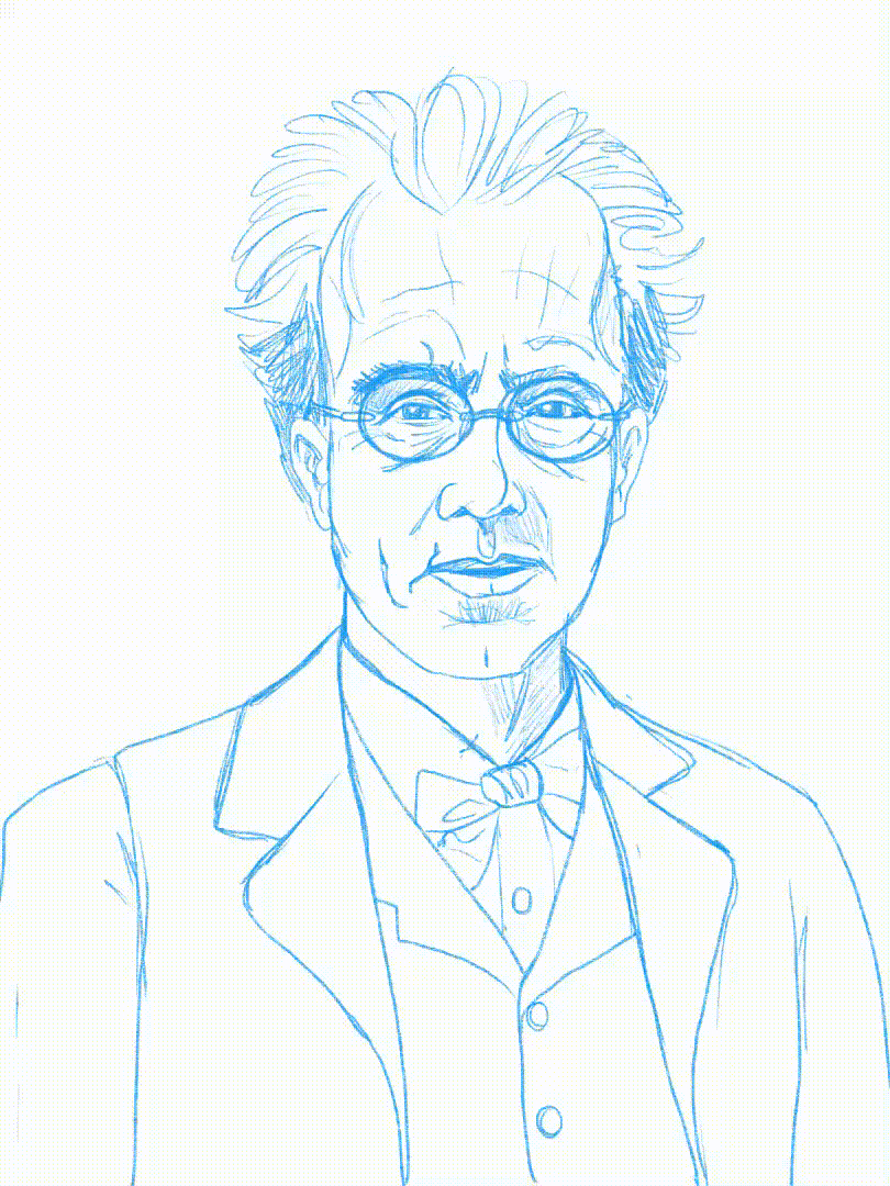
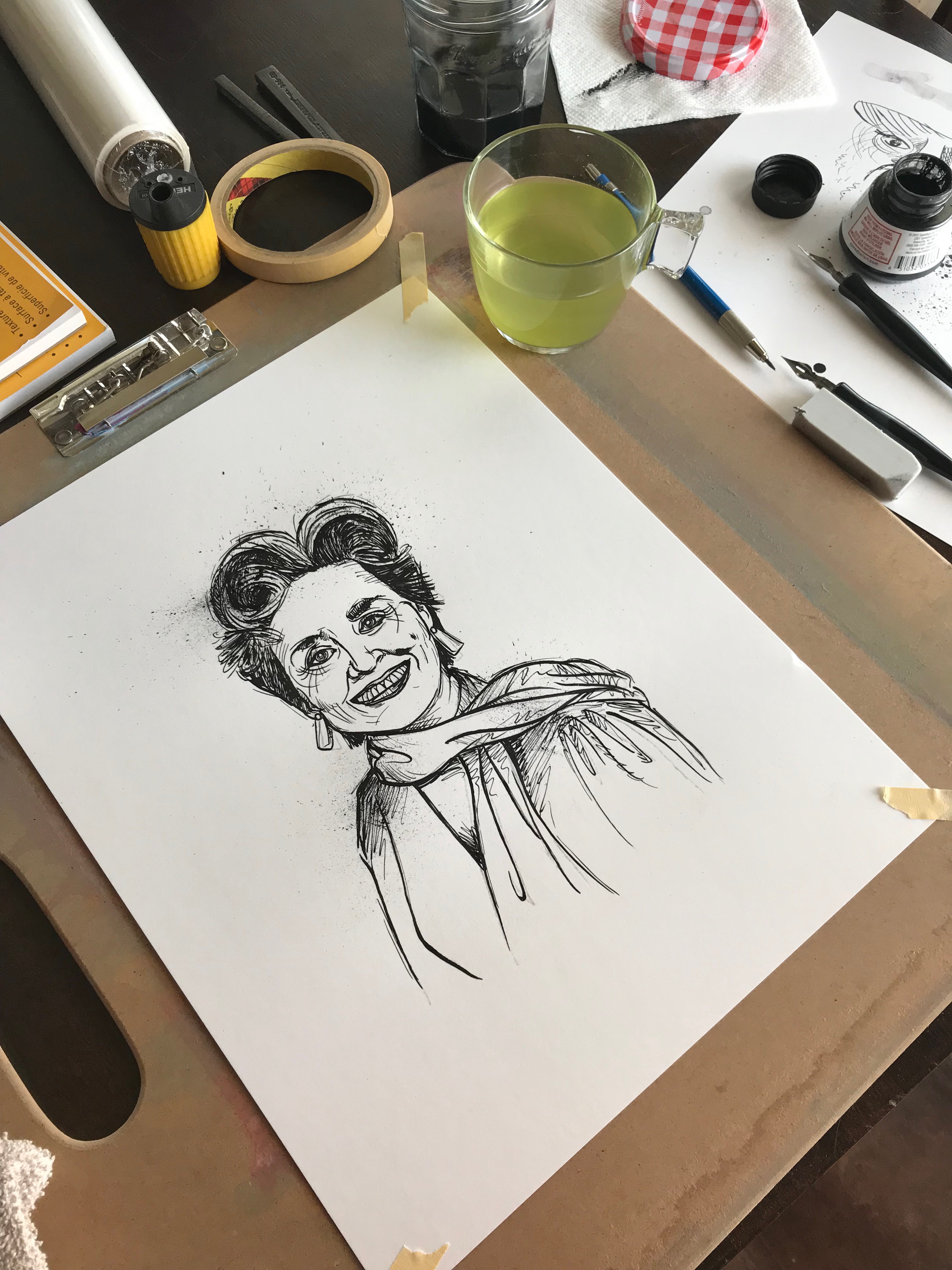
Since the art would be printed in black and white in the book, I settled on ink and paper for the original art. Even though it would be hand-drawn on paper, I actually did my rough sketching digitally with Procreate on iPad Pro. Why? Speed. Working digitally meant I could easily erase, redraw, resize, move, stretch, copy and skew my drawing as I refined each sketch. Nose, too big; eyes too small? It’s just a matter of seleting and resizing instead of erasing and drawing again. What I could do in seconds with the tools in Procreate would have required dozens on redraws on paper.
Drawing portraits of people you don’t know and can’t observe in-person is a tricky thing to do so I had to gather publicly available image references for each figure. Google Images was instrumental in this, in particular because it allowed me to see many images of a person all together. Studying a subject from many angles, in different situations, and even at different times in their lives allowed me to create exactly the portrait I imagined for each person.
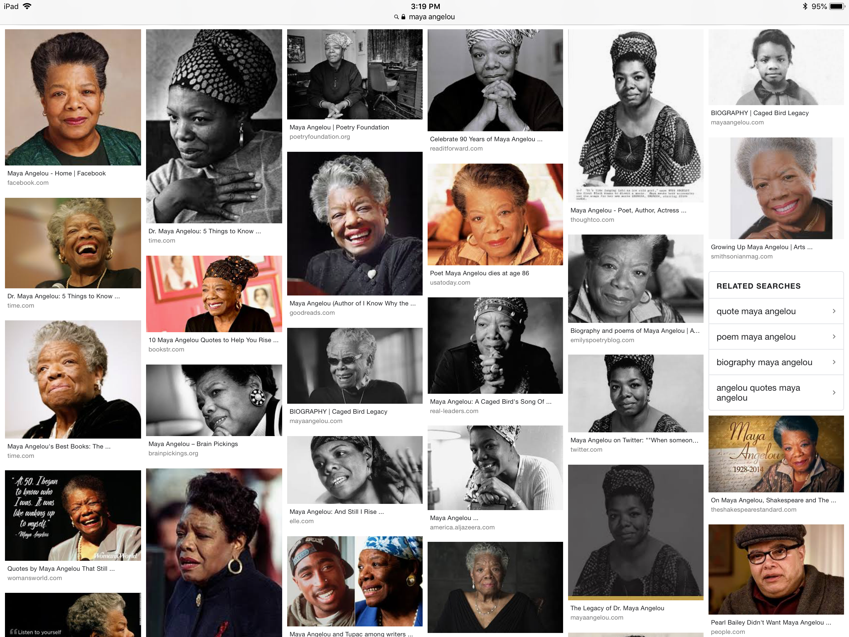
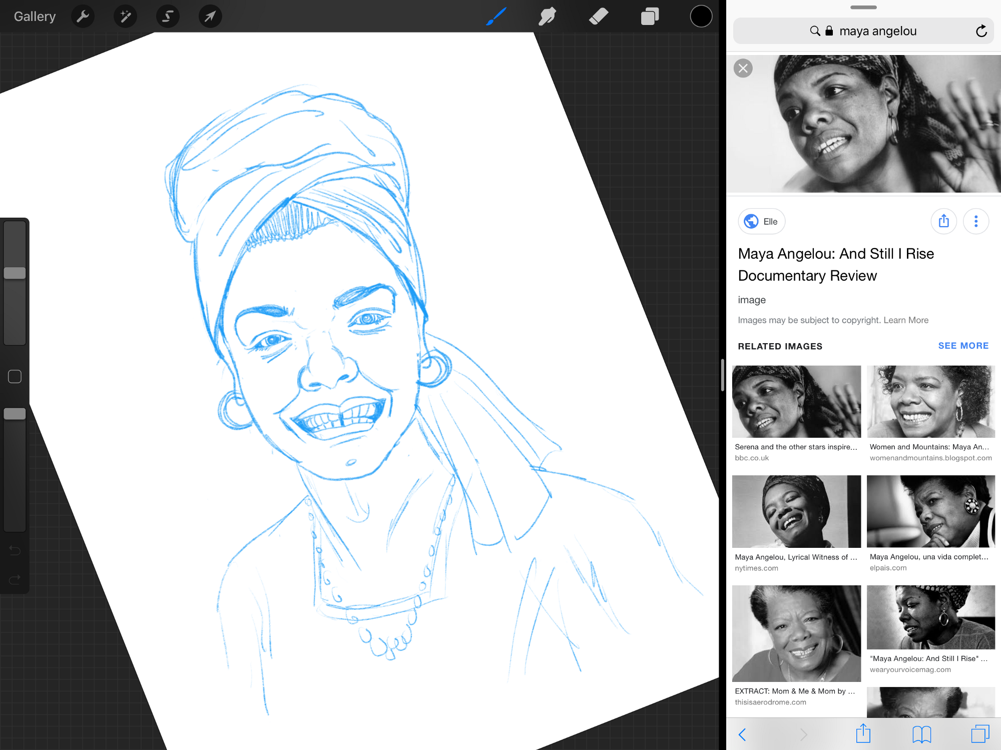
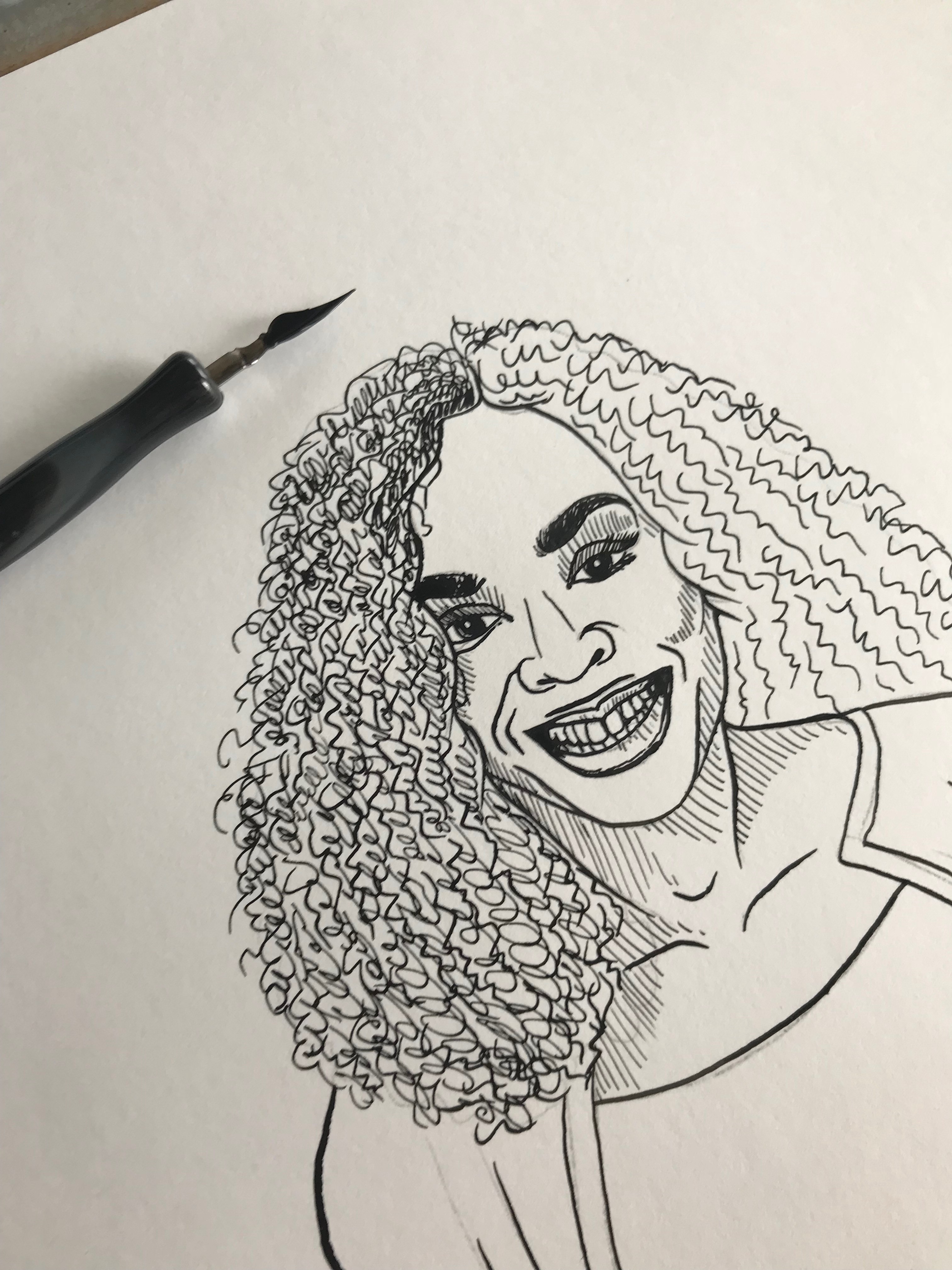
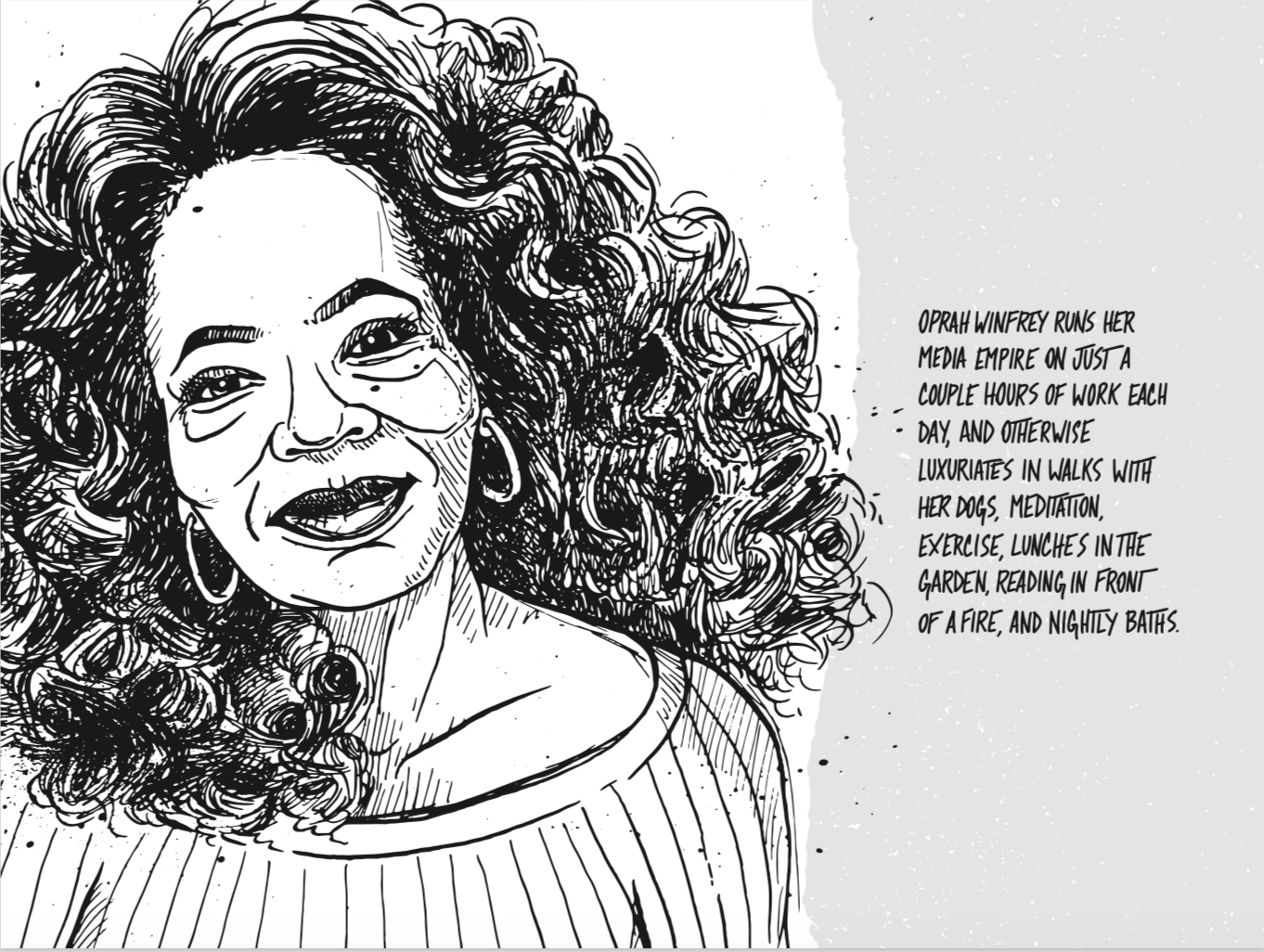
The portraits of Maya Angelou and Stephen Hawking are examples of this that I’m particularly proud of. I had a pretty clear idea going in about how I wanted to represent them and a wide range of reference photos of these well-known figures gave me all the image data I needed. In both cases the final piece is a somewhat ageless portrait that represents their character without recalling a particular, recognizable moment in their lives. I found that the younger reference images didn’t have enough character, but the images in their later years exaggerated their features in a way that helped me understand them better. The final art is more like a set of caricatures than serious portraits.
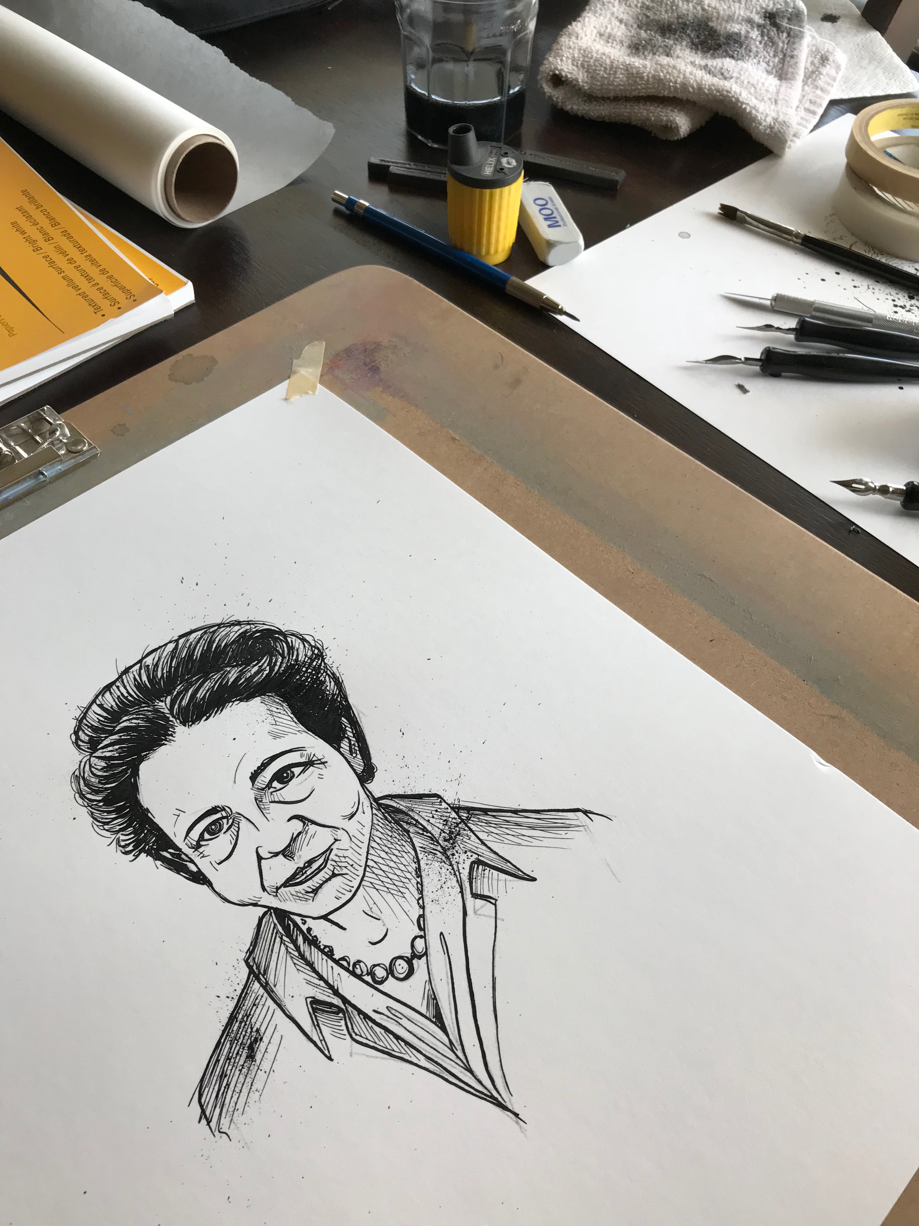
After completing the rough sketch, I would resize it for consistency and print it out. Then using a classic technique, I’d transfer the image to paper for inking. This made the task of drawing a set of 20+ images at a consistent size and laid-out nicely on the final page mistake-free. If you’ve ever drawn something starting in the middle only to run off the edge of the paper, you know what I mean!
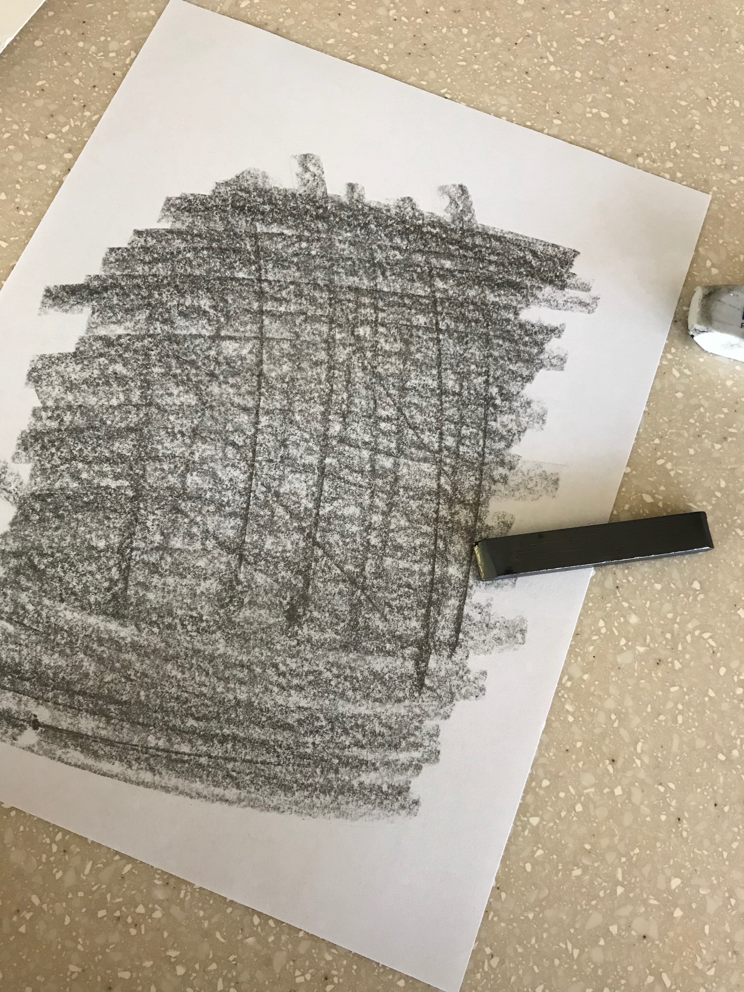
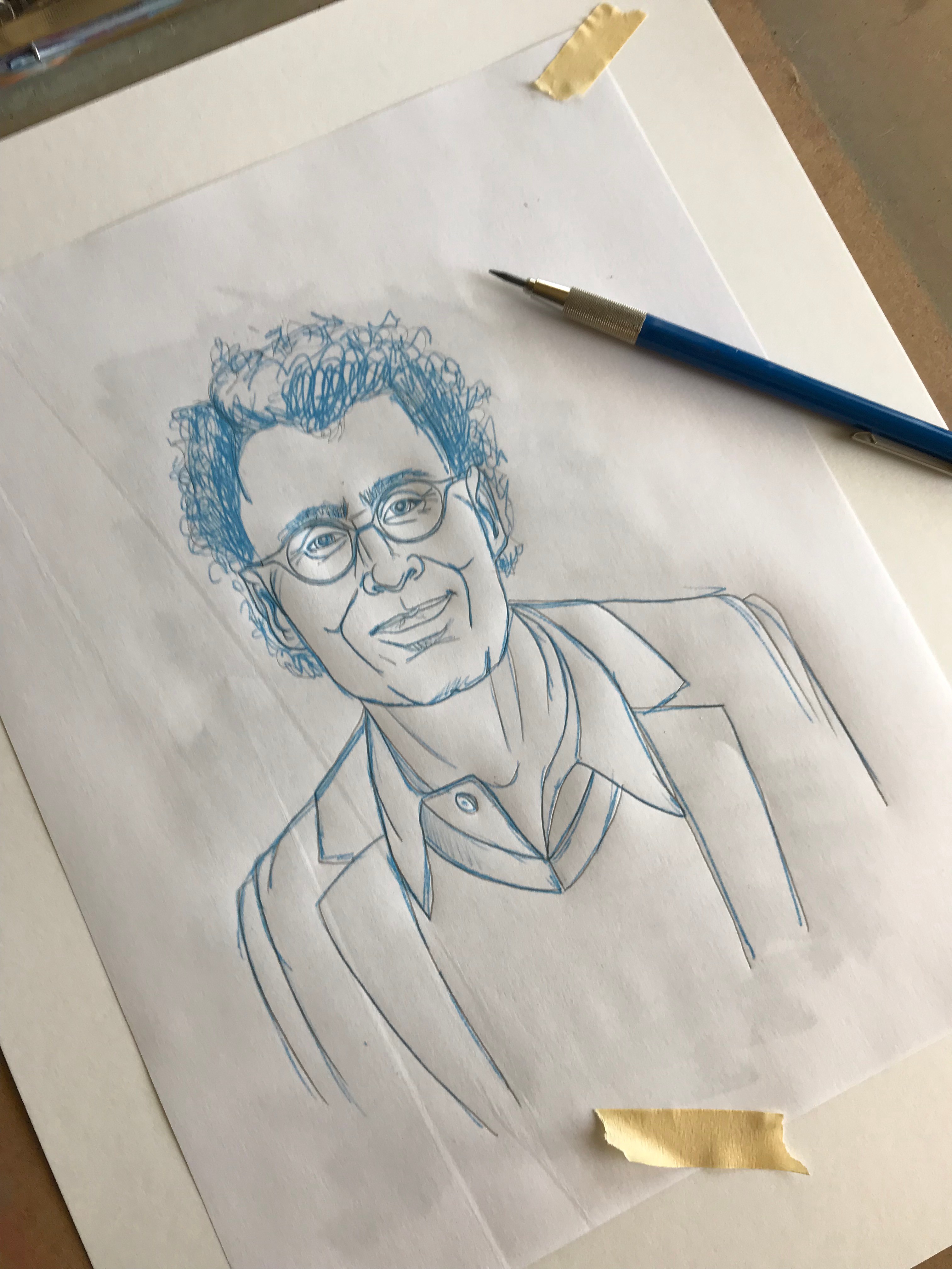
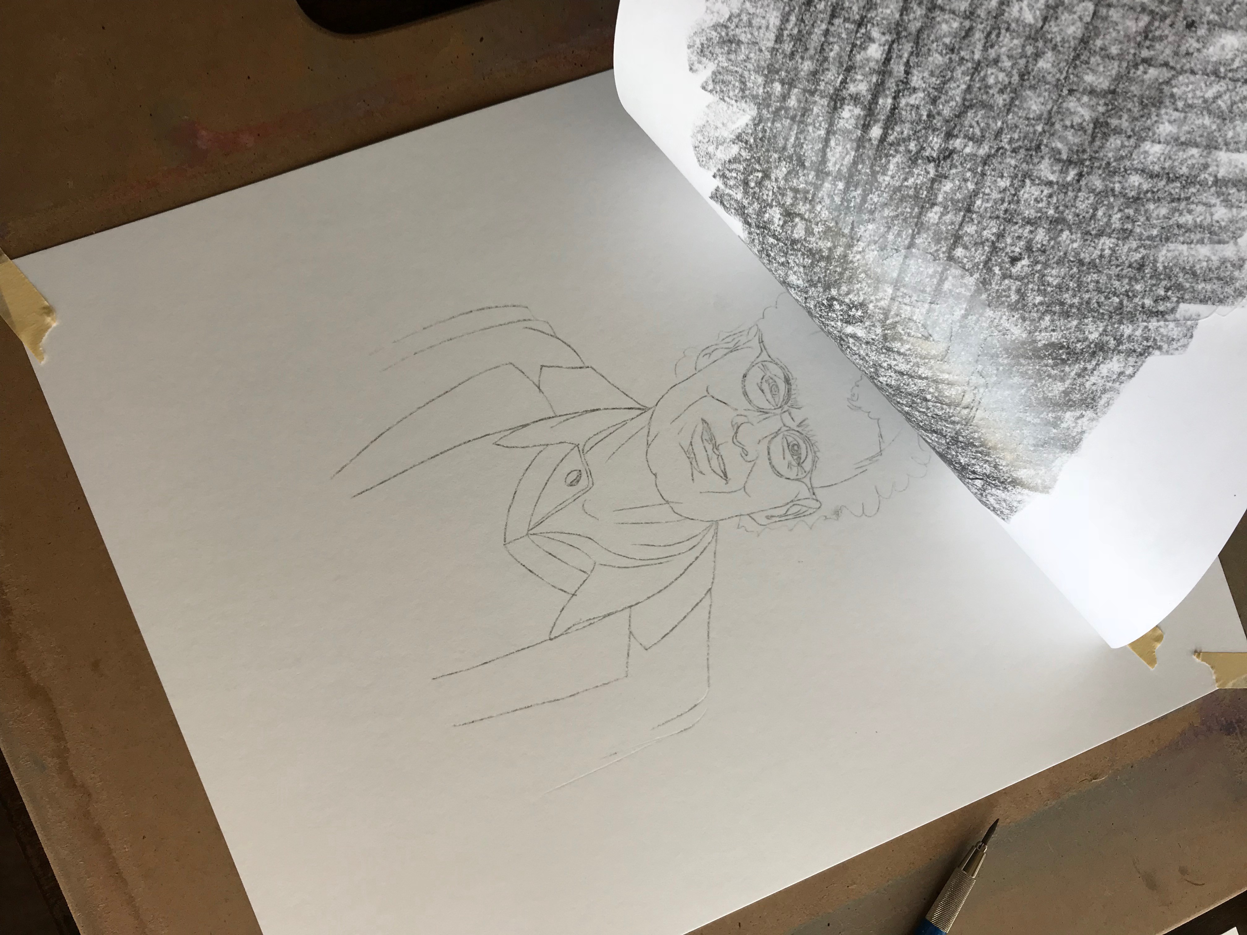
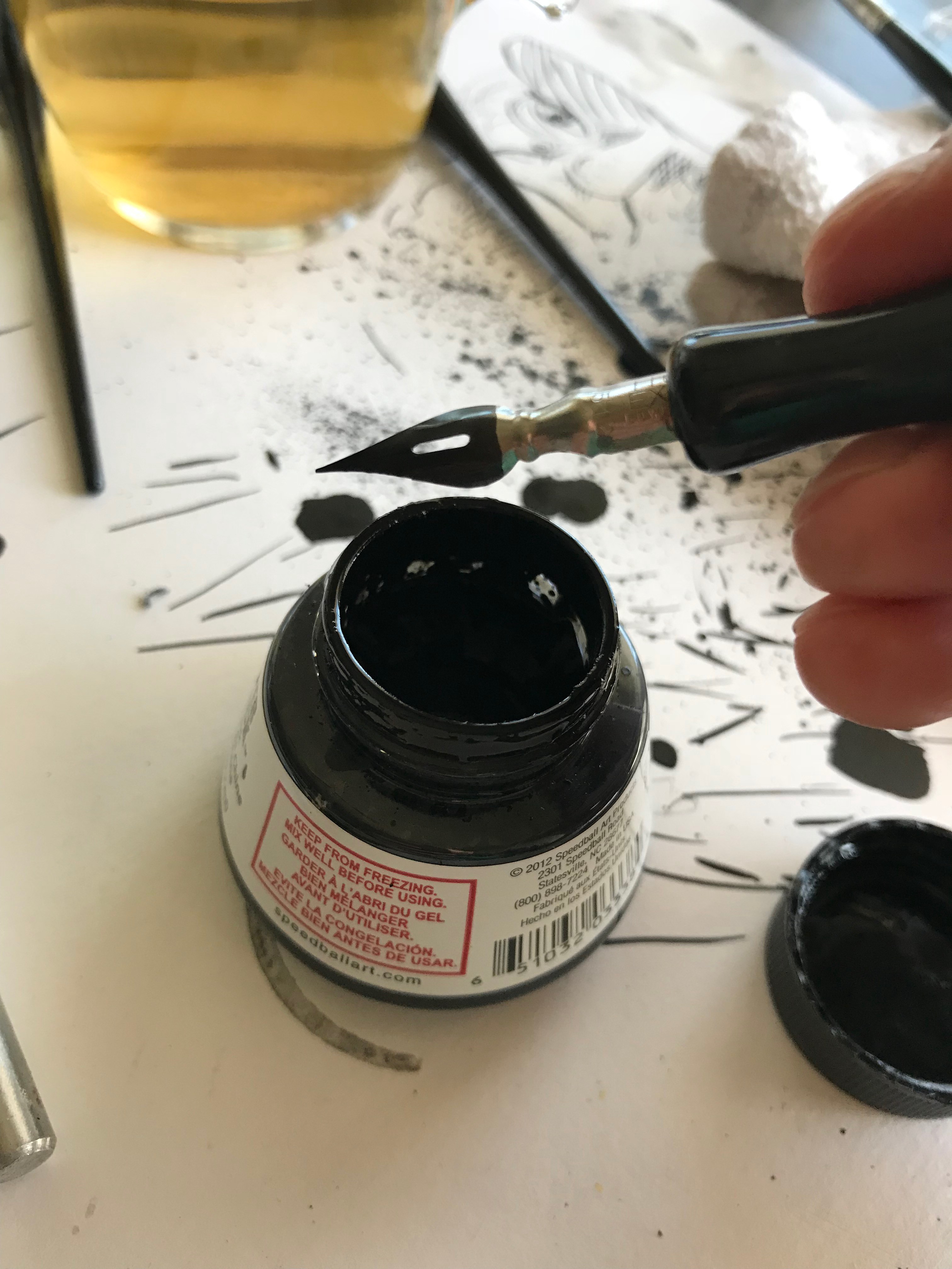
The last step was to do the final drawing in ink using my transferred sketch as a guide. I used Speedball Super Black india ink with Speedball calligraphy pen nibs and holders on 11 × 14 Canson Bristol Vellum. Splatters were added with ink flicked from the britles of a stiff paintbrush.
This project was unlike anything else I’ve attempted. All said, I completed 25 drawings, 18 of which appear in the first print and e-book editions of It Doesn’t Have to Be Crazy at Work. I’m incredibly proud of the project and even more grateful for the opportunity Jason and David gave me to contribute to this wonderful book that speaks so clearly about how we work. In fact, the entire project was done almost entirely in-house at Basecamp. It was written by Jason Fried (CEO) and David Heinemeier Hansson (CTO), jacket design and interior design by Adam Stoddard (marketing designer), illustrations by me, Jason Zimdars (product designer), and research by Wailin Wong (producer of The REWORK podcast).
It Doesn’t Have to Be Crazy at Work
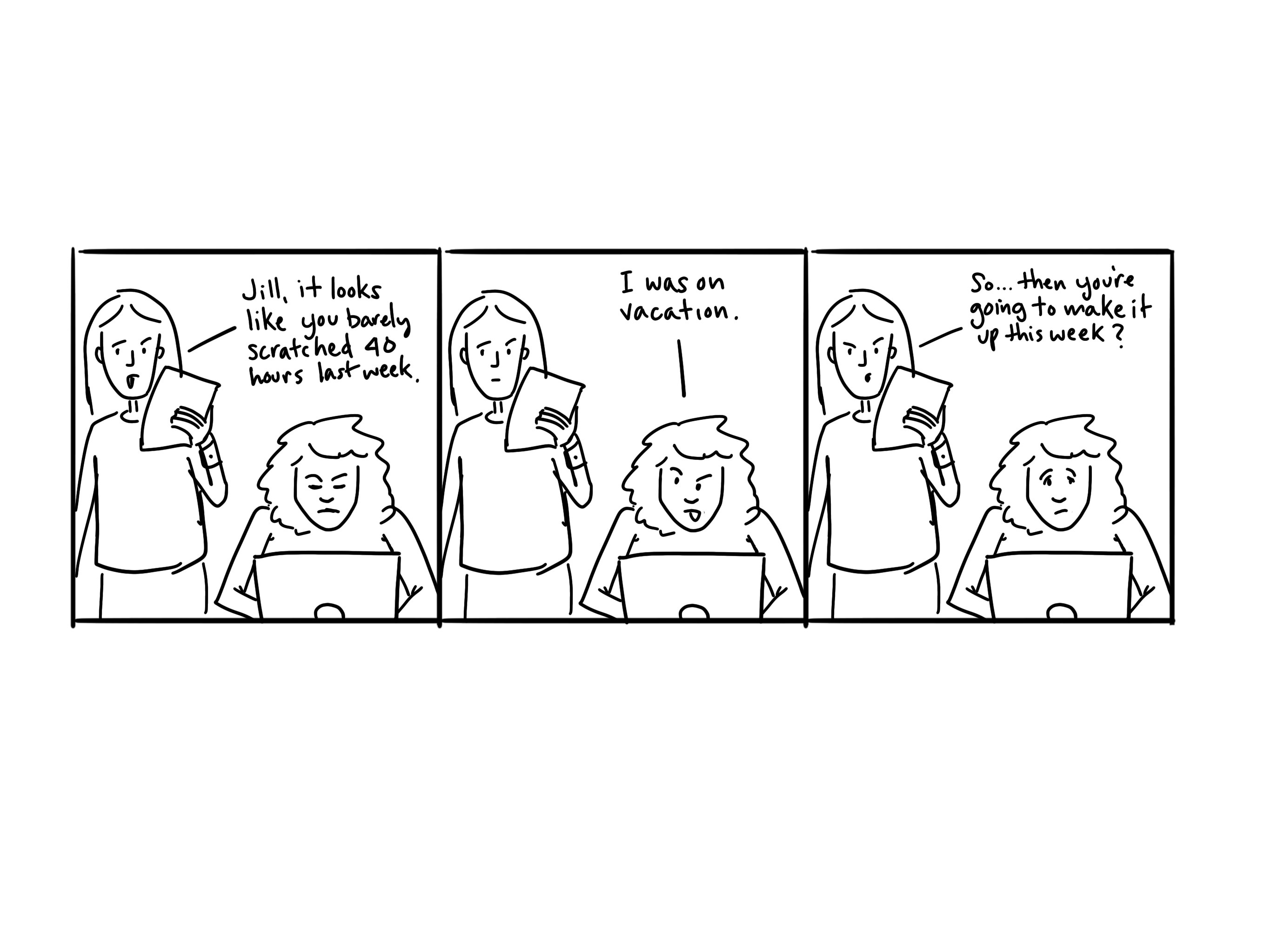
I did this work at Basecamp where 40 hour work weeks are the norm, no one checks email on the weekend, and our benefits are focused on getting people out of the office, not enticing them to stay longer. We’ve stepped out of the hustle game in Silicon Valley and designed our company differently. This book will show how you can have a calm company too.
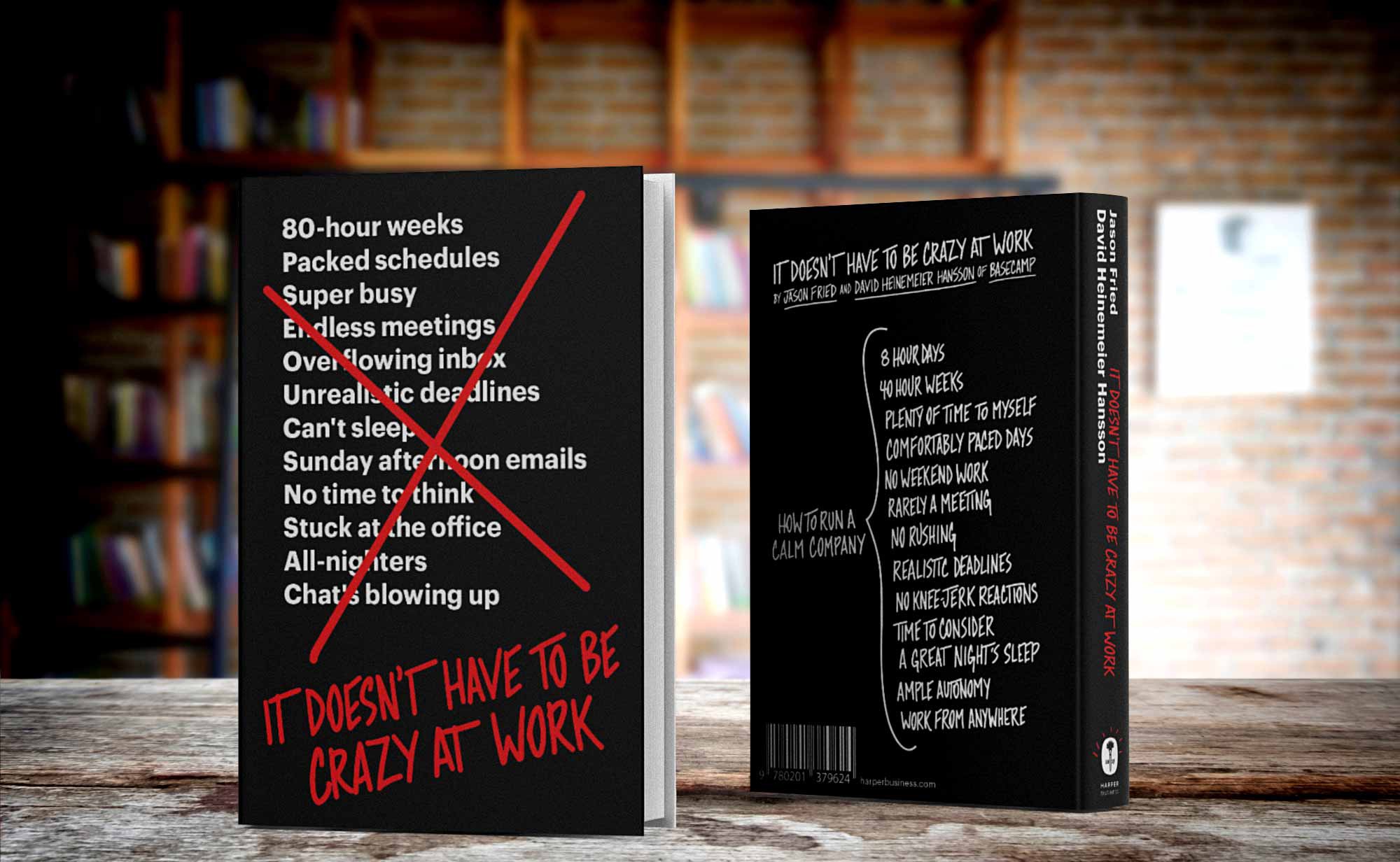
It Doesn’t Have to Be Crazy at Work is available October 2, 2018 in hardcover, e-book, and audiobook. Order now at Amazon.com or most anywhere you buy books.