In the year since we launched Basecamp 3 for iOS we’ve shipped 16 releases full of features, improvements and fixes. After all that you might be surprised that the app has gotten simpler, not the other way around.
The most recent release is the biggest yet but it doesn’t include a bunch of new features. Instead, it’s a huge step forward in clarity and simplicity. While it’s nearly a complete redesign, it wasn’t planned that way. We never decided to do a “Major Redesign”, we simply started with a hunch that Basecamp could be much simpler. And then we ended up somewhere great.
Here’s how we set off with a hunch and arrived somewhere entirely unexpected.
It’s full of buttons
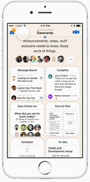
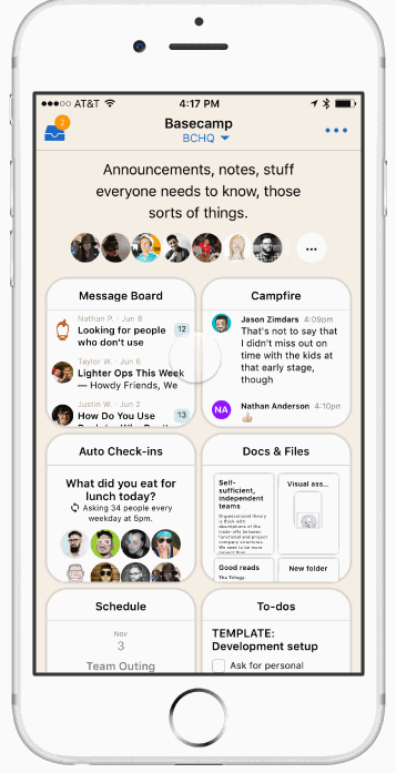
The old Home screen on Basecamp for iOS was the core of the app, the jumping-off point for everything in your projects. It had tabs for Basecamps, Campfires, Pings, and “Hey!”. But that’s not all. It had buttons for Activity, “Find…”, Reports, Me, and HQ. In fact there were 9 buttons in all and that’s if you don’t count the contents of each tab. Four of those buttons could be badged when something new arrived! All that UI chrome could overwhelm the contents of your account, especially if you only had one or two projects. We were especially concerned about this situation because that’s the experience for nearly everyone when they first start using Basecamp.
We thought, “This screen is trying to do too much.” Nowhere was this more evident than on the Campfires tab which listed every chat on your Basecamp account and also called out the ones with new activity. Just this one part of the Home screen was trying to do the jobs of both a directory and an inbox. That was a big red flag.
We also a more radical thought, “Does Basecamp need separate tabs for “Hey!”, Pings and Campfires? Early on we’d decided that having dedicated inboxes for each kind of notification was a helpful way to triage when you have a lot going on. For example, when you’ve got your head down managing a to-do list or writing a Text Doc what kind of notification just arrived matters. A Ping might require immediate attention, but a Check-in Answer could wait. Knowing what type could help you decide if you should break your focus and respond or keep working. The question was did this pattern fit on mobile?
With these two thoughts in mind we set out to explore some new ideas. But first we need to address a bigger insight that would become a driving force throughout the process.
The “us” and “them” problem
Basecamp is the software we use to run our company and literally to build Basecamp, itself. It’s long been a core principle at the company that we’re building software for us and that remains true to this day. After all, we’ll never know our customers better than we know ourselves.
This guiding philosophy serves us well but recently we’ve noticed that we don’t look as much like our customers as we used to. We still use Basecamp much like them but we use it a lot more than they do. Compared to our average customer we have more employees, more projects, and larger teams; we chat more, comment more and have longer to-do lists.
We had a sense that Basecamp’s design overly favored our own usage levels. It elegantly handled dozens and dozens of projects, hundreds of lines of daily chat, constant activity and frequent notifications. But if your account wasn’t like ours, when you only had a couple of projects, or when you were just starting out, Basecamp could be confusing and feel empty.
That our design was optimized for our own use levels was understandable but it made the experience worse for the majority of our customers who didn’t have the same problems we did and that felt awful. Throughout the project as we evaluated designs or responded to feedback from our internal testers we returned to this question, Is this an “us” problem? and that was key to unlocking this design.
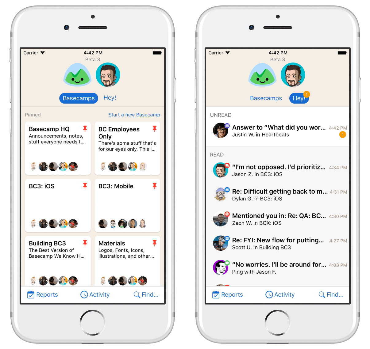
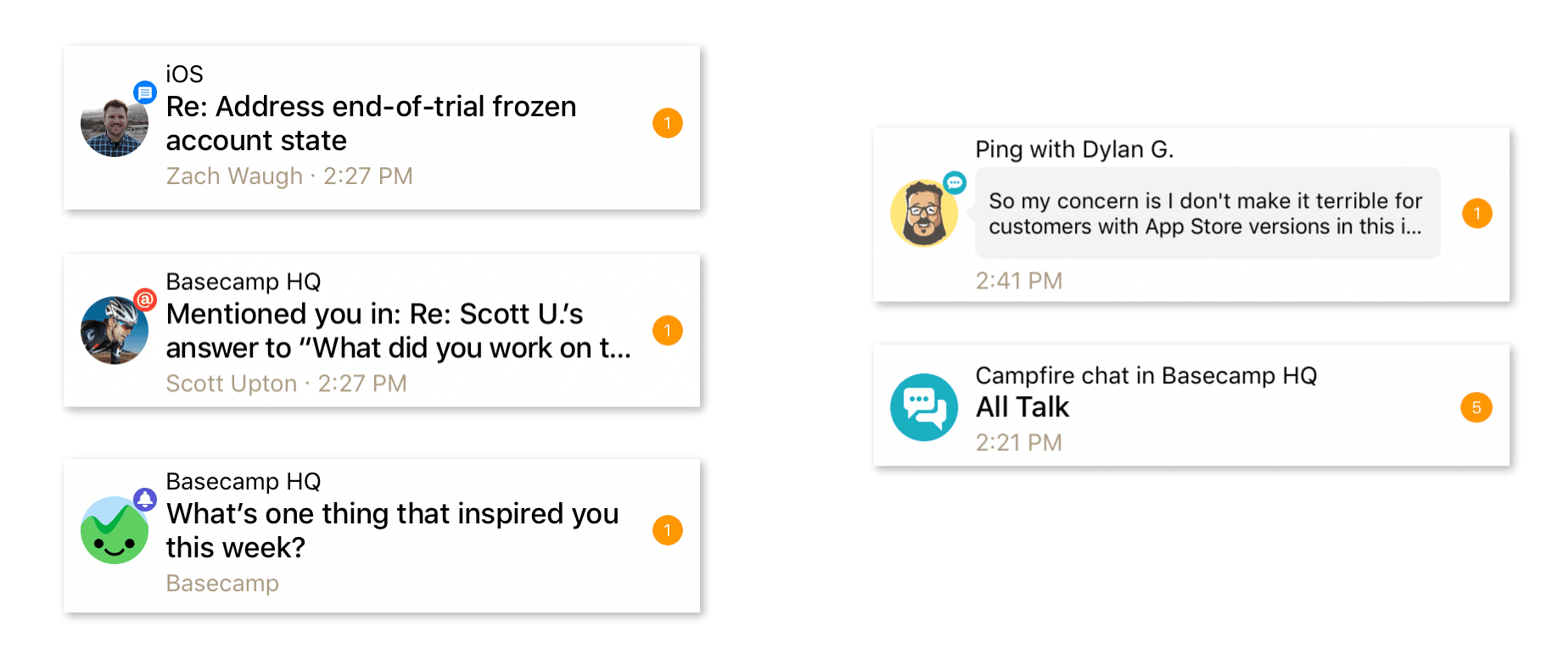
The Unified Inbox
Next, we set off to explore a design that we came to call the Unified Inbox. We reasoned that if you weren’t getting dozens of notifications at a time then separating them into different buckets wasn’t all that useful. You don’t need a file cabinet if you’ve only got 3 folders. And it didn’t seem like managing focus was as important on your phone as it is on your laptop.
Having all these places to see what’s new for you seemed like overkill and it actually resulted in more work (jumping back-and-forth), more UI, and more cognitive load. Having all your notifications in one place just makes sense. It’s easier to pick-up when you’re new and easier to explain in a help document or customer support email.
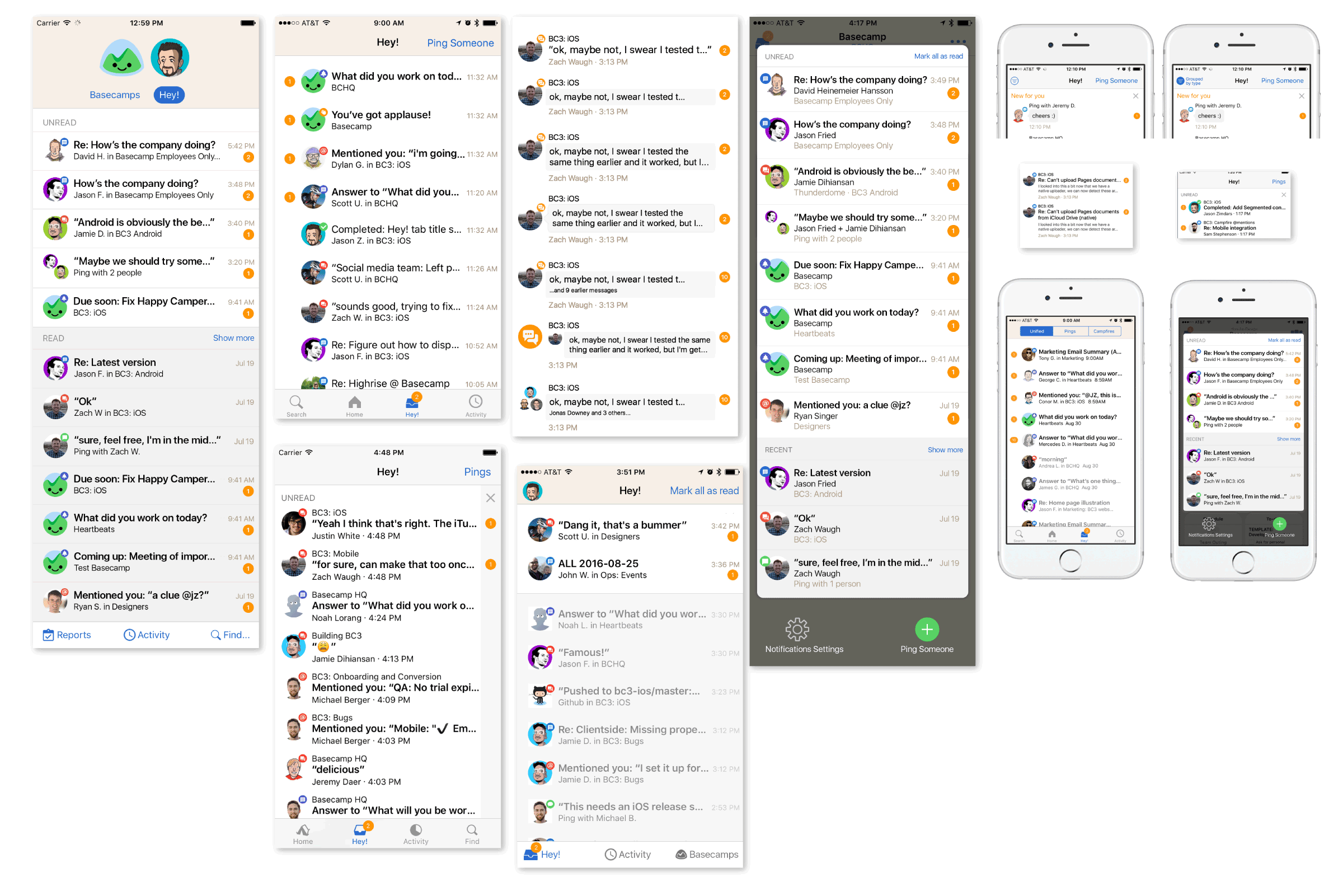
Combining these separate tabs into one screen called “Hey!” was a huge simplification but that was just the start.
Getting around in Basecamp
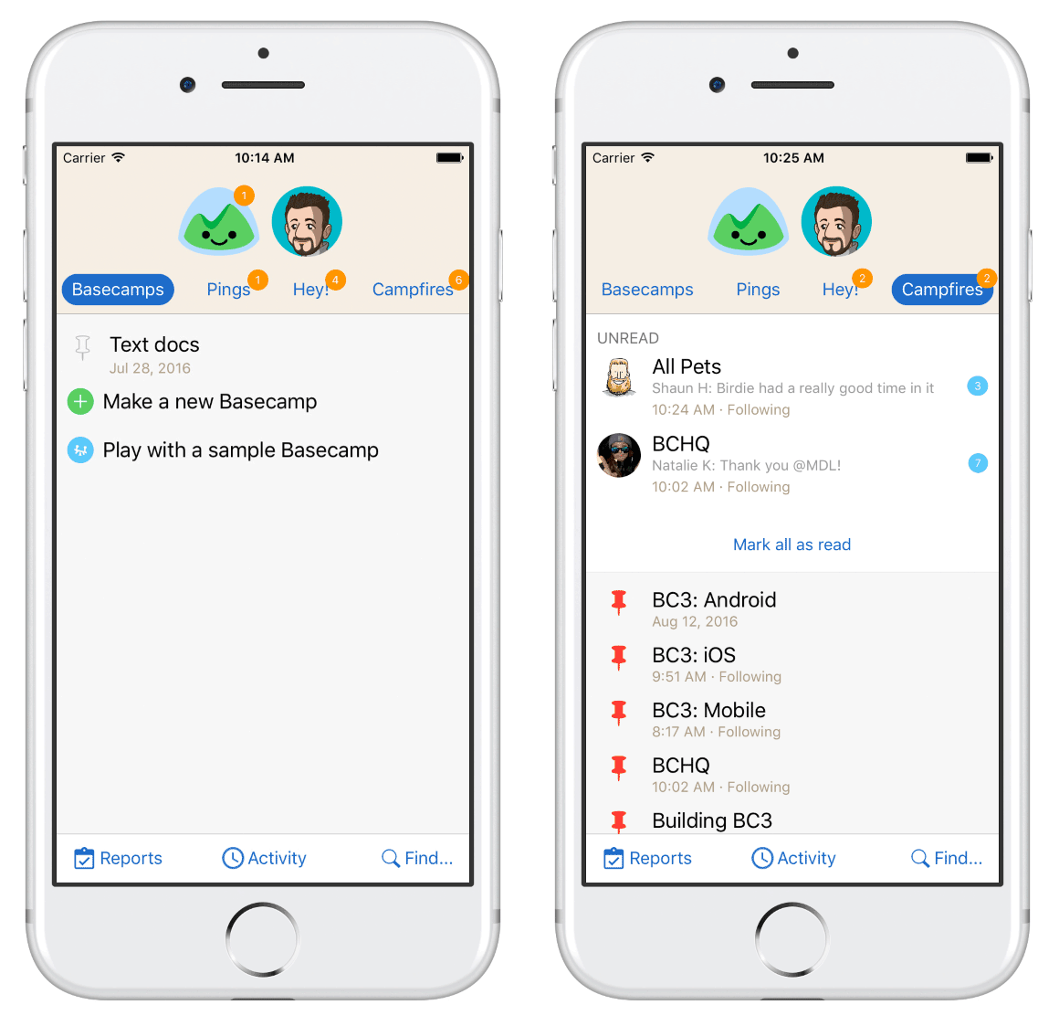
The old Basecamp Home screen was comprehensive but in providing a way to get to everything in Basecamp from one screen, it failed to help users understand what Basecamp was about and offered no hints about what matters most. This led to another radical idea, “What if there was no Home screen?” If your account wasn’t busy, starting each session on a screen that’s all about what’s new isn’t very useful. If Basecamp was all about your projects, why not have the project screen be the root of the app?
We imagined you’d open Basecamp to the last project you visited, it might even be your only project—even better. You’d still need a place to read your notifications when they arrived so a badged inbox button in the Navigation Bar would slide the inbox screen in from the left. If you did have multiple projects another button on the right side would slide a project switcher in from the right. As a bonus these overlaid the screen you were on so you’d never lose your place.
We jumped into Framer and started building prototypes to try out these ideas. Everything was feeling great and the project switcher was particularly promising. It wasn’t long, however, before we got stuck in the details. If we move x, how will people get to y? Doesn’t z require more taps than the old flow? Progress ground to a halt because a protoype isn’t real and it couldn’t answer certain questions. The way forward was to try our designs in the wild with real data.
Getting Real
We’d been using the project switcher in our prototypes for weeks but it only took a few hours of real world use to see the problems.
When you popped open the switcher you’d see a card for the project you were already viewing. Swiping right-to-left would reveal additional cards from off-screen, one for each of your most recently active projects. But you couldn’t see which card was next until you swiped which meant it was always a surprise which one you’d see. That was hardly intuitive. If the goal was to make it fast and easy to jump in and out of a few projects, this missed the mark. After a day or two we killed the idea completely.
But all was not lost! In a separate build we were also making the Unified Inbox idea real.
Writing real code is an expensive and time-consuming way to explore ideas that aren’t yet fully-formed. That’s the whole reason we started with prototypes in the first place! So we knew we needed to get real in order to move forward but we wanted to write as little code as possible. One way to do that was to plug the Unified Inbox into the existing Home screen. We didn’t need to figure out how to display it in an overlay in order to prove the concept.
We would never have tried this in a prototype but it worked great. Even better, one of our web product teams was working on a new design for the Projects (formerly Basecamps) screen that fit nicely. The one-two punch of Projects and Hey! was a great simplification. The constraints of writing real code took us down a path we didn’t expect and we never went back to the overlay design.
Putting it all together
We knew we were getting close and that’s when an old idea resurfaced. Earlier, Zach Waugh and Dylan Ginsburg had each proposed we try a standard iOS Tab Bar. The reasoning was sound: it’s a stock UI component on iOS that’s very flexible, widely used, and well understood by users.
I was concerned it would make Basecamp look generic and convinced it was a poor fit for Basecamp’s deep, hierarchical navigation which could leave users in a confusing state where multiple tabs were several screens away from the root view.
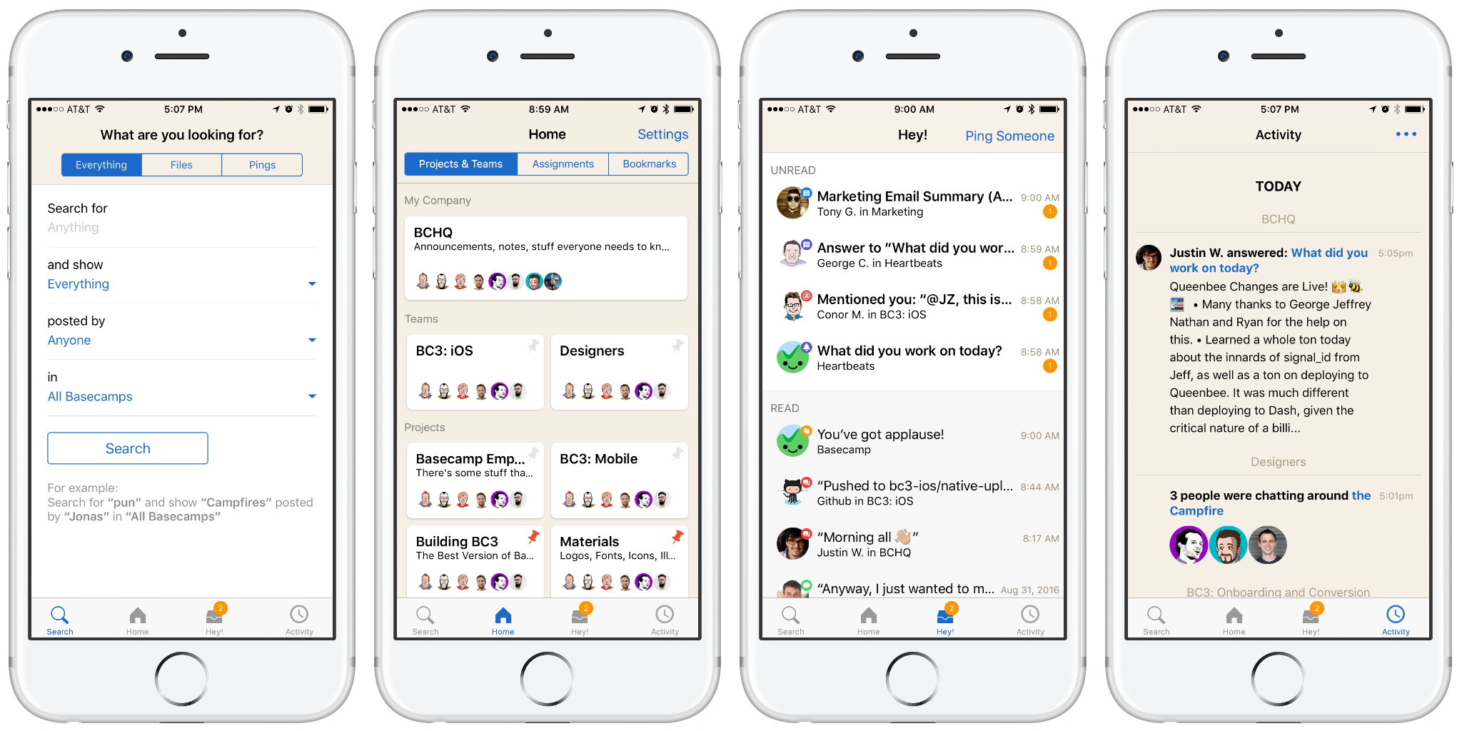
Dylan persistently pushed an internal build to prove the point. He was right, it was great. Conceptually, Basecamp was now four memorable and understandable places: Home (your projects), Hey! (your notifications), Activity (what’s going on), and Find…(search for something).
Finishing touches
We pushed the new tabbed design out to our internal testers with great excitement. Feedback was very positive and everyone seemed to agree this was a big step forward but one issue kept coming up: the Unified Inbox could feel overwhelming at times. With a lot of notifications—all using the same template—it could be hard to pick out the important stuff. At first, my instinct was to pushback on this as an “us” problem but I began to see that in some ways it was a step back.
Being able to visually spot a new Ping or @mention was important but we couldn’t agree that one type was more important than another in every situation or for every person. It was a highly personal thing. We considered grouping them by type, pushing kinds to the top of the list, even going back to separate tabs inside Hey!, but in the end all it took was a little graphic design to right the ship.
No destination in sight
Basecamp 3.3 is a nearly complete redesign of the app but we didn’t set out with that end in mind. We started with just a couple of observations and began exploring.
We made thousands of decisions, reacting to and building on the iteration before, all based on using it as we worked. New ideas came from people across the company, not just designers. It was only through that process that the ideas developed, through building and using it day-to-day that they matured, and only then could we see how they converged into something completely new.
We’re excited that Basecamp hasn’t just gotten better and more feature rich over the past year (it truly has) but I’m most proud that it also got simpler. We hope you agree and Basecamp is making you feel more in control of your company and your work.
Basecamp 3 is available on iOS, Android, Mac, and Windows — and anywhere you’ve got a web browser and an internet connection. Still haven’t tried Basecamp? Here’s what a 1,000 of our customers said when we asked, “What’s changed for the better since you started using Basecamp?”