Here’s an idea to make it easier for the driver to identify who they’re picking up, and for the passenger to feel more confident that they’re being picked up by the right driver.
I’ve used Uber a lot. They’ve nailed so much of the process. Hailing, riding, paying, etc. But there’s one little important moment in the experience that feels neglected. So here’s a straightforward idea I put together that doesn’t require expensive hardware installations, retrofits, steep learning curves, or challenging adoption curves.
The problem
Ever call an Uber, wait outside for it to show up, and then you have to do this dance where you raise your hand or point your phone or do some sort of maneuver so the driver can identify you? It’s not a problem if they are picking you up at isolated location where you are clearly the only person standing around, but I live in Chicago and there are people standing around all over. So waiting for a car looks the same as waiting for the bus, waiting for a friend, waiting for the light to change, or just waiting.
The proposed solution
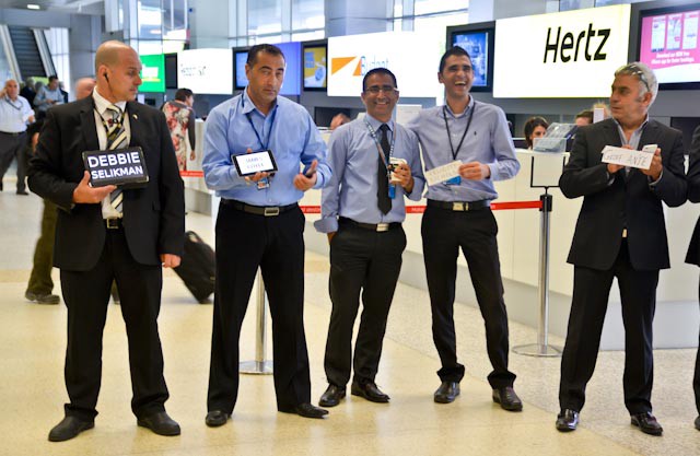
This problem of drivers and passengers being able to identify themselves at a fixed location has been solved long ago. Get off a plane, head to the baggage claim area, and you’ll see drivers holding up signs with people’s names. Like this:
However, in the case of Uber (or Lyft or…), the driver isn’t the one in the fixed position. You are. So rather than the driver holding a sign from within their car (which would obviously be hard to display and see), the passenger should be the one with the sign.
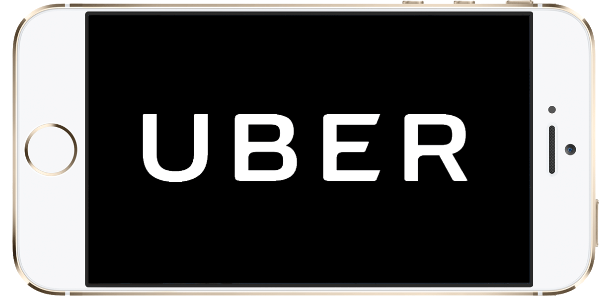
So here’s what I’d like to see happen. As the driver approaches, the Uber app switches from the map of the driver arriving, to a flashing Uber logo, alternating between black and white to attract enough attention. Then Uber tells you to hold your phone up so the driver will see you. Like this:
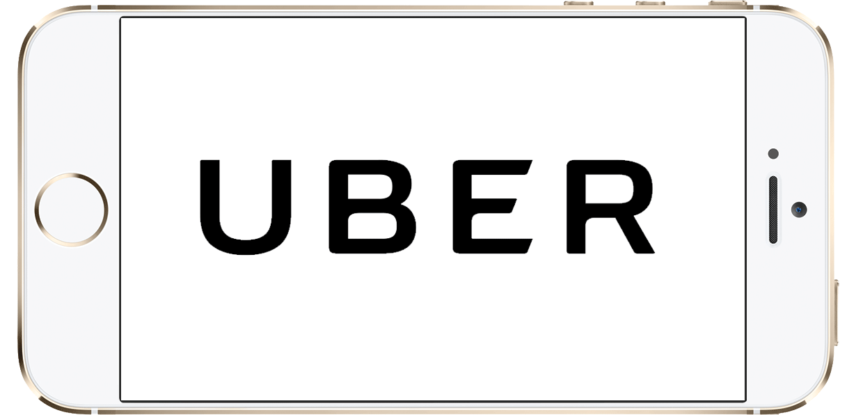
Now you’ve got your own sign that the driver can clearly see. Connection made! The driver sees you, and pulls right up. No more handwaving dance where the person across the street things you’re waiving at them, but really you’re just trying to flag down the driver who’s approaching.
Another version of the solution
Now, you might say “Well, what if there are a bunch of people waiting for an Uber at the same location?” Ah ha! Good question! This is what makes product design fun!
Here’s an idea. Rather than just flashing black and white, perhaps each passenger gets a color assigned randomly, but no two passengers in the same 500m would be assigned the same color at the same time. So then rather than just flash black and white, it flashes black and the color. Like this:
Then on the driver’s side, on their Uber app, it would show a purple block/dot/something that would let them know to look out for the passenger with the purple flashing logo. And if a driver was color blind, perhaps a big shape flashes as well. Or instead of the Uber logo, you could flash the first 4 letters of the person’s last name. Or… There are all sorts of other solutions that could be applied.
So, hey, please do this! Take it! It’ll make that last moment prior to pickup smoother, and less awkward. No more “You? Me? Wait, are you? Wait, me?” pointing back and forth through car windows. It would help a lot of passengers and drivers alike.
Note: I used Uber as an example, but the same thing applies to Lyft or any other ride hailing service.
Isn’t product design fun? Thinking through the little details like this? Identifying a problem and figuring out how to solve it? If you like this kind of thinking, check out Basecamp 3 — it’s full of great little details just like this.