How we made the Basecamp 3 Jump Menu accessible
Earlier this year I wrote about How we stopped making excuses and started improving Basecamp’s accessibility. Accessibility improvements in Basecamp 3 have come in two ways: All new features we’ve shipped over the past year and a half have been designed and tested to meet WCAG AA guidelines (The Web Content Accessibility Guidelines, or WCAG, provides a shared standard that web developers can follow to make sure their products are accessible).
At the same time, we’ve gone back and retrofitted existing features and interactions for better accessibility. Today I’m excited to announce that we just completed some significant improvements to the Basecamp 3 Jump Menu!
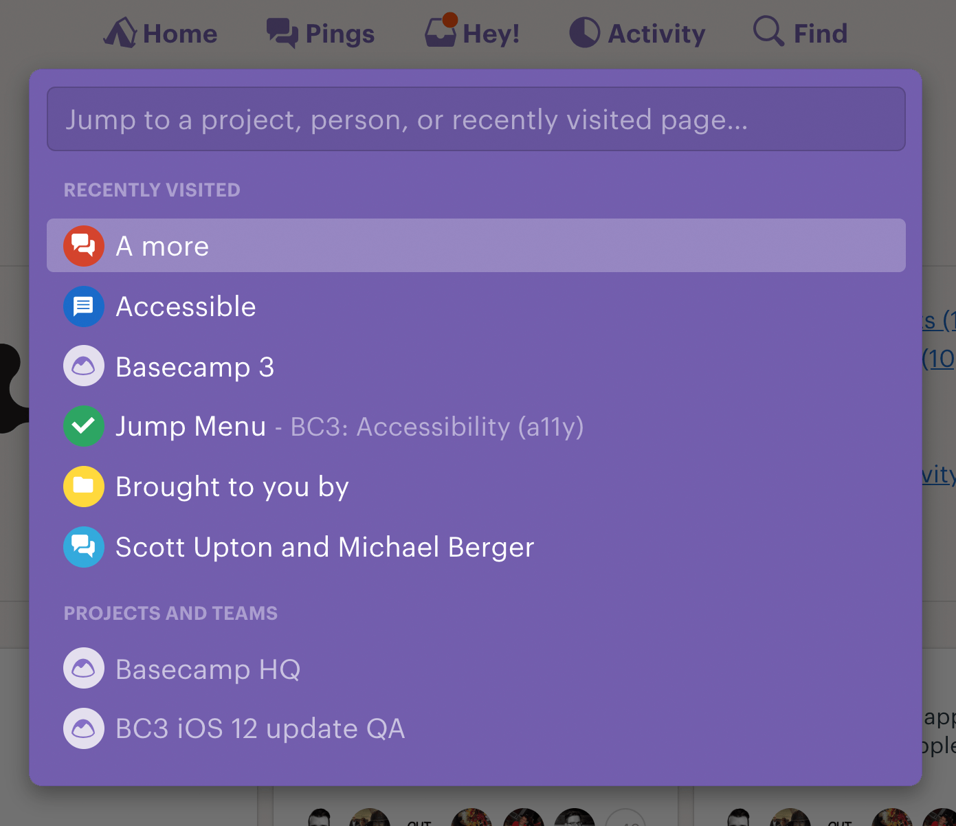
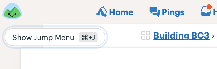
The jump menu has always been the quickest way for getting to a person, project, recently visited page, and My assignments/bookmarks/schedule /drafts/latest activity. Here’s a look at it in action:
In setting out to make the jump menu more accessible we identified a few specific areas in need of help.
1. Provide an alternate way to trigger the menu
The ⌘/Ctrl + J shortcut for opening the jump menu isn’t communicated in a non-visual way, and initiating multi-key commands can be difficult for people who have motor function challenges.
To improve this, we added a button-based trigger, implemented as an invisible button that appears when someone first presses their tab key after loading up Basecamp. This technique is very similar to the common “Skip Navigation” link technique used around the web (we added one to Basecamp at the end of last year).
2. Clear non-visual instructions for how to interact with it
As a visual user it’s fairly obvious how the jump menu works: We show the placeholder “Jump to project, person, or recently visited page…” with a blinking cursor, and a list of entries below it that filters down as you type.
To clarify this interaction for customers using a screen reader, we created a visually hidden <span> element with more verbose instructions, “Type to filter and use the up and down arrow keys to navigate this list of people, projects, and recently visited pages.”
3. Announcing the selected item and number of results as you filter
If you’re using a screen reader to filter through a list, how do you to know how many items are listed as your search term increases? And which item is selected as you arrow up/down or tab to navigate through the list of results?
This required the use of some specific HTML markup and JavaScript to convey this information to the Accessible Technology (such as screen reader software) that I’ll go into below.
Implementation
The first step in making a complex element like this one accessible is doing some research. We look for examples of similar elements from around the web for inspiration and guidance on the proper markup to use. The W3C WAI-ARIA examples site (get ready for a long one! “World Wide Web Consortium’s Web Accessibility Initiative (for) Accessible Rich Internet Applications”) is a great place to start. The second example on their Combobox with Listbox Popup Examples page, “List Autocomplete with Automatic Selection,” seemed most similar to the behavior of our Basecamp jump menu.
Authoritative as this site may seem, it’s worth testing the examples on real screen readers. There’s an abundance of quirks across screen reader + web browser combos that means these examples often don’t work quite as expected. When that happens, additional code is often required to get screen reader announcements to fire in the way you’d like. Expect lots of trial and error 😊
The implementation we settled on uses the aria-activedescendant property. This technique provides a way to keep DOM focus on the <input> while updating your selection as you move through the list of results. This is the key that allows the screen reader software to understand what’s happening on the screen. Here’s a look at the final product in action, followed by all of the dynamic and static attributes we used to get this working. For further reading about these attributes check out the W3C article linked above where many of the following definitions are borrowed from.
Demo
Code
- On the combobox container
<div>,our<bc-content-filter>element:
-
role="combobox": This identifies the element as a combobox. -
aria-haspopup="listbox": This indicates that the combobox is associated with a pop up list of suggested values. -
aria-owns="jump-menu__results": This associates the combobox with the results container. -
aria-expanded="true": This indicates that the associated results listbox popup element is displayed. Since in our case the list of results is always shown when the jump menu is shown, we don’t need to toggle this attribute. If it only appeared after some text was entered, we would need to toggle the attribute between this andaria-expanded="false".
2. On the text box <input>:
-
aria-autocomplete="list: Indicates that the autocomplete behavior of the string that’s entered is to suggest a list of possible values in a popup. -
aria-labelledby="a-jump-menu__description": A sort of backup label for instructions on how to use the jump menu. -
aria-controls="jump-menu__results": Points to the popup element that lists the suggested values. -
Dynamic attribute: As
up/down arrow keysortabare used to navigate the list of results JavaScript is used to update the value ofaria-activedescendant="IDREF"with the ID of the focused item.
3. A non-visible status <span> to communicate the number of results (e.g. “Home, 1 of 14”). Making it an aria live region with role=”status” and aria-live=”assertive” ensures that the screen reader will immediately speak any new text content that gets pushed into it. Just make sure the <span> is present in the DOM before pushing text into it, or it won’t work!
id=”a-jump-menu__status”-
role=”status”: A type of aria live region used for conveying advisory information. -
aria-live=”assertive”: This makes sure that when the selection changes, announcing it takes priority over anything else the screen reader might be saying. - Dynamic attribute: When the jump menu is first rendered we inject the name of the auto-selected first item in the list followed by the directions for using the widget (“Type to filter and use the up and down arrow keys to navigate this list of people, projects, and recently visited pages”). As you arrow/tab through the list of entries, we use a helper to update the contents of the span to again communicate the current selection, followed by your current location in the list, for example “Management team project – Match 2 of 3”.
4. Another hidden description <span>, referenced by aria-labelledby, provides a better description for how to use the jump menu than the visual placeholder:
id=”a-jump-menu__description”- Text content: “Type to filter and use the up and down arrow keys to navigate this list of people, projects, and recently visited pages”
5. On the listbox results container <div>:
-
id=”jump-menu__results”: Used as a reference by thecomboboxelement. -
role=”listbox”: Defines it as a container for the list of results.
6. On each <article> element in the list of results:
- A unique
idfor each result in the list. -
role=”option”: This defines the element as a listbox option. -
Dynamic attribute: Using JavaScript we set
aria-selected=”true”as you move through results. This correlates with when the item is referenced byaria-activedescendanton the<input>.
We also use some additional JavaScript to generate and set the “Match X of Y” status text:
https://gist.github.com/bergatron/71f0eac50c3a8b11d3d8715819c77c58
I hope this walkthrough was helpful! I would have loved to see more examples like this one as we were building the feature out. If you have any questions, please let us know!