Much of the tension in product development and interface design comes from trying to balance the obvious, the easy, and the possible. Figuring out which things go in which bucket is critical to fully understanding how to make something useful.
Shouldn’t everything be obvious? Unless you’re making a product that just does one thing — like a paperclip, for example — everything won’t be obvious. You have to make tough calls about what needs to be obvious, what should be easy, and what should be possible. The more things something (a product, a feature, a screen, etc) does, the more calls you have to make.
This isn’t the same as prioritizing things. High, medium, low priority doesn’t tell you enough about the problem. “What needs to be obvious?” is a better question to ask than “What’s high priority?” Further, priority doesn’t tell you anything about cost. And the first thing to internalize is that everything has a cost.
Making something obvious has a cost. You can’t make everything obvious because you have limited resources. I’m not talking money — although that may be part of it too. I’m primarily talking screen real estate, attention span, comprehension, etc.
Making something obvious is expensive because it often means you have to make a whole bunch of other things less obvious. Obvious dominates and only one thing can truly dominate at a time. It may be worth it to make that one thing completely obvious, but it’s still expensive.
Obvious is all about always. The thing(s) people do all the time, the always stuff, should be obvious. The core, the epicenter, the essence of the product should be obvious.
Beyond obvious, you’ll find easy. The things that should be easy are the things that people do frequently, but not always. It all depends on your product, and your customer, but when you build a product you should know the difference between the things people do all the time and the things they do often. This can be hard, and will often lead to the most internal debates, but it’s important to think deeply about the difference between always and often so you get this right.
And finally are the things that are possible. These are things people do sometimes. Rarely, even. So they don’t need to be front and center, but they need to be possible.
Possible is usually the trickiest category because the realistic list of things that should be possible will often be significantly longer than the list of things that should be obvious or easy. That means that some things on the possible list might be better off off the list completely. Instead of making them possible, maybe not making them at all is the right call.
Coming to know the difference between obvious, easy, and possible takes a lot of practice, deep thinking, critical analysis, and, often, debate. It’s a constant learning process. It helps you figure out what really matters.
But once you’re able to see the buckets clearly, and you begin to think about things in terms of obvious, easy, and possible instead of high, medium, and low priority, you’re on your way to building better products.
Check out how we’ve balanced the obvious, the easy, and the possible in the all-new Basecamp 3! There’s a whole lot of each in there!
When collaborating with others — especially when designers and programmers are part of the mix — watch out for these dirty four letter words:
Need
Must
Can’t
Easy
Just
Only
Fast
They are especially dangerous when you string them together. How many times have you said or heard something like this:
“We really need it. If we don’t we can’t make the customer happy. Wouldn’t it be easy if we just did it like that? Can you try it real fast?”
Of course they aren’t always bad. Sometimes they can do some good. But seeing them too often should raise a red flag. Be careful when you use them, be careful when you hear them. They can really get you into trouble.
We’ve always felt strongly that we should share our lessons in business and technology with the world, and that includes both our successes and our failures. We’ve written about some great successes: how we’ve improved support response time, sped up applications, and improved reliability. Today I want to share an experience that wasn’t a success.
This is the story of how we made a change to the Basecamp.com site that ended up costing us millions of dollars, how we found our way back from that, and what we learned in the process.
What happened?
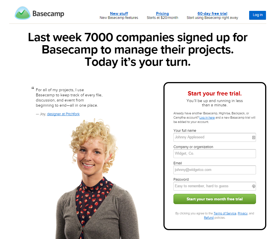
This story starts back in February 2014 when we officially became Basecamp the company. This was a major change — a rebranding, the discontinuation of some products, the sale or spinoff of others, and more. As part of that process, we decided to redesign basecamp.com (our “marketing site”) to reflect that it was not only the home of Basecamp the product but also Basecamp the company.
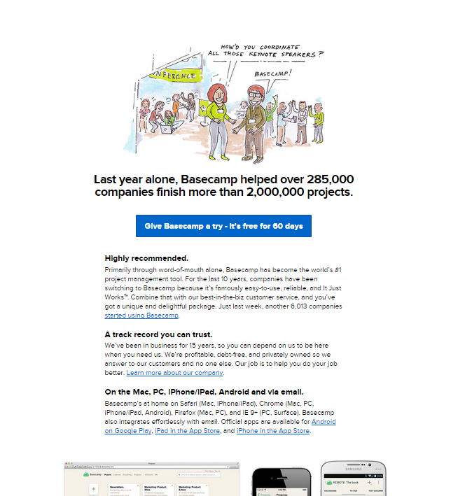
The result was a fairly dramatic change, both in content and visual style. The redesign extended well beyond just the landing home page (you can browse the archived version before and after we became Basecamp), but the most noticeable change was to the main page, which you can see below.
One very significant change here was that we removed the signup form from the homepage. This wasn’t necessarily the most considered decision; we hadn’t done extensive research or testing recently on the role of the number of steps required to signup for a Basecamp trial. Over the years, we’ve long debated the value of a fast signup (which might bring in more people initially) vs. a well considered signup (which might have fewer initial signups but still retain all of the committed people who would ultimately become paying customers), but as far as I’m aware, we didn’t explicitly decide that we wanted to go for a slower signup. It was one of the many decisions that we made in the course of “Becoming Basecamp”.
We didn’t A/B test this new marketing site initially for a variety of reasons: we were too busy to prepare dramatically different variations, we wanted to present a consistent image at this time of big change, and we liked what we had come up with.
Immediately after we changed the marketing site I noticed that conversion rate had fallen on the marketing site; a smaller portion of people visiting basecamp.com were signing up to try Basecamp than had been before we changed the site. This wasn’t an unexpected effect: we had more traffic coming to basecamp.com because we were redirecting visitors from 37signals.com and we picked up some tech press coverage and traffic from other low-converting sources, so a smaller portion of people signing up wasn’t initially concerning. In the immediate aftermath of Becoming Basecamp, the absolute number of signups held steady, which fit with our expectation as well.
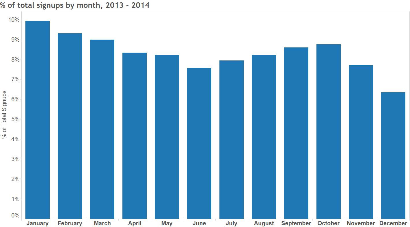
In the first couple of months after we changed the marketing site, signups trended lower than they had at the start of the year. This, too, wasn’t a hugely concerning event by itself: our biggest signup month is always January, and things slow down through late summer and then pick back up again in the fall. Because demand for Basecamp is driven in part by normal cycles within small businesses (many of which start new projects at the start of the calendar year), there’s a fairly strong seasonality to new signups.
It took a while to conclude that the decline in signups we saw through the summer of 2014 was more than normal seasonality. When things didn’t pick back up in the fall, it was clear that there was something else going on. In an internal writeup of our 2014 performance, I wrote:
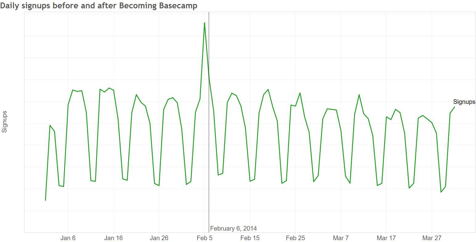
Things didn’t improve through the first half of 2015, and we discussed it intermittently without making any major changes. Finally, in July we launched an A/B test that brought a signup form back onto the homepage, with immediate and dramatic results: signups increased by 16% in the with-signup-form group compared to the group without. The net impact upon finishing the test and rolling out the change to 100% of traffic was clearly visible:
We’re of course thrilled to have this performance back: at our scale, this sort of improvement is worth millions of dollars in revenue. The period of degraded performance was in no way threatening our livelihood (2014 was our highest revenue year ever, and 2015 is on track to beat it), but it certainly hurt.
Where did we go wrong and what can we learn?
There’s an obvious lesson here: in the specific context of Basecamp at the moment, we get more net paying customers when we make it as easy as possible for people to get started. The marketing site for the new version of Basecamp we’ll be launching soon will include a signup form on the homepage, but this is just the surface level learning from this experience.
The deeper lessons are really about process, and there are two key things that I hope we take away from this experience:
1. We don’t know what will work. We didn’t A/B test this change, which meant it took a long time to notice what happened. An A/B test of the new marketing site vs. old, conducted back in February 2014, would likely have caught the lower performance of the redesign within a couple of weeks. In an A/B test, you hold many external factors constant — the same seasonality effects apply, you can send the same mix of sources to each variation, etc. This lets you draw a more direct connection between what you are changing (the design, and more specifically the number of steps in the signup flow) and signup rates.
Because we didn’t test the redesign, we were limited to making longitudinal comparisons to see how the new marketing site compared to the old. With seasonality and other external effects (for example, when you rename your company and discontinue some products), it’s really hard to identify which of the many things that contribute to the ultimate number of signups we see had what impact, so it took us a while to nail down exactly what was happening.
It’s easy to decide not to test a change — you’re busy, you just know it will be better, you don’t want to risk the confusion that’s always possible anything you’re running a split test. In the future, it will be easy for us to justify spending the time and effort to test a marketing site redesign thoroughly in the future — we’ve learned the hard way what can happen if you don’t do that.
While we’re unlikely to make exactly this same mistake again, it’s worth considering where else we might be making a similar mistake that we aren’t even aware of. Are there areas of the product where we make untested assumptions that might have a big impact either on us as a business or on our customers success at using Basecamp? Can we test our beliefs in a quantifiable way?
2. We didn’t communicate effectively. Because we’re such a small company, many of the decisions about things like where to put the signup form are made by individuals or very small groups without a lot of broader discussion. In this case, that discussion might have brought up the risk associated with removing the signup form from the homepage, and we might have made a different decision back in 2014.
We also failed to take action quickly once we knew what was going on: over six months passed between when we clearly identified the problem and when we took action to address it.
We’re a very project-driven company: we tend to focus on a limited set of things at any given time and work on those very actively. In the time between the redesign and now we’ve collectively worked on a lot of different projects. We launched The Distance, added many new features to Basecamp, worked on many behind-the-scenes projects, and have been hard at work on the next version of Basecamp coming out soon. We also shifted a designer who had been working on things like our marketing site to work on Android, and we explored a bunch of new marketing ideas around advertising, sponsorship, etc.
All of this led to us just not spending a lot of time thinking about our marketing site, and that’s reflected in the pace of testing and refinement that it’s seen. We conducted only 1/3rd as many A/B tests in 2014 as the year before, and made significantly fewer commits to the marketing site’s repository. This all helps to explain why we were so slow to act: with no ongoing project working on the marketing site, we just weren’t spending any time thinking or talking about it.
As a data analyst, I could have done more, too — I knew that we should have A/B tested the redesign when we did it, and I knew that we needed to try bringing back the signup form months before we actually ran a test. In both cases, I either didn’t find the opportunity to make my case or didn’t do it vociferously enough to change the outcome. In hindsight I certainly wish I’d banged the table more loudly.
These were certainly painful and expensive lessons to learn, and we’re fortunate that the fundamentals of our business are strong enough that this wasn’t anywhere near an existential crisis. We’ll be a better company as a result of having gone through this, and hopefully we won’t make the same or similar mistakes in the future.
Today we’re feeling really good because we get to announce that Mercedes De Luca will be joining Basecamp as our first-ever COO.
Over the last few years, David and I have come to realize that high-level strategy and hands-on product development is what we enjoy doing most. But of course there’s so much more to running a company than just that stuff.
Products are products, but companies are products too. Your company should be your best product, since it’s the product that produces all the others. We should operate the company with as much love and attention and care as we put into building our products. We want Basecamp the company to be outstanding at every level.
Mercedes is going to help us be all we can be. She’s been a CEO, a CTO, a CIO, and a GM. She’s run big groups and small groups — local and remote. She has the right mix of a structured, analytical mind and an insightful, creative spirit.
She’s wonderful with people — warm, approachable, and motivated to help everyone else be the best they can be. She’s excellent at spotting gaps, identifying things we should be trying that we’re not, building up capabilities without introducing bloat, and pulling together a team that produces results without compromising what a company stands for. She’s a person of principle and strong character. Her references were glowing — and so many of them touched on just how wonderful a person she is. That had a big influence on us.
We’re fortunate to have her on our team. We’re going to learn a lot, do a lot, and have a lot of fun along the way. And like the majority of our company, she’ll be working remotely (she’s based in California).
We were careful and deliberate with our COO search. We’ve got a great thing going here and the easiest thing to do is to fuck it all up. This is a major role and we don’t want to upset the balance that makes this company what it is today and what it’s been for nearly 17 years. We were looking for someone who would feel like they’ve been here for years, but also someone with a fresh outsider’s perspective. Someone who can push us in new directions and challenge us to do things we may have never done on our own — but never at the expense of the values we hold near and dear.
We talked to contacts we knew, asked others for recommendations, and ultimately hired an executive recruiter to help find the perfect fit. After interviewing an august collection of highly qualified and capable people, Mercedes stood out as the one for us. When it comes to considering a group of people who are all clearly qualified to do the job well, it ultimately comes down to something else — comfort. How do you feel about someone? Who do you click with? Who has the right combination of subtitles, perspectives, and life experiences that add up to something unique? For us, Mercedes had all the right stuff.
She’ll be starting in a few weeks. We think you’ll be able to feel her presence and influence in 2016. With an all new version of Basecamp right around the corner, with the best team we’ve ever had, and with Mercedes joining the crew, we look forward to the new year, the next decade, and beyond. Good stuff on the way.
Designers often talk about the look and feel of a product, an app, an object, etc. These are good concepts to be talking about, but how the thing feels isn’t really the important feel. The important feel is how it makes you feel. That feeling isn’t usually covered by look and feel discussions.
This has recently come into focus for me. The trigger? Instagram.
I’ve been on Twitter (@jasonfried) for years. Since I don’t have a Facebook account, Twitter has been my only social networking outlet. I mostly use it for sharing novel or interesting things I’ve seen or read, the occasional quote, or a point of view, perspective, or epiphany about something business related.
I follow just under 200 people. Some of them I know personally, others I’ve never met, some are brands, some are individuals, some are because of hobbies or special interests, some are dead serious, others funny or silly. It’s a healthy mix, and I try to pay attention to everything that shows up in my feed.
Twitter’s an amazing thing, no question. I think it’s one of the most important products ever, and it’s absolutely changed the way ideas, news, insights, complaints, and casual communications happen.
A few months ago I signed up for Instagram (@jason.fried). I started following a few people — some of the same people I follow on Twitter. Almost immediately I felt something — I felt good! Instagram makes me feel good. I enjoy thumbing through Instagram.
Since then, every time I’ve gone back to Twitter, I’ve noticed I’ve felt anxious, unhappy, uncomfortable. I didn’t notice this before I started using Instagram, because I didn’t have anything to contrast it with. It was just the way it was, and I didn’t think much about how it made me feel.
Every scroll through Twitter puts at least one person’s bad day, shitty experience, or moment of snark in front of me. These are good happy people — I know many of them in real life — but for whatever reason, Twitter is the place they let their shit loose. And while it’s easy to do, it’s not comfortable to be around. I don’t enjoy it.
Every scroll through Instagram puts someone’s good day in front of me. A vacation picture, something new they got that they love, pictures of nature, pictures of people they love, places they’ve been, and stuff they want to cheer about. It’s just flat out harder to be negative when sharing a picture. This isn’t a small thing — it’s a very big deal. I feel good when I browse Instagram. That’s the feel that matters.
So now I have a choice… When I have a few minutes to kill, and my phone is in front of me, I almost always reach for Instagram. I never regret it. I come away feeling the same or better. When I occasionally reach for Twitter, I discover someone’s pissed about something. I often come away feeling worse, feeling anxious, or just generally not feeling great about the world. Twitter actually gives me a negative impression of my friends. I know it’s not Twitter doing it, but it’s happening on Twitter. that’s how Twitter feels to me.
None of this has anything to do with how the apps look or feel. It’s not the buttons, it’s not the animations, it’s not the interface or visual design. It’s not the colors, it’s not the font, it’s not the transitions. It’s how using the apps make me feel before, during, and after. The sense of anticipation (am I about to see something wonderful vs. am I about to get a dose of someone’s bad day?), the things I experience as I scroll through (a butterfly vs. an injustice), and how I feel once I’m done (that was nice vs. fuck that — ugh).
The Twitter vs. Instagram experience is really reinforcing what matters when designing a product. What kind of behavior can we encourage? What kind of moments can we create for people? What do people anticipate before they use something? How does it leave them feeling when they’re done? These are now some of the most important questions for me when working on a design.
BTW: You can follow me on Twitter at @jasonfried or on Instagram at @jason.fried. I promise to keep both positive.
I was recently speaking to a class at a local university and the topic of valuations came up. One student asked me what our valuation was. I gave her the honest answer: I haven’t a clue.
How is it possible that a successful software company today doesn’t know its worth? A valuation is what other people think your business is worth. I’ve only ever been interested in what our company is worth to us.
Startups these days are bantered about as if they were in a fantasy football bracket. Did you hear Lyft raised another $150 million at a $2.5 billion valuation? But Uber got tossed another $2.8 billion at a $41.2 billion valuation! Then there are the companies barely off the ground getting VC backing with 25x valuations, despite having no product or business model.
Entrepreneurs by nature are competitive. But fundraising has become the sport in place of the nuts and bolts of building a sustainable business.
The last time I considered Basecamp’s valuation was nearly a decade ago. We’d been approached by dozens of VC firms looking to invest. But with a solid product, a growing consumer base, and increasing profitability, we didn’t entertain any offers.
Then, in 2006, I got an email from Jeff Bezos’s personal assistant. Jeff wanted to meet. I’d long admired him for what he was building at Amazon, and how he generally sees the world. I took the meeting.
After a visit to Seattle and a few more calls, Jeff bought a small piece of our company. I didn’t take the cash out of some fantastical desire to turn Basecamp into a rocket ship. Instead, his purchasing shares from me and my co-founder took a little risk off the table and gave us direct access to the brain of one of today’s greatest living entrepreneurs.
In the years since, we’ve been approached by nearly 100 private investors, VCs, and private equity firms. They want to put money into our company, but we don’t want it. It’s not hubris; it’s the cost that comes with the cash. I want to deliver a product that our customers want, not one that our investors want. I want to grow our company according to our timetable, not one dictated by a board. For many startups, funding has worked to their detriment — unnecessarily raised stakes, a path to unnaturally rapid growth. Venture capital is not free money.
Years ago, during the investment discussion with Jeff, we had to place a financial value on our company. The process of constructing a valuation was pretty silly, to be honest. We drew up charts, made some educated guesses, negotiated back and forth, and ultimately came up with a figure. We made it up, as everyone does. Let’s just admit it right now: Financial projections are big, fat guesses. They are best-case scenarios. Since they’re hypothetical, why not pull a number out of a hat?
Jeff knows this. All investors know this. Yes, you can look at revenue and profit and multiples, but so many tech company projections these days aren’t based on anything real. They’re based on fantasy. And too often, the more profit you have, the lower your valuation is. Because nothing pops the valuation bubble like reality.
My not knowing how much our company is worth doesn’t affect our business on a daily basis. I know our revenue and our profit. I know how fast we respond to customer service inquiries and how many people signed up for Basecamp last week. Those are real numbers to me. A valuation is an invented number that ebbs and flows on the basis of how much someone else thinks you’re worth. It’s nothing more than a distraction.
Here are a few reasons, in no particular order, why I think The Drudge Report is one of the best designed sites on the web.
Staying power
People talk about timeless design all the time. But most things people point to that are timeless end up being time stamped. The Drudge Report, on the other hand, has proven timeless. It’s generic list of links, black and white monospaced font, and ALL CAPS headlines have survived every trend, every fad, every movement, every era, every design do or don’t. It doesn’t look old and it doesn’t look new — it looks Drudge. It hasn’t changed since at least 1997, and I believe the design goes back even further. How many sites can survive — and thrive — unchanged for a decade? That’s special.
It’s straightforward
There are no tricks, no sections, no deep linking, no special technology required. It’s all right there on one page. “But it’s a mess!” you could say. I’d say “it’s straightforward mess.” I wouldn’t underestimate the merit in that.
It’s unique
When you’re on the Drudge Report you’re on the Drudge Report. There’s no question where you are. The design has become iconic. How many other news sites can claim that? If you pull the logo off some of the other major news sites/networks (CNN, MSNBC, FOX News, ABC News, CBS News, etc.) you may have a hard time distinguishing them from one another. They all sorta blend into the same standard news-site look and feel. There are a few standouts, but even the NYT and the WSJ aren’t that unique. Drudge’s design stands alone.
This is important
Many news sites have lost their guts. They’re afraid to really call out one big story. They may have a leading headline, but it’s not all that obvious or different from the others. It may be a font size or two bigger, but it’s not confident. They hedge. Drudge, on the other hand, says “this is the story of the moment” with a huge headline. This is what’s important in the news right now and nothing else even comes close. Drudge isn’t afraid to be an opinionated editor and his site design perfectly emphasizes that. It’s bold, it’s risky, and it’s pure Drudge design.
It’s good cluttered
The Drudge Report usually leads with a “font size=+7” ALL CAPS headline in Arial. Sometimes it’s italicized. Sometimes, for something big big, he’ll cap it off with the infamous siren.
The infamous Drudge siren.
After that you have three columns. Some headlines are sentence case, some are ALL CAPS. Some have photos, some are just a plain text headline. Sometimes more controversial or sensational headlines are colored red. There’s usually a big ad at the top and a few other ads sprinkled among the columns.
Stories aren’t grouped or organized except probably more interesting ones up top. And that’s it. Your eye darts all over the place looking around for something that looks interesting. The design encourages wandering and random discovery.
The site feels like a chaotic newsroom with the cutting room floor exposed. I think that’s part of the excitement — and good design.
Breaking news is breaking news
Have you seen “breaking news” on MSNBC or CNN lately? Almost anything can pass for breaking news now. “So and so speaks to the press about this or that” is now breaking news. Breaking news used to mean something seriously big and important or spectacular just happened. But the major news sites have watered it way down. When I hit MSNBC or CNN, and they have a “breaking news” bar (red/yellow usually), it’s easy to ignore because they’ve cried wolf one too many times. But when you see a big honking red ALL CAPS headline with the flashing siren on Drudge, you know it’s newsworthy.
One guy can run it
The site is run by Matt Drudge full time with help from an occasional part-time contributor. If the site was 5 pages or 10 pages or 30 pages, he’d likely need additional people and technology to manage it all.
No news is the news
The Drudge Report is a headline site. There’s no “content” on the site. Yet, that’s news. The headlines themselves can be news. Drudge breaks stories without writing stories. In fact, The Drudge Report may be one of the only sites on the web that can break a story with just a headline or a photo. That’s baked right into the design.
It sends people away to keep them coming back
There’s actually no content on the Drudge Report. Well, sometimes he will post an email or a memo on his site, but it’s 99% links out to other news sources. His site is designed to send you away to bring you back. The more often you hit his site to go somewhere else the more often you’ll return to go somewhere else again. You visit the Drudge Report more because you leave the Drudge Report more. This is one of the secrets to building traffic: The more you send people away the more they’ll come back.
It’s fast
When you visit The Drudge Report, you get the Drudge report. There are no interstitial ads. There’s no load time. There’s no buffering. There’s nothing but instant content. The Drudge Report is Google-fast and Craigslist fast — quite a feat for a site that does 3,000,000 uniques a month run by one guy.BTW: Those 3,000,000 uniques a month translate into hundreds of millions of visits a month (source: CNN).
It’s cheap to maintain
The design of the Drudge Report doesn’t require a fancy CMS or, in fact, anyCMS at all. It’s edited by hand. His overhead is probably a couple grand a month max. A few thousand bucks a year in overhead that generates a few million a year in revenue. That’s good design.
It’s one page
The Drudge Report is one page. Every visit and every visitor is focused on that one page with a headline and three columns. He knows exactly what people are going to see, he knows exactly how people are going to see it. There’s no mystery page here that hasn’t been redesigned or mystery page there that’s throwing an error. It’s one page to look at at one page to work on. It is what it is. It doesn’t try too hard to be something it’s not.
It makes him a great living
Based on published ad rates and traffic numbers, it’s estimated that Matt Drudge makes “over a million a year.” Not bad for a single black and white page on the internet.
So these are some of the reasons why I think The Drudge Report is one of the best designed sites on the web. Swing away.
I used to be a hothead. Whenever anyone said anything, I’d think of a way to disagree. I’d push back hard if something didn’t fit my world-view.
It’s like I had to be first with an opinion — as if being first meant something. But what it really meant was that I wasn’t thinking hard enough about the problem. The faster you react, the less you think. Not always, but often.
It’s easy to talk about knee jerk reactions as if they are things that only other people have. You have them too. If your neighbor isn’t immune, neither are you.
One’s strapped to my left wrist. The other lives in my pocket.
The one on my wrist can tell me the time (precisely in 12 hour format, roughly in 24), the day of the week, the month of the year, which year of the leap year cycle we’re in, and the current moon phase. But that’s its limit. There’s no software, only hardware. It’s programmed in springs and gears and levers and jewels.
The one in my pocket can tell me anything and do just about everything. It knows my voice, it responds to my touch, and it even instantly recognizes my fingerprint out of fourteen billion fingers. This machine even knows the angle, velocity, and distance it travels when I swing it around. And it always knows exactly where it is anywhere on the planet.
But sometimes I wonder which one is more modern.
The one in my pocket can do more, but only for a limited time. And then it can’t do anything. It dies unless it can drink electrons from a wall through a cable straw for some hours every day. And in a few years it’ll be outdated. In ten years it might as well be 100 years old. Is something that ages so fast ever actually modern?
And then there’s the machine on my wrist. It’s powered entirely by human movement. No batteries, no cables, no daily dependency on the outside world. As long as I’m running, it’s running. And as long as one person checks it out once a decade, it’ll be working as well in 100 years as it works today. It’s better than modern. It’s timeless — yet it keeps time.
As time goes by, my pocket will meet many machines. My wrist might too. But when I look down at the machine on my wrist today, and know that in 50 years my son will be able to look down at his wrist at the same machine ticking away the same way it ticks today. That’s a special kind of modern reserved for a special kind of machine: the wonderful mechanical wristwatch.
One of the biggest challenges when hiring someone is trying to envision their potential.
Sometimes someone’s a sure bet. They’re the perfect person for the perfect project at the perfect time. Their pedigree is exceptional, their portfolio is stocked with amazing work, their experience is vast, they’re a confident interview, and everything just feels right.
It happens, but that’s not how it usually works. There are very few perfect people.
Instead there’s a lot of future perfect people. People who have the potential to become the perfect person in the perfect role if just given the right opportunity.
When I hire designers, I look for future perfect people. Some people have the potential, but they haven’t had the opportunities. Their portfolios are full of mediocre work, but it’s not because they’re mediocre designers. It’s because they’ve been given mediocre opportunities.
A lot of future perfect people are stuck in current mediocre positions. They just haven’t had the chance to do their best work.
While it’s a bonus to find that perfect person today, I find more it more rewarding (for me and them) to pluck the future perfect person out of their mediocre job today. I love betting on people with potential. When they finally get that chance to do their best work, they blossom in such a special way.
And as the owner of a company, few things make me prouder than seeing someone excelling in a way that their resume/portfolio/references wouldn’t have suggested they could.