Improve your App by Connecting the Dots.


Improve instead of redoing

The Basecamp 3 app for Android is designed and maintained by a team of three people: Dan Kim, Jay Ohms, and me. We keep pace with the rest of the company because it’s a hybrid app—native code plus mobile web views. New Basecamp features usually work in the Android app without us having to re-do the same feature in native code.

This hybrid architecture allows us to focus on Android specific improvements. Recently that’s meant giving customers a way to add stuff like to-dos and share links faster than they can in the web browser or through the desktop app. Here’s how we approach improving the Basecamp 3 Android app.


Lay the foundation

A few months ago Jay Ohms and I designed a way for customers to quickly add to-dos, messages, events, and file attachments right from the app home screen. We call this feature Quick Add.

On the surface, implementing the feature looks pretty easy. You might be thinking “All you did there was add the Floating Action Button thing that other Android apps have!”

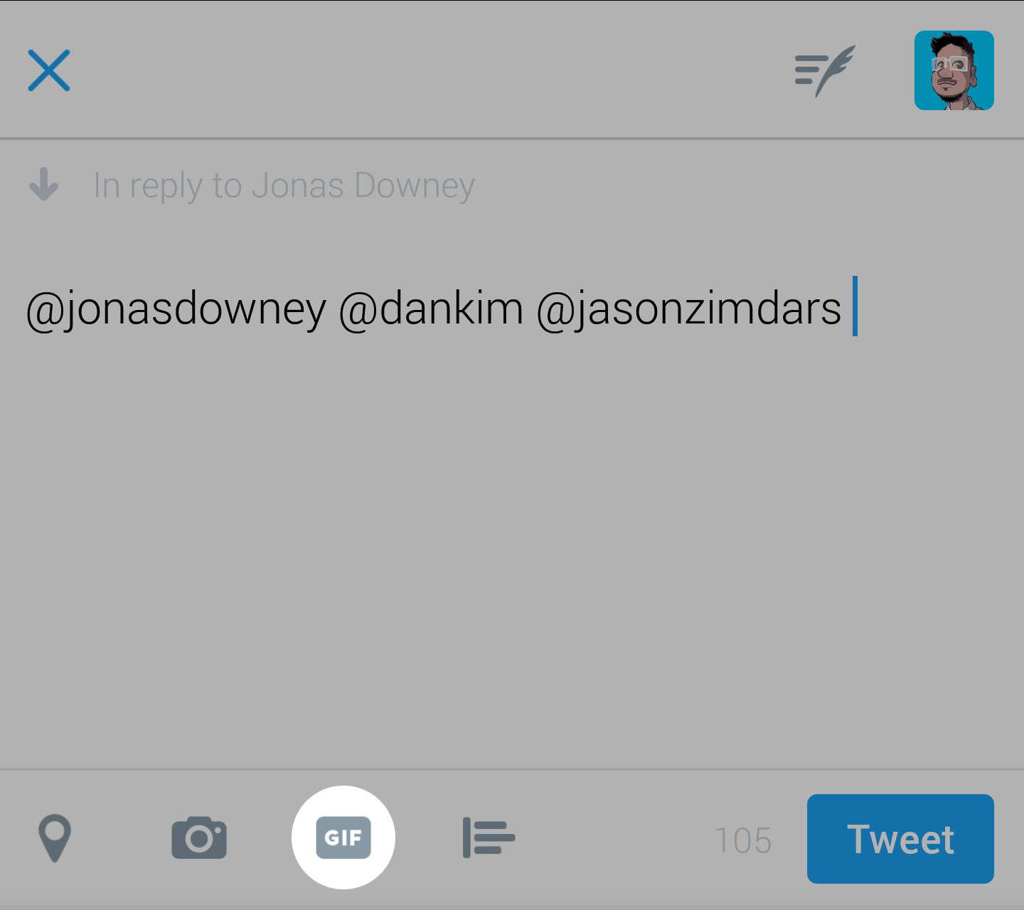
However, you’ll quickly realize that the customer needs a way to pick the correct Basecamp. We don’t have any information about where this new to-do is going. This interaction is also happening on a small screen. When a customer has many Basecamps the app needs to provide a way to make it fast and easy to pick the right one.

Jay and I made a Basecamp picker screen, and added a list of your recent Basecamps. These recent Basecamps are based on ones you’ve recently chosen through the Quick Add interface. We also made a screen that allows you to select the To-do list and make the to-do. Here’s what that looks like:


We approached this project in the way we always do: by building the necessary screens to get the feature working. We didn’t realize it then, but we were laying down the foundation for different feature that would further improve the Android app.

Bridge the gaps

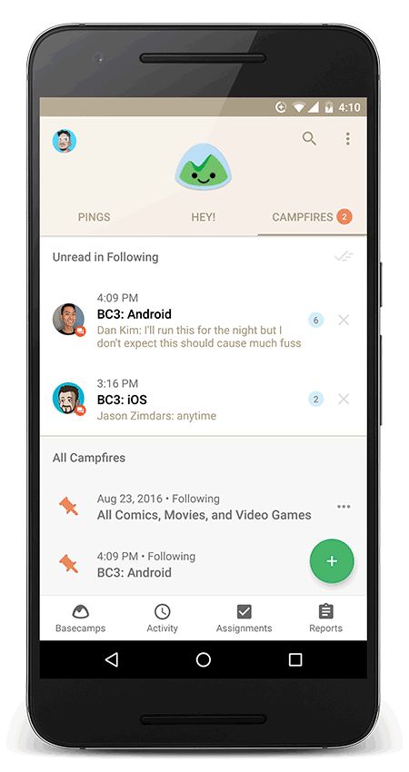
Shortly after launching the Quick Add feature, Dan Kim started looking into customer usage patterns. He noticed that the My Assignments screen was one of the top destinations from the home screen. This was odd since My Assignments was only accessible from tapping your profile picture on the home screen.


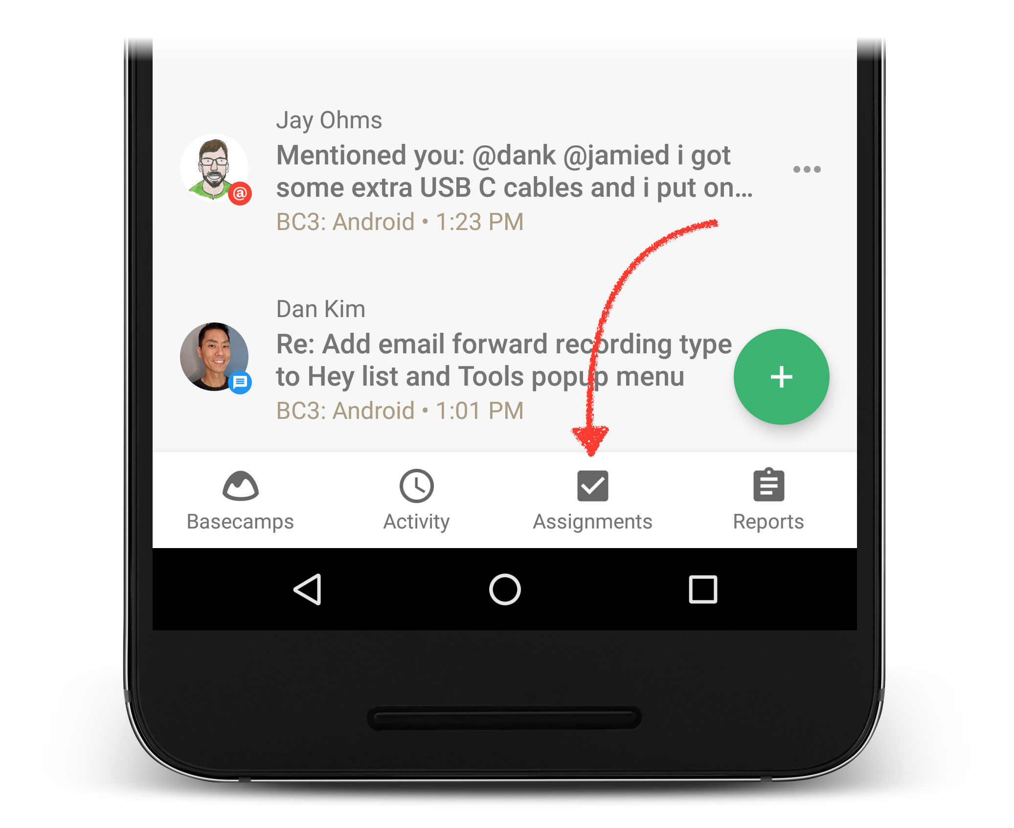
It seemed that customers wanted quick access to their to-dos, and we weren’t making it easy by burying it. It sounds obvious in hindsight. Of course you want to see your to-dos as quickly as possible. Your mobile phone is your most personal device.

Dan pushed to get My Assignments onto the home screen. Now customers can quickly see what to-dos need to get done when opening the app.

Use the foundation

It’s nice that we added My Assignments to the home screen. However, the My Assignments screen is read-only. That means you can’t add new to-dos from that screen. You can only see to-dos that have been assigned to you.

I mentioned earlier that we’re able to get a lot done with a small team because of the hybrid architecture and the web views. However, the interaction design for web views is sometimes optimized for desktop browser use. We might want to design a special interaction for the mobile app, but we can’t with the web view we get from the Basecamp 3 core team.


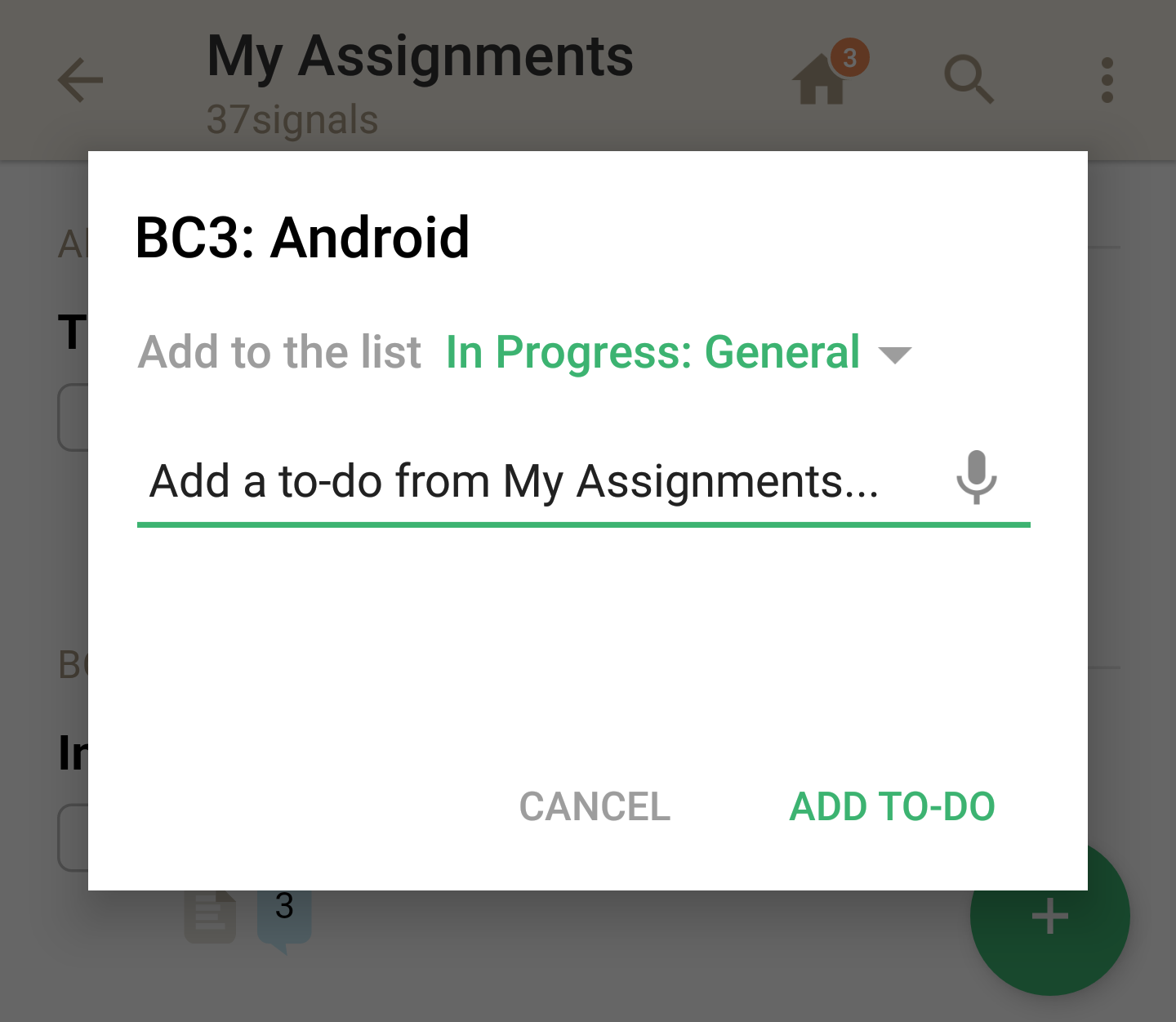
If there isn’t a way to add to-dos on the My Assignments screen from the browser then there isn’t a way to add to-dos from mobile.

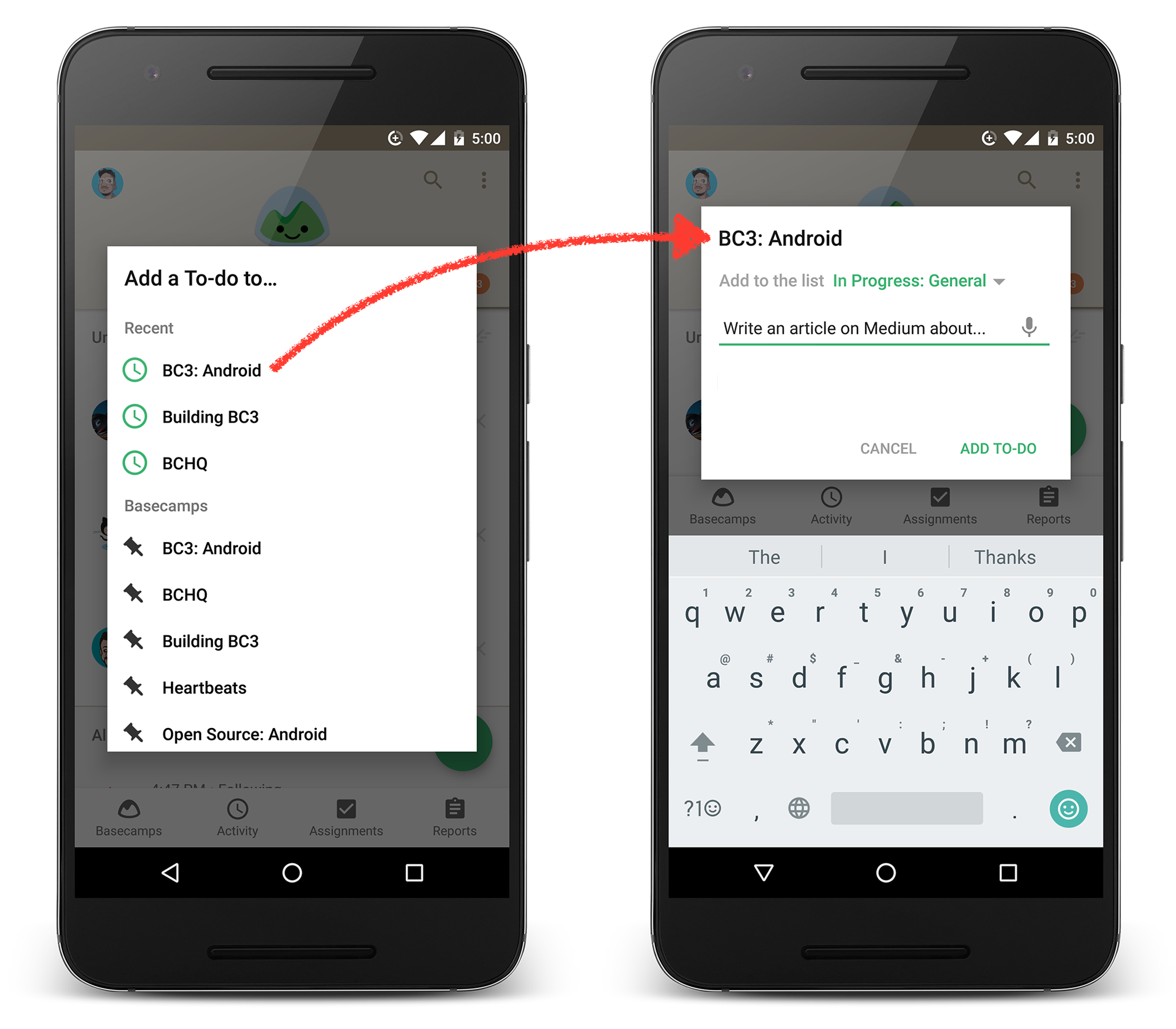
A few weeks prior, Jay and I made the Quick Add feature. We used this foundation to provide the ability to add to-dos straight from the My Assignments screen. This was a big improvement. Now the screen wasn’t just a launching pad to your tasks. You could also fill in the blanks by adding tasks yourself.

Build on the foundation

Usually we’d call this done and launch it. There was one problem. When you make a to-do from Quick Add it doesn’t have an assignee. When we initially designed Quick Add we optimized for “quick.” That meant that we didn’t allow room for assigning the to-do to someone.


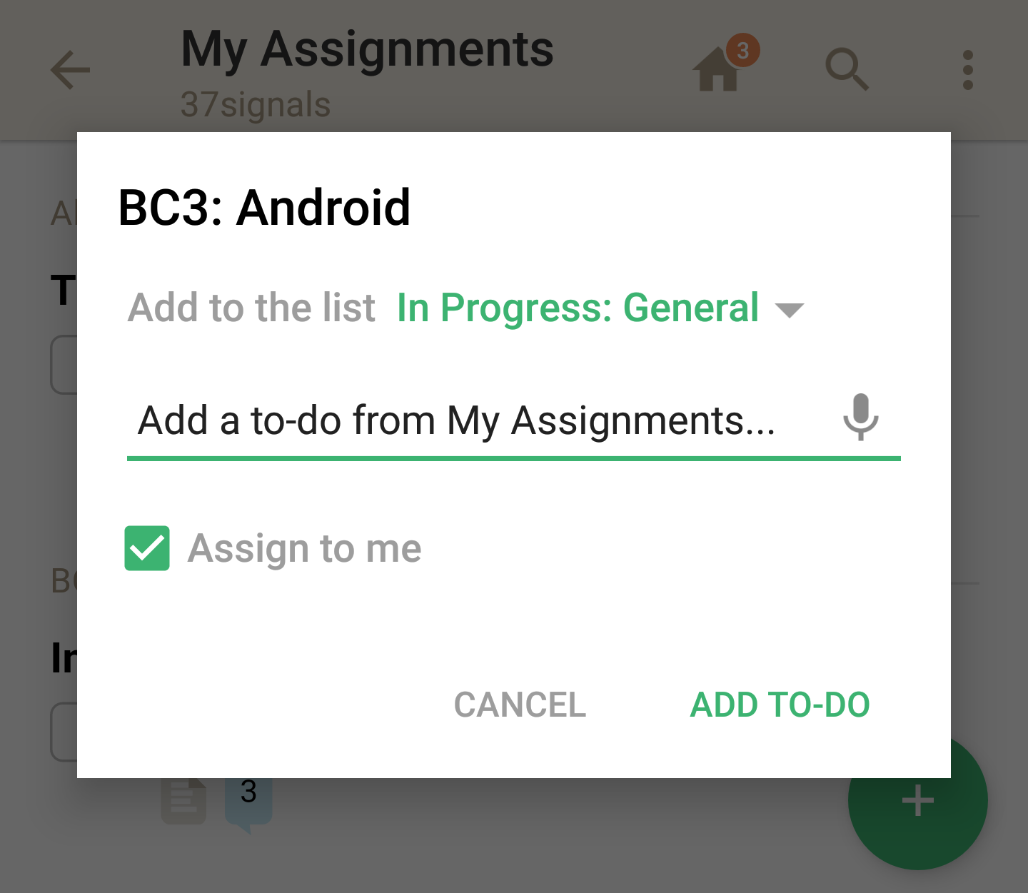
Once we added this feature on the My Assignments screen a missing piece was apparent. Why couldn’t you assign the to-do to yourself? Maybe it could be a checkbox. We could even have it pre-selected to “Assign to me” when you’re looking at the My Assignments screen.

We did just that. We added a checkbox to assign the to-do to yourself. When you make a new to-do it will automatically appear on your open to-do lists. We also improved the Quick Add foundation by adding the “Assign to me” checkbox when you create a new to-do from the home screen.

In the future you’ll be able to assign to-dos to people that are part of your Basecamp too. We just haven’t built that part out yet.

Full circle

We didn’t plan on designing the Quick Add feature as a portable element. Our original intention was to have it isolated on the Android home screen. When Dan added a link to My Assignments from the home screen it became obvious to apply the Quick Add framework there. It wasn’t until we started using the feature on the My Assignments screen that we saw the need for an “Assign to me” checkbox.

There’s a personal to-do list in the Android app—exclusively on Android—because we connected the dots from Quick Add on the home screen to Quick Add on My Assignments. Now you can add new to-dos, add comments to to-dos, and even complete the to-do right from that screen.

By connecting the dots from one feature to the next we’ve improved the app for our Android customers. We didn’t have a grand plan. Rather we kept pushing the interface along, extending the foundations, and making small changes with big benefits.


Thanks for taking the time to read my article. My name is Jamie, and I’m a Designer on the Basecamp 3 Android team. If you’re a Basecamp customer you should get Basecamp 3 from Google Play. If you’re not a Basecamp customer… what are you waiting for? Get a free Basecamp today.

How we designed the Basecamp 3 app listing for Google Play

Your app store listing is a great marketing and support channel. Here’s how we approached the app page design for the Basecamp 3 Android app.

On app videos

I knew we had to have a video for our listing, but I wasn’t sure what type of video it would be. Would it be a demo of the app? Would it be a series of screenshots? If it was a demo, how long would someone even watch it?

To make matters more complicated, whatever video we’d upload would get outdated quickly. Since launch, the Android app has been updated nearly every week. We didn’t have the time or resources to keep making a new demo video.

Luckily we have a talented filmmaker named Shaun on staff at Basecamp. Shaun and I came up with an idea that would showcase the high level features of the Android app, but also be fun to watch. We wouldn’t have to keep updating the screens in the video as the app changed too.

On app descriptions

When we first put up our page, the description for the app was minimally formatted. Google just gives you a big text box to write all about your app. One day I was browsing Google Play and saw a listing for an app called Japanese Kanji Study.

Japanese Kanji Study description

I noticed the app made use of special characters in the description. I wasn’t sure how that was accomplished, so I did a Google search to find out. That brought me to this post on Stack Overflow.

Turns out that you can do a lot with the Google Play description. Strange that it isn’t really documented, but there it was. You can make things bold and italic. You can even add UTF-8 characters (★) like the Japanese Kanji Study app did.

I did an overhaul of our app description so that it talked about the high level stuff Basecamp 3 could do. I didn’t go too wild with formatting, but adding bold headers helped to highlight the tools that make Basecamp 3 great.

Better formatting to highlight the tools Basecamp 3 offers

I decided to have the text description talk about Basecamp 3 the platform rather than specifically this Android app. That’s because we talk about the app specifically in the screenshots.

On app screenshots

A lot of people/companies do this with their app screenshots. I know it isn’t new territory. But I thought that by having the app description focus on Basecamp 3 the bigger thing I could focus on specifically Basecamp 3 for Android in the screenshots.

Messaging specific to the Android app

I also wanted to show a bit of variety in the devices. Shown here are a Nexus 6P, Nexus 6, and a Nexus 6P. I know it isn’t a huge variety, but I didn’t want all the phones to be exactly the same shape.

On app release notes

Dan Kim, programmer on the Android team, really likes emoji. Maybe too much in fact. During on of his emoji fits he discovered that you can have emoji in our “What’s New” release notes.

Emoji in Google Play

Adding emoji instead of bullets here allows us to summarize the item with an image. It also helps us to consider exactly what we should write.

On app reviews

I like to read and respond to every review. This is what makes Google Play stand out from the other app stores out there. Our customers might be having problems with the app, or they might not like some parts of the app.

Sometimes it’s hard to read a harsh review. But it helps to close the loop and respond to the customer. If they’re having problems with the app, I’ll ask them to contact support so we can help them in more detail.

You can read our reviews and my responses on our Google Play listing.


Have questions about the Basecamp 3 Android app? Let our awesome support team know by sending us an email.

Basecamp 3 works where you do on Android, iOS, Mac, and Windows — anywhere you’ve got a web browser and an internet connection. Your first Basecamp is completely free so try it today, it takes just a minute to sign-up.

Only on Android: Add Basecamp 3 To-dos, Events, Messages, and Files from the home screen

Our Android app is awesome for staying on top of new activity. You can easily see unread messages, reply to notifications, and jump into Campfire chats. It’s great at what you’d expect to do on Mobile: check in and reply to stuff.

The Old Not-So-Great Way

On the other hand, the Android app wasn’t so great at adding something new. That’s another thing you’d expect to do quickly on Mobile. It used to take five screens (and a lot of scrolling) to add a new To-do to a Basecamp. Here’s how it used to work:

The old way took 5 steps and a lot of scrolling…

The New Improved Way

The new Quick Add feature allows you to add a To-do (and other stuff) right when you open the app.

Add a To-do, Add an Event, Post a Message, Upload a File

Here’s a video showing you how a To-do is added with Quick Add. It takes fewer taps now.

This new update also has these great additions:

  • Support for renaming Basecamp tools
  • Faster home screen
  • Fixed a timezone display issue
  • Fixed Campfire and Ping send button display

Get the latest on Google Play

This Quick Add feature is only available on Basecamp 3 for Android. Download the new update with Quick Add on Google Play today.

Like something in the app? Think something can be better? Please let us know in the comments. We’re always looking at ways to improve the app.

Thanks,
Dan Kim, Jamie Dihiansan, Jay Ohms
The Android Team at Basecamp


Have questions about the Basecamp 3 Android app? Let our awesome support team know by sending us an email.

Basecamp 3 works where you do on Android, iOS, Mac, and Windows — anywhere you’ve got a web browser and an internet connection. Your first Basecamp is completely free so try it today, it takes just a minute to sign-up.

All New in Basecamp 3 for Android


This week our Android team is headed to the Google I/O conference. They’ll learn how to incorporate the latest tech into Basecamp 3 on Android phones, tablets, and other devices. Meanwhile, we’ve been making regular improvements to the Basecamp 3 Android app every few weeks. Some of these new features are also unique to Basecamp 3 on Android!

Here’s what’s new in Basecamp 3 for Android:


Control how Basecamp shows you new stuff

Do you feel overwhelmed by the number counts on the notifications Basecamp shows you? Maybe you need to see those numbers to make sense of what to read or dismiss. Well, now we’re giving you control over how Basecamp shows you what’s new. There’s a new option in your Notification Settings to “Show the number of unread items” on your Home Screen. Choose the setting that suits your preference.

Control whether Basecamp shows you the number of unread items.

Participate in discussions without opening Basecamp

When you have push notifications turned on (here’s how you do that) you can reply from anywhere: the Lock Screen, Home Screen, even while you’re in a totally different app. Basecamp doesn’t need to be always open and top of mind. You can send replies at your convenience.

Reply from anywhere. You can reply later too.

Rename “IMG_23214.jpg” to something that makes sense

We’ve completely redesigned how Basecamp 3 uploads files on Android in Campfires, Pings, and the Docs section. Now you can rename images, movies, PDFs, and other files before you upload them to Basecamp.

Also, when you upload a large file—a 100 mb movie for instance—Basecamp will show you the upload progress. When a file can’t be uploaded due to a weak data connection, Basecamp will allow you to “Retry” or “Cancel.”

Rename files you upload.

Share images with colleagues who aren’t in Basecamp

We’ve improved the image viewer in the Android app. Now you can download images from Basecamp to your device. You can also share images from Basecamp as email attachments in case you want to send designs or other images to people who aren’t in Basecamp.

Share images from Basecamp as attachments in an email.

Move between your Campfires and To-dos faster

Someone on your team might ask you a question in Campfire: “Hey, where are we with those to-dos?” Now there’s an easy way to check on that and send a reply. There’s a quick access menu in the title of every Basecamp that allows you to jump between any of the accessible tools: To-dos, Schedule, Message Board, Campfire, Docs & Files, and Check-ins.

Jump from Campfire to any other tool inside Basecamp.

Stay on top of all your Campfire chats

Some of our customers chat in multiple Campfires during the day. It’s easy to switch between Campfires on your Desktop, but it’s harder on mobile. We came up with a solution on Android that enables you to peek at new chats in other Campfires while you’re in another. You can also mark chats as “Read” by tapping the X icon. It’s a nice feature to have on the go.

Peek at chat activity in other Campfires while you’re in another.

We fixed one of our biggest bugs: Typing works great now!

Basecamp is great because it keeps all your discussions, messages, and communication in a centralized place. Writing needs to be dependable. Unfortunately, some of our customers had trouble writing messages in Basecamp 3 for Android. We’re happy to say these problems are now fixed. We’ve got more improvements planned too. Stay tuned!

Typing on Android has been vastly improved!

Basecamp 3 for Android is available free on Google Play. Like something in the app? Think something can be better? Please let us know in the comments. We’re always looking at ways to improve the app.

Thanks,
Dan Kim, Jamie Dihiansan, Jay Ohms
The Android Team at Basecamp


Have questions about the Basecamp 3 Android app? Let our awesome support team know by sending us an email.

Basecamp 3 works where you do on Android, iOS, Mac, and Windows — anywhere you’ve got a web browser and an internet connection. Your first Basecamp is completely free so try it today, it takes just a minute to sign-up.

A Leap of Faith

Every button in your app requires a little curiosity and a leap of faith. Here’s how I discovered a new feature on my Twitter app just by being curious.

My colleague Jason Zimdars sent a goof tweet my way…


Then my other colleague Jonas Downey stepped in…


I recall seeing a GIF of Eddy Cue doing a “dad dance” at one of the Apple Events a few years ago. I wanted to reply with that GIF. Normally I’d search Google or Imgur then copy the link, paste it in the Tweet, etc. Then I saw this GIF button along the bottom of the Reply feature.


I was curious. Would it have “Eddy Cue Dad Dancing” GIFs? Was this only for mainstream GIFs? Was Eddy Cue too obscure? It turns out that it did in fact have an Eddy Cue section with the exact GIF I was looking for. I even misspelled his name and it still knew what I meant.


This, of course, is a frivolous use case. However goofy as it may be, it serves as a reminder as we add new features (and buttons) to the Basecamp 3 Android app. I was perfectly happy to do the copy and paste dance to find that perfect GIF. Had I not been curious, I wouldn’t have been delighted and surprised by that GIF button in the Twitter app.

As we add new features we can’t assume everyone will discover or use them immediately. It requires a bit of curiosity on the part of the customer—a leap of faith—to make that feature whole.


We’ve been working really hard to make the all-new Basecamp 3 and its companion Android app as great as they can be. Check ’em out!

If you have any feedback, I’d love to hear it! Email me or hit me up on Twitter and let’s chat.