Ever since Basecamp 3 launched in 2016, the inside of a project has looked like this, with little cards for jumping between the tools in the project.

That worked well, but there are a couple things that weren’t so great:
- It took up a lot of space and visual attention, which meant less space for the work you’re doing.
- It didn’t include much information about where you are or what you’re looking at, which can be confusing when you arrive somewhere after clicking on a notification.
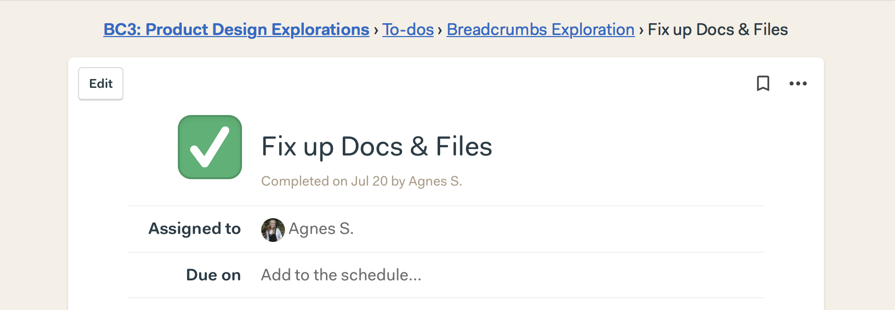
Starting today, we’ve made this better! Now you’ll see simple, old school breadcrumbs. Nothing revolutionary here–just very clear.
You’ll know exactly where you are inside a project, and can easily jump back a level or two. Here’s how it looks:
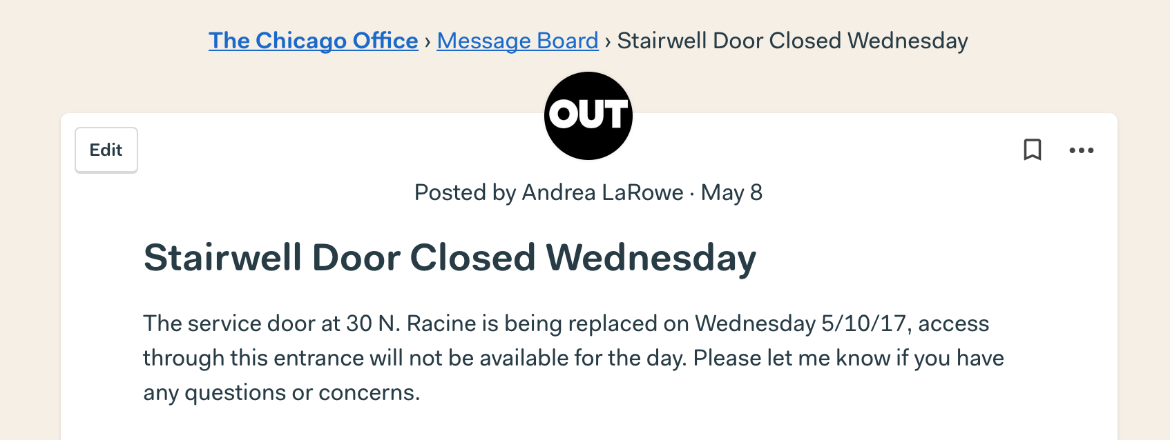
This new navigation helps you focus on your work, and it makes pages load faster too. Now you’ll have consistent way to move around, no matter which tool you’re in — you’ll see breadcrumbs in Messages, To-dos, Docs & Files, and everywhere else inside your projects.

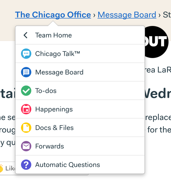
We also kept the ability to jump between tools in a project. Just click the project’s name for a quick menu to hop where you need to go — exactly like our iOS and Android apps.
You’ll see this change right now on the desktop version of Basecamp 3.
We hope you like it. Happy navigating!
I’m a design intern at Basecamp, and this was my first project during the summer. Say hi to me on twitter 🙋