Big update today! Starting right now, Basecamp 3 customers will see an entirely new design when they flip over to the Schedule screen in any team, project, or HQ.
The schedule used to look like this…
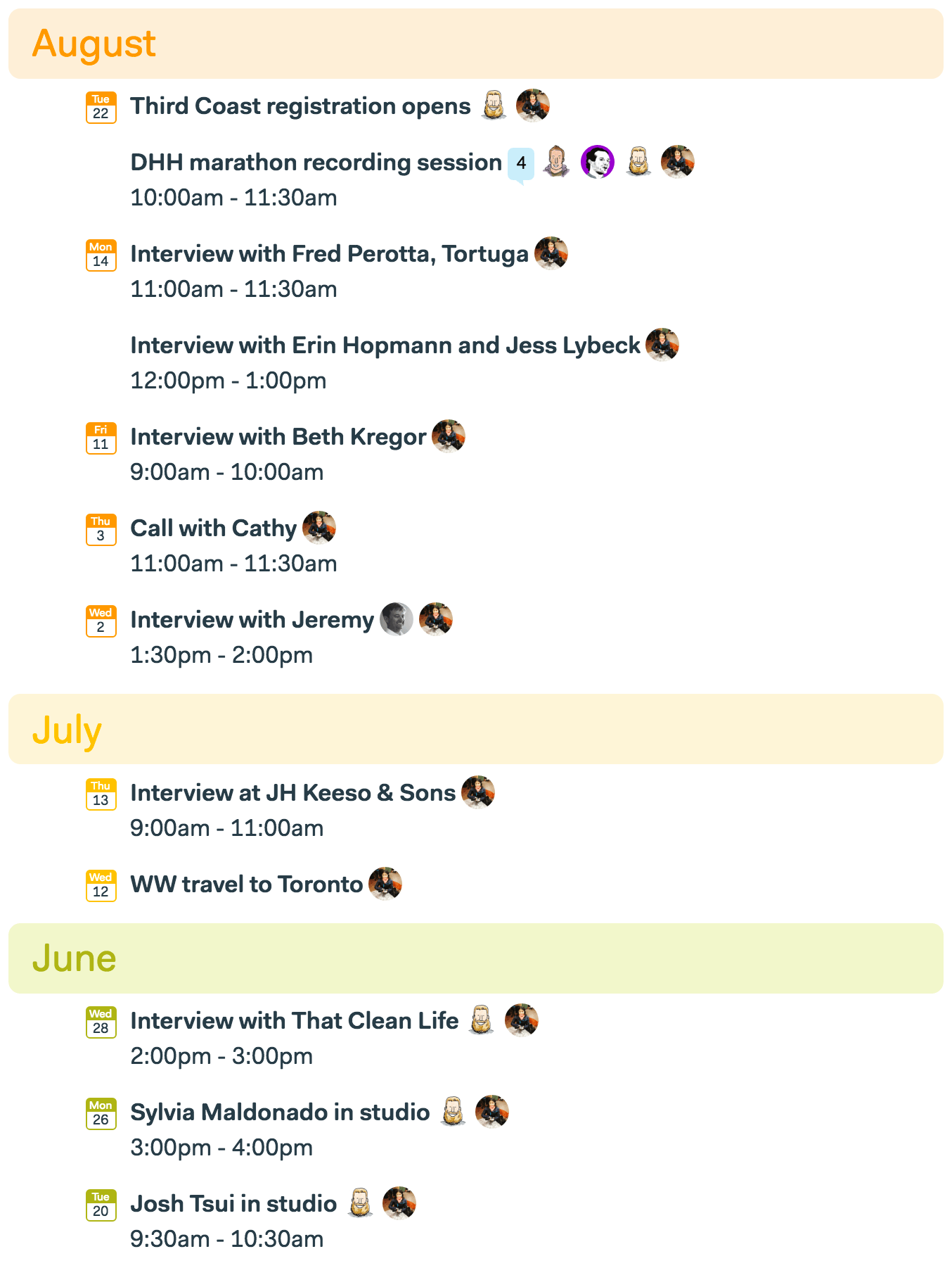
It was colorful, and it provided a nice overview if you only had a few events, but it quickly got out of hand if you had a lot of events or to-dos mixed in. And when you wanted to get in there and see exactly what was happening next week, or if there was anything on the schedule this Friday, it fell down pretty hard.
So we fixed it. And more!
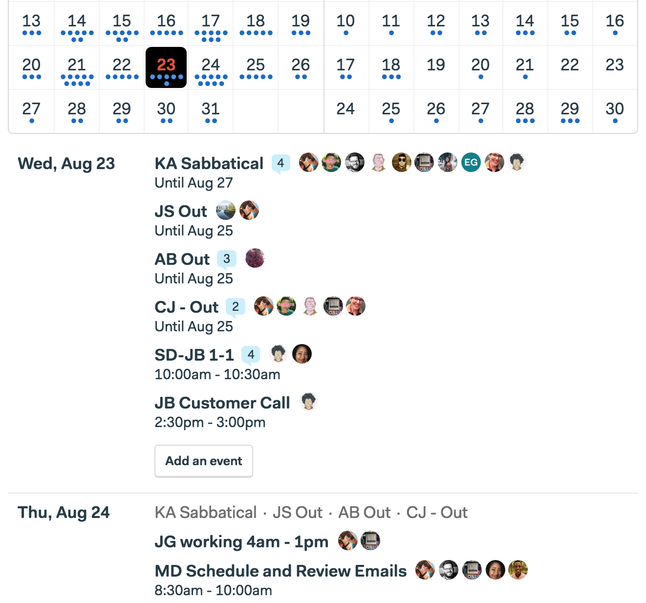
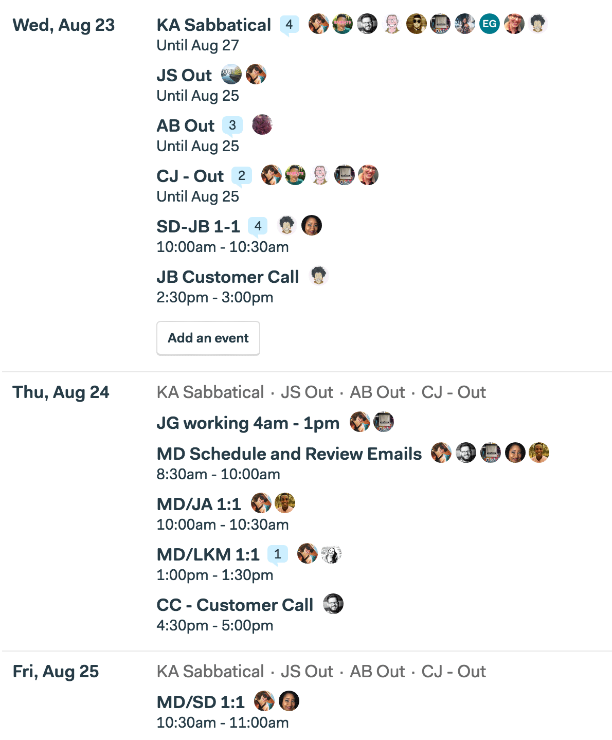
And here’s the new schedule…
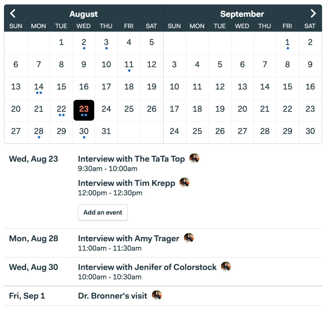
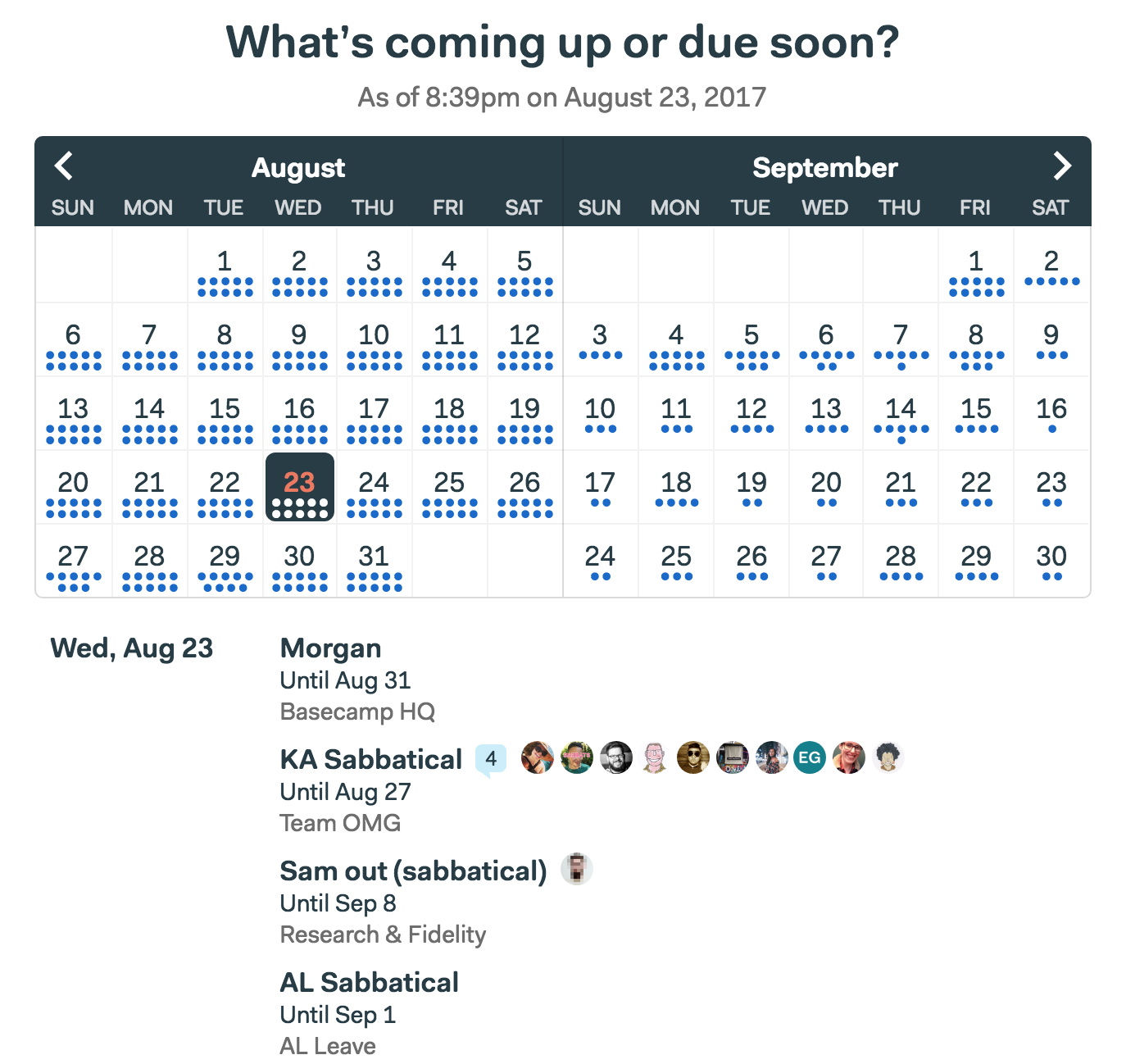
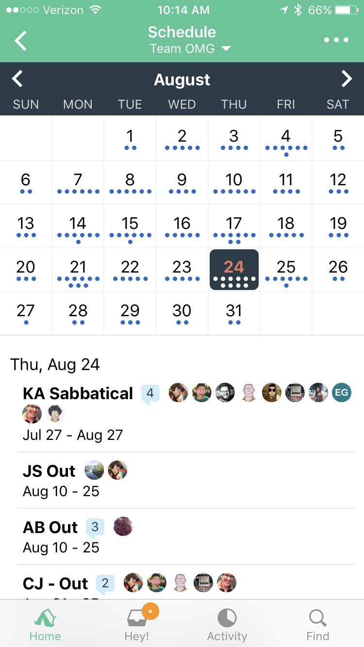
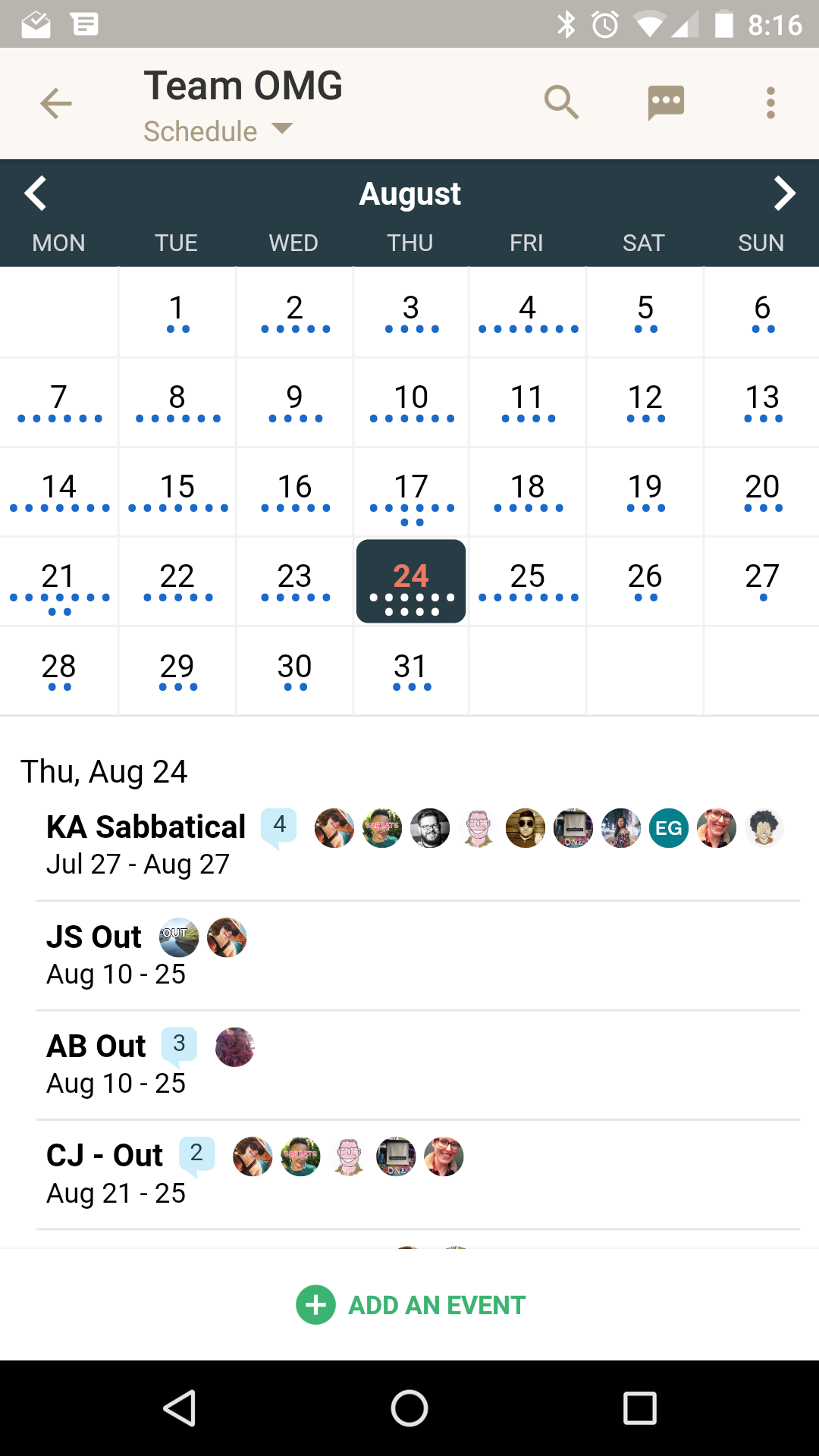
At the top you have a grid showing the current month + the next month. You can page through the months using the arrows top left and right. Every event or to-do that’s due on a given day is represented by a dot. Three events, three dots. If there are no dots, there’s nothing on the schedule for that day. Now you can see gaps and openings and weekly overviews — something that wasn’t possible with the previous design.
Below the grid is a straightforward agenda view. Events are clearly grouped by days (if there’s anything on a given day). And you can jump around the agenda view by clicking around in the calendar above. Want to see what’s happening next Wednesday? One click and it pops right to the top of the agenda view. This was something you couldn’t do before.
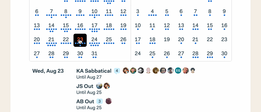
Events (or to-dos) that span multiple days are shown in a couple ways. First, if they’re on the current day, they show an “Until” right under the event. And then, they’re shown in light grey at the top of subsequent days. They’re also repeated on every future day so you can get a very direct sense of what’s happening on a given day. You couldn’t see this in the previous design because they were only shown at the top of a month, and not on individual days where the event occurred.
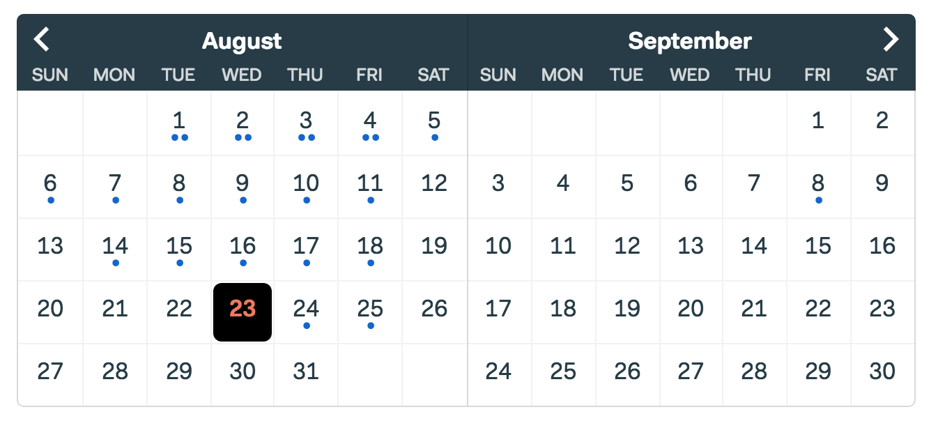
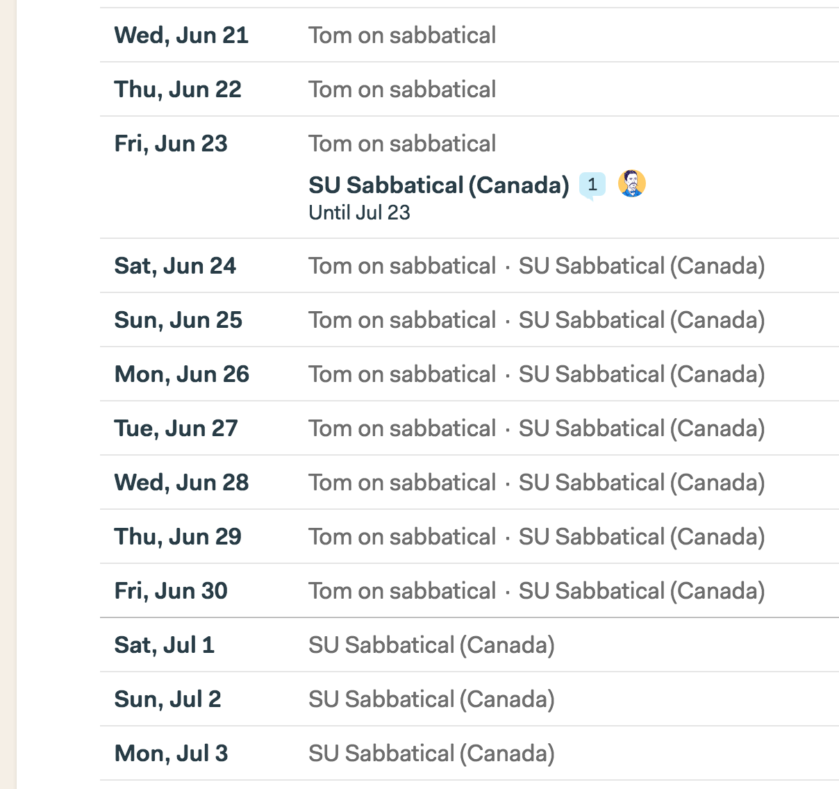
One of the really nice benefits of this is that you can see overlapping long-running events. In the example below, you’ll see Tom is out on sabbatical, and then “SU” starts his sabbatical on the 23rd. Now from June 24th — 30th you’ll see they are both on sabbatical. This was non-obvious in the previous design. Now it’s clear as day.
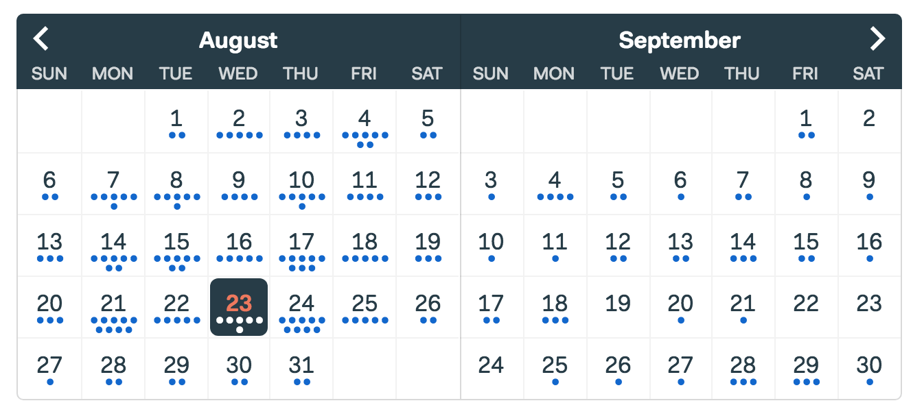
Here’s another before and after. Before on the left, after on the right…
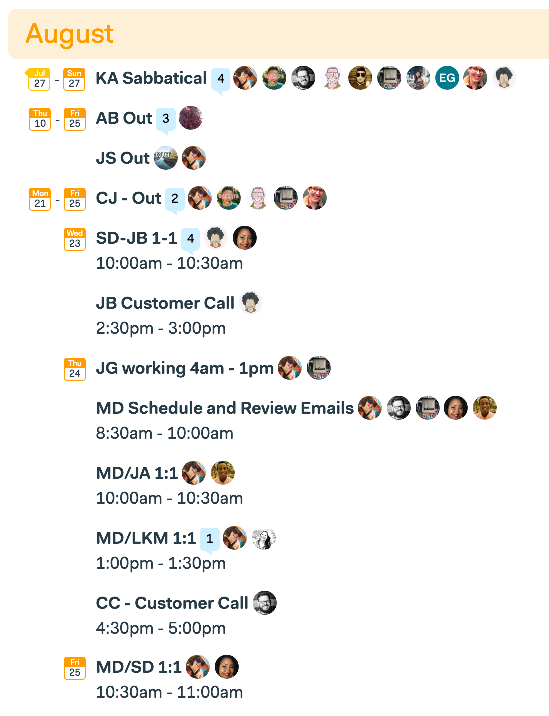
You’ll notice the previous design (on the left) doesn’t show that KA, JS, AB, and CJ are even out on the 24th— you’d have to go back up to the top of that month to figure that out. Forget to do that, or not even realize you have to, and you’re missing out on important information. This is fixed in the new design.
Lastly, we’ve pulled this design over to two more places: “My Schedule” and the “What’s coming up” report. An example:
Summarizing the improvements on the new schedule design:
- Jump to any day to see exactly what’s happening that day. Just click a cell in the grid at the top of the schedule and the agenda below updates instantly with the selected day right at the top.
- Now you can see gaps in time. Looking for an empty day to schedule something? Now it just takes a quick glance at the grid at the top to spot openings.
- See busy days or weeks at a glance. Lots of dots tells you there’s a lot going on on a specific day or week. Just click into a cell to see exactly what’s up.
- See long-running events on every day they occur. You no longer have to scroll back up to earlier in the month to see if there’s something happening on a given day.
- Jump back in time using the same interface. Previously, if you wanted to see past events you had to flip to a separate tab called “Looking back”. This wiped the screen clean and listed old events. It was cumbersome to see something that happened yesterday. Now you just navigate using the grid at the top and jump between future days and past days the exact same way.
- Plus a variety of smaller improvements, specifically around speed and performance.
One more thing… Now that you have a calendar view up top with dots that represent events, you may be wishing for a way to assign colors to different kinds of events. We agree! While we haven’t built this into this first revision of the schedule, it’s something we’d like to do down the road.
So there you have it. An all-new and improved schedule, available today in your Basecamp 3 account. You’ll see the same design in the iOS and Android apps as well!
We hope you find the new design useful, and thanks again for your continued support.
If you’re a Basecamp customer, thanks so much! And if you aren’t, but you find yourself struggling with messy email chains, overwhelmed by chats and txts, finding stuff slipping through the cracks, and generally feeling like your process is breaking down, it’s time to give Basecamp 3 a shot. It’s free to try.
It’d be neat if we could assign colours to dots that appear on the calendar, at the very least having 3-4 different colours (blue, green, red, purple, etc.) would help differentiate tasks at first glance.