Originally Highrise was built for Jason and David, the founders of Basecamp, who had trouble staying on top of who was talking to the lawyer, who needed to follow up with the landlord, what was said to the reporter, etc.
But do our customers look like Jason and David?
Maybe they did originally but things changed over the last decade Highrise has been in business? Is that still our reason for existing? So we recently did a series of Jobs-to-be-Done interviews to understand who uses Highrise at a deeper level.
The results were clarifying.
Our interviews uncovered that Highrise was now in the hands of a very different group of people with very different needs. It’s less about “Contacts” and more about “Leads” someone needs to get into a sales process. It’s less about “Todos” and “Tasks” and more about “I need a reminder to follow-up with this lead in a few weeks.” But that’s just functionality and how it’s communicated.
The core job we saw people looking for was a system to track leads and manage follow-ups that needs to be turned on immediately. No manual required. So, it’s less about: “I need robust pipeline analytics”, and more about “I need this system to be running yesterday.”
With this insight in front of us, there’s a lot of options. How should we change the product? The marketing site? How can we get in front of more people who look like these customers?
But I’m not one to put all my resources in long term projects. We need quick experiments, quick lessons, and hopefully quick wins along the way.
So I took our current marketing site, and gave it a very fast redesign. Can I change the headlines and copy to match what our customers say about the product?
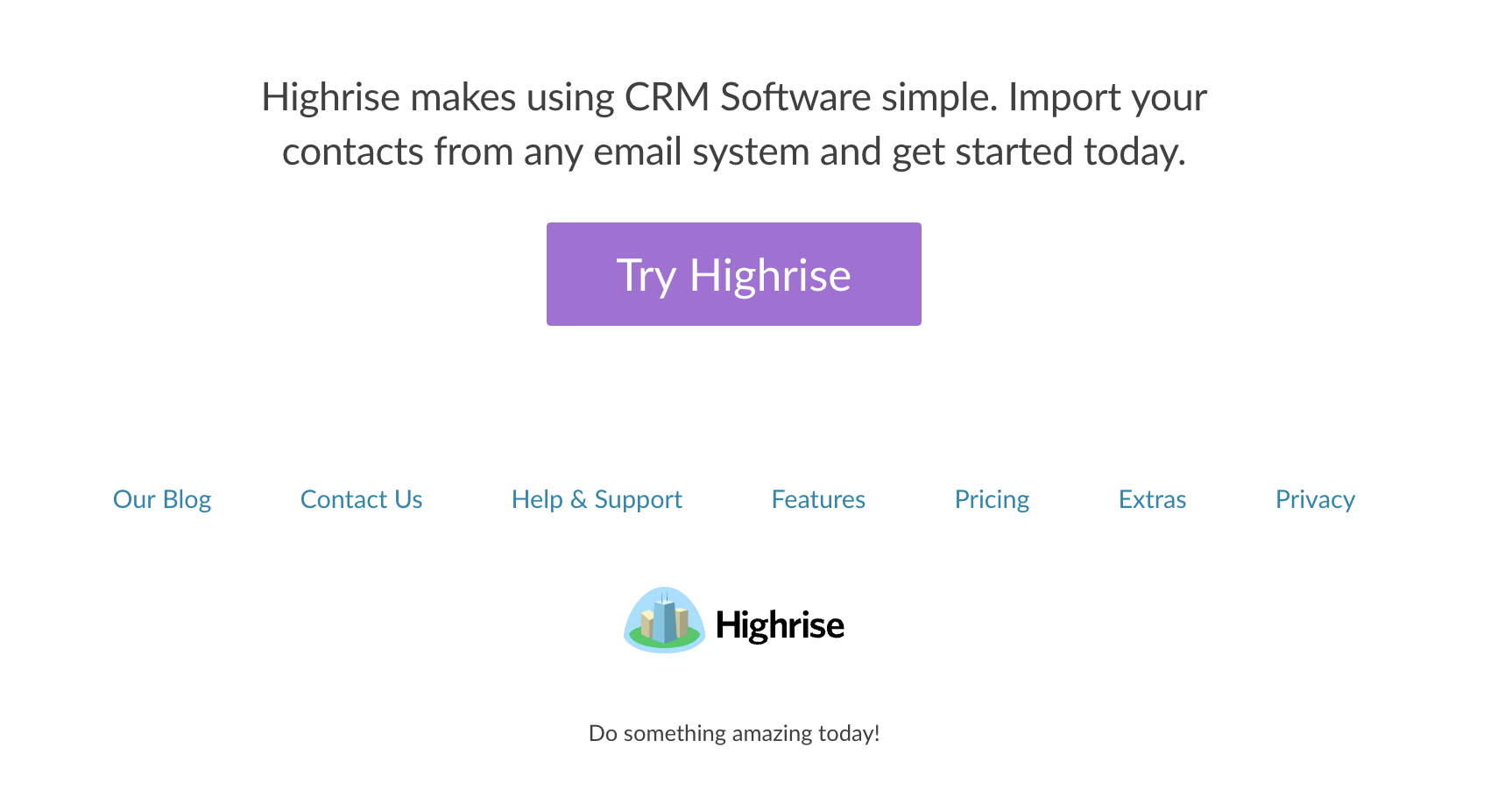
Here’s the before and after “above the fold”.
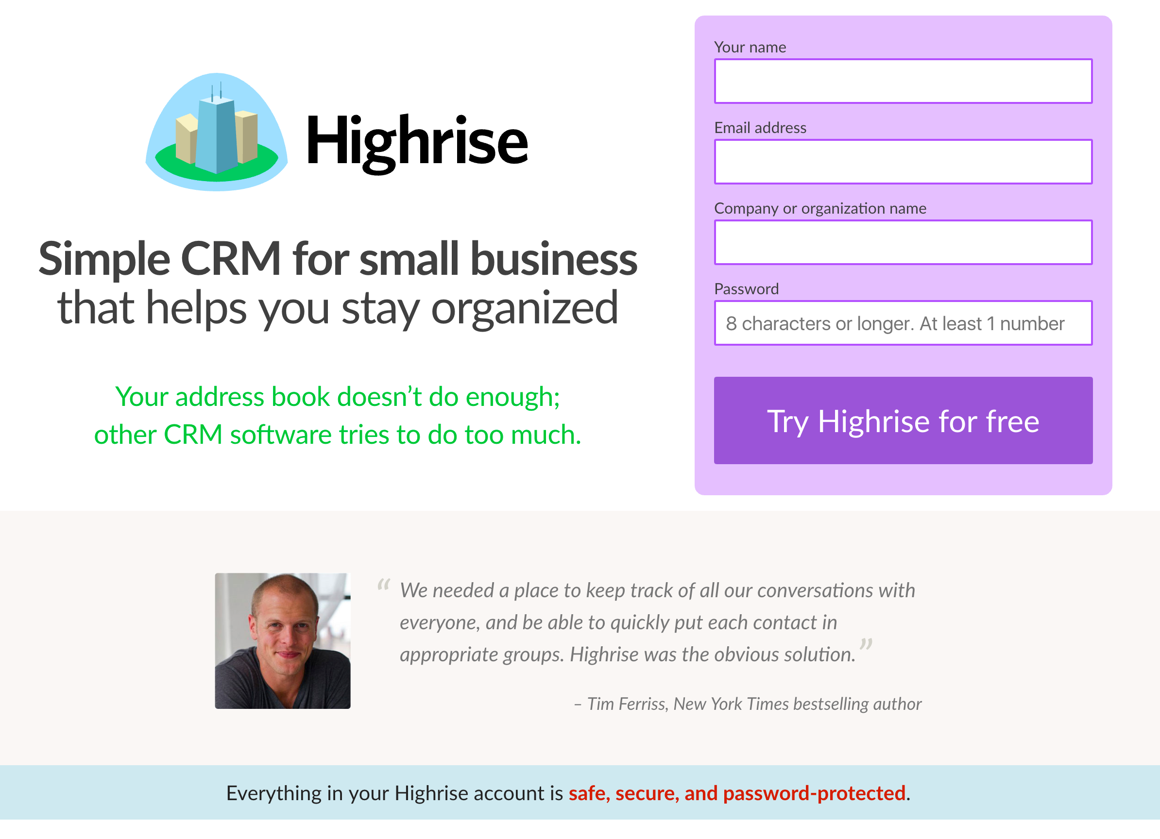
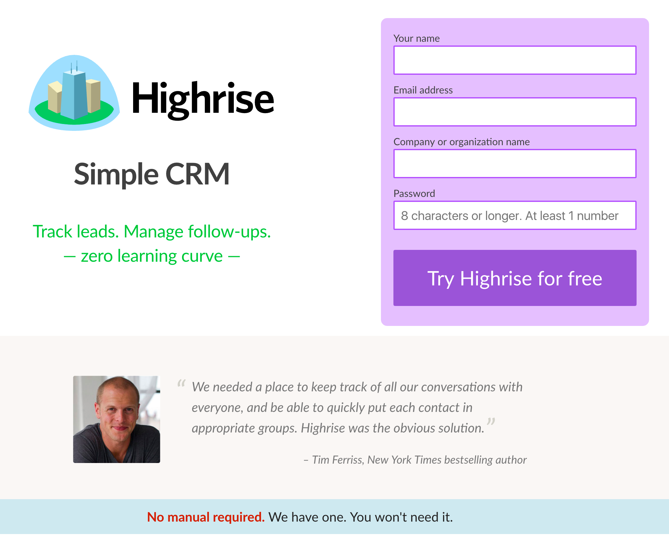
Every single customer we’ve talked to refers to Highrise being the simplest.
“Simple CRM for small business that helps you stay organized” — Too wordy. Became:
Simple CRM
Probably better for SEO, and if simple and instant are so important to Highrise, let’s cut to the chase.
The sub-head of: “Your address book doesn’t do enough; other CRM software tries to do too much.” became:
Track leads. Manage follow-ups. Zero learning curve.
Covers the main features our customers are looking for, and nails one of the main benefits: we’re instant. “Zero learning curve” — a phrase coming directly from our customers.
The original page has the headline: “Everything in your Highrise account is safe, secure, and password-protected.”
But our customers don’t talk a lot about security being on their mind when they signed up, so let’s not waste the valuable space on it. Again, let’s cover how easy to learn this thing is. So that became:
No manual required. We have one. You won’t need it.
Features Section
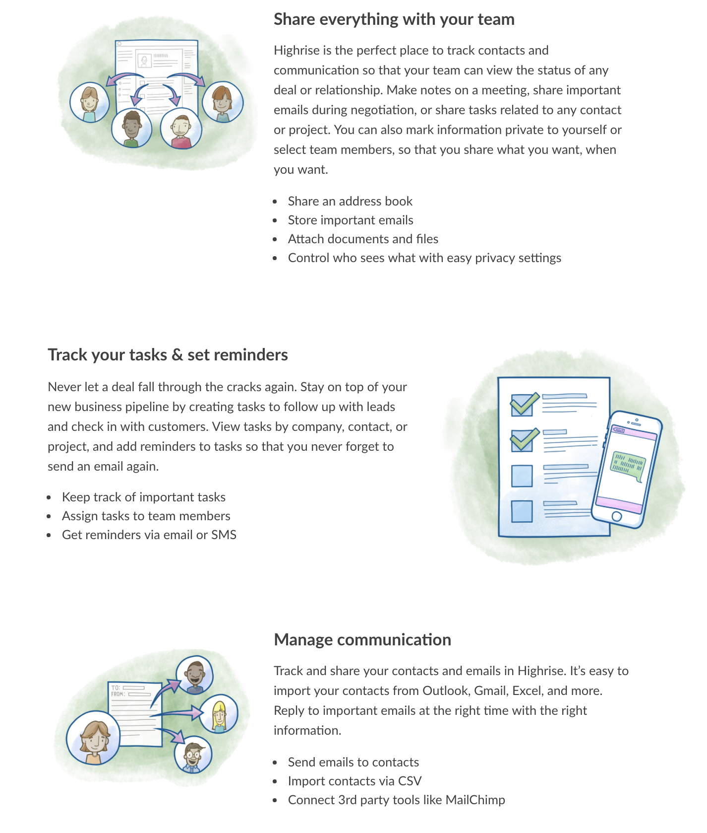
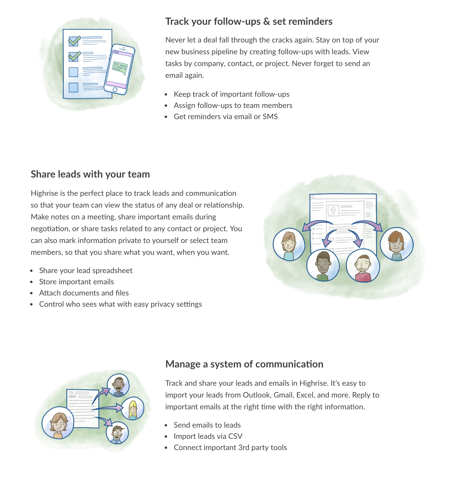
The original site had a few “features” in a bit of a random order. I prioritized them from the importance that came through in the interviews. I went through the copy and replaced all mentions of “Tasks” and “Contacts” with “Follow-ups/Reminders” and “Leads”.
“Track your tasks & set reminders” became:
Track your follow-ups & set reminders
“Share everything with your team” became:
Share leads with your team
Also, our customers talk about setting up a system. So “Manage communication” became:
Manage a system of communication
This wasn’t just search and replace. I made the copy more concise and grammar more consistent.
Midsection
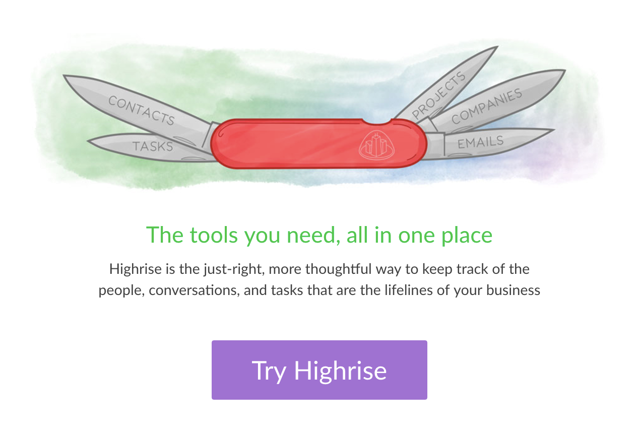
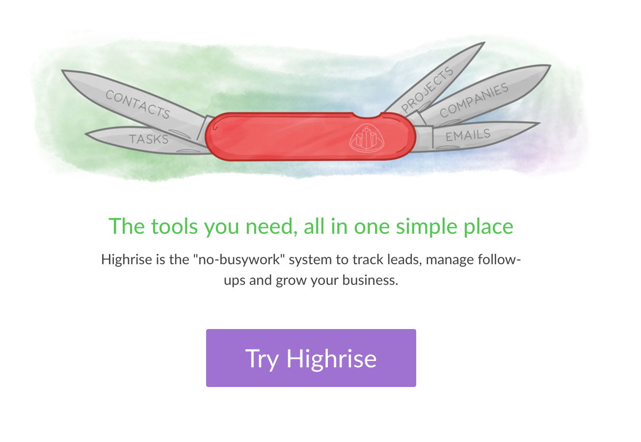
There’s a nice illustration of a utility knife in the middle of our landing page. I left it. But I changed the headline from “The tools you need, all in one place” to:
The tools you need, all in one simple place
Our customers weren’t talking about “people, conversations, and tasks”. They were talking about leads, follow-ups, and getting rid of busywork. So the sub-headline “Highrise is the just-right, more thoughtful way to keep track of the people, conversations, and tasks that are the lifelines of your business” became:
Highrise is the “no-busywork” system to track leads, manage follow-ups and grow your business.
There’s a section of copy in the middle:
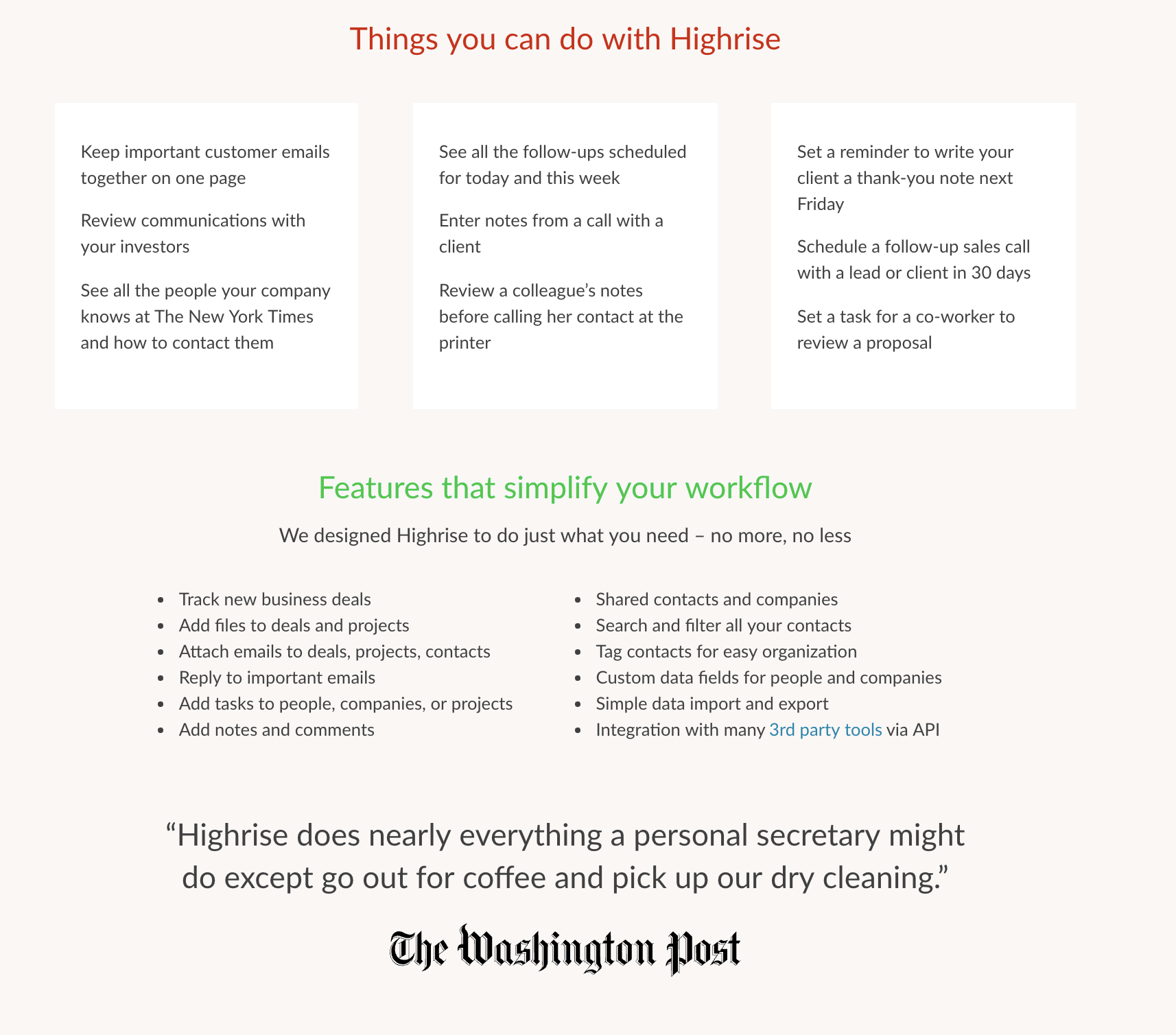
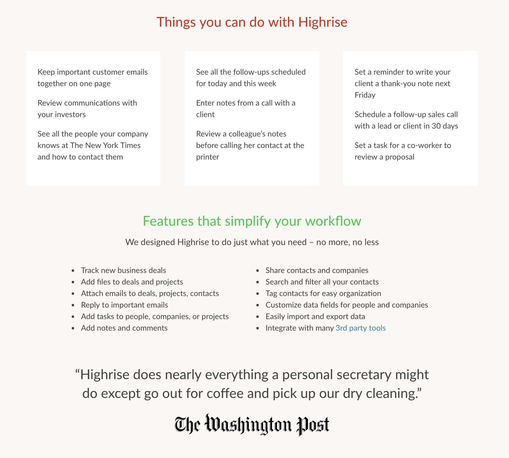
That was pretty much left alone except for making some of the bullets more consistent grammatically.
Footer
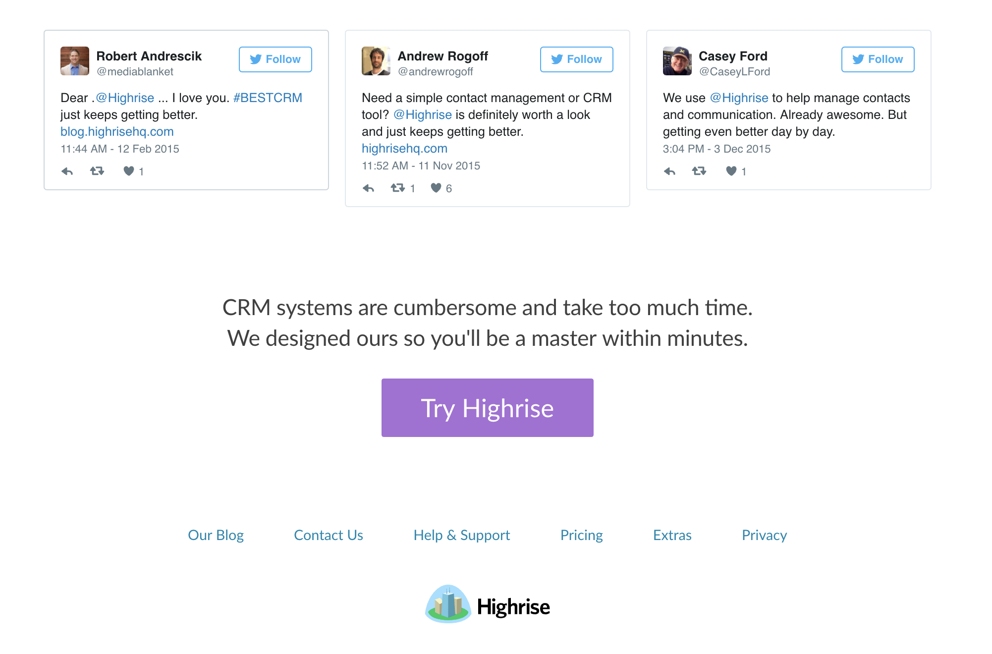
I added a few testimonials from Twitter to the new footer. Also changed the old headline “Highrise makes using CRM Software simple. Import your contacts from any email system and get started today.” To:
CRM systems are cumbersome and take too much time. We designed ours so you’ll be a master within minutes.
The original wasn’t too bad. Could have just changed Contacts to Leads. But the new one expresses simple with a bit more flair: “master within minutes”
Also dropped the “Do something amazing today!” which has been a sort of placeholder for something more interesting that never materialized.
Still to come…
The changes above took under an hour but we saw a 35% bump in our conversion rate. It was already a well converting page, so I’m thrilled.
Still, it’s not close to the end-goal of our Jobs-to-be-Done interviews. The page overall still has a lot of problems I’m working on now with bigger changes and experiments coming out soon.
For example…
The Tim Ferriss quote at the top is nice:
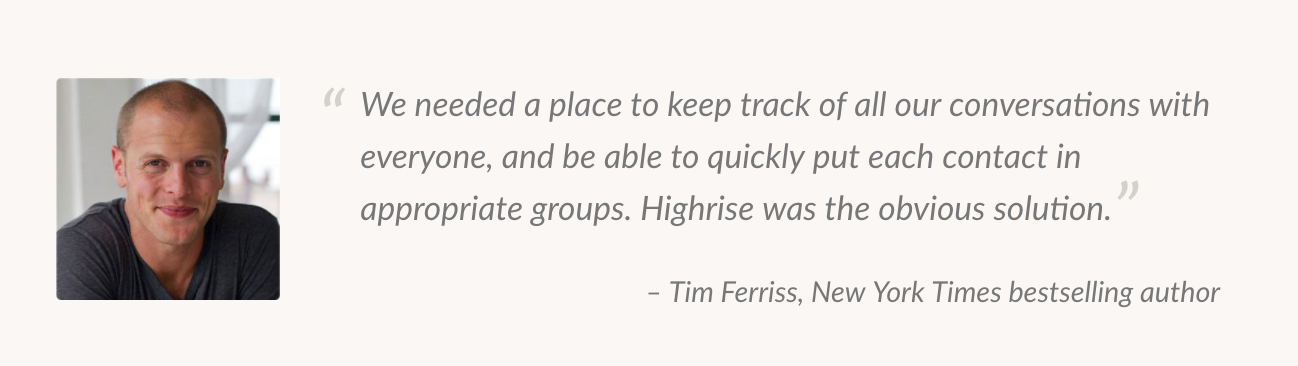
But it’s not very on message. Doesn’t talk about leads or follow-ups. It mentions “quickly” but that’s more about categorizing a contact vs getting started today or on-boarding others without training.
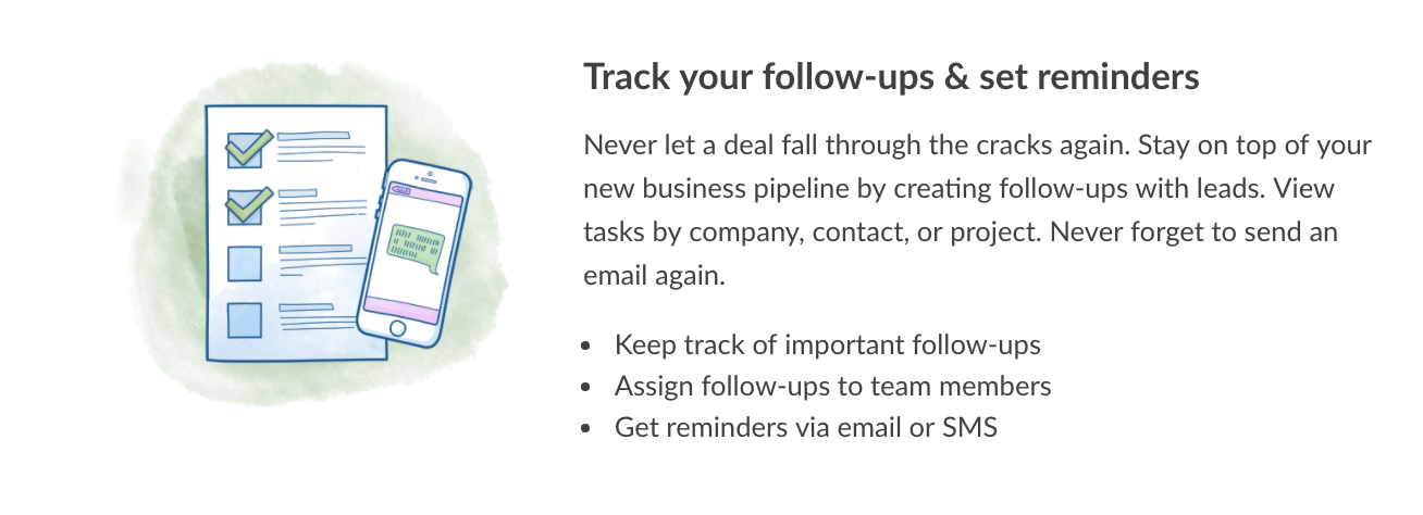
The illustrations are nice but don’t exactly convey simple. They’re generic.
Personally, I’m on the fence about the utility knife:
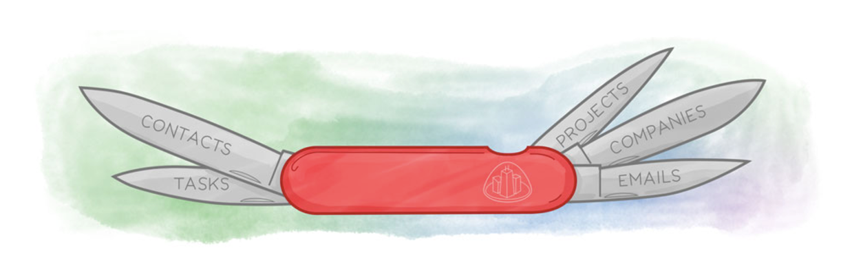
On one hand it conveys: “I’m a simple tool you can use to do a lot of things”. But on the other: that’s not quite the job customers are hiring Highrise for. We’re not trying to be a “do lots of things in a simple” package. We’re trying to be the “system you can set up today and everyone will instantly understand, so you and your team can get back to selling to your leads.”
There’s still a lot of copy on the page that’s off message: “Review communications with your investors. See all the people your company knows at The New York Times and how to contact them.” — Not really our customers’ problems.
That Washington Post quote is nice because it’s from a major paper:
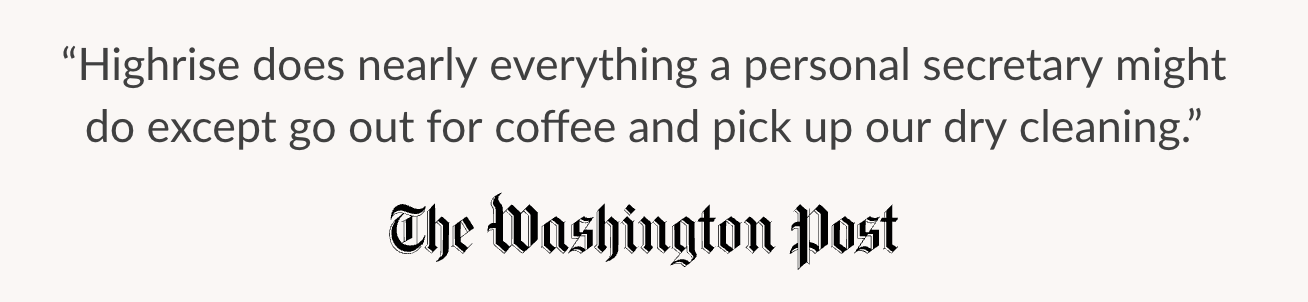
But that couldn’t be more off message.
Even the final testimonials are nice:
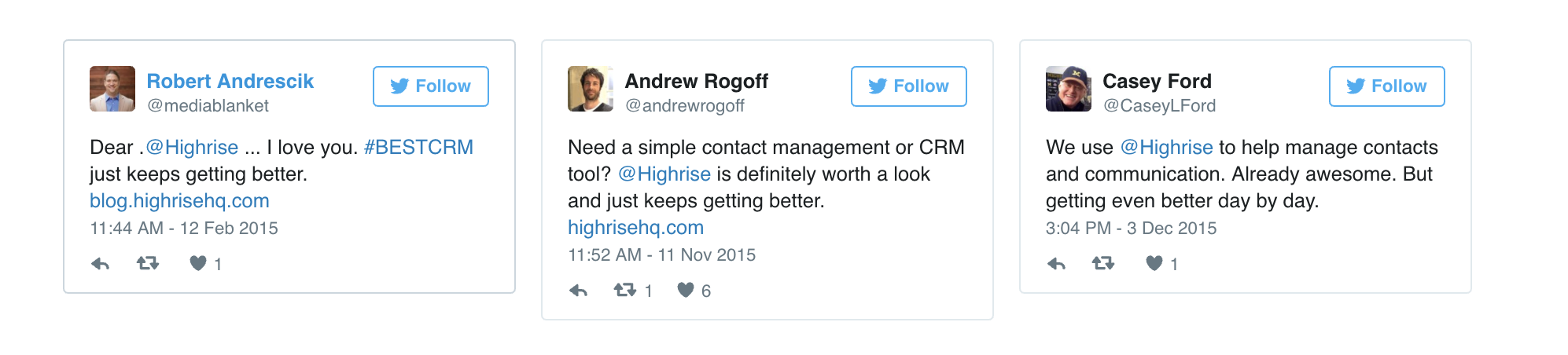
But only Andrew briefly touches “simple”.
And my biggest issue is that the page itself is so many words. If someone is looking for “instant” wouldn’t they appreciate a page that gets to the point? I’d like to see our Homepage mimic the ethos of Google’s or Draft’s.
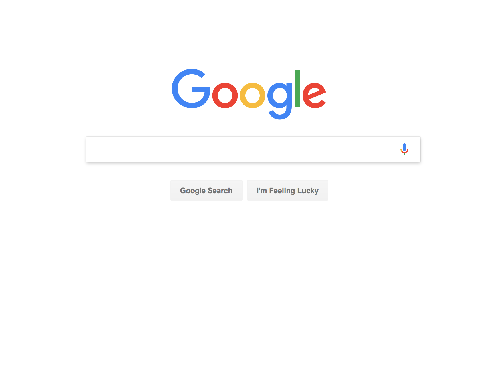
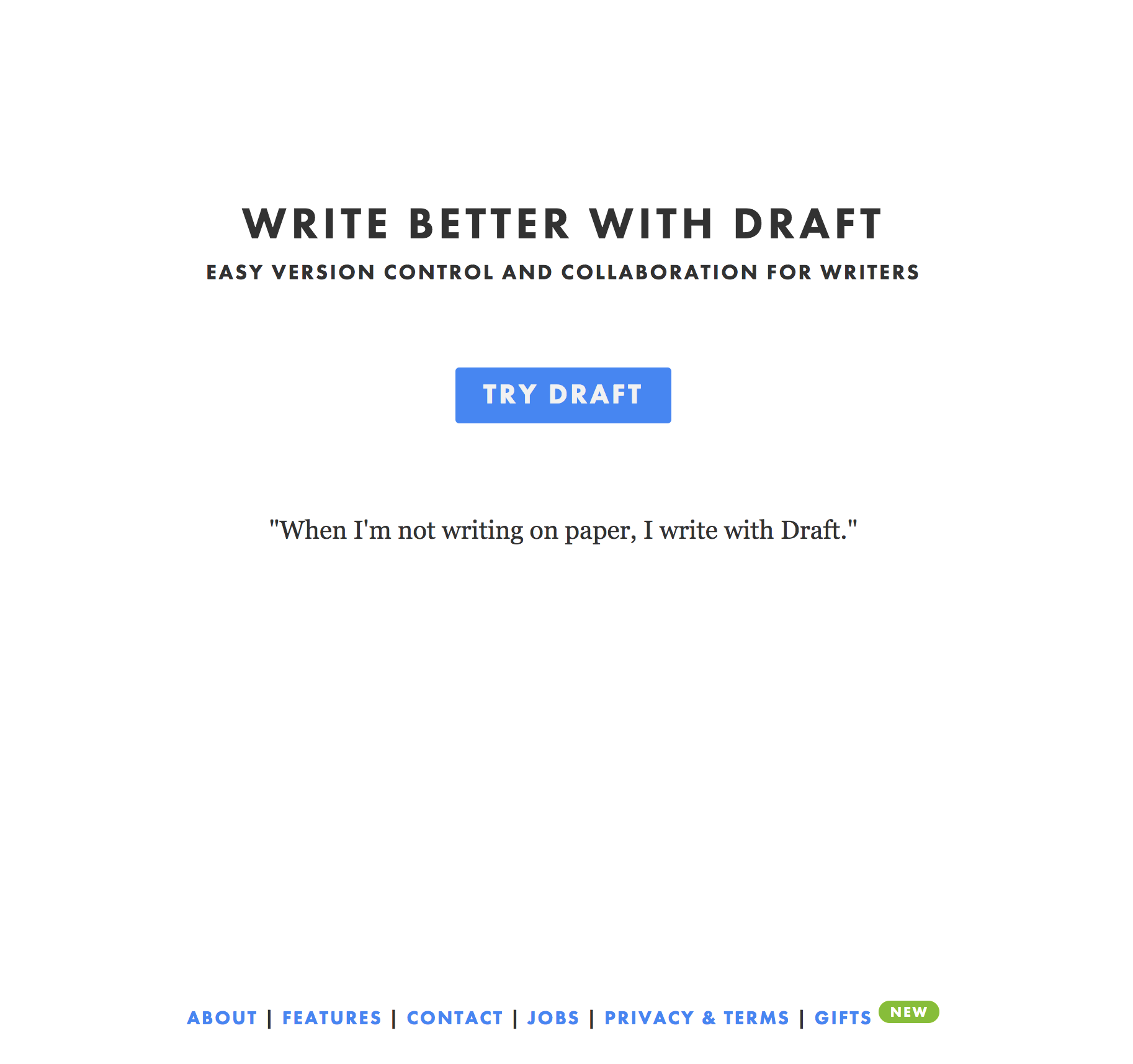
Understood immediately, and if you really want to dig in, you can. We’ll see how an experiment with that turns out.
I have a lot more work to do. And it’s coming soon. You should stay tuned.
But it’s a great lesson that embracing the words your customers use can have a big impact. It’s not what you think you are; it’s what your customers think you are.
P.S. Please help spread this article by clicking the ❤ below.
You should follow my YouTube channel, where I share more about how we run our business, do product design, market ourselves, and just get through life. And if you need a no-hassle system to track leads and manage follow-ups you should try Highrise 🙂

One thought on “Marketing Design — How we improved our conversion rate at Highrise”
Comments are closed.