About a year ago, I wrote about something I’d recently started doing at Basecamp and a year and over 250 charts later, I’m still at it: every workday, I share a different “chart of the day” with my coworkers at Basecamp.
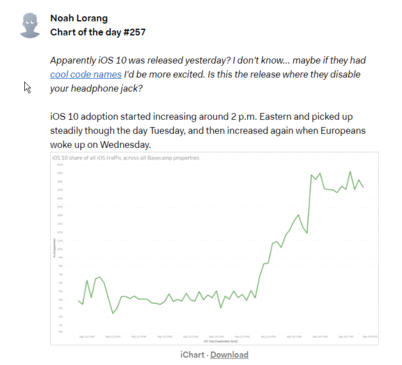
The charts are just pulled from whatever I’m working on, a question someone asked, or something topical (iOS 10 was released a couple days ago, so yesterday’s chart was about adoption among our users). They can be about anything — marketing, support, operations, performance, usage, the company itself, whatever. I don’t intentionally try to make them extra interesting or visually stunning, and I try to spend no more than ten minutes per day on that day’s chart. I just find a chart and post it in the “Data” project on our Basecamp account.
I had two primary motivations in starting this chart habit:
- I wanted to challenge myself to keep things fresh, and to tell stories with data without using more than one chart and a couple sentences.
- I wanted to make data more accessible. You shouldn’t have to set aside a half hour to read a report to get a piece of information that can change the way you think.
It’s been a fun challenge to keep this up for over a year, and I’d like to share a few of the things that stand out to me from the last 272 charts.
Isn’t this just chart junk food?
Given how I feel about real-time dashboards and the importance of solving real business problems, I sometimes wonder if these charts are just the data equivalent of junk food.
Maybe they’re a little high in data sugar, but I think they serve a purpose that you don’t get from a dashboard.
Every day is something different. In a year of charting, I’ve never intentionally reused a chart, which means that people have seen over 250 unique slices of data about our business. That’s a breadth that’s hard to achieve any other way.
There’s context. I don’t do a lengthy writeup about each chart, but I write a sentence or two about what the chart shows and why it matters. A chart with no context might just be eye candy, but contextualizing makes it more valuable.
They’re a conversation. I post a chart. People read the chart. Some people applaud it. Some people ask a question that I can try to answer. Some people reference it later. Today’s chart is influenced by yesterday’s chart. Unlike a dashboard or a report, the chart of the day serves as the starting point for a conversation about the challenges we’re facing as a company and the things that people care about.
Making data fun
One of my goals with Chart of the Day is to make working with and thinking about data fun for people. Data isn’t just numbers and long reports; it can also inspire, motivate, intrigue, and make you laugh out loud. While I hope that all of my charts cause joy, there are a couple things that I’ve started doing that are a little more blatant in their aim.
Round numbers
When you do something daily, you’ll inevitably start numbering things, and when you do that, you hit round number milestones, and you’ll be tempted to go a little crazy.
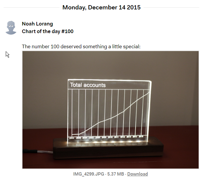
I wanted chart #100 to literally light people up with a look at our growth as company over more than ten years [pun intended].
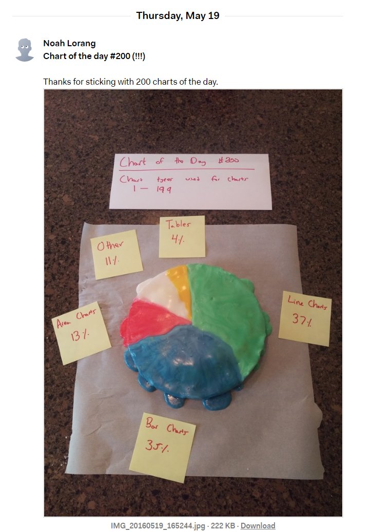
When it came time for chart #200, I was just hungry.
I’ve got about two months to figure out what to do for #300. Your suggestions for the wackiest, most over-the-top chart possible are appreciated.
Fun Chart Fridays
On most Fridays, rather than posting a “serious business” chart about Basecamp, I try for something a little lighter. Fun Chart Fridays are either charts about a less serious aspect of Basecamp (Campfire sounds are a perennial crowd pleaser) or something that I’ve seen elsewhere on the internet that’s interesting or amusing.
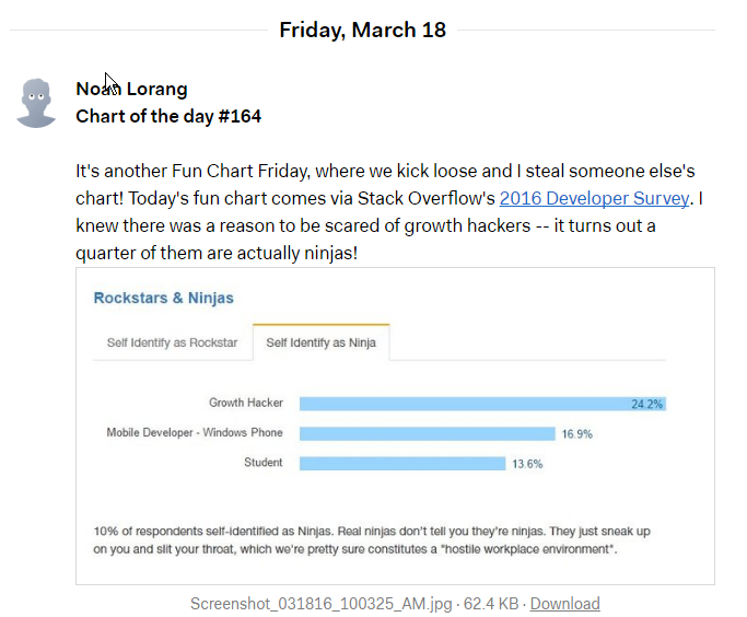
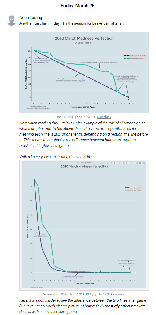
Sometimes they’re also a good chance to talk about a way of visualizing or thinking about data that’s a little different than the ordinary, or to contrast different looks at the same piece of data.
Inside the mind of a daily charter
Most days, charting is easy: I copy something from an analysis or report I’m working on and I paste it in Basecamp, write a sentence or two of explanation, and move on with my day.
Then there are days where charting is a real slog — I don’t have anything handy because I’ve been working on infrastructure, or I realize that the chart I was all set to post is actually too similar to something else I’ve posted, or I’m just tired. On those days, I sometimes question why I’m bothering. Does it really matter if I post a chart today? Or any day?
Eventually, I always convince myself that it does matter, because data can change the way people see things. People sometimes don’t even know the question they want to ask, which can make it hard for me to help them, but I can at least put a piece of data in front of them each day and hope that it sparks something in them that leads them to think about a problem a little differently. It sounds corny, but if that leads to us making a single better decision for our customers, that’s all the payback I need to make another chart.
A daily reminder that there are questions we can answer if we look at them the right way is pretty neat. — Jim
I’ve missed days because I’ve totally forgotten, and the chart of the day took a few weeks of summer vacation this year, but I’ve yet to just give up and not post on a day because I didn’t feel like it. That’s a small thing, but it gives me some satisfaction, and I’m going to keep on charting until they pry the x-axis out of my fingers.
These charts help us make Basecamp. You can use Basecamp for your daily charting habit too! If you do, let me know