Basecamp has a new website and a new logo. If this is the first you’re hearing about it, it’s because we opted out of the big rebranding announcement that many companies undertake. There should be a post from Jason Fried forthcoming here on Signal v. Noise, but in the meantime, check out the latest episode of the Rework podcast. Jason and marketing designer Adam Stoddard talk about what prompted the new look and the laidback way it came together.
11 thoughts on “Farewell, Happy Camper”
Comments are closed.
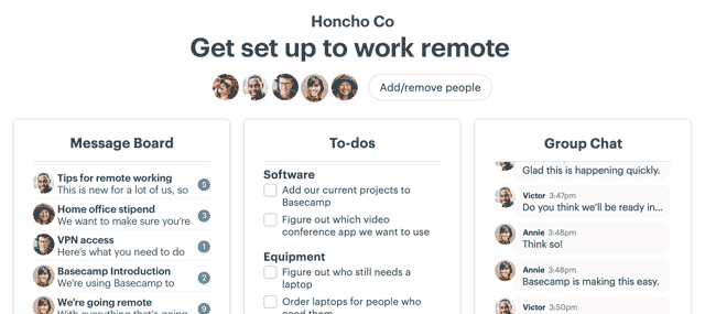
Email’s new heyday
Email sucked for years. Not anymore — we fixed it. HEY’s fresh approach transforms email into something you want to use, not something you’re forced to deal with.
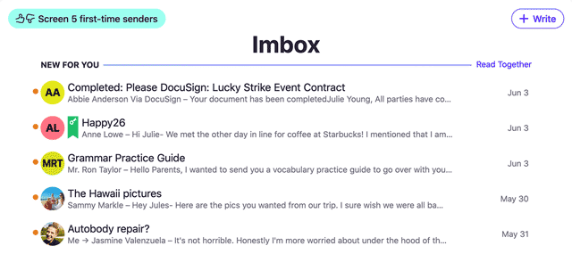
Tried Basecamp lately?
Used an earlier version, but moved on? Heard of it, but never signed up? Today’s Basecamp will surprise you! It’s all-new, entirely modern, and unlike anything else.
I found the new yellow app icon to be a stark and unwelcome unannounced intrusion to my home screen on my phone. I thought it would grow on me after a few weeks, but it still hasn’t. I hate the color. I may move the app to a sub-folder or the second page so I don’t have to look at it.
After an endless string of questionable rebranding efforts from many known companies your new logo is clean, instantly recognizable and makes sense. Great job!
Have to admit, I don’t care for the logo either 🙁 Love the software and the company though, so I guess it doesn’t matter.
Man, that’s ugly as fuck.
It reminded me of Mailchimp’s rebrand! I thought you guys might have copied.😄
Non-sarcastic: it hurts my eyes. The first time I pulled up the new BC homepage on my phone it was like walking outside on a bright day with no sunglasses – I winced and quickly dimmed the screen.
Bright yellow + stark white bg = the visual equivalent of chugging mustard.
I hope BC tones it down and adds some fun back to the mix. I really, really dislike it.
Nice episode!
I miss the smiley face, but the first time I got a notification with the new logo, it looked really good. I think that’s one of the most important interactions because it’s so frequently seen on a busy account.
One thing that didn’t come up in the episode was how many tweaks you made to the homepage before launching. In the past, you’ve attributed a lot of the success of the old site to a lot of little adjustments over time. Granted you can take some of those lessons into the new site.
Overall, a positive step for light-weight branding.
– The typography in top navigation, and in customers’ statements is too dark for the eye; it can be more soothing.
– I also notice how you plan with footer content position, just above the timeline. For some customers who are interesting to see Company or Terms of Use… findability can be bit of a challenge!
I’m surprised people are getting so emotional over a logo. Keep up the good work.
Well that’s disappointing. There’s new content but the website doesn’t look “new” at all, some lipstick has just been applied from the looks of it.
While I’m all for simplicity with a logo, the new rendition has me thinking of an egg cracking every time I see it. I would have selected three of the most popular logo designs internally followed by having some fun with it by letting Basecamp fans vote byway of a fun public poll, which would have undoubtedly garnered a fair amount of free publicity/attention in itself.
Please use the white and black one which shows up https://launchpad.37signals.com rather than the nasty yellow one which shows up as the website icon in the address bar. Yellow is a colour which is very off-putting for many people. Hence it’s use in caution/danger signs.
Not exactly the message you want to be communicating with a project management application.
On other fronts, thrilled to hear you are cutting back on all the tracking.