You hear a ton of different advice on the right and wrong way to go about designing an app or website.
“You should be using Sketch.”
“Design Systems or GTFO.”
“Real Designers design 100% in code.”
“Wireframes are a waste of time.”
“If you’re not making prototypes, you’re not doing it right.”
“You need to start on paper.”
You’d think there’s no agreement whatsoever about the right way to design, but there’s one point that’s largely free of controversy — that your process should be linear.
The classic linear approach looks something like this:
research → sketch → wireframe → static comps → prototype → code
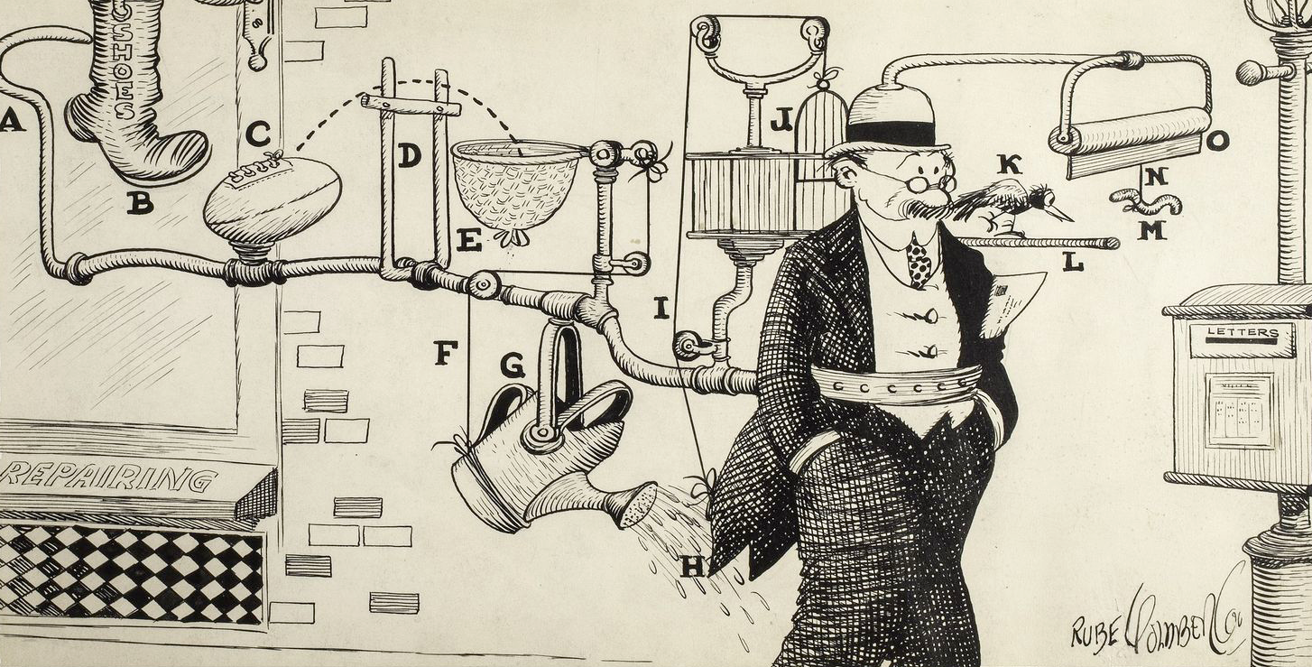
It’s kind of like those Rube Goldberg-esque manufacturing machines they use to make Doritos and Ding-Dongs. Drop an idea into the process machine, and after getting mashed and molded into shape as it winds through the steps a finished product pops out the other side! Predictable! Efficient!
Kind of.
Process machines work, but only when they work. They don’t adapt, and that makes them fragile. All it takes is one little Sabot to grind your process machine to a halt.
Hank, a.k.a. “the Sabot”
I’ve been watching Finding Dory with my kid lately, and part of the “making of” footage keeps jumping out at me.
In the movie, there’s this octopus named Hank:

Septopus, technically. His character model was so onerous to work with, they lopped off a tentacle to make animating him doable. Still, with 4,000 separate controls he was incredibly challenging to work with.
At this point in the process, they’re well past sketches and renderings and animatics — those lower fidelity stages that help you vet a bunch of ideas quickly and cheaply. They already Got Real too. The character rig was built, technical details worked out, fundamental questions answered.
They’re in the final animation stage — 3D models in 3D environments. They could have soldiered on at the expense of the production schedule and budget. Instead, they did something really interesting — they went back to sketching.
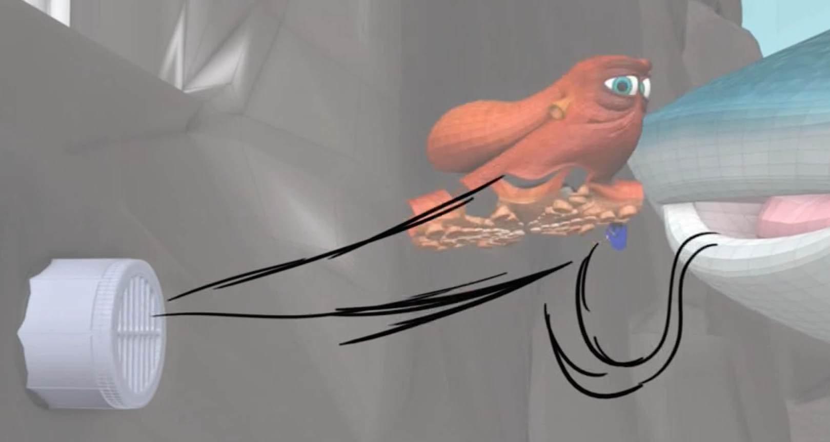
By sketching out the complex movement of Hank’s tentacles on paper, they could nail down the perfect, fluid animation they were looking for in a fraction of the time. Once they were happy with the sequence, they’d animate in 3D to match. They got a better product in less time because they chose to value process principles instead of a process prescription.
The cure for a prescriptive process
The Finding Dory team made a better product faster by making decisions that prioritized speed and quality instead of sticking to a rote process.
You might choose other things to value, but if you’re working in a commercial setting, focusing on the sweet spot between speed and quality should be at the top of your list. Turning around great work quickly is kind of a big deal for professional designers and artists after all.
Defining the principles that drive your process is just the beginning. Here’s how you can put them into practice.
Start with the big questions
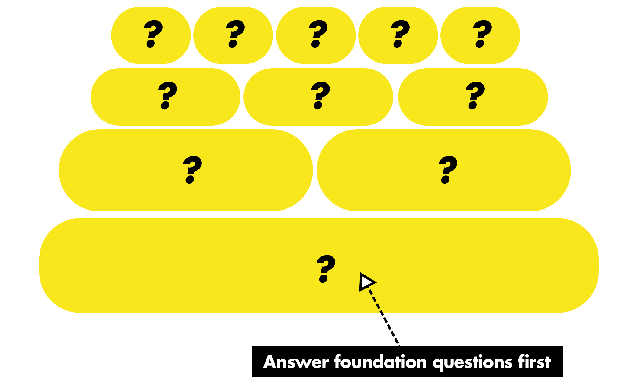
If you value speed, start a project by figuring out what the biggest, most fundamental questions are. In Getting Real, this is called “epicenter design”:
Start from the core of the page and build outward
Epicenter design focuses on the true essence of the page — the epicenter — and then builds outward. This means that, at the start, you ignore the extremities: the navigation/tabs, footer, colors, sidebar, logo, etc. Instead, you start at the epicenter and design the most important piece of content first.
Whatever the page absolutely can’t live without is the epicen- ter. For example, if you’re designing a page that displays a blog post, the blog post itself is the epicenter. Not the categories in the sidebar, not the header at the top, not the comment form at the bottom, but the actual blog post unit. Without the blog post unit, the page isn’t a blog post.
Only when that unit is complete would you begin to think about the second most critical element on the page. Then after the second most critical element, you’d move on to the third, and so on. That’s epicenter design.
Epicenter design eschews the tradtional “let’s build the frame then drop the content in” model. In that process, the page shape is built, then the nav is included, then the marketing “stuff”
is inserted, and then, finally, the core functionality, the actual purpose of the page, is poured in to whatever space remains. It’s a backwards process that takes what should be the top priority and saves it for the end.
Here’s an example of why this is crucial. I was working on a little side project iOS app that used a unique, possibly unworkable audio interface. If I didn’t value speed, I could have spent countless hours designing the myriad details that rested on the foundation of this one oddball idea. Design comes before code in the classic linear process, after all.
Instead, I started in code to figure out whether or not this idea was viable. It wasn’t! So I adjusted my plans, and saved myself an enormous amount of time and energy.
Just ask, WMGMTCATMQITLAOT?
Once you know the questions that need answers first, ask yourself:
“Which medium gives me the clearest answer to my questions in the least amount of time?”
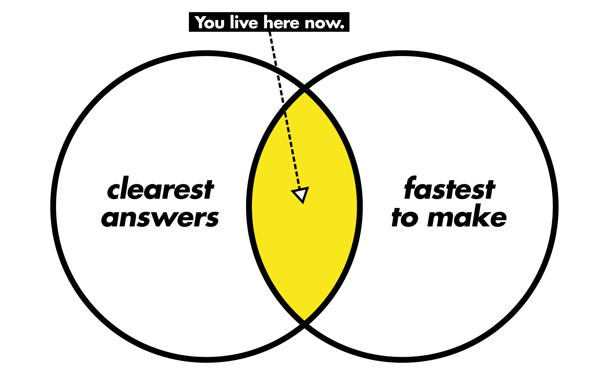
In the case of my side project, the answer was code. For a page on Basecamp.com, the answer is often text or a sketch. For you, it might be something else entirely.
Knowing when to change gears
That gives you a place to start, but how do you know when it’s time to switch to a different medium? When you hit resistance.
Think about driving a car. You’re cruising down the highway — engine purring away like a contented kitten. But then you start driving up a hill. The gear you’re in was great for cruising, but not for hill climbing. In order to keep up your speed, you shift into a new gear.
Same thing here. But unlike cars, there’s no rock solid indicator that you’ve hit too much resistance in your medium of choice. Luckily, most designers and artists have a solid handle on when you need to switch to a medium that offers more fidelity. This is the part that lines up with the classic low fidelity → high fidelity linear process after all. You know you’re ready to move on from sketching when sketching stops giving you useful insight.
Once you’ve hit this point, figure out the next most important set of questions and ask yourself again: “which medium gives me the clearest answer to my questions in the least amount of time?”
The second case — shifting back to a lower fidelity — is tougher. Both because people are less practiced at it, and also because it’s tricky. Take working in code. You’re working at 100% fidelity, so there’s no limit to the medium’s ability to answer questions. But there is a limit to its ability to answer questions fast.
When you feel yourself not pursuing paths because it feels like too much work, that’s a really good sign that you need to back out. When things feel like they just aren’t clicking like they should, it’s time to reassess. Be mindful, and you’ll start to develop a feel for it.
Using a medium to your advantage
There’s a third case for switching to — or sticking with— a medium. This one doesn’t care about resistance, it only cares about a fundamental truth; process influences outcome. Just like drawing something with a pencil is going to look different than drawing it with a marker, designing in browser is going to produce an different outcome than designing in Sketch.
The more you understand how a medium affects your work — the kind of tool marks it leaves — the more you can use it to your advantage. Want your design to be expressive? Probably better to work with a visual tool like Sketch, Illustrator, or even *gasp* Photoshop. Want a minimal, lightweight design? Stick to designing in code.
A practical example
Now that I’ve railed on about the perils of prescriptive process, I’d like to share with you… my process. Not for you to follow step-by-step! Just to give you a real life example of how you can use principles to guide your process.
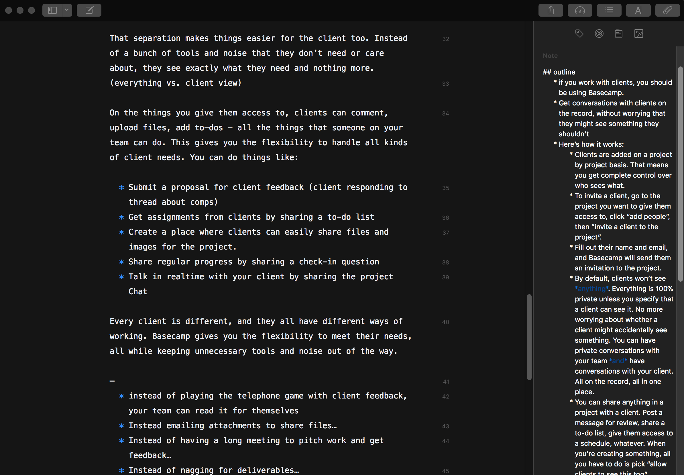
We’re launching a new way to work with clients in Basecamp, and my job was to create a new page on Basecamp.com to market it. Here’s how it played out:
Determining big questions, picking a medium
This isn’t a new site, or a wholly new layout. First, I needed to figure out the purpose of this page, what it’s trying to say, and the overall structure.
“Which medium gives me the clearest answer to my questions in the least amount of time?”
Comps and sketching are out. This is slotting into an existing design and an existing template. I could jump straight to code, but the markup is noise at this point. Text is just right.
Increasing fidelity
I didn’t stick with text long enough to finish all the copy for the page. Once I had an outline and a sense of how I wanted to talk about the feature, I shifted gears into code.
Why?
A text doc couldn’t tell me anything about whether a line would leave a widow, whether a paragraph “felt” long, how the images would flow, etc. I needed more fidelity. Some of the new questions could have been answered by a static comp, but that wouldn’t have answered questions about copy fit unless I wasted time matching the comp exactly to code. No thanks.
Selectively decreasing fidelity
After a few more rounds of copy revisions, the page was starting to take shape. Visually, it was mechanical and underwhelming. I wanted it to be more expressive, so I switched over to Sketch to riff on some ideas.
I could have stayed in code for the most part, but with Sketch I could fire off a bunch of ideas much faster than I could code them. It also let me directly compare those ideas against each other, and wouldn’t leave a CSS rat’s nest from all the churn. Win-win-win.
Notice how none of them are fully baked? It’s because they don’t matter! These aren’t for a client presentation or for developer handoff. They’re there to help me figure something out, then they’re trash. Investing time to polish them would have been a total waste of effort.
Finishing up
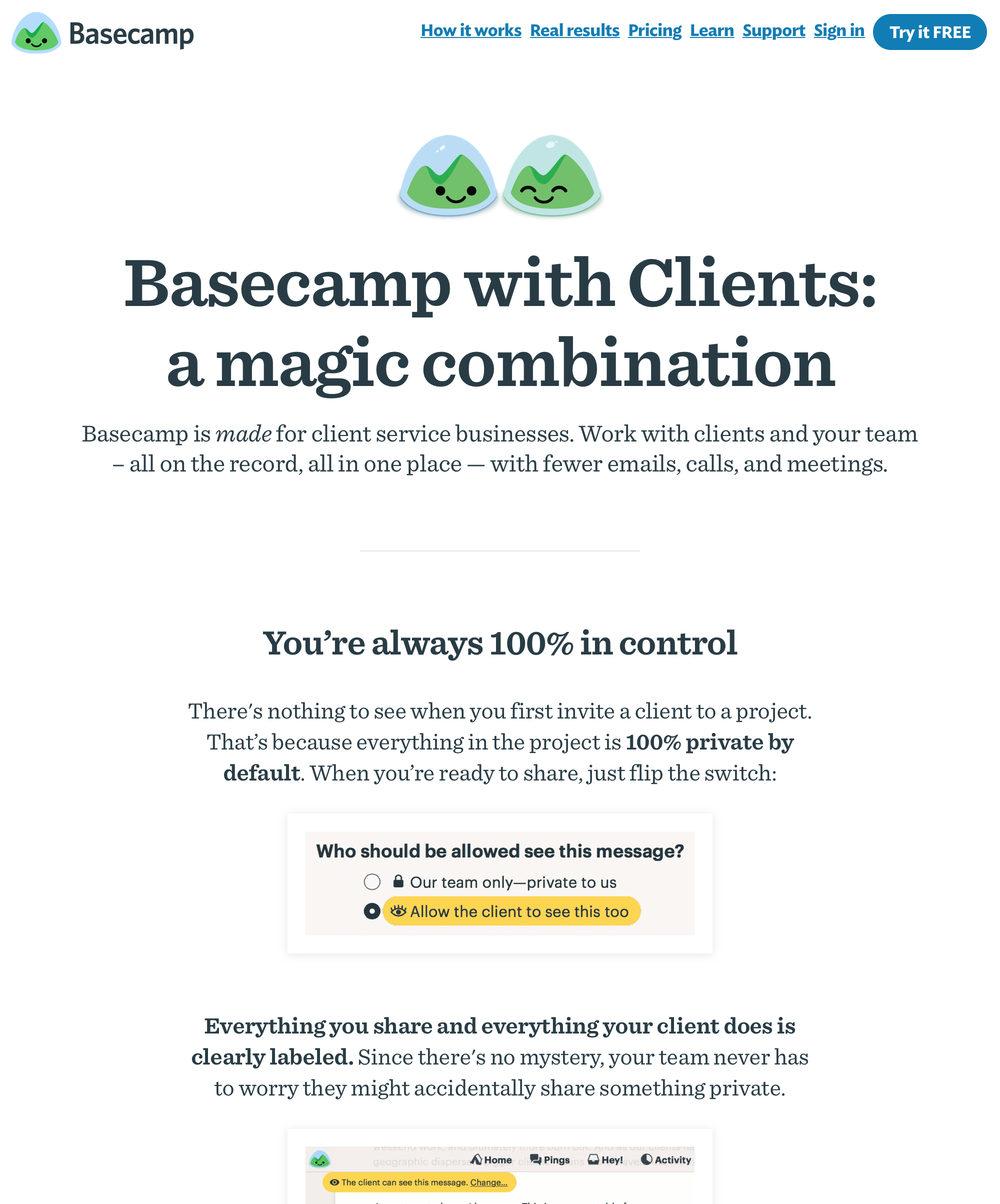
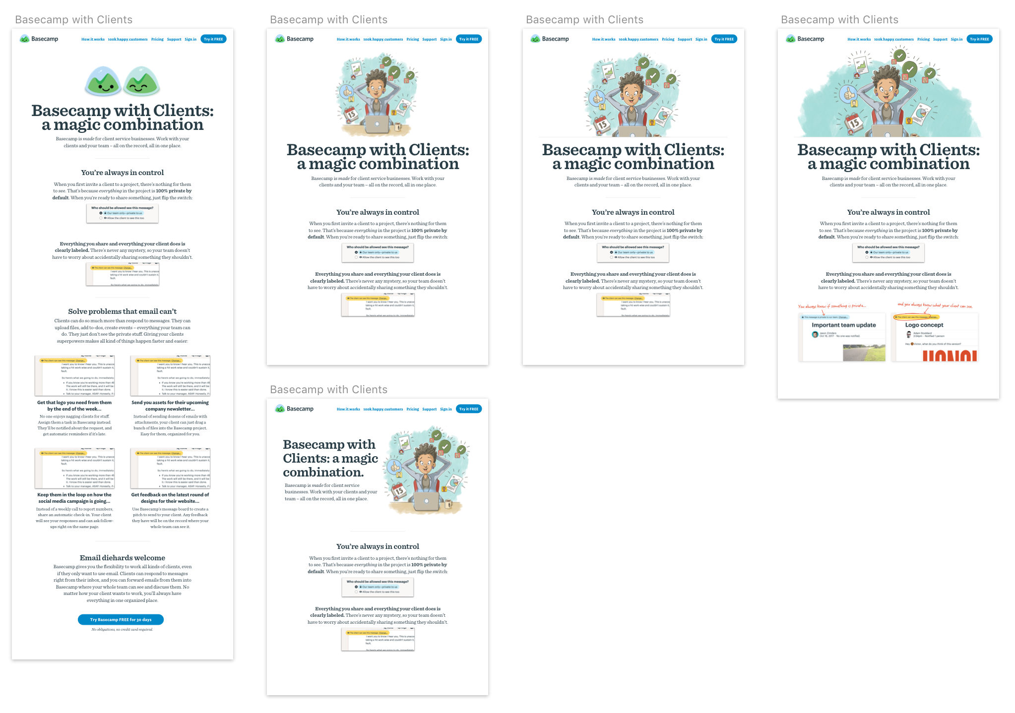
Once I had a sense of the direction, it was code the rest of the way. Polishing copy, nailing down screenshots, and always evaluating against the final, key question: “Is this ready to ship?”. You can take a look at the live Clients in Basecamp page here.
This isn’t how every project plays out. Sometimes I’ll sketch something in Procreate, sometimes I’ll start with a quick and dirty visual comp, sometimes I’ll write copy in Sketch, sometimes I’ll work 100% in code. It all depends on the project at hand.
Hopefully that gives you some insight into how you can use principles to guide your process on case-by-case without feeling like you’re constantly reinventing the wheel.
Think about your process and the kind of work that you do. Define the principles that are important to you, focus on the big stuff first, and keep questioning if the medium you’re working in is the right one for the moment. Your work will be better for it.