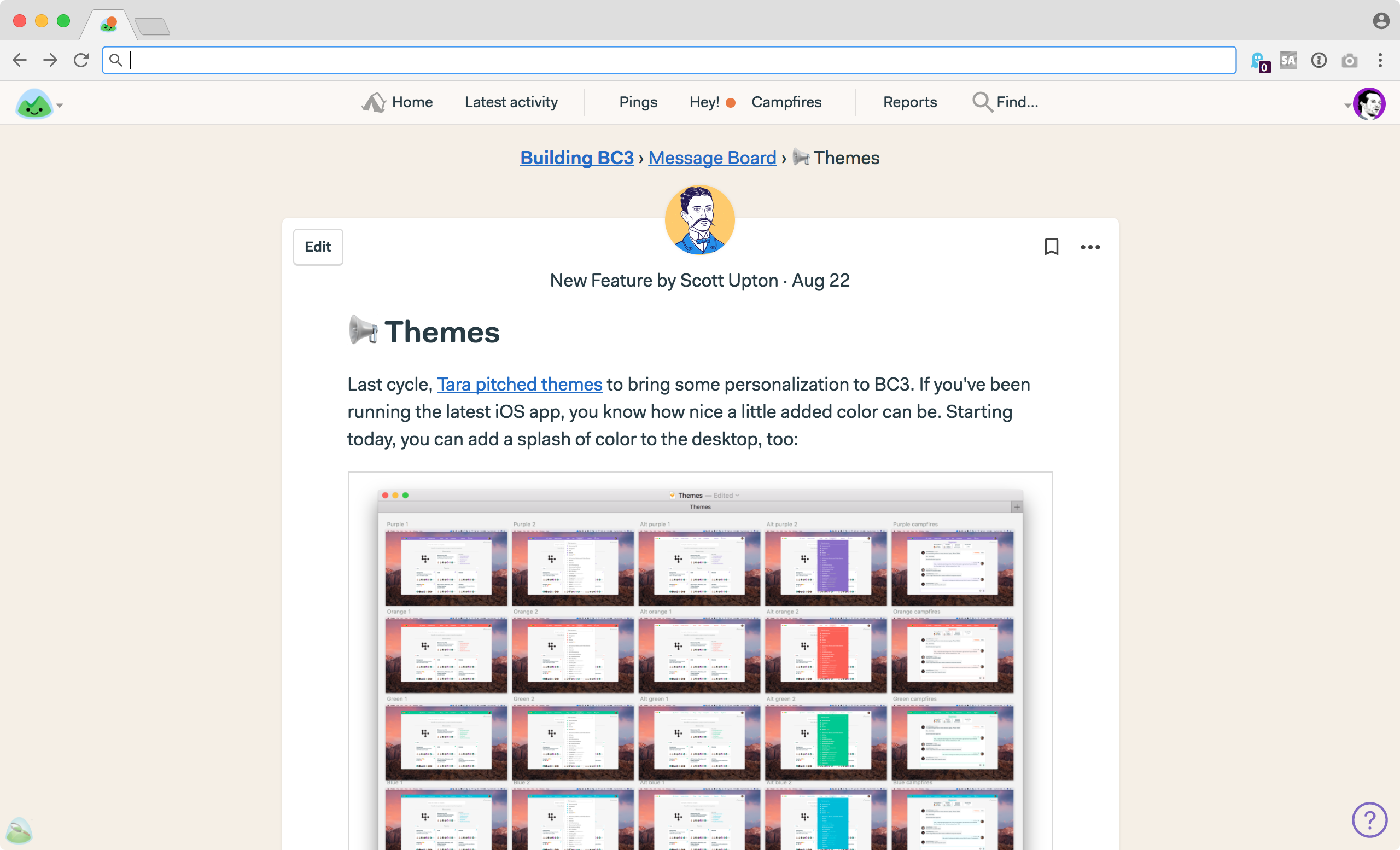
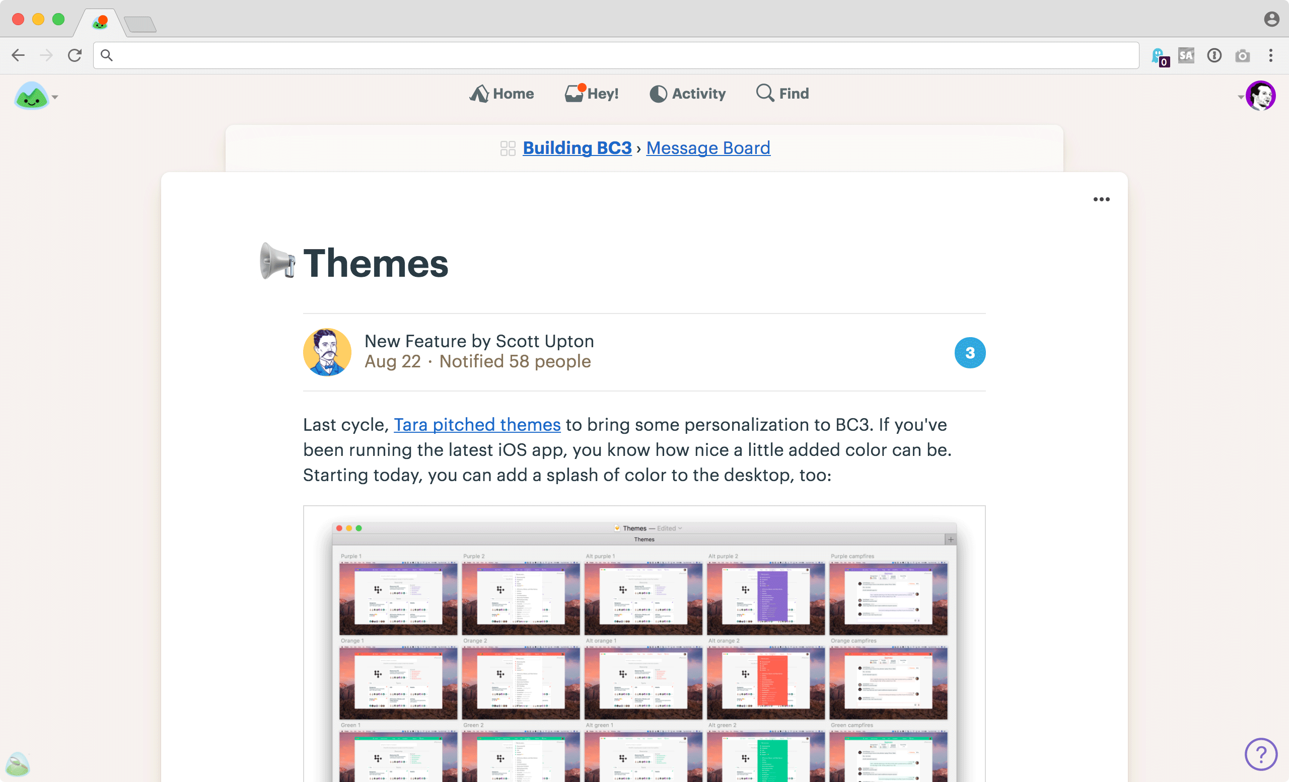
Over the next few months we’ll be rolling out a visual refresh to make Basecamp 3 even easier to use — and more approachable for new users. Today we launch the first set of updates.
Most products get more complicated as they go. More stuff, more screens, more options, more ways to do things. It’s natural — evolution tends to create more complex creatures over time. Software development is no different.
That’s why it’s on us to push back on complexity and clutter as we go. If we’re smart about it, we can add power and clarity over time, while making everything feel simpler than before. With that in mind, we’re ready to share what we’ve been working on for you.
Phase 1 goes lives today
First things first. This initial refresh is centered around simplifying the global navigation at the top of the screen.
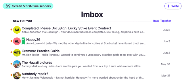
We’re going from this:

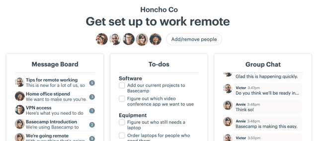
To this:

Simple on the surface, but there are a variety of deep changes behind the scenes. Let’s look at them…
NEW: A single, unified inbox called Hey!
Previously, Basecamp 3 had three separate inboxes: Pings for direct messages, Hey! for posts, comments, to-do assignments, automatic check-ins, @mentions, and Campfires for group chat rooms. It made technical sense as these are all different things that run at different speeds, but we don’t think the mental overhead of three inboxes was worth the trouble. Don’t we have enough inboxes in our lives already?
So we’re switching to a single unified inbox. Everything goes in the Hey! menu. Now if there’s something for you to see, there’s only one place to look. And it’s been totally redesigned.
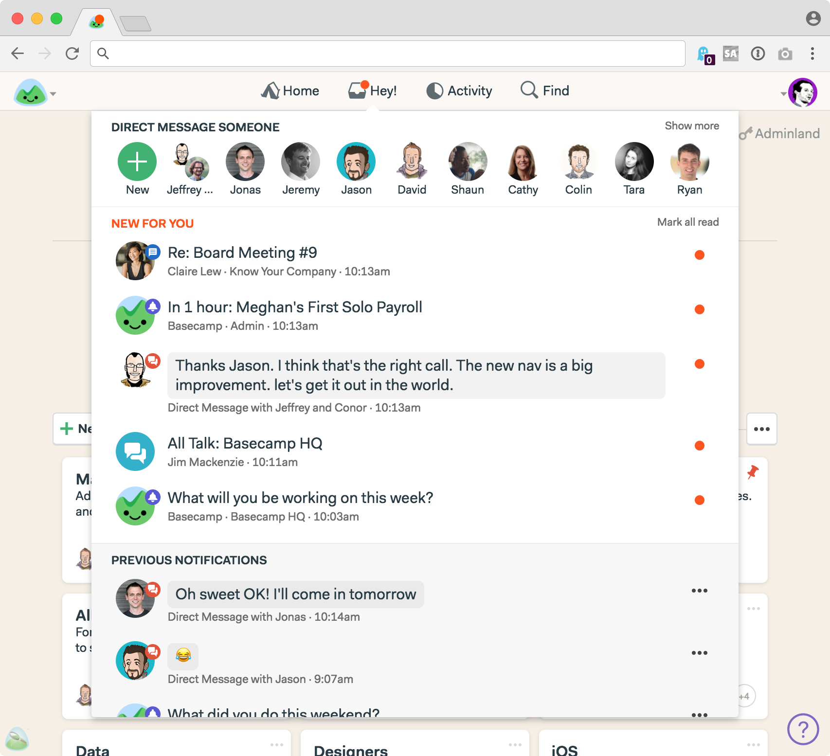
At the top you’ll see a row of faces and a plus button. Want to send someone a private, direct message? Just click their picture, or hit the plus button and type their name if you don’t see them listed. We used to call these Pings, but we’ve renamed them Direct Messages. Same feature, more familiar name.
Below Direct Messages, you’ll see a NEW FOR YOU block. All your notifications flow into here. Direct Messages, new comments, new posts, threads, Campfire chats, @mentions, new to-do assignments, etc. If you need to know about it, it’ll line up right here. Direct Messages now have previews as well, so it’s easier to see what someone wants to tell you without having to click into it. And Campfires now show who posted the last chat.
Last, you’ll see all PREVIOUS NOTIFICATIONS. Once you read something in NEW FOR YOU, it drops down to PREVIOUS NOTIFICATIONS for safe keeping and easy access. Plus there’s a link at the bottom to see all previous notifications — a screen we warmly call the Heystack.
UPDATE 14 December: Based on customer feedback, we’ve changed our mind and brought back the Pings menu. Here’s the story behind that decision.
NEW: Reports roll into Activity
As part of the navigation cleanup, we’ve eliminated the Reports menu and consolidated Reports and Activity into a single screen. Now when you click on Activity, you’ll see this:
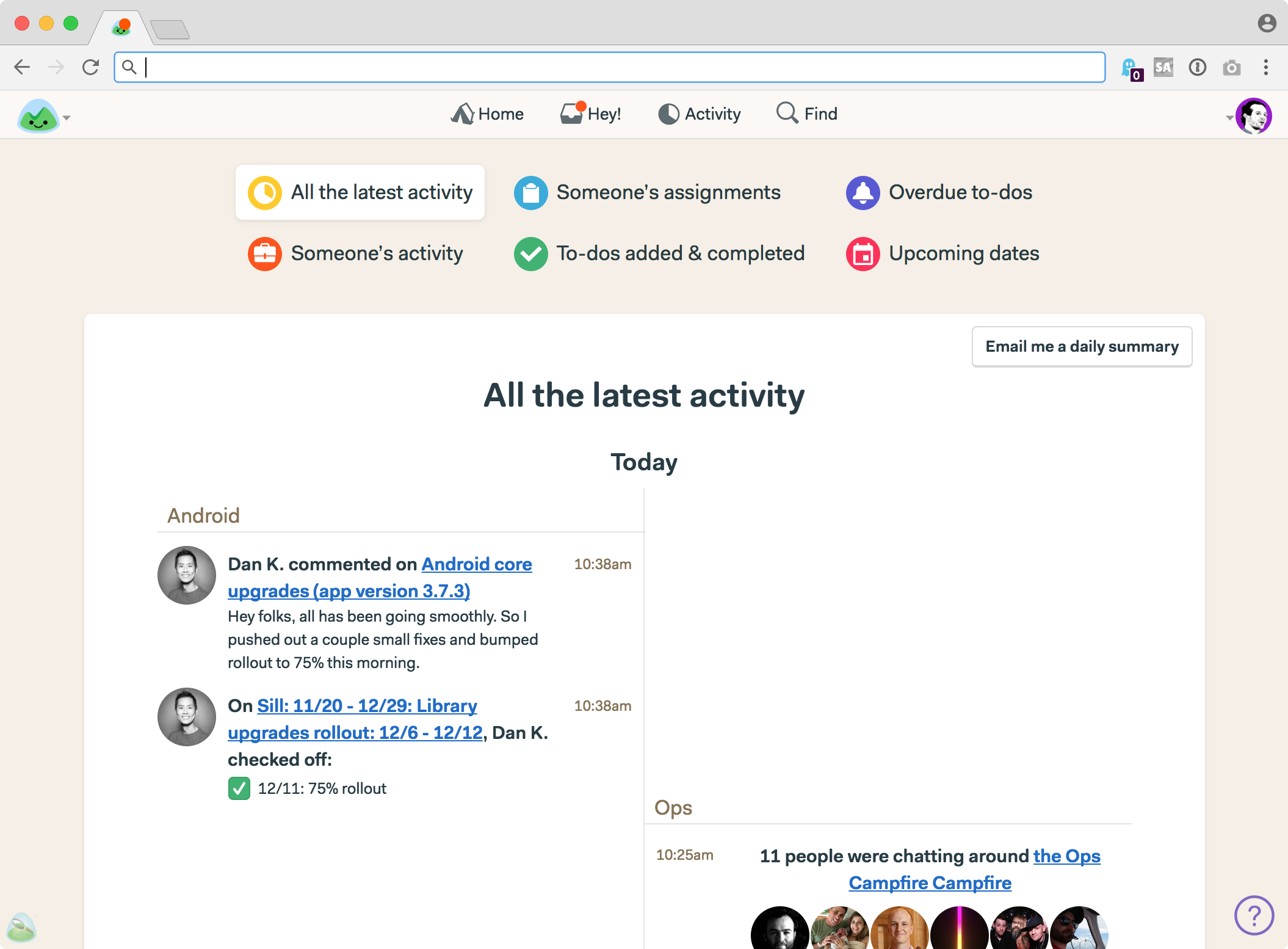
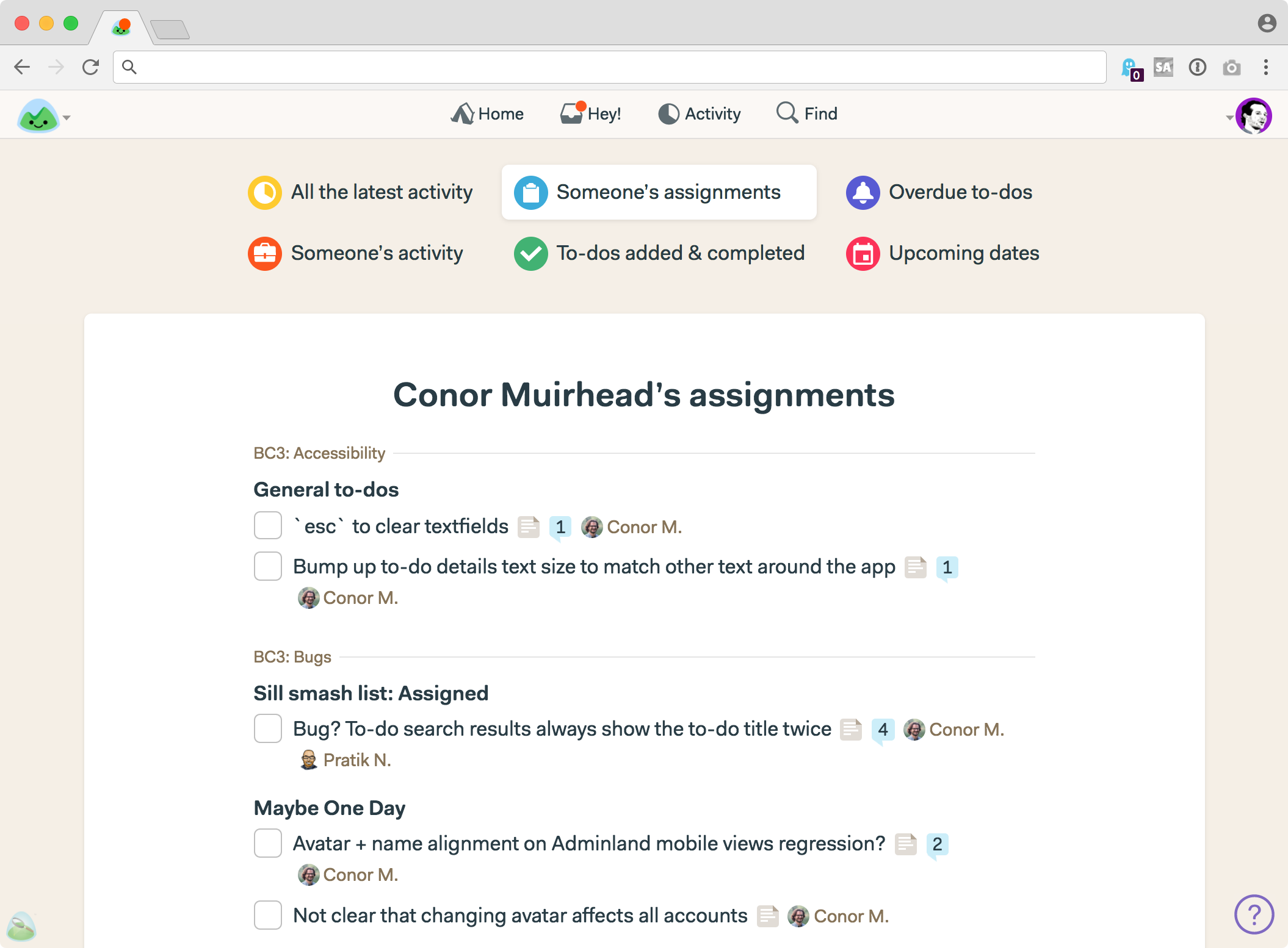
Reports that used to be in a separate menu are now front and center at the top of the Activity screen. Just click a button to switch to a different report. For example, here’s what’s on Conor’s plate:
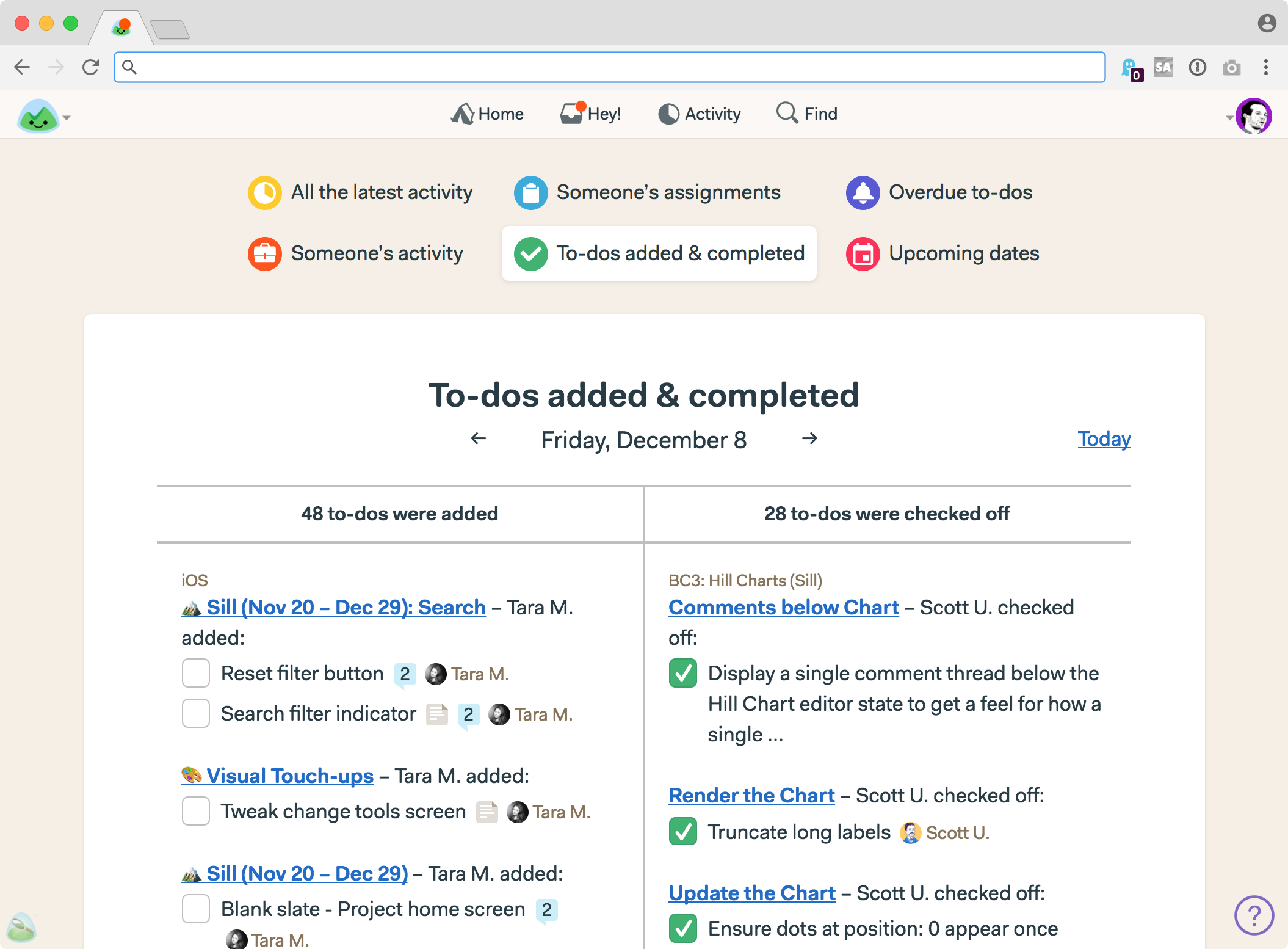
And here are all the to-dos added and completed across our account on Friday December 8th:
Simpler, clearer, and fewer places to go to get at the information you want. We’ve also improved how you select a person for a report. You’ll see that when you select “Someone’s activity” or “Someone’s assignments.”
Revamping the global navigation by consolidating and simplifying means there are fewer places you need to go to stay on top of it all. Concentrating power in a few key places, rather than spreading it out, puts more of what Basecamp can do for you front and center. And it makes it a whole heck of a lot easier for new users to learn. We’re excited for you to get your hands on it.
Preview of Phase 2
With Phase 1 now live, let’s turn our attention to a preview of what’s coming shortly in Phase 2.
Phase 2 is a broad overhaul of key screens, while still keeping things familiar enough so people aren’t disoriented. We know our customers are in the middle of important projects, so change comes carefully.
This phase of the refresh hits things like project home pages, message boards, to-do lists, automatic check-ins, etc. Plus some more tweaks to navigation. All new typography, better use of space, fewer elements on each screen to help you focus on what really matters, consistent placement of key buttons, better proportions, a toned back background, etc. Big stuff that touches nearly every screen.
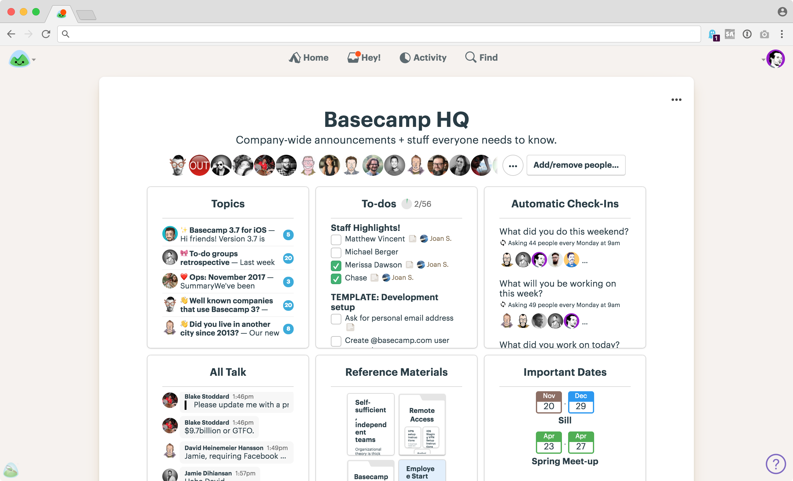
Keep in mind this is work in progress, and still subject to change, but here are some highlights:
So there you have it! An all new navigation and Hey! inbox is available today on the web and desktop. And a few weeks from now we’ll push Phase 2 live. We think you’re going to love the overall simplification moving into 2018.
Wishing everyone the best!
And, BTW, if you haven’t tried Basecamp 3 yet, now’s the time. Since switching to Basecamp 3, 89% of customers reported having a better handle on their business, 84% report more self-sufficient teams, and early 60% have fewer weekly meetings! Want to be there too? Sign up to try Basecamp 3 for free, today.