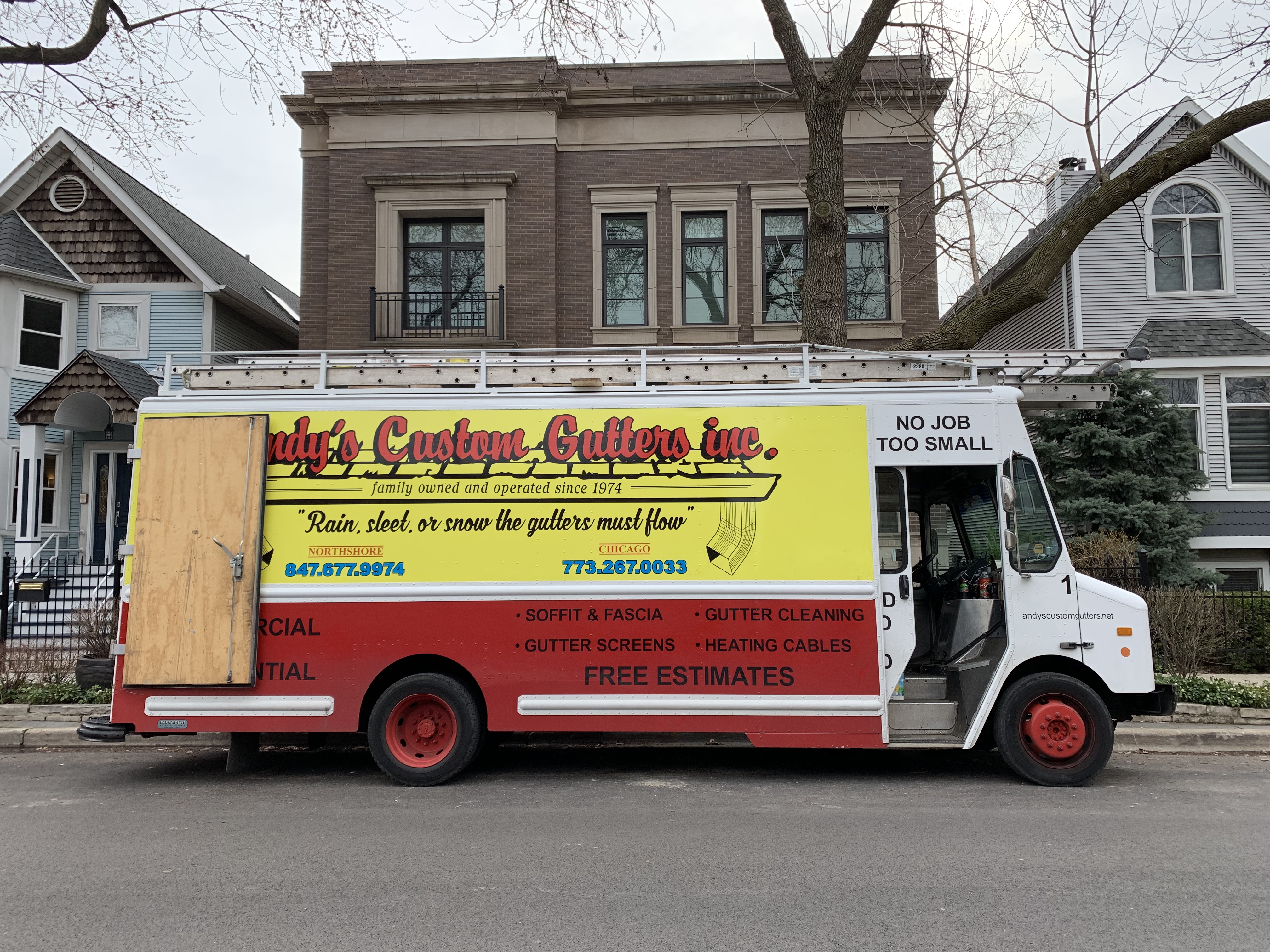
I’ve always loved this kind of design. It’s clear, it’s colorful, it’s honest, it’s approachable, it’s folksy, it’s effective. ALL CAPS works. “NO JOB IS TOO SMALL” is impossible to improve on (it also says this in huge letters on the front of the truck). “Rain, sleet, or snow the gutters must flow” rhymes (and they’re right!). You could argue that the URL is too small, you could say it’s messy because there are too many colors, fonts, styles, etc. But I’d say so what? How does any of that make this a bad advertisement on the side of a truck? It’s beautiful – and ugly – in all the right ways.
Small typo (or a good habit peeking out), it’s “sleet”, not “sleep”.
Now corrected, I noticed.
Hmm, I might need some gutter help.
Advertising is subjective, for some this is sort of design is a turnoff. Obviously you recognize this hence the article. I’m remember one of Basecamp hiring policy when all things being more or less equal, hire the better writer. I have something similar although more subjective, hire the company with the better design.
Advertising is subjective, for some this sort of design is a turnoff. Obviously you recognize this hence the article. I’m remember one of Basecamp hiring policy: when all things being more or less equal, hire the better writer. I have something similar although more subjective, hire the company with the better design.
Needed to size the design so that important details like company name were not partially obscured when the doors were open. A lot of advertising value is gained while truck is parked on the job.